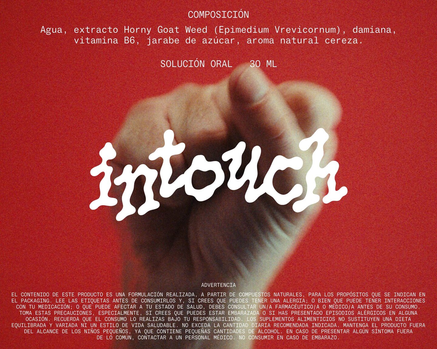
Technology has made our lives easier, but it seems everything comes at a price. INVOLUT introduces a range of supplements to combat the negative side effects of modern times. Featuring PicNic by Velvetyne.
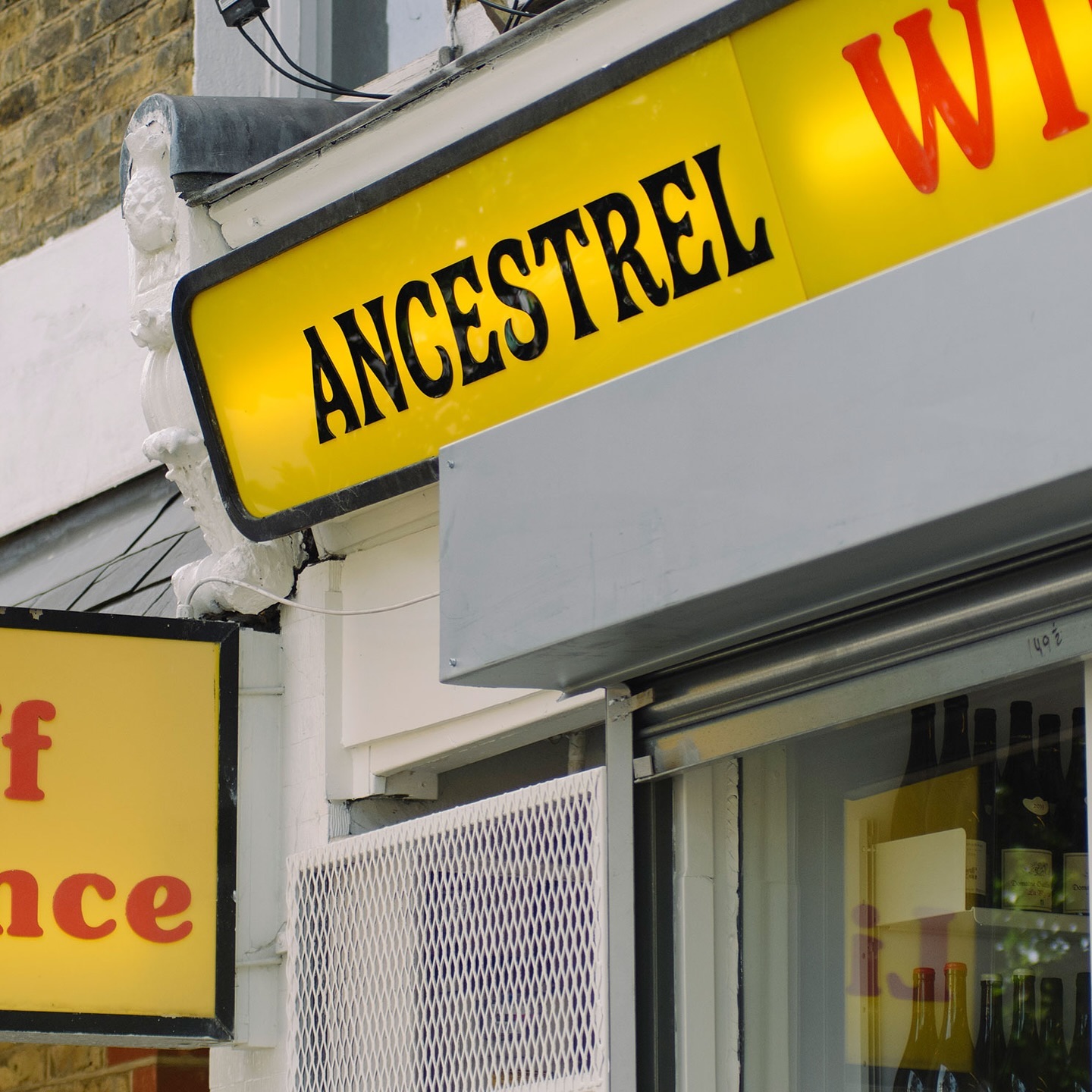
The first store to bring natural wine to the UK, Ancestral Wines, features an identity inspired by the winemaking process and a logo shaped like a grape cluster.
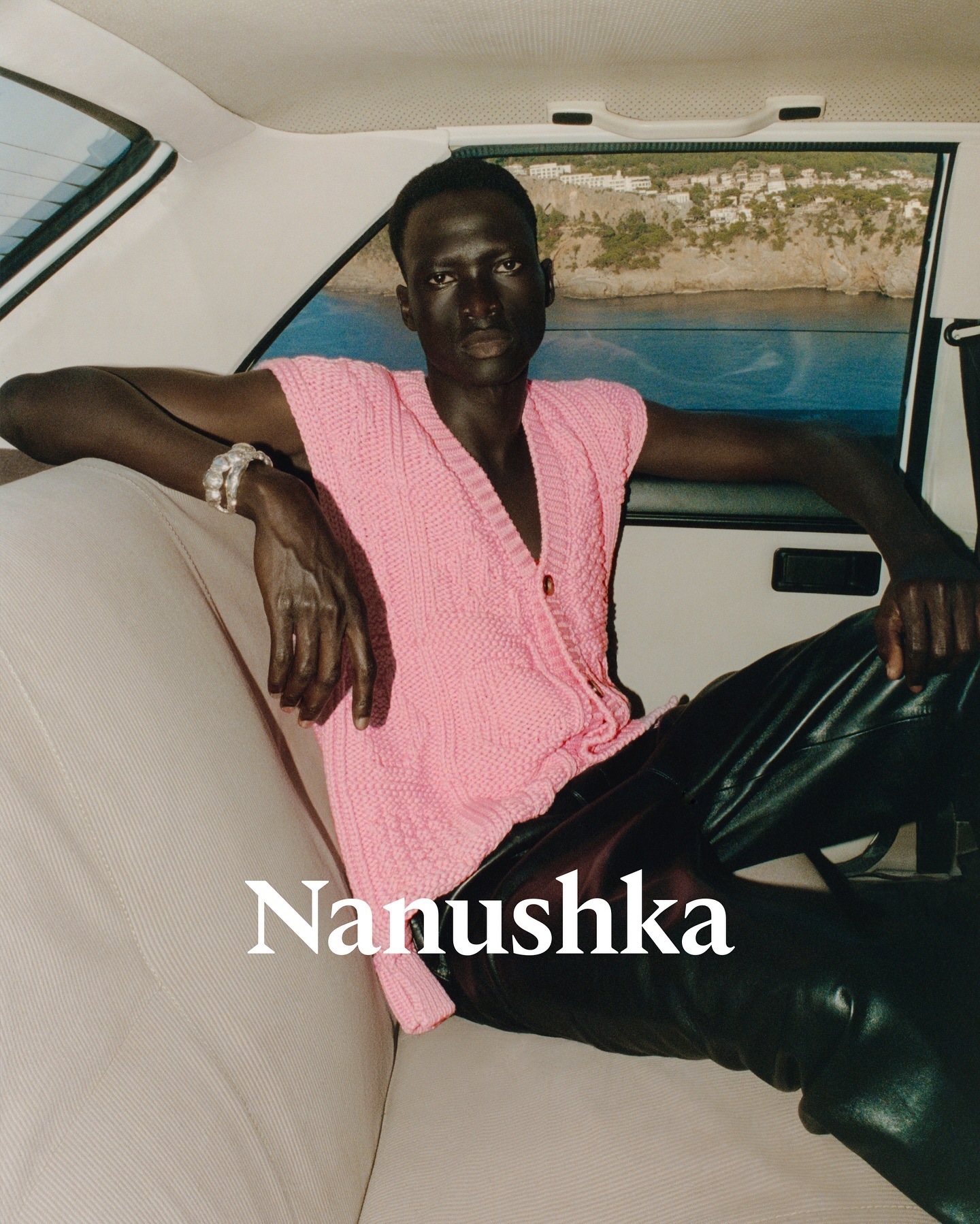
Nanushka is making its mark in the fashion market with inspiration drawn from Hungarian history as well as a wordmark and visual identity rooted in traditional symbols.
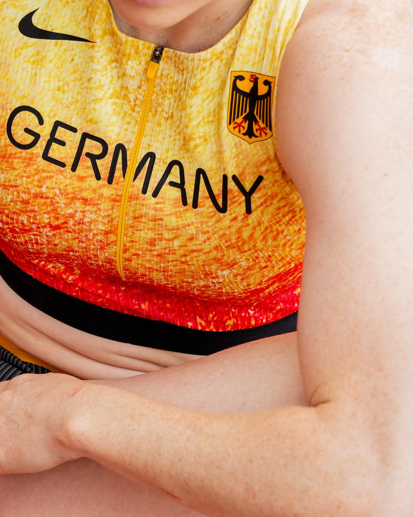
At the world’s largest sporting event, Nike embraced a modern, dynamic, and fluid typeface. In collaboration with Pizza Typefaces, they created the Nike Olympics fonts, a typeface inspired by twisting motion.
Elephant magazine showcases the rustic and imperfect details of the ZG Elephant typeface through these graphic spreads. Type and editorial design by Zak Group.
As fun as family movie nights, Moore by Eliott Grunewald was used in this list of films curated by A24 and approved by kids and adults alike. Designed by Jordi Ng and Elana Schlenker.
Logotype and lettering inspired by the baroque era of the internet, proposed by Muon Studio for Youhee’s visual identity.
Justin Sloane used this interesting mix of Gothic letters (Castilla by Sharptype) and sans serif (Octave by Josh Finklea) for a vinyl cover.
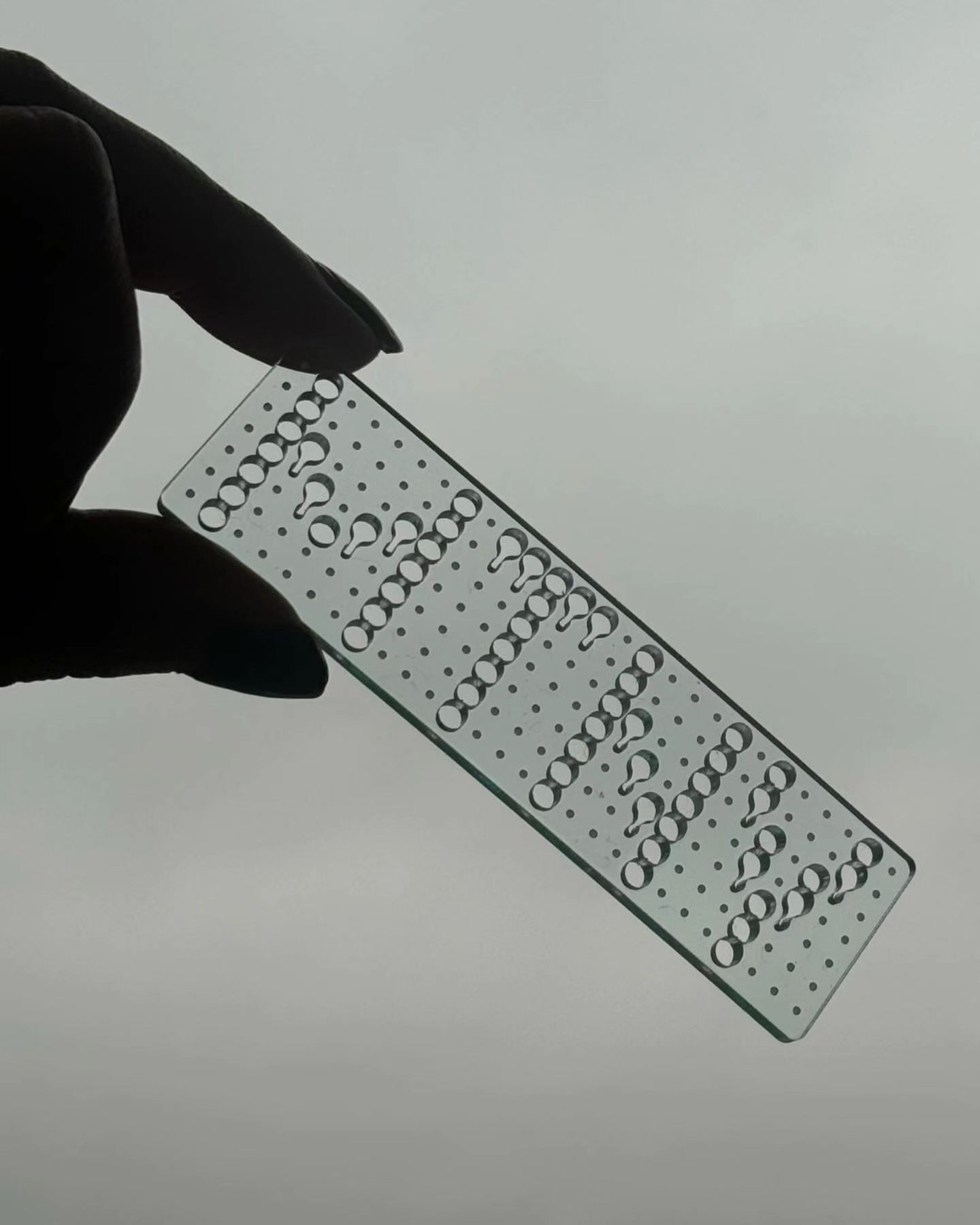
This series of keychains, the result of Pauline Esguerra’s exploration with laser cutting, uses, among other typefaces, Eurocat by Maxitype.
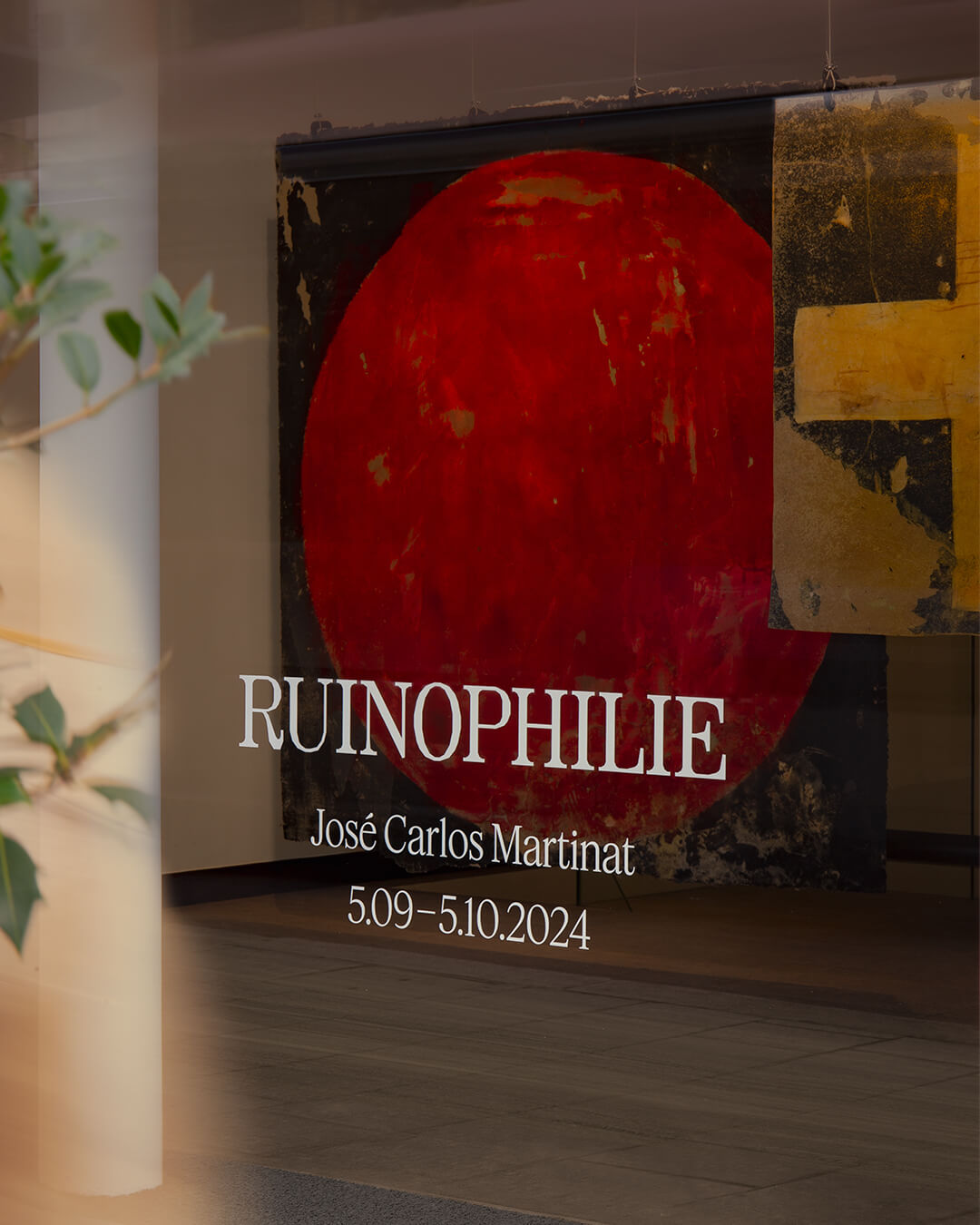
Three typefaces come together in this warm visual identity for an art exhibition in Paris: Minotaur by Production Type, Diatype by Dinamo, and Feature Deck by Commercial Type.