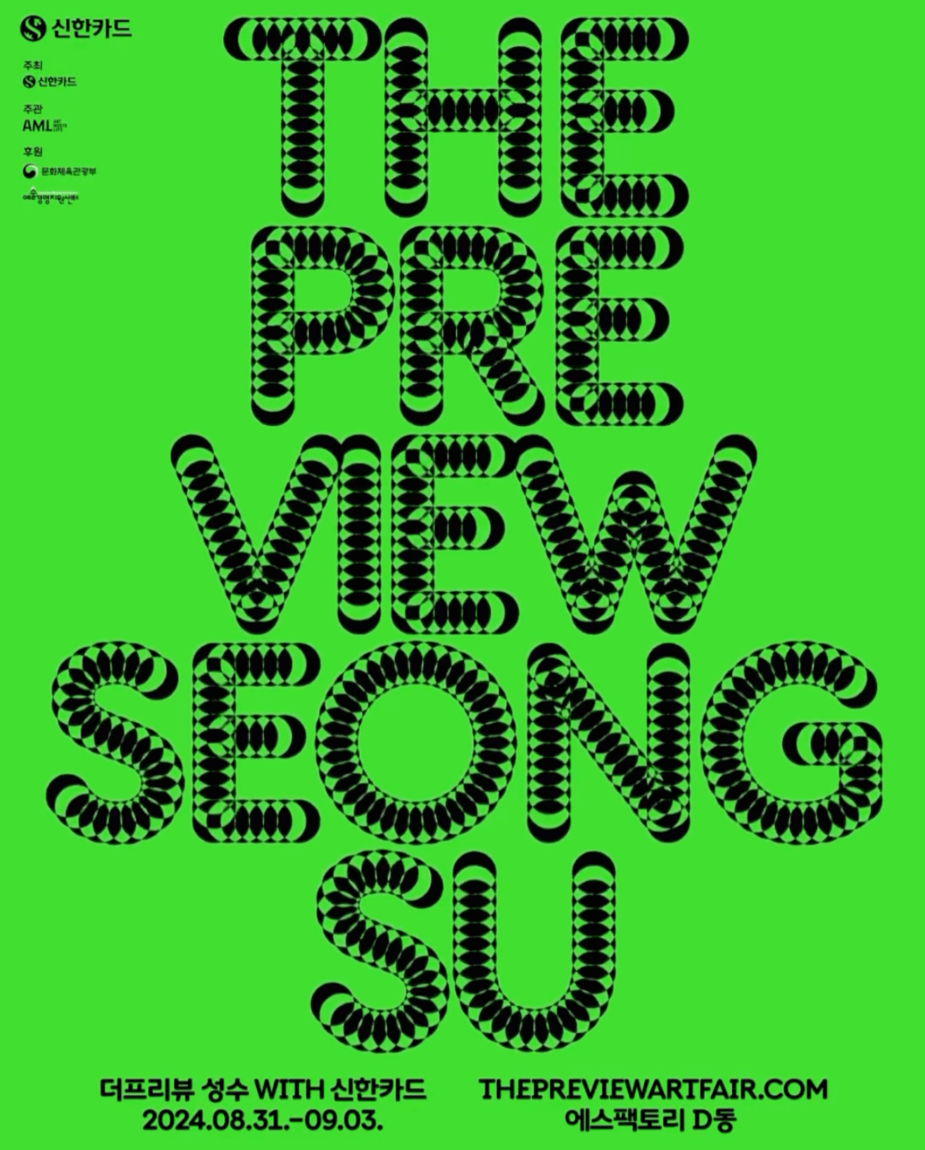
A typeface that –literally– shows its starting point and journey; the Korean graphic designer, @jun.works , included this along with other elements to create the visual identity for @thepreviewartfair.
An affair depicted through typography to create the identity for the Belgian Art and Design Affair, where @otisverhoeve,@bureauclaes, and @pino_type designed three different typefaces incorporating hearts into each letter.
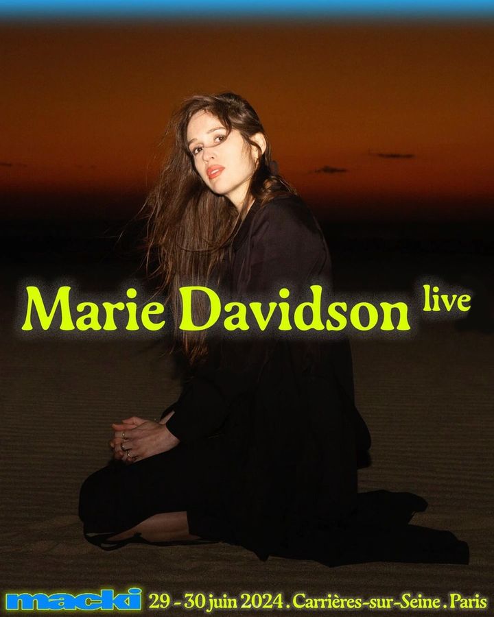
An electric identity designed by DR. ME and an organic serif typeface, Gaya, accompany the 2-day indie music festival hosted by Macki.
Asfalt will have its first edition featuring an identity filled with color blocks, sports images, a vertical logo using a customized version of Generation Mono, and texts using ABC Diatype.
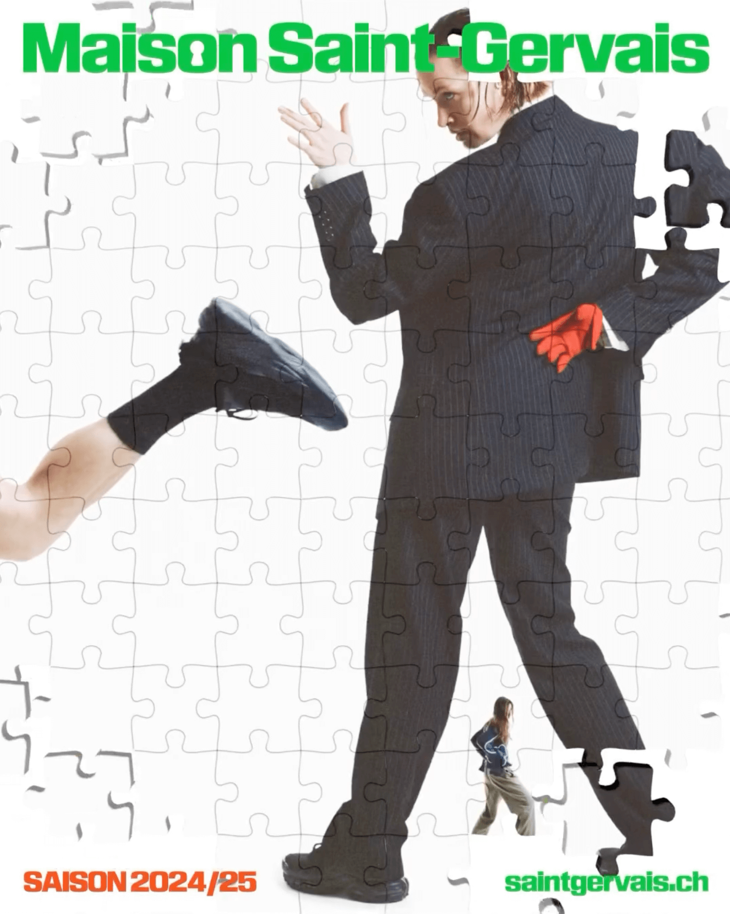
The Swiss graphic design studio Dual Room renewed the image of the Maison Saint-Gervais theater, using KTF Rublena Black.
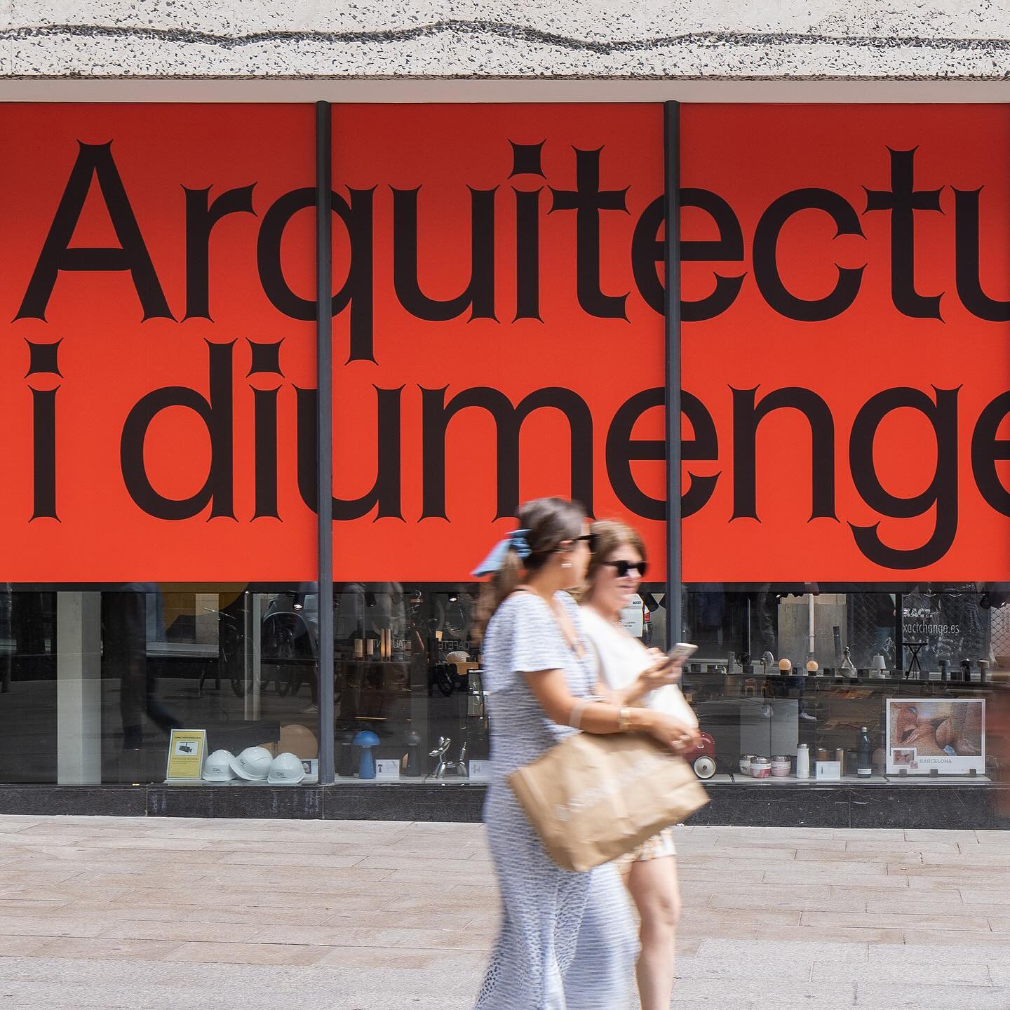
Graphic design for different spaces of this exhibition at the Architects’ Association of Catalonia, by PFP Disseny. Using Helveesti by Dinamo.
Workbyworks Studio designed this unconventional serif typeface and visual identity for Steffan Studio.
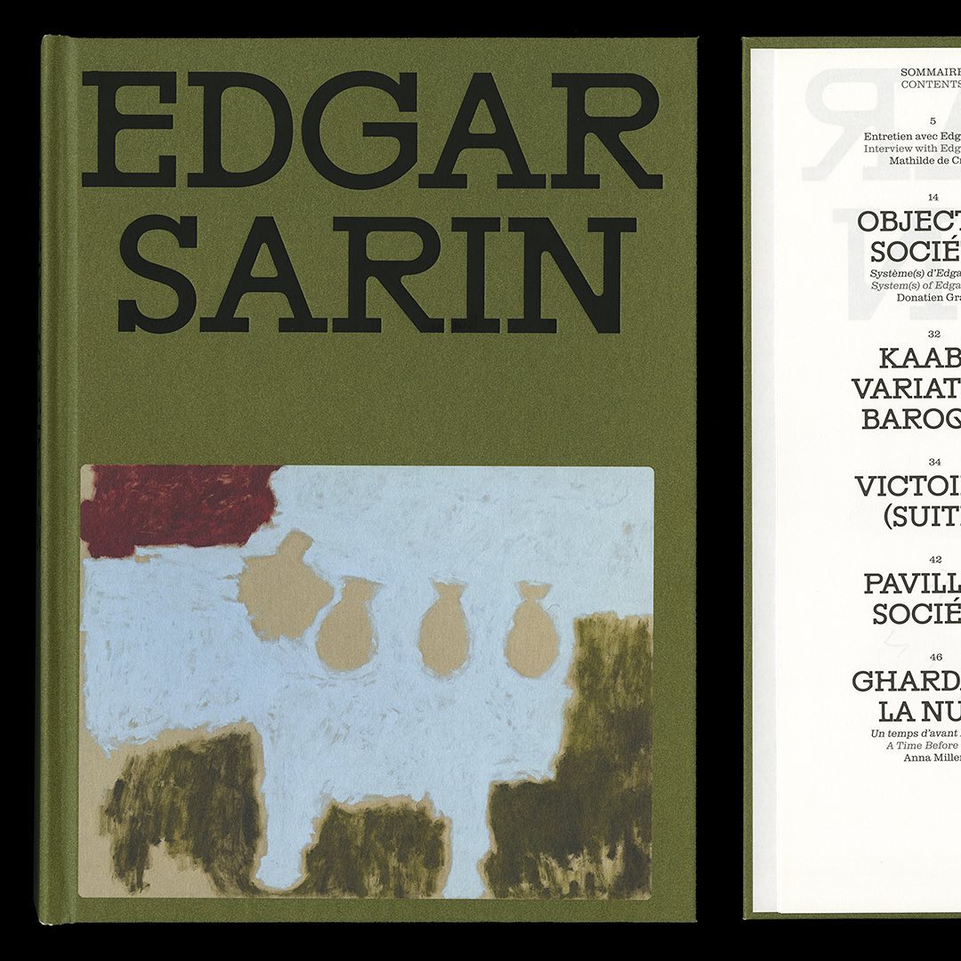
Resonanz B by Out of the Dark and Clarendon Graphic were the typefaces selected by Lisa Sturacci for the editorial design of this book about about Edgar Sarin’s work.
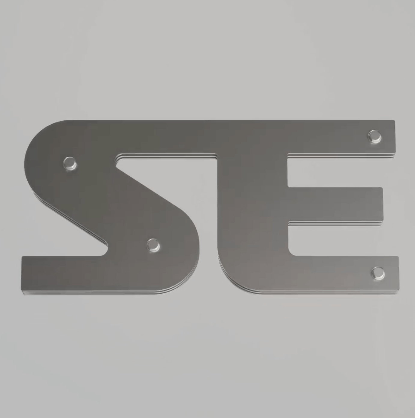
Apparat Bold + Buch Schmal, both from Kimera, were part of the update newkid made for Standard Equipment, a system of household objects.
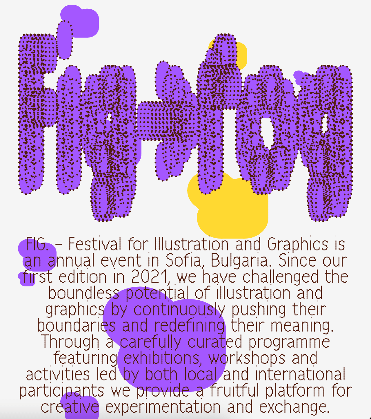
A festival that explores visual creativity to the point of blurring the lines between illustration and graphics; Miroslav Zhivkov created the identity of FIG (Festival for Illustration and Graphics) using Harber.