Ottimo celebrates the tradition of olive oil with an identity designed by Somekind Studio, the brand takes shape with Edition by Elias Hanzer, a monolinear typeface that brings a timeless feel.
Storefronts have served as stages for performances, for experimentation, and part of the art itself. Fresh Window at Museum Tinguely explores this connection with an identity using Stabilo Boss.
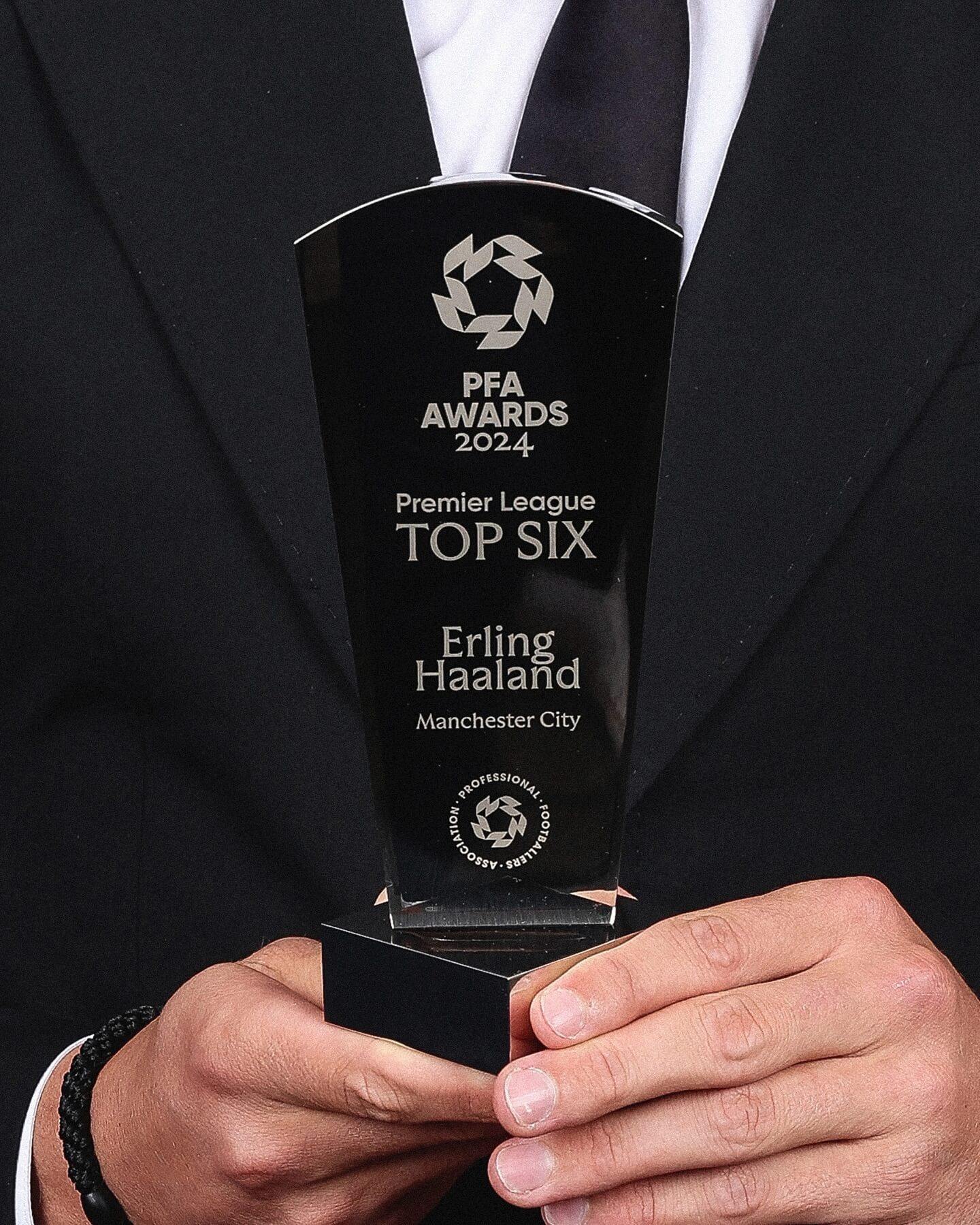
Realm by Approximate Type being used in this annual award ceremony for the best player of the year in the English league.
This old Dutch apple syrup design, featuring the Phyllis typeface by Heinrich Wieynck, reminds us that the good things always last.
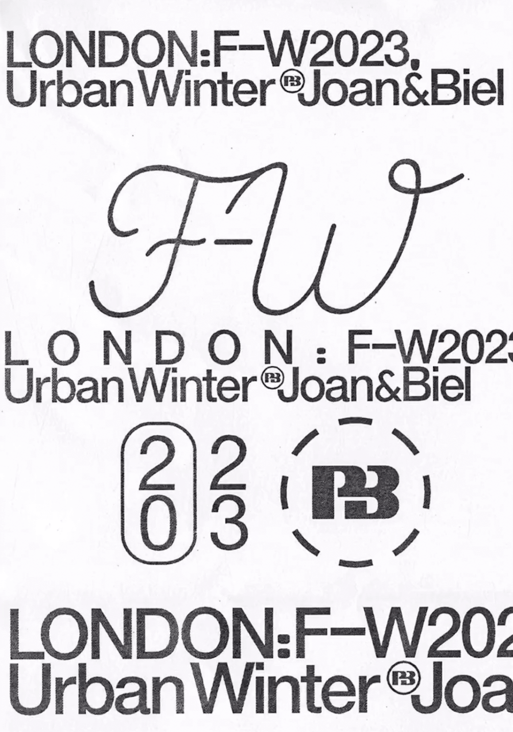
Simple and dynamic, these explorations by Paula de Álvaro use brand elements and basic information to present the Pull&Bear London AW 2023 collection.
The foundry From A+, built a wordmark, an alternate script version, and two monograms based on art deco letterforms, for the seafood Californian tavern, Bar Le Côte.
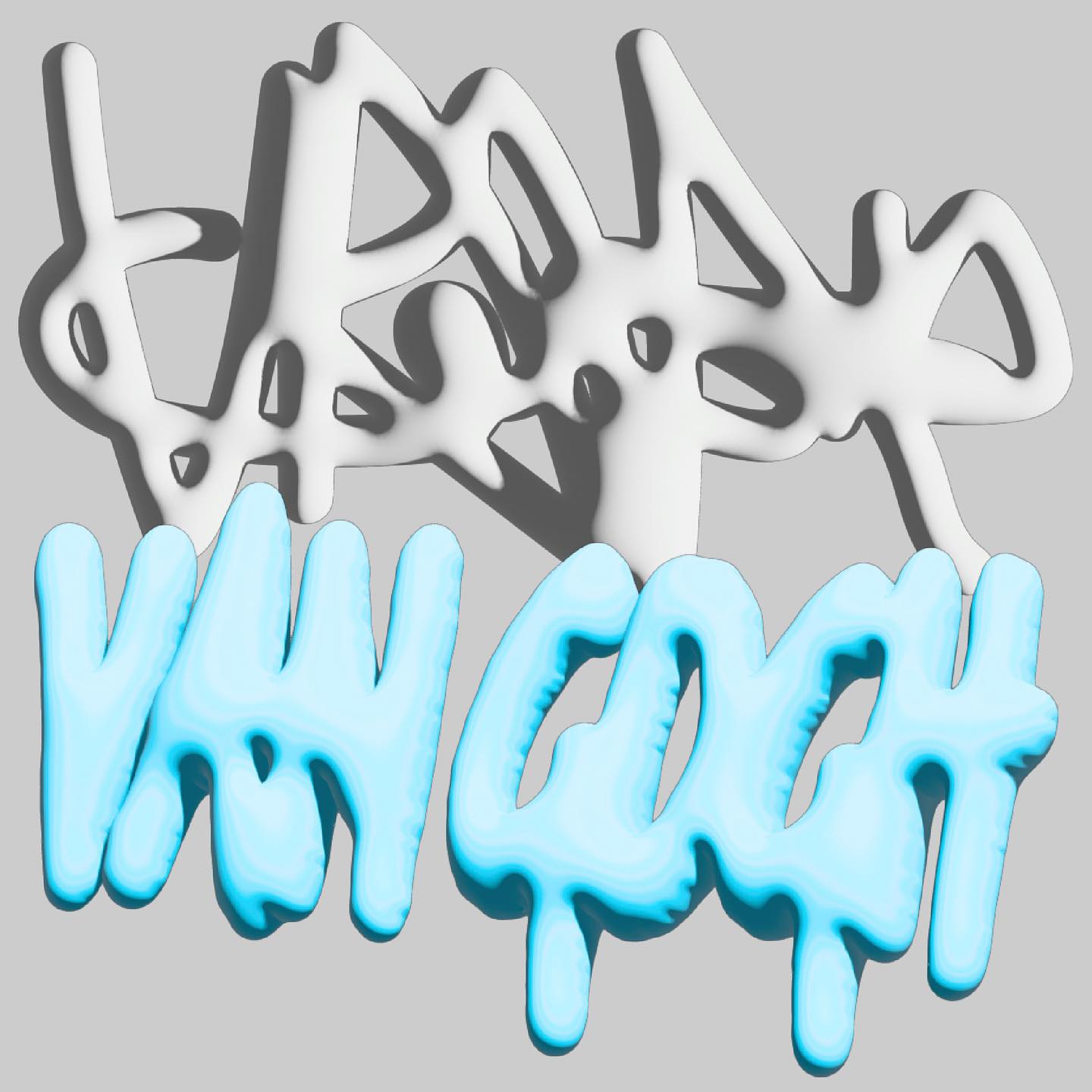
Handwritten sketches by Leandro Senna and The New Company made for the cultural center of gaming, 100 Thieves
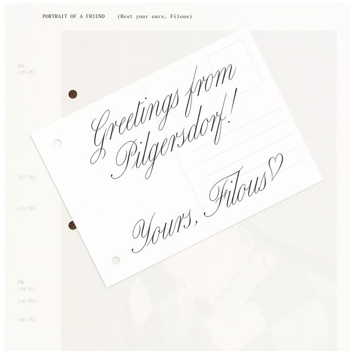
The zine “Portrait of a Friend (Rest Your Ears, Filous)” of the Vienna-based musician Filous, using Carta Nueva by Sharp Type.
A symmetrical logo that can be read in both directions, alongside a custom typeface to create the branding system for the awe music label.