AG Grafik created a brand identity for a poetry festival, blending experimental layouts with the classic elegance of Timezone.
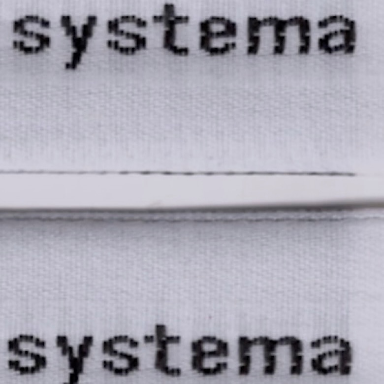
The French studio Plus Mûrs used Diatype Mono by Dinamo for the logo of the sophisticated sports brand, Counter Systema.
Horst Arts & Music 2024 debuts with a visual identity that connects disciplines, emotions, and practices through a network of symbols, featuring Oracle by Dinamo.
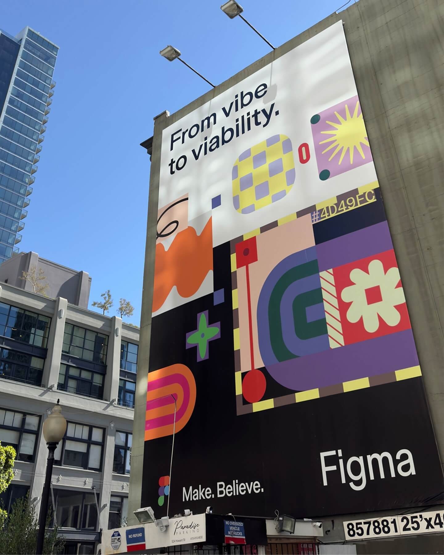
Grilli Type took on this ambitious project and proposed Figma Sans; a typeface with personality but practical, focused on efficiency, and free of unnecessary embellishments.
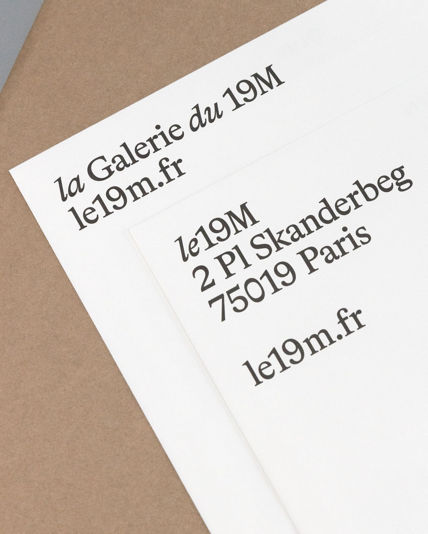
Hort Berlin used this serif typeface with classic and elegant forms (Bradford) for the visual identity they designed for the cultural center le 19M.
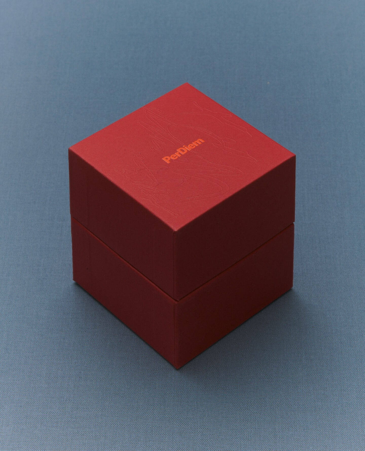
A jewelry brand that saves us from monotony and invites us to live creatively. Brand identity and art direction by Tino Nyman, featuring the typefaces Onsite, Exposure and GT Pressura.
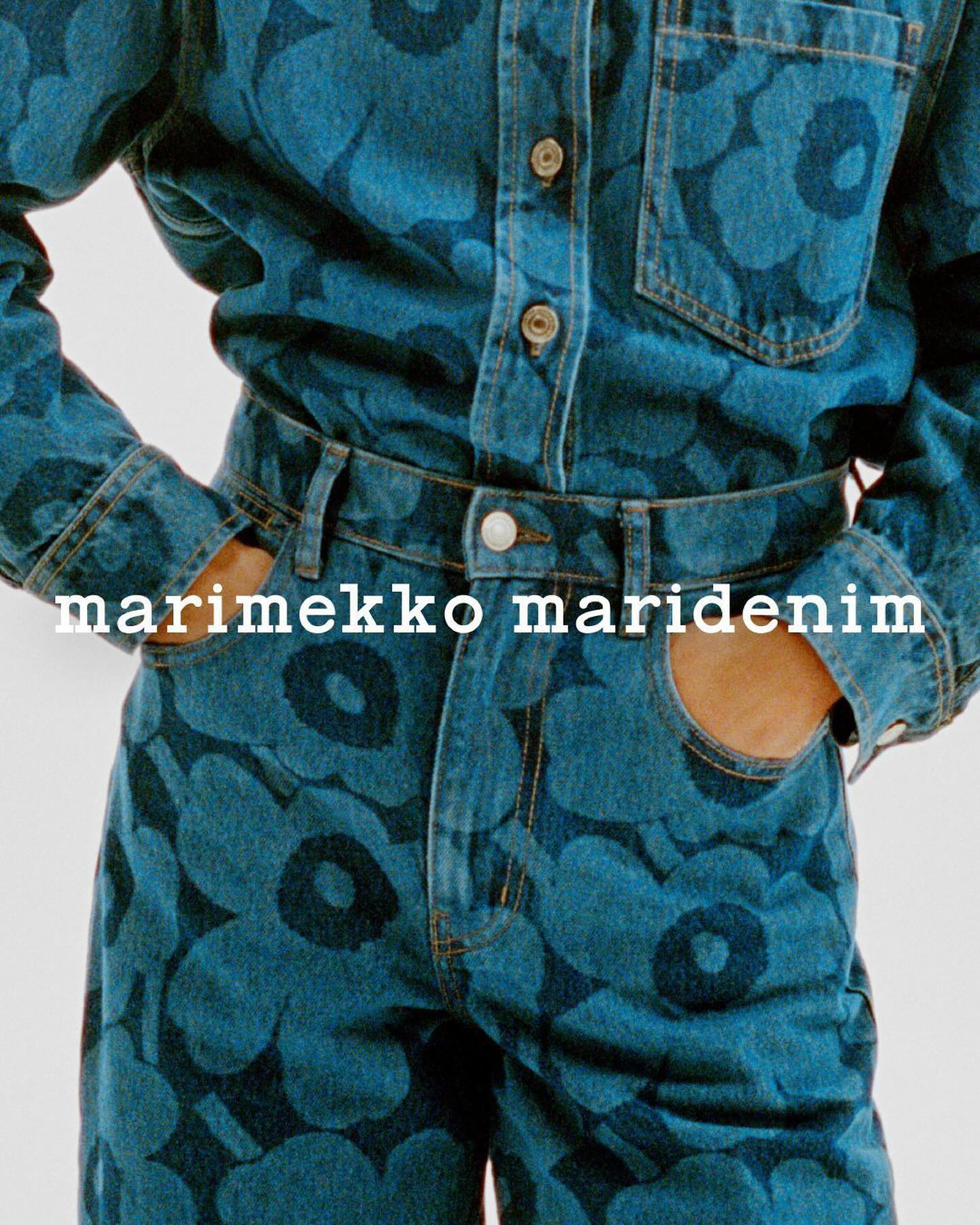
Maridenim just made its debut at the Fall/Winter 2024 show during Copenhagen Fashion Week. Blending their iconic bold designs with a fresh denim twist.
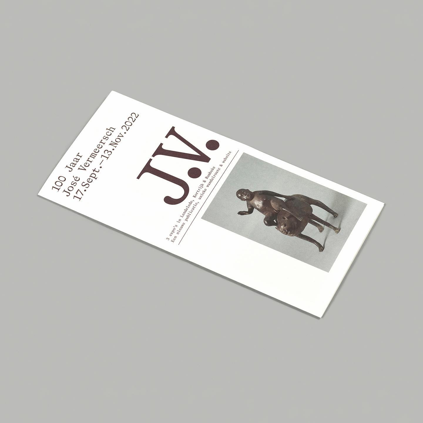
On the 100th birthday of artist José Vermeersch, an exhibition was held to celebrate his work, where the Bradford Mono typeface played a crucial role.
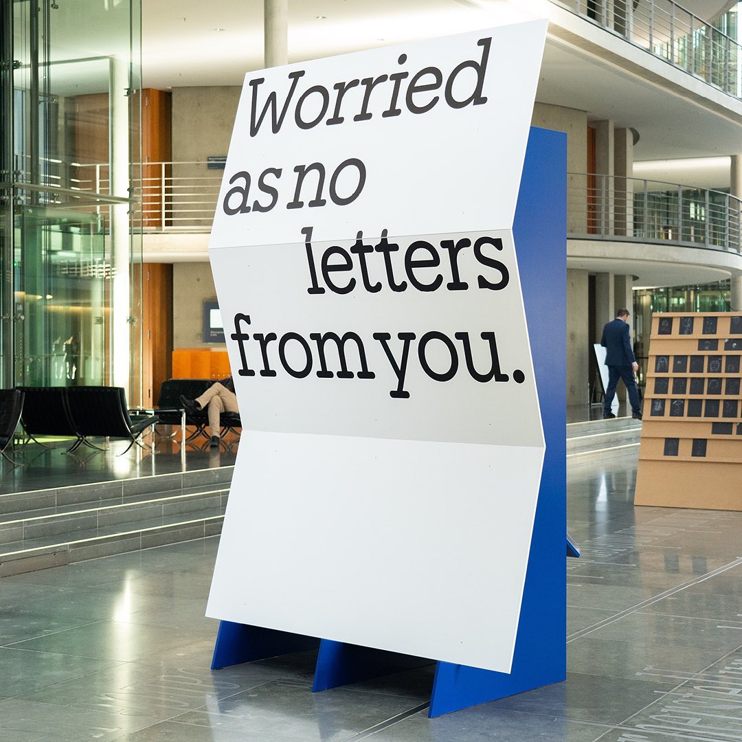
I said, ‘Auf Wiedersehen’ (I said ‘Goodbye’) displays the letters exchanged by five families separated during World War II, hoping to reunite one day. The texts are set in Repost, with supplementary texts in HAL Four Grotesk.
A story of friendship between agriculture and its natural habitat, between the design by Olsson Barbieri and the Or Lemmen typography proposed by them for the image of an organic orchard in Hardanger, Norway.