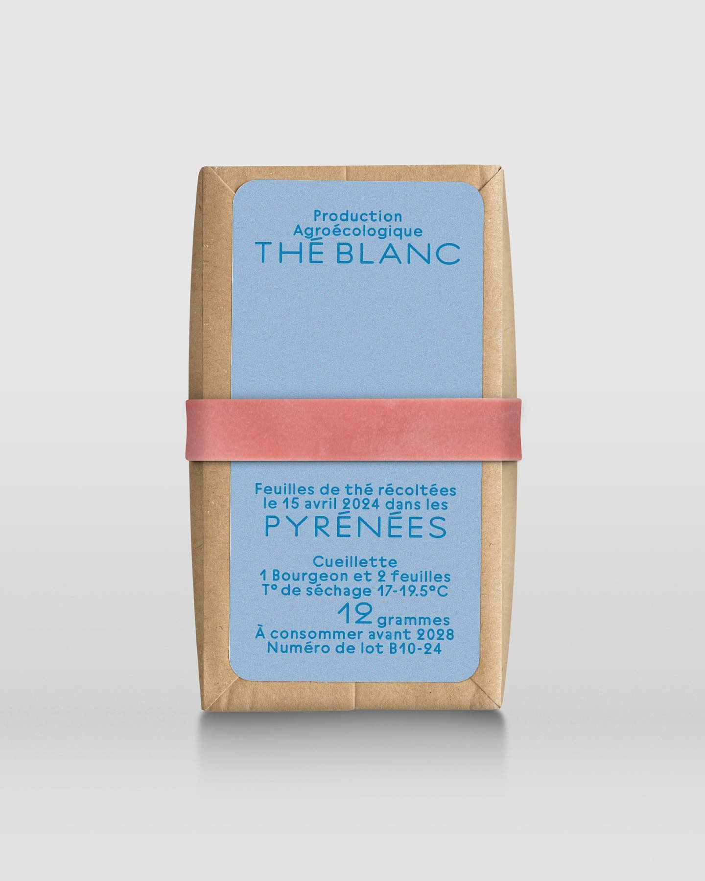
In a comprehensive project including handwriting, drawing, packaging conception, and global branding, Quentin gave @the.pyrenees an organic and approachable identity.
A studio and shop at the same time, or a shop that also functions as a studio; Polar Ltda brings together various design professionals to offer a fresh creative approach.
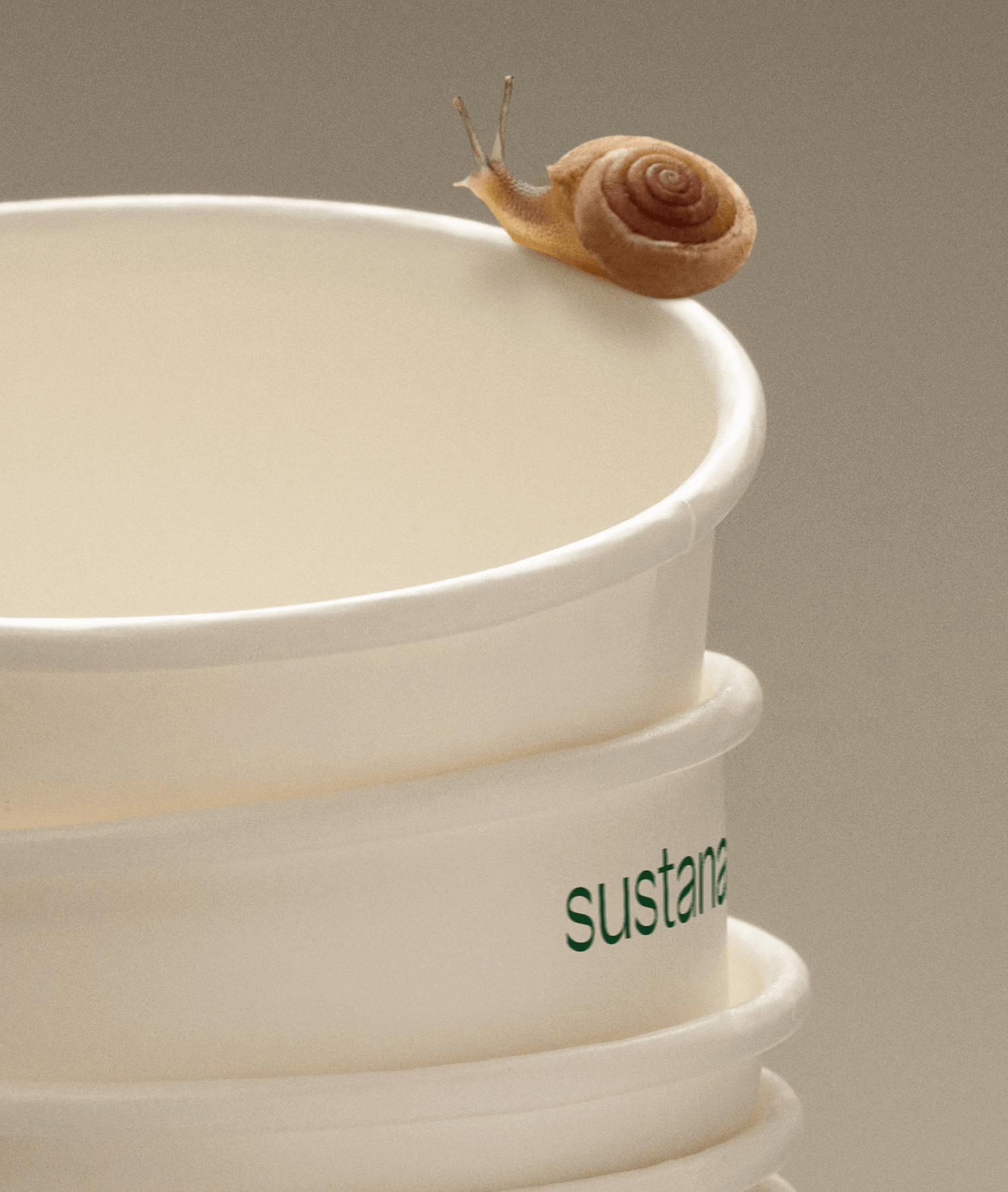
Paper made with clean materials; this was the twist COLLINS gave to this Canadian company, transforming it into Sustana. Custom typography by Sharp Type.
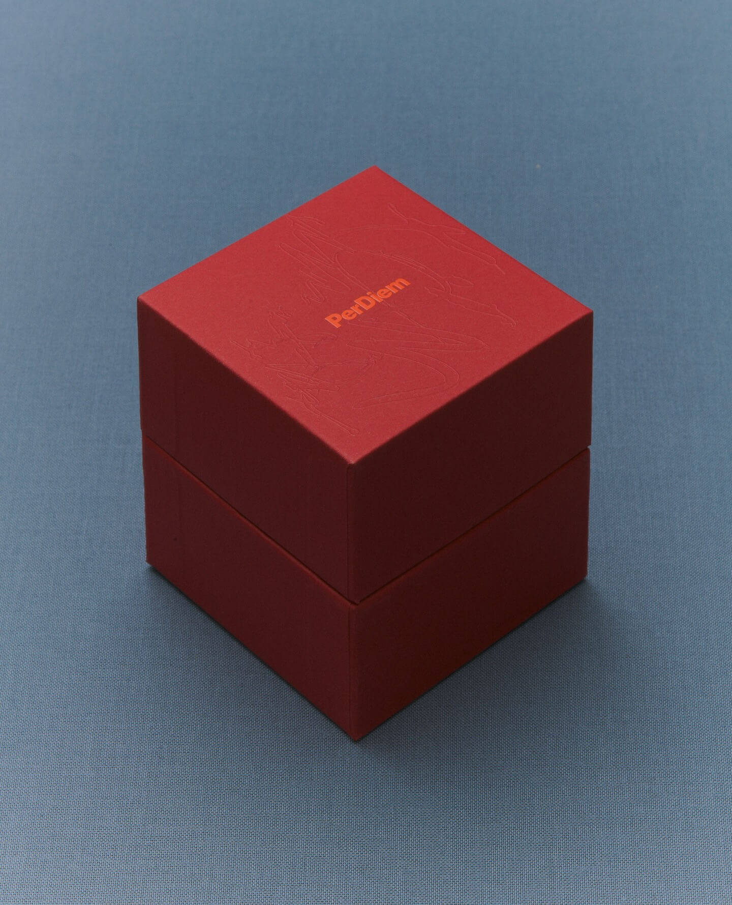
A jewelry brand that saves us from monotony and invites us to live creatively. Brand identity and art direction by Tino Nyman, featuring the typefaces Onsite, Exposure and GT Pressura.
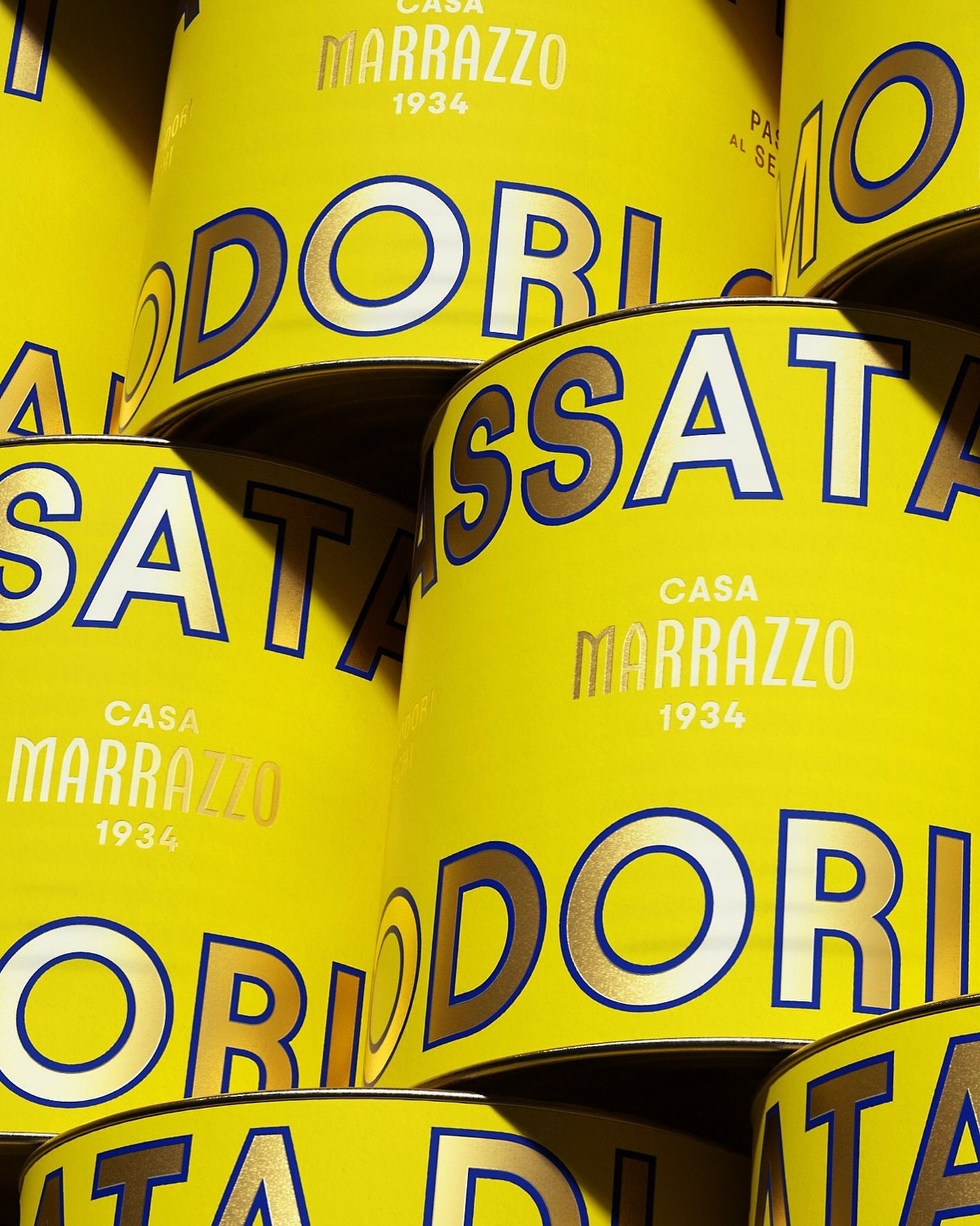
A clean layout, lots of gold, and the Avantt typeface were the elements that the Italian agency Auge Design used for these canned foods full of tradition and flavor.
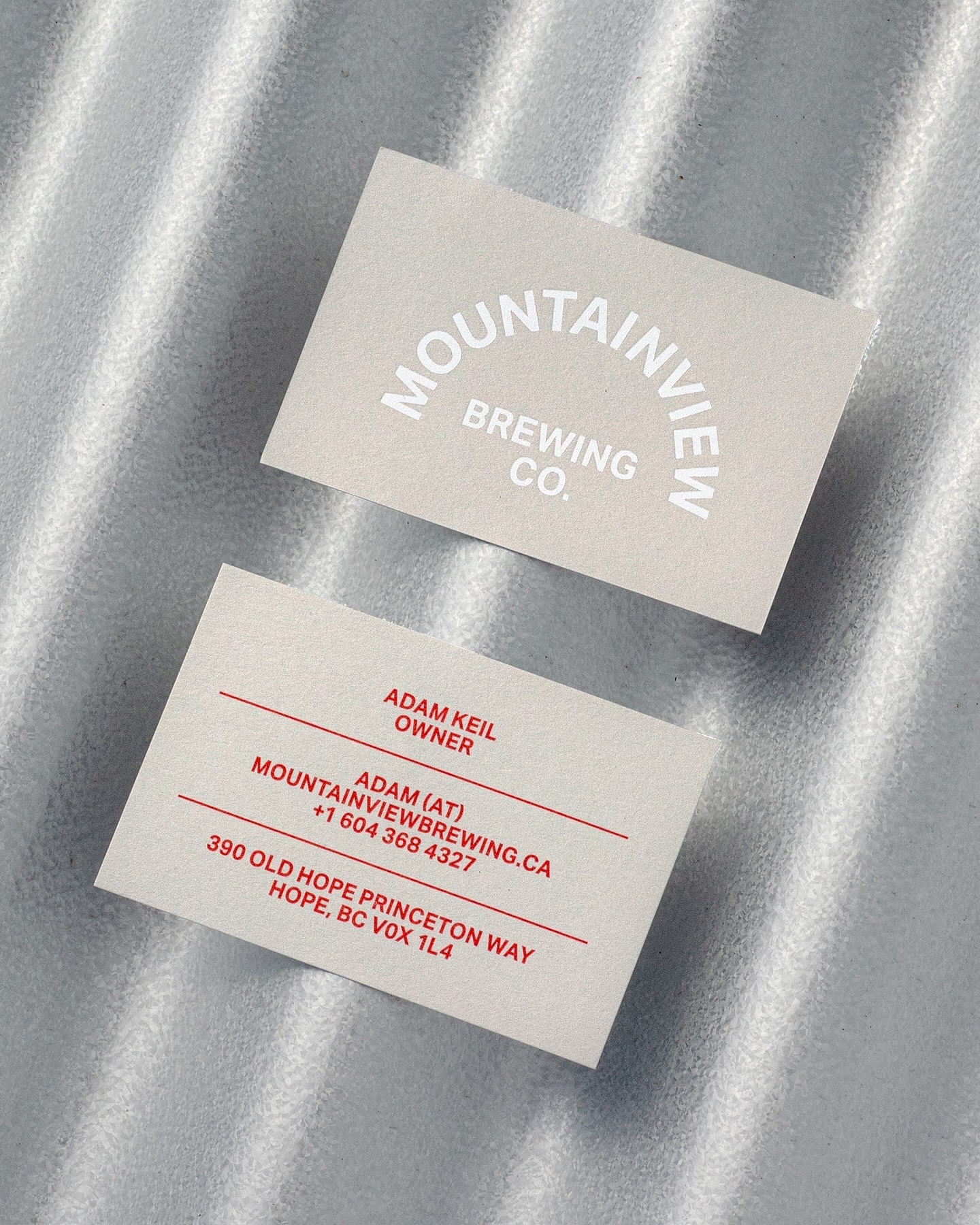
Memory Studio was inspired by vintage elements, like old book covers, and used Aktiv Grotesk to create the identity for this craft brewery.
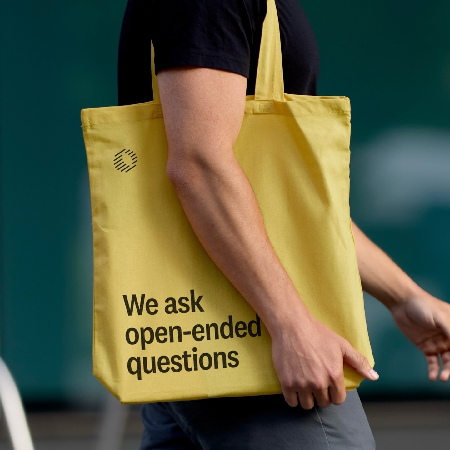
Classics with a modern twist; National 2, Atlas Grotesk, and Atlas Typewriter, were used by Play for the identity they created for Open Research.
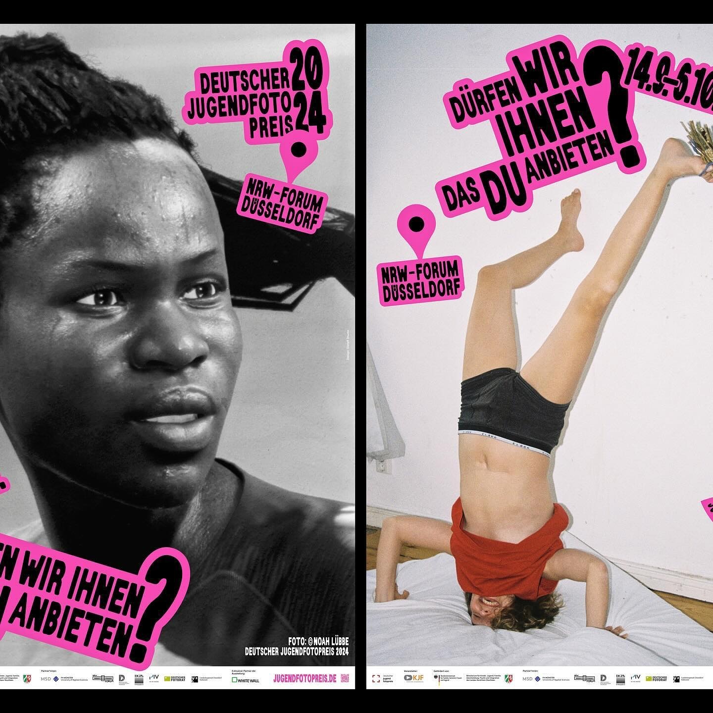
An identity made with stickers that follows no rules in the layouts. Distaff Studio used Serial A as the typeface for the image of this exhibition of the German Youth Photography Prize.
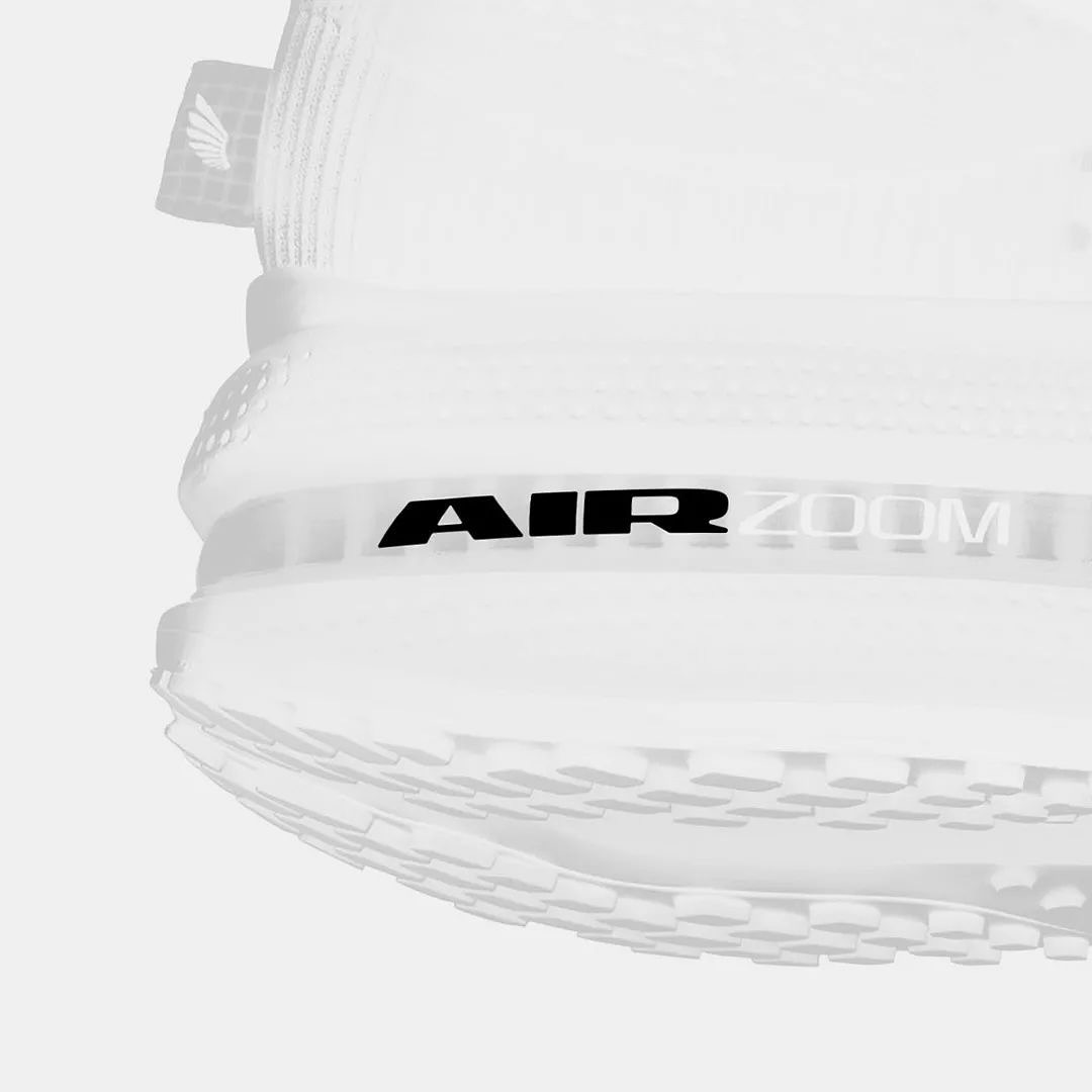
Win on Air is the name of the new Nike Air identity, where David Gobber and Hoang Nguyen were part of this project, designing the typography used in the logo, which is a custom version of Generation Mono, another typeface of their own creation.