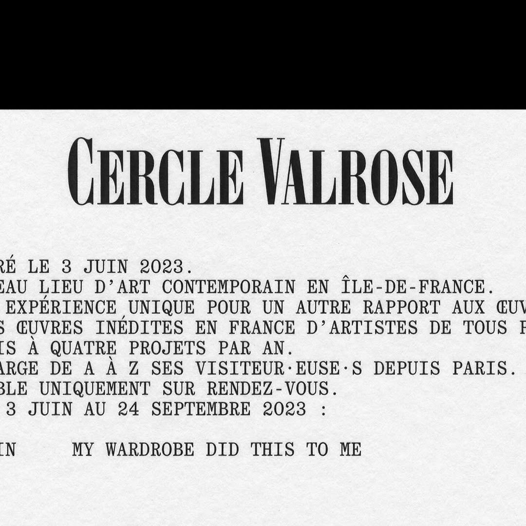
OTT Harker by Ornamental & Title Type is used in the logo for Cercle Valrose. The design is by Bizzarri-Rodriguez, who also created the typeface. Quadrant by Matter of Sorts is used for the supporting text.
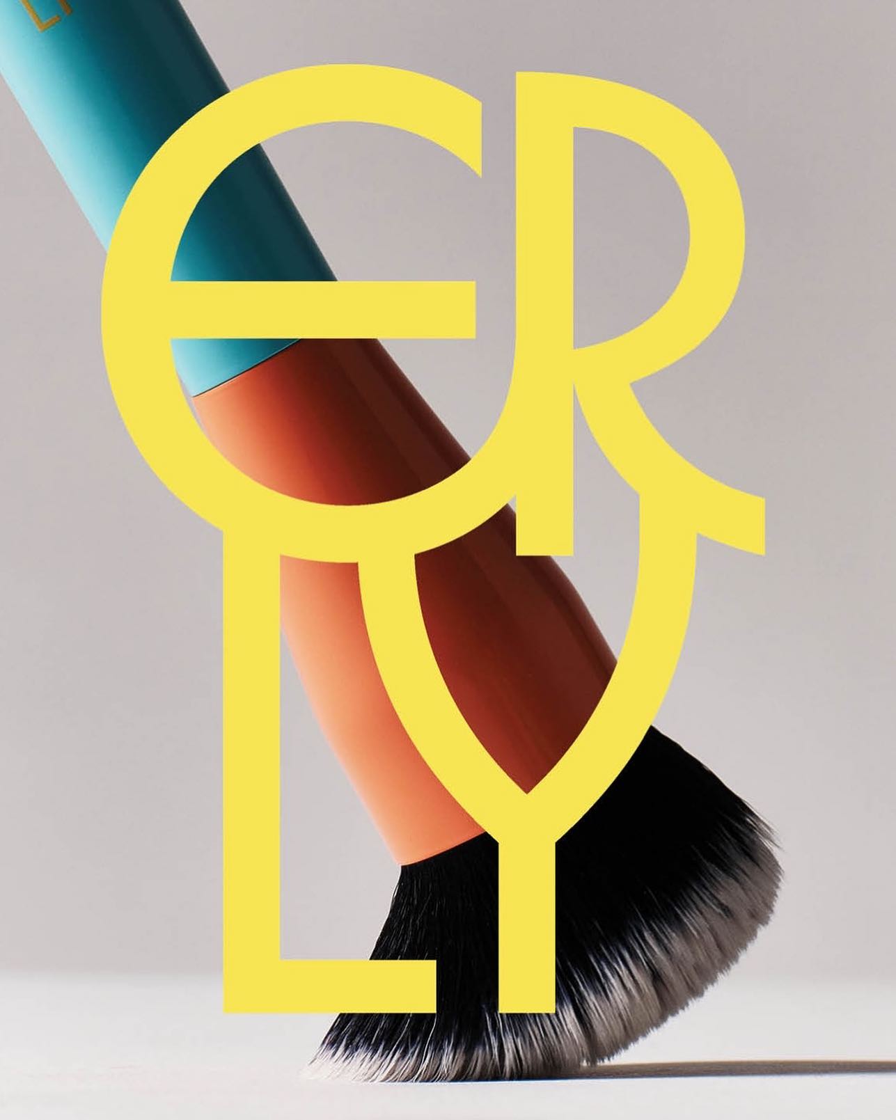
ERLY reinvents skincare with a fresh, typographic identity. Herbus Regular & Title Type, in the design by Studio Lotta Nieminen.
Ottimo celebrates the tradition of olive oil with an identity designed by Somekind Studio, the brand takes shape with Edition by Elias Hanzer, a monolinear typeface that brings a timeless feel.
Tetier, the jewelry brand using recycled materials that recently collaborated with Asics, features Octave by Faire Type in its logo and texts.
AG Grafik created a brand identity for a poetry festival, blending experimental layouts with the classic elegance of Timezone.
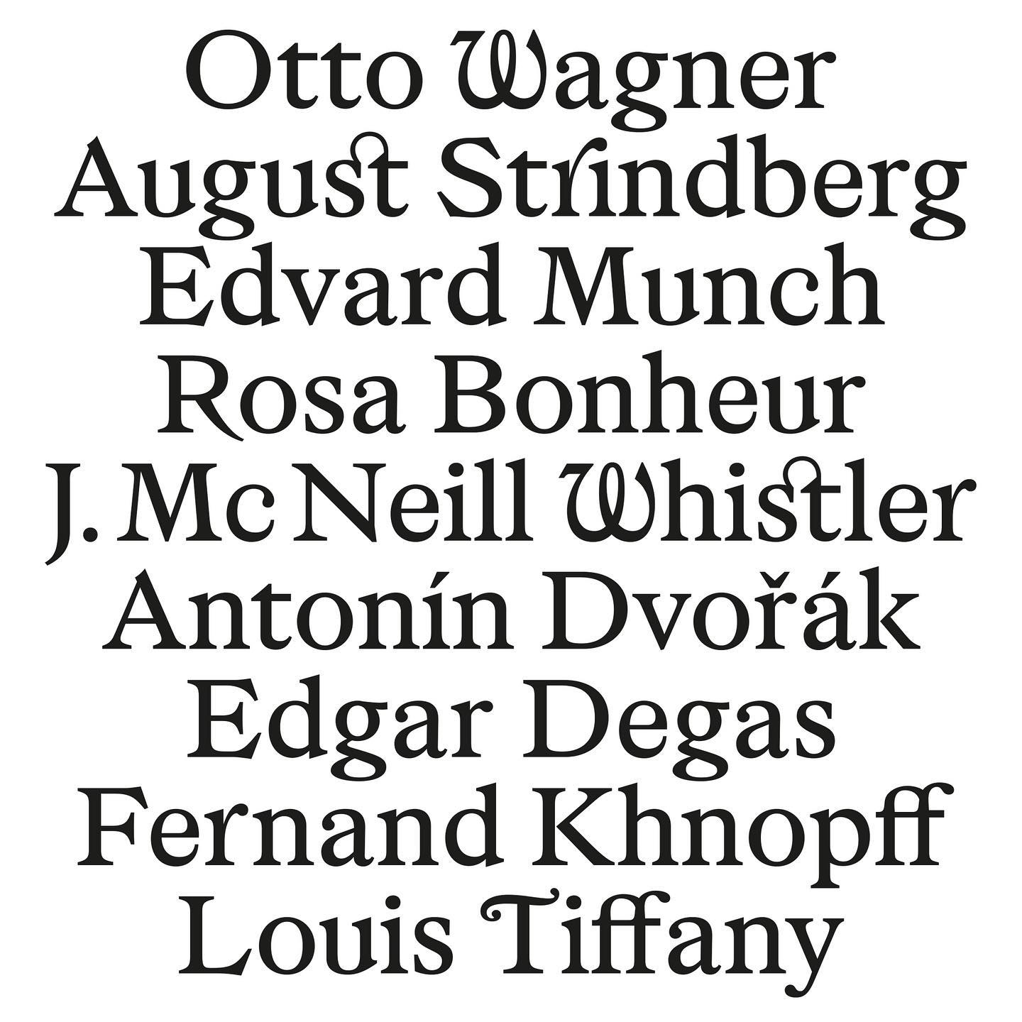
As part of Musée d’Orsay’s rebranding, Orsay Elzevir was created—a typeface inspired by La Belle Époque, reflecting the energy of the period the museum celebrates.
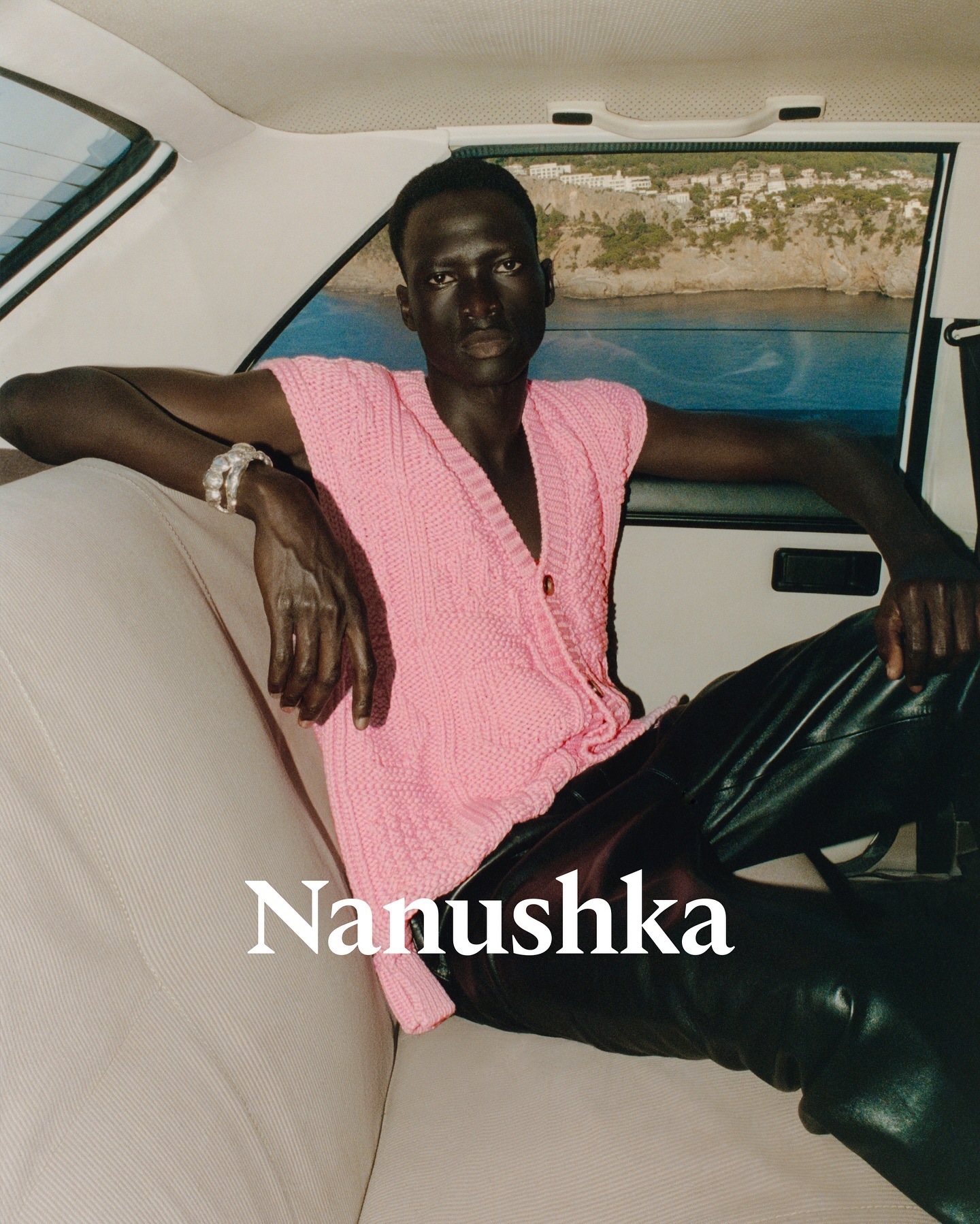
Nanushka is making its mark in the fashion market with inspiration drawn from Hungarian history as well as a wordmark and visual identity rooted in traditional symbols.
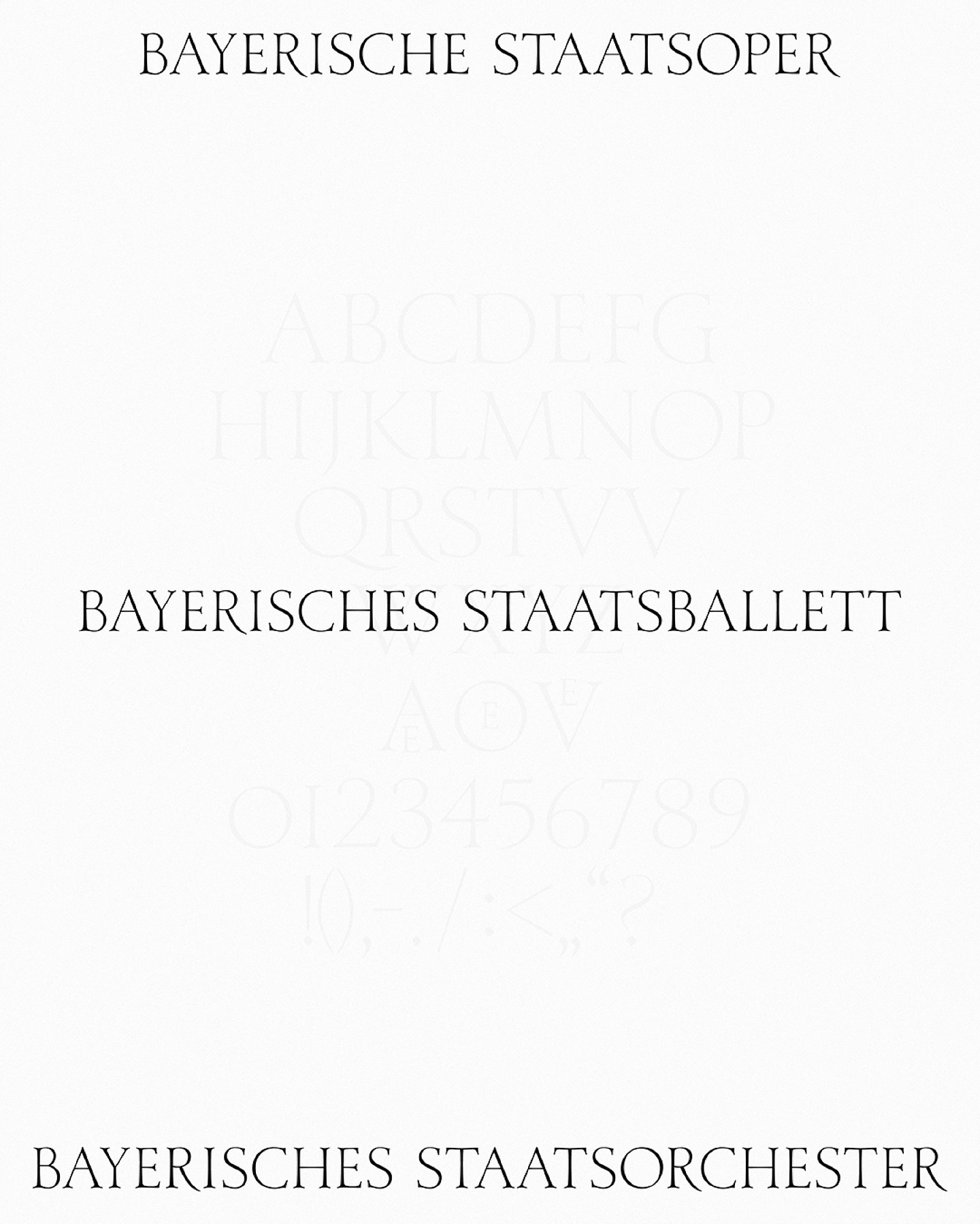
As part of the visual identity that Bureau Borsche created for the Bavarian State Opera, a digitized typeface —developed by Samara Keller— was created, based on a design found in the opera’s facilities.
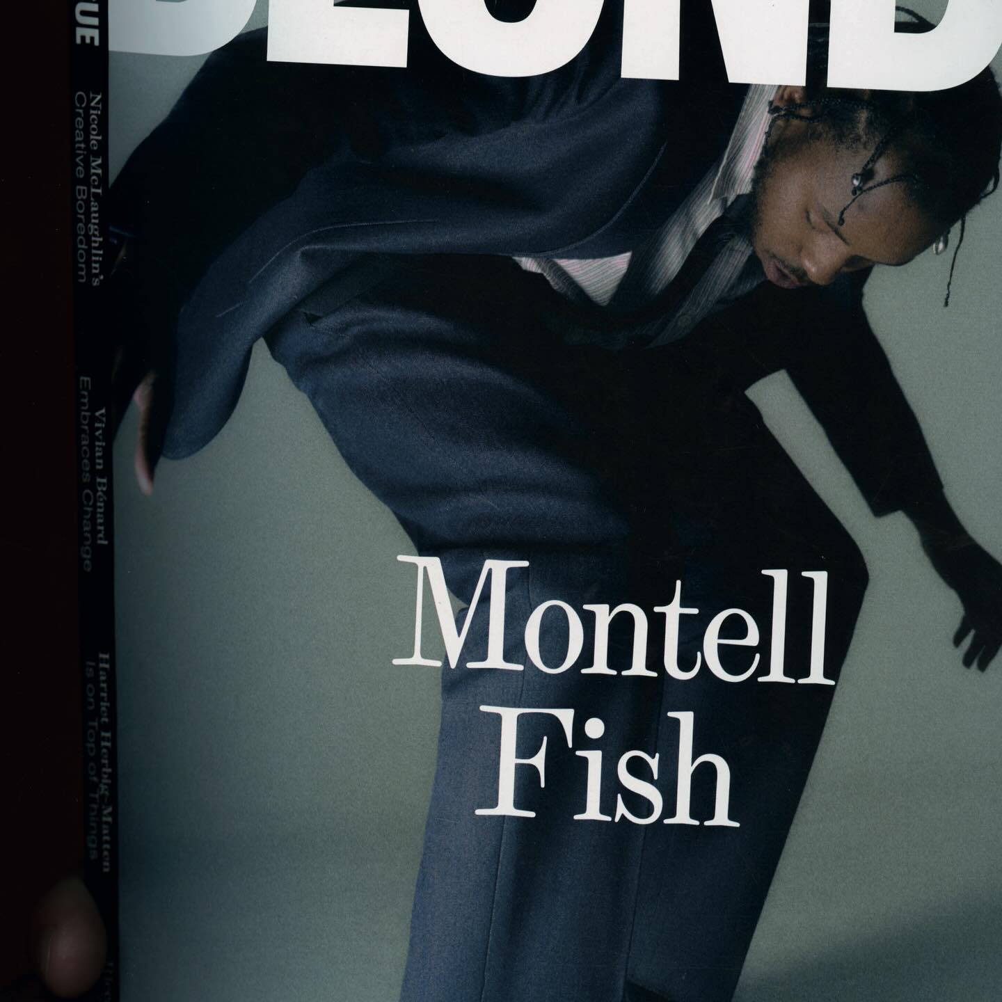
The type selection for Blonde Magazine’s redesign, managed by Hei Agenda, includes Contrast Foundry on the logo, Counter Forms for the serif (Eyla), and sans fonts by Lucas Liccini & Elias Hanzer (HAL Four Grotesk)