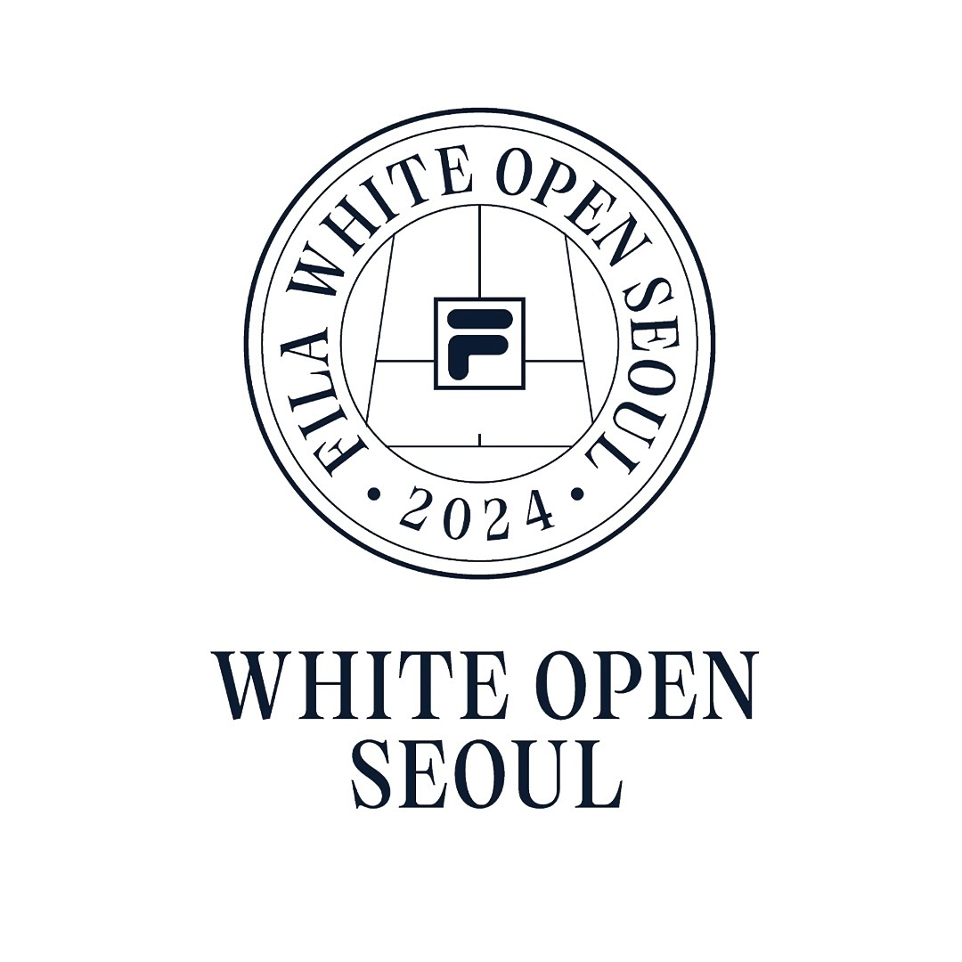
Tartuffo by Bouk Ra for Lift Type in the identity created by Fila Korea for the 2024 White Open Seoul; a tennis open where everyone can participate.
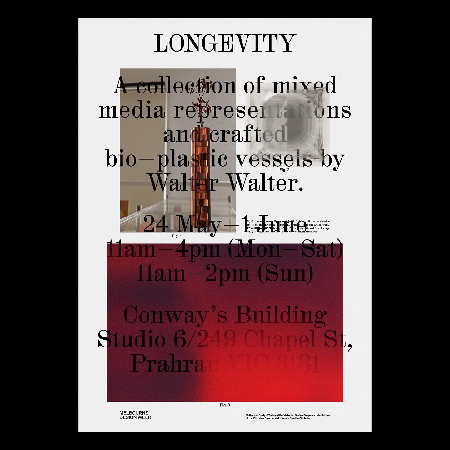
M. Geisser used HAL Colant from HAL Typefaces and ROM from Dinamo for the poster and invitation for the Walter Walter Longevity exhibition.
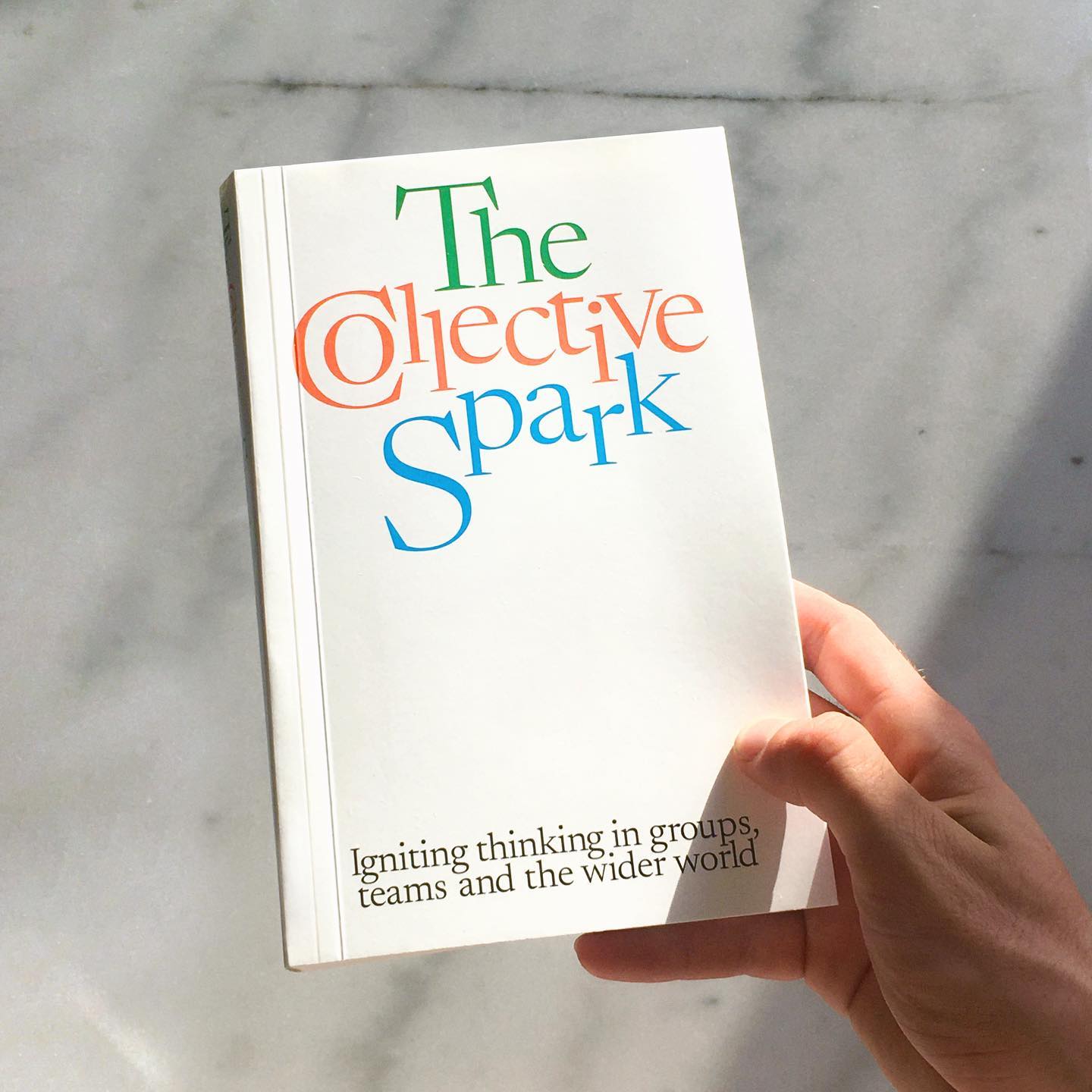
Newsreader by Production Type on the cover of this book addresses collaborations and how to coexist with other ideas.
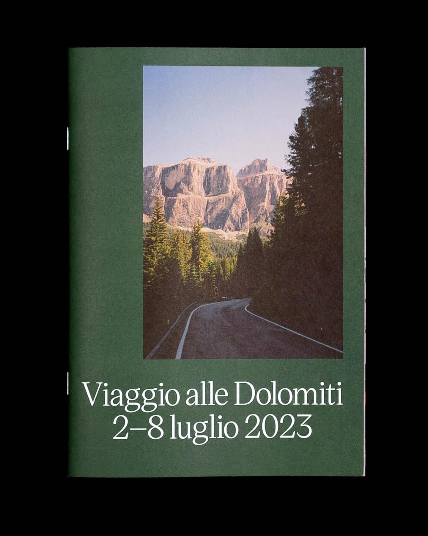
Victor Serif by KOMETA accompanies the photographs taken on a cycling trip with friends in this booklet designed by Familia.
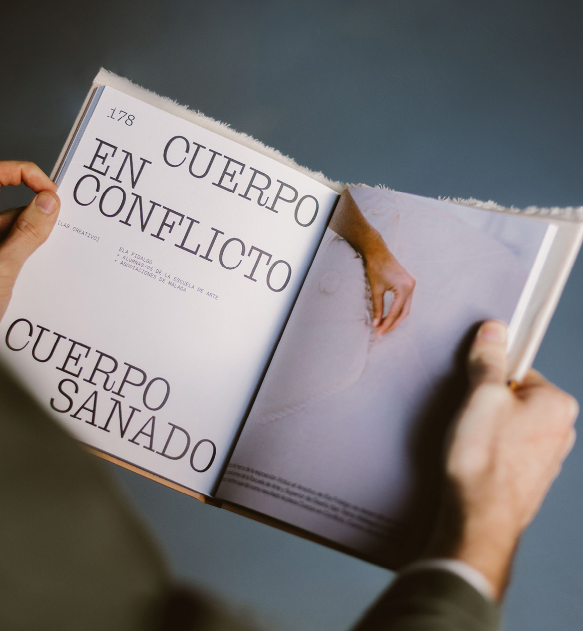
Mixture of materials, papers, and typefaces (Neue Montreal and Cucina); that’s how Tiquismiquis designed this editorial piece that covers Ela Fidalgo’s creative career.
How to design the extension of –a very well-known– brand, while also making it unique. Order solves this question with the identity of Journal House, a branch of WSJ dedicated to events.
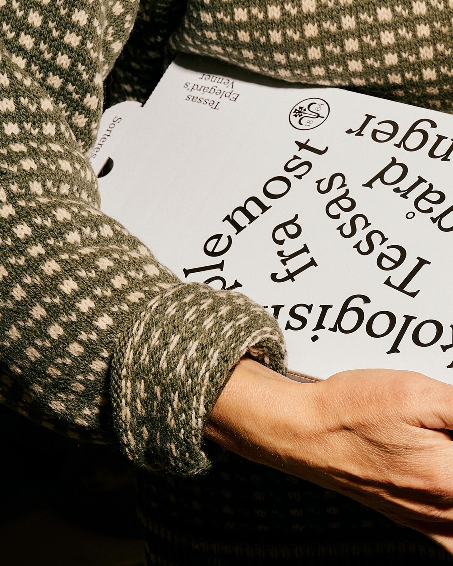
A story of friendship between agriculture and its natural habitat, between the design by Olsson Barbieri and the Or Lemmen typography proposed by them for the image of an organic orchard in Hardanger, Norway.
As a collectible object decorating a space, Christopher Doyle & Co. used Moulin for its unique and attractive features, along with Scto Grotesk, to achieve the elegance and sophistication that the interior design brand, Tom Mark Henry, aimed to convey with its new identity.
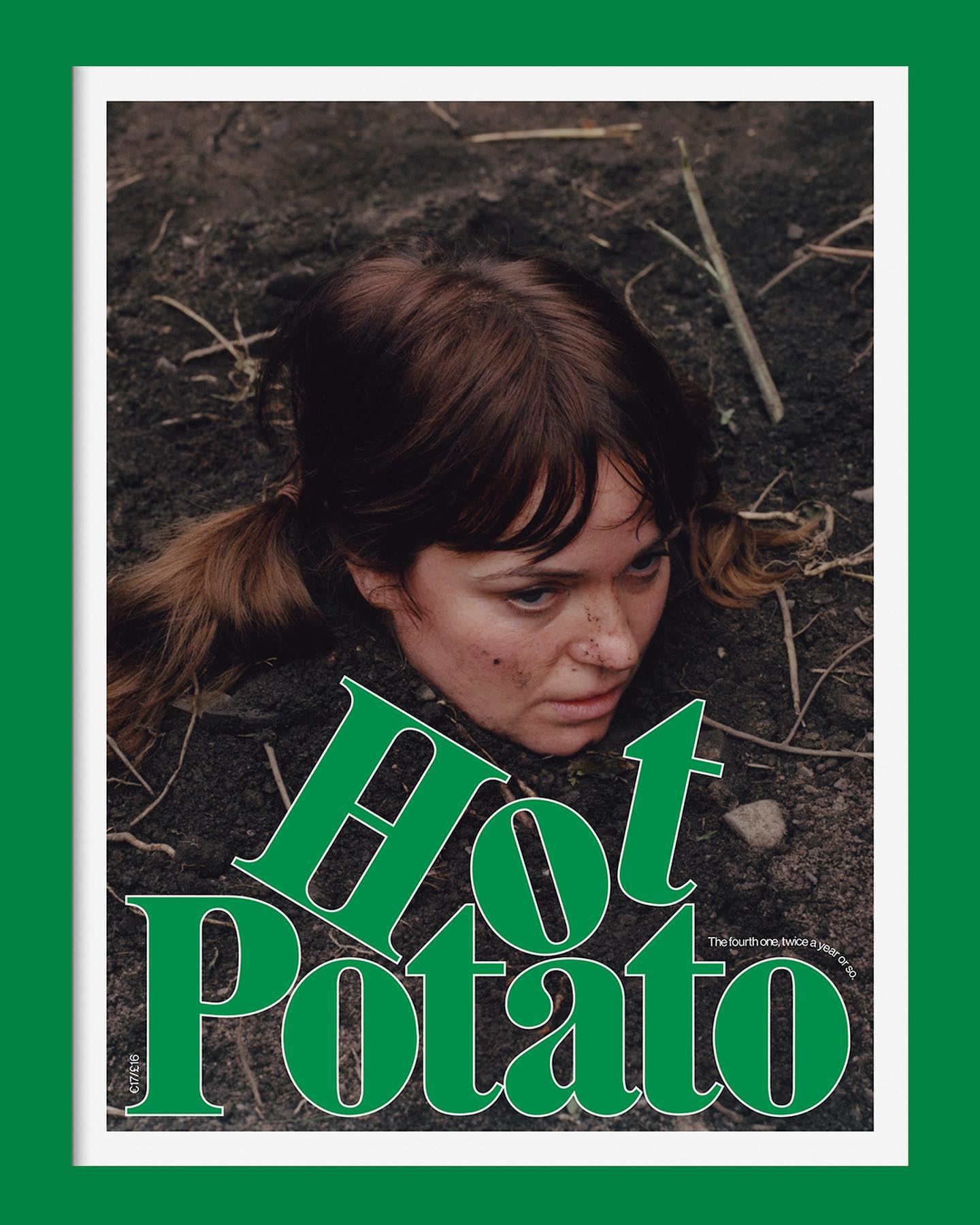
Neue Haas Grotesk is a common typeface on the blog, it works well in many scenarios, for example alongside Marfield in the fourth edition of Hot Potato magazine.
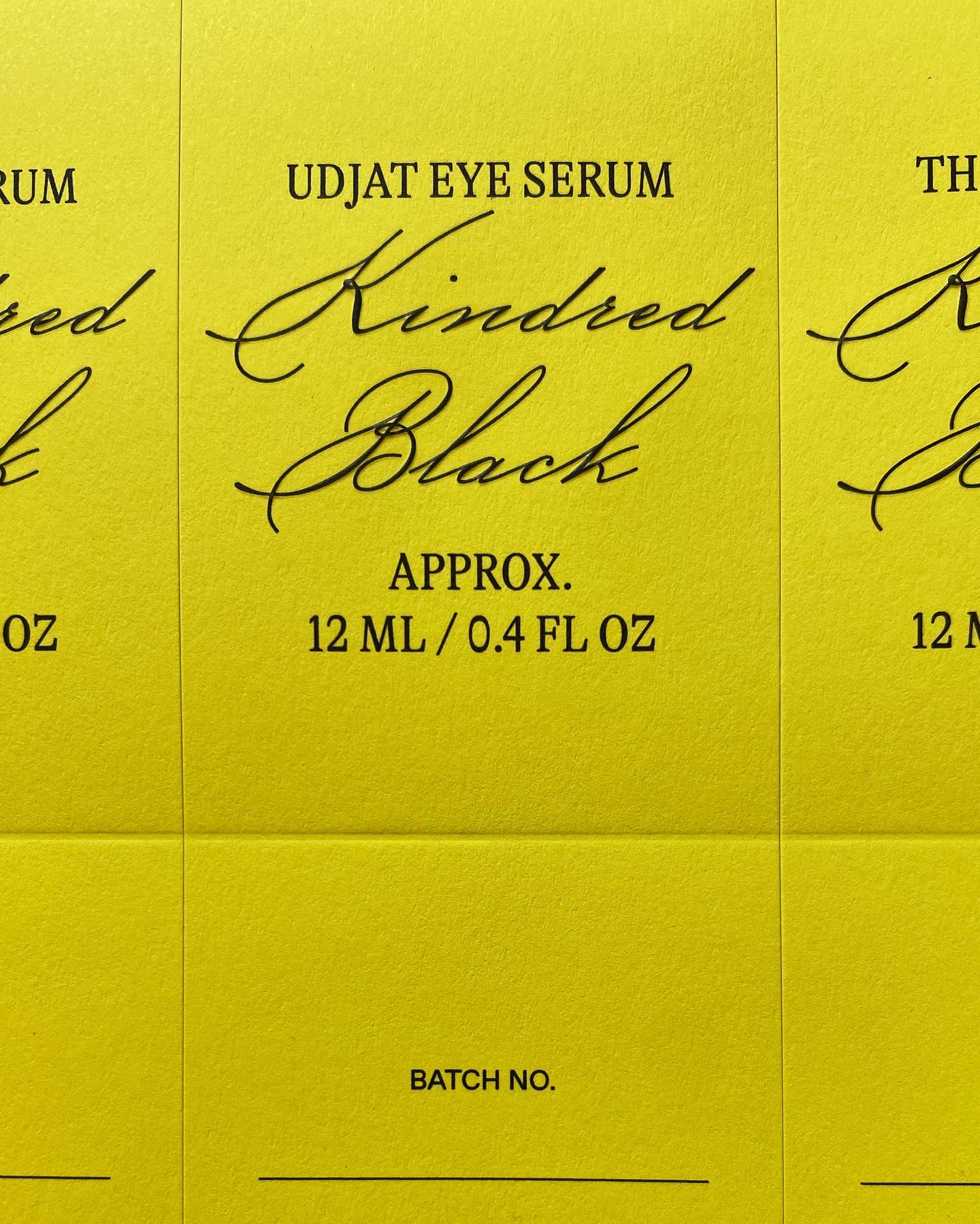
GT Alpina and Monument Grotesk are part of this packaging system that the creative studio Ania et Lucie devised for the glass bottle brand Kindred Black