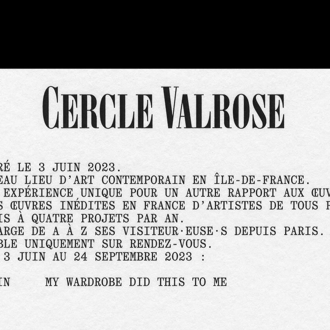
OTT Harker by Ornamental & Title Type is used in the logo for Cercle Valrose. The design is by Bizzarri-Rodriguez, who also created the typeface. Quadrant by Matter of Sorts is used for the supporting text.
This custom typeface was part of the identity design that Bureau Bernklau created for the production company BWGTBLD—extended and bold, just like its cinematic vision.
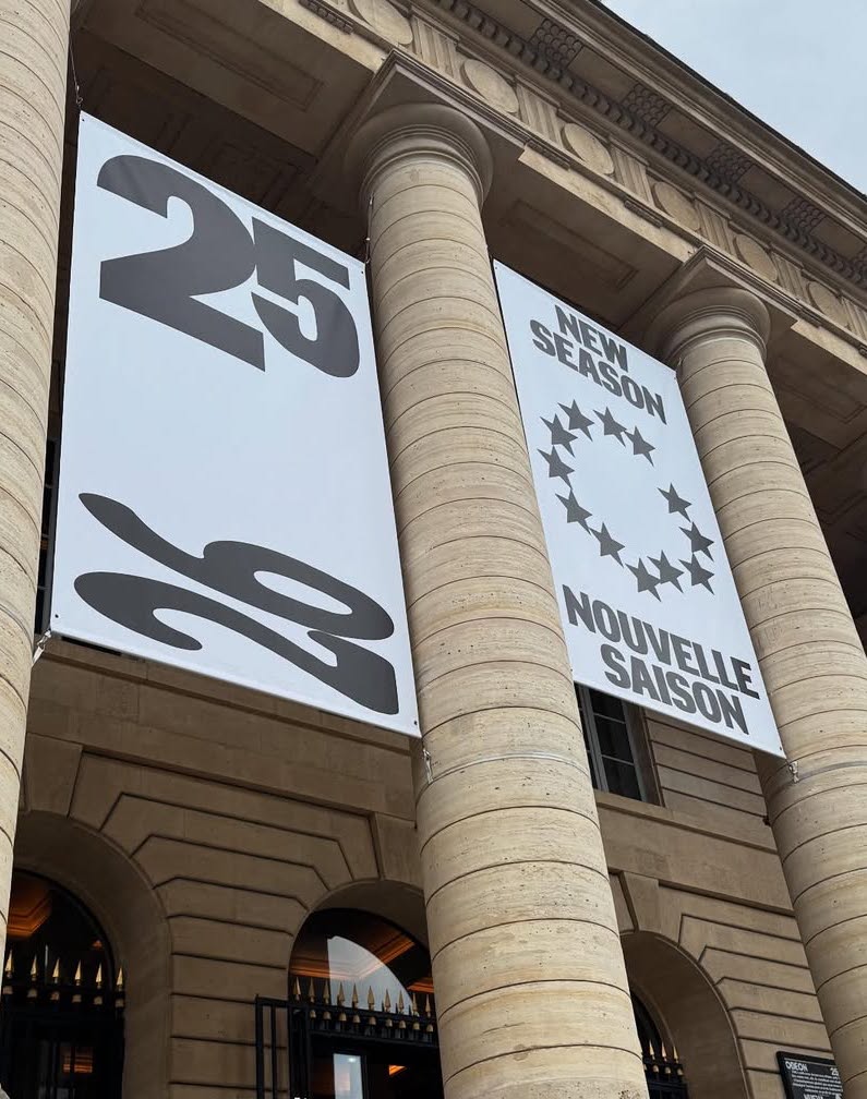
New visual identity for Théâtre de l’Odéon, designed by Atelier Choque Le Goff, featuring the large-scale Insitu typeface by Formagari.
Inspired by Chicago’s sign painting, the packaging of Foxtrot’s potato chips captures the essence of the iconic Maxwell Street Market hot dog.
Buenaventura designed IOC, a typeface that becomes the visual signature of Islands of Cocoplum, blending tradition, luxury, and modernity.
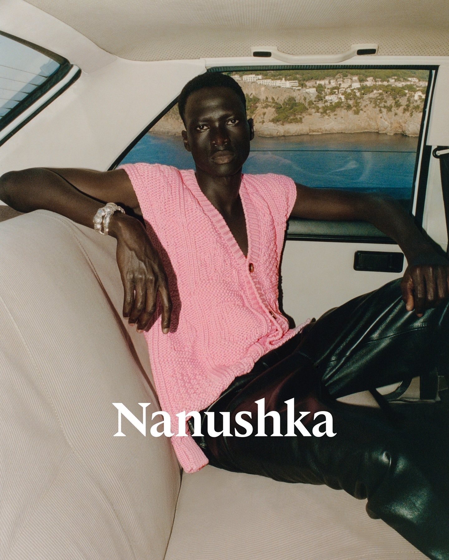
Nanushka is making its mark in the fashion market with inspiration drawn from Hungarian history as well as a wordmark and visual identity rooted in traditional symbols.
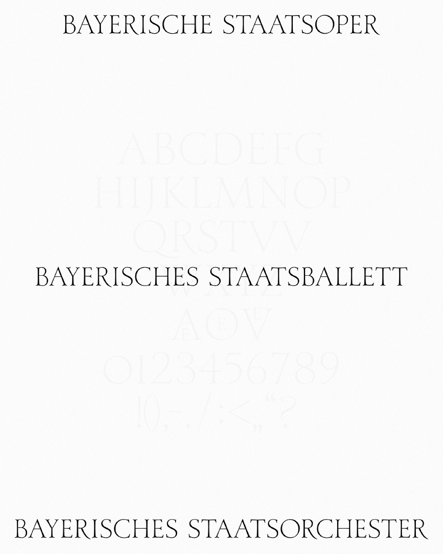
As part of the visual identity that Bureau Borsche created for the Bavarian State Opera, a digitized typeface —developed by Samara Keller— was created, based on a design found in the opera’s facilities.
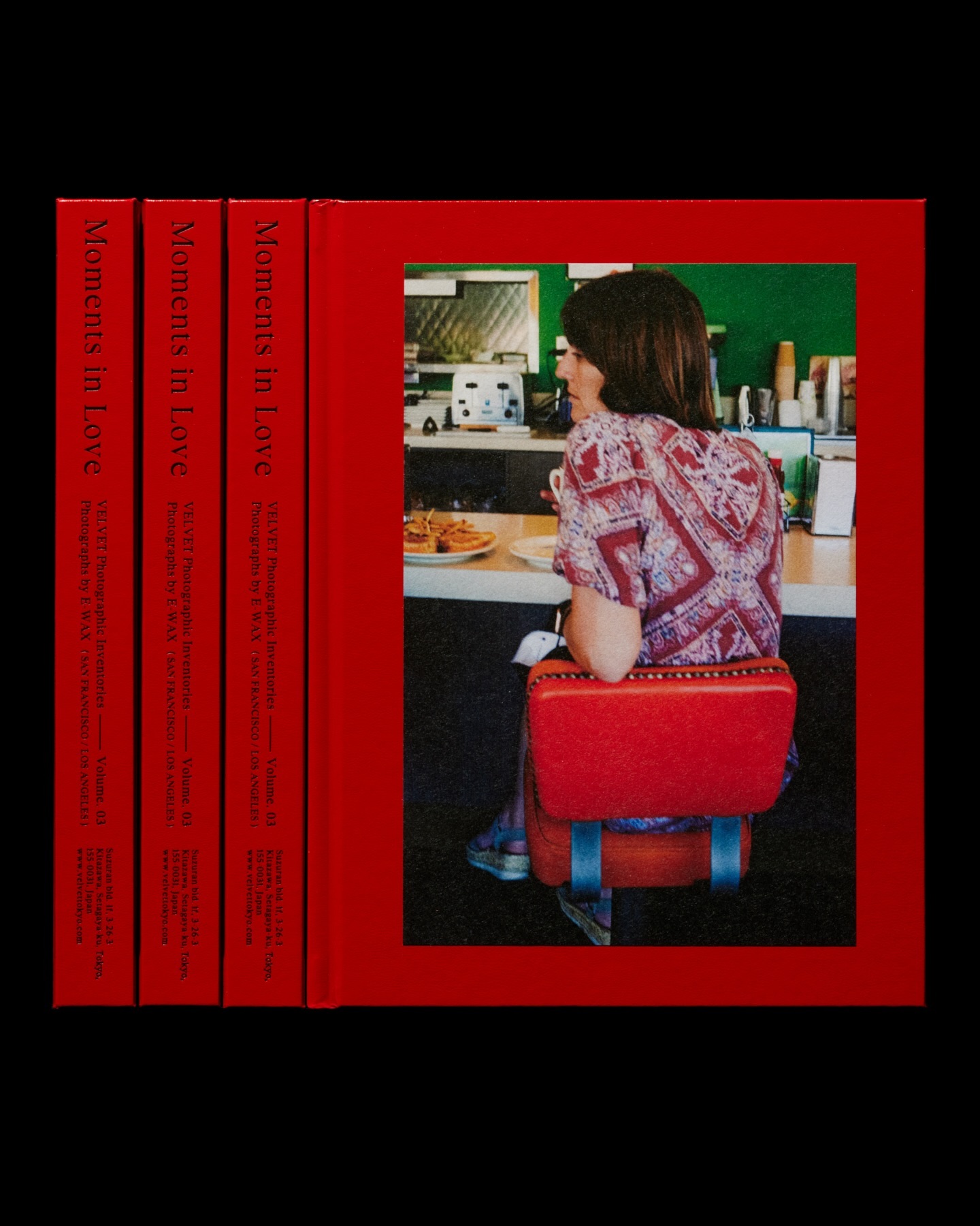
Moments in Love narrates a new way of portraying fashion, blending it with photos of passersby. Designed by the studio Siun, using FT Bureau.
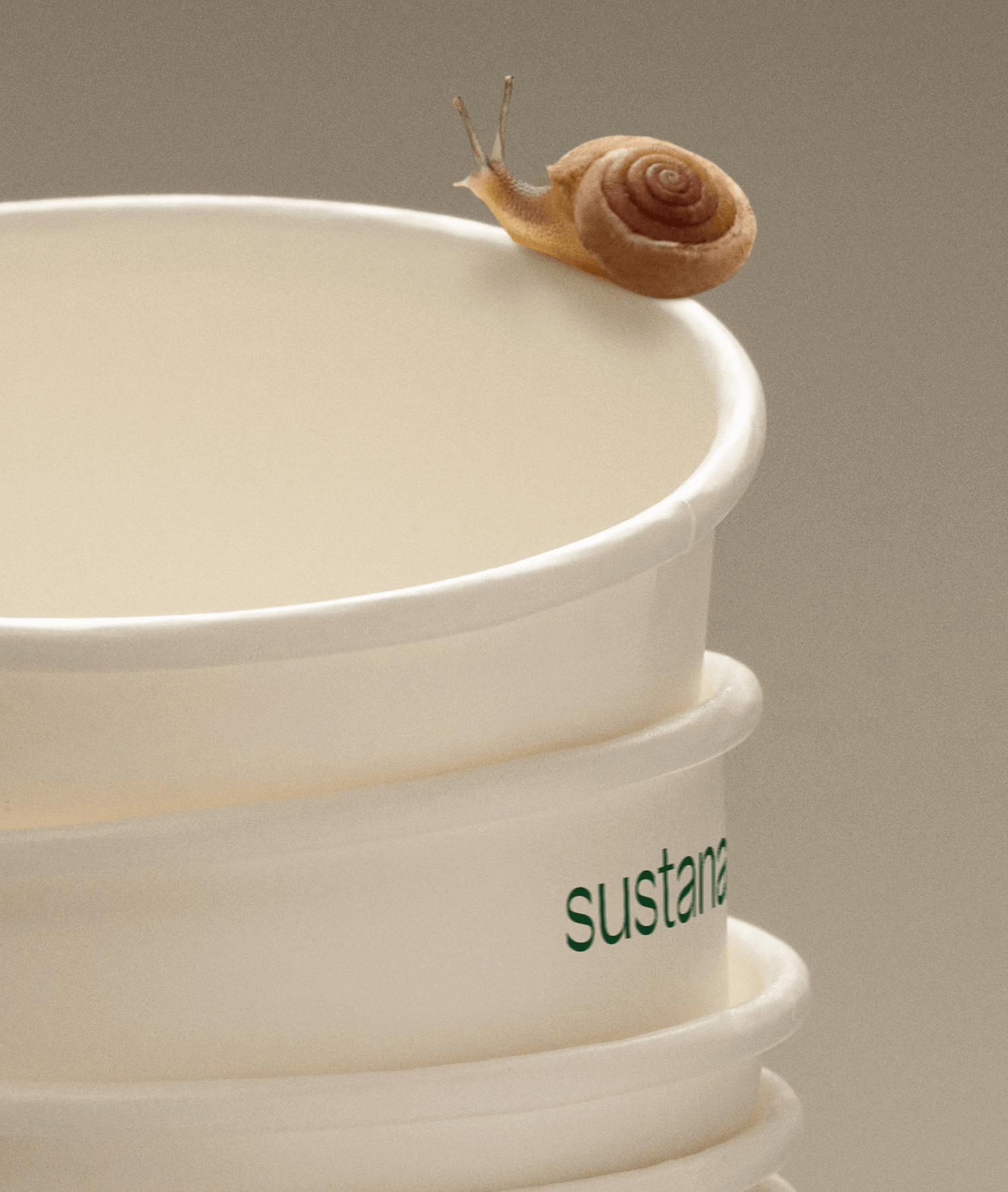
Paper made with clean materials; this was the twist COLLINS gave to this Canadian company, transforming it into Sustana. Custom typography by Sharp Type.