Designed by Copyright/Reserved, this special publication by @extensive.publishing and @greedydust features Cortese and Cortese Sans by Mark van Leeuwen.
Storefronts have served as stages for performances, for experimentation, and part of the art itself. Fresh Window at Museum Tinguely explores this connection with an identity using Stabilo Boss.
EXTRALESS, a Japanese clothing brand reflected its ethos in a custom typeface by British Standard Type embodying simplicity and shared humanity.
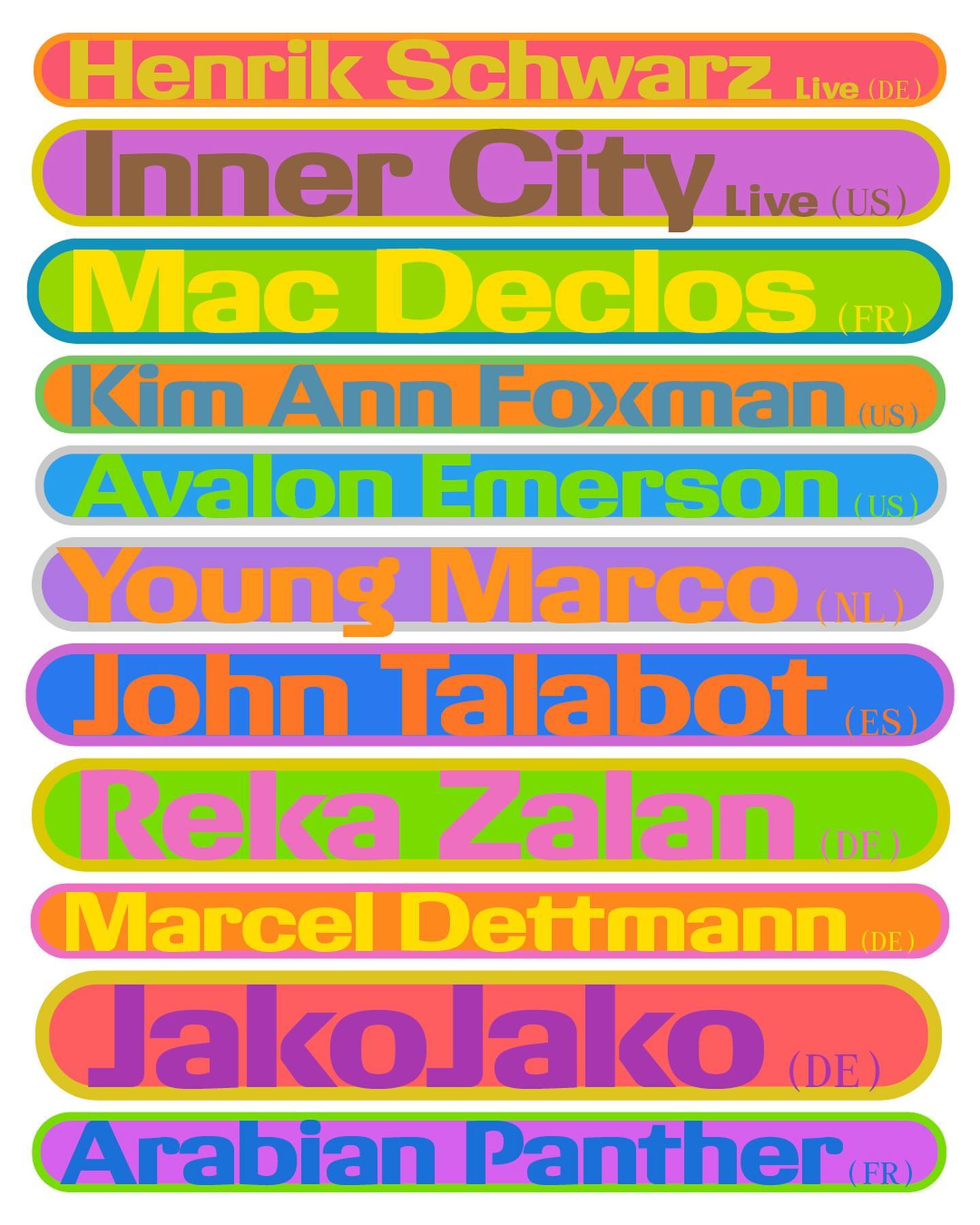
With dots inviting the creation of interconnected forms, the design by Atelier Tout va bien features Baste in The MV Festival 2024.
As fun as family movie nights, Moore by Eliott Grunewald was used in this list of films curated by A24 and approved by kids and adults alike. Designed by Jordi Ng and Elana Schlenker.
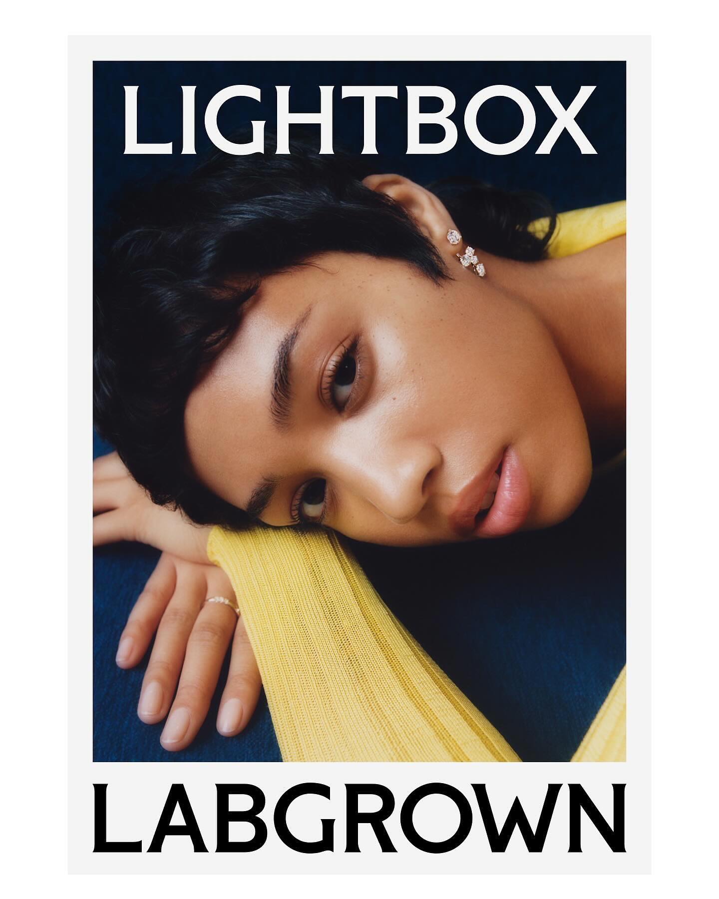
Decade created this visual identity to position an innovative lab-grown diamond brand, proposing a custom flare logo designed by Colophon Foundry.
Rajola is a stencil and filled typeface designed by ErrorErrorStudio. It is inspired by and pays tribute to the iconic hexagonal tiles characteristic of the Mediterranean.
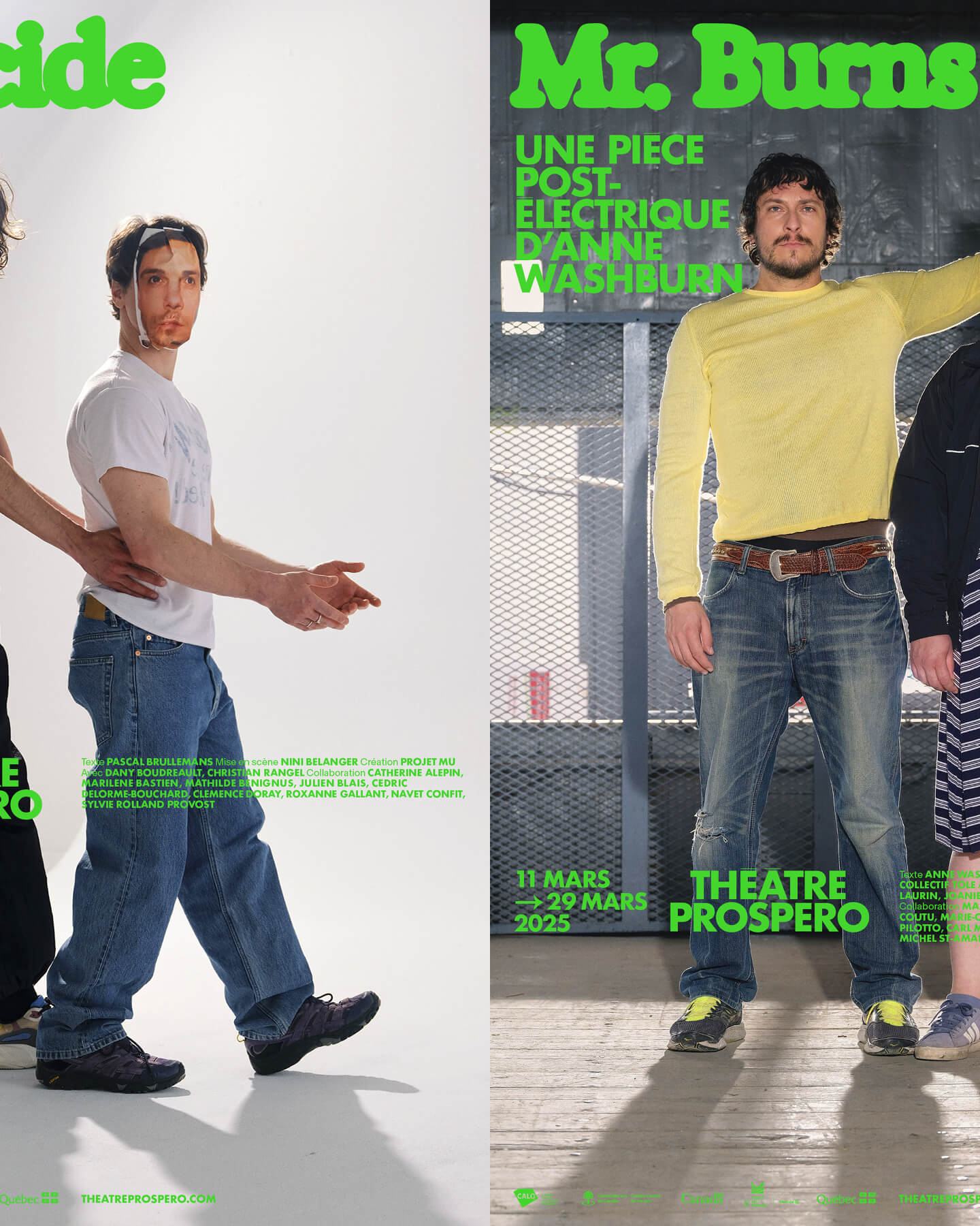
“After all, being together is revolutionary.” That was the main idea behind the 2024-2025 season campaign for Théâtre Prospero, directed and designed by Principal Estudio using Exposure.
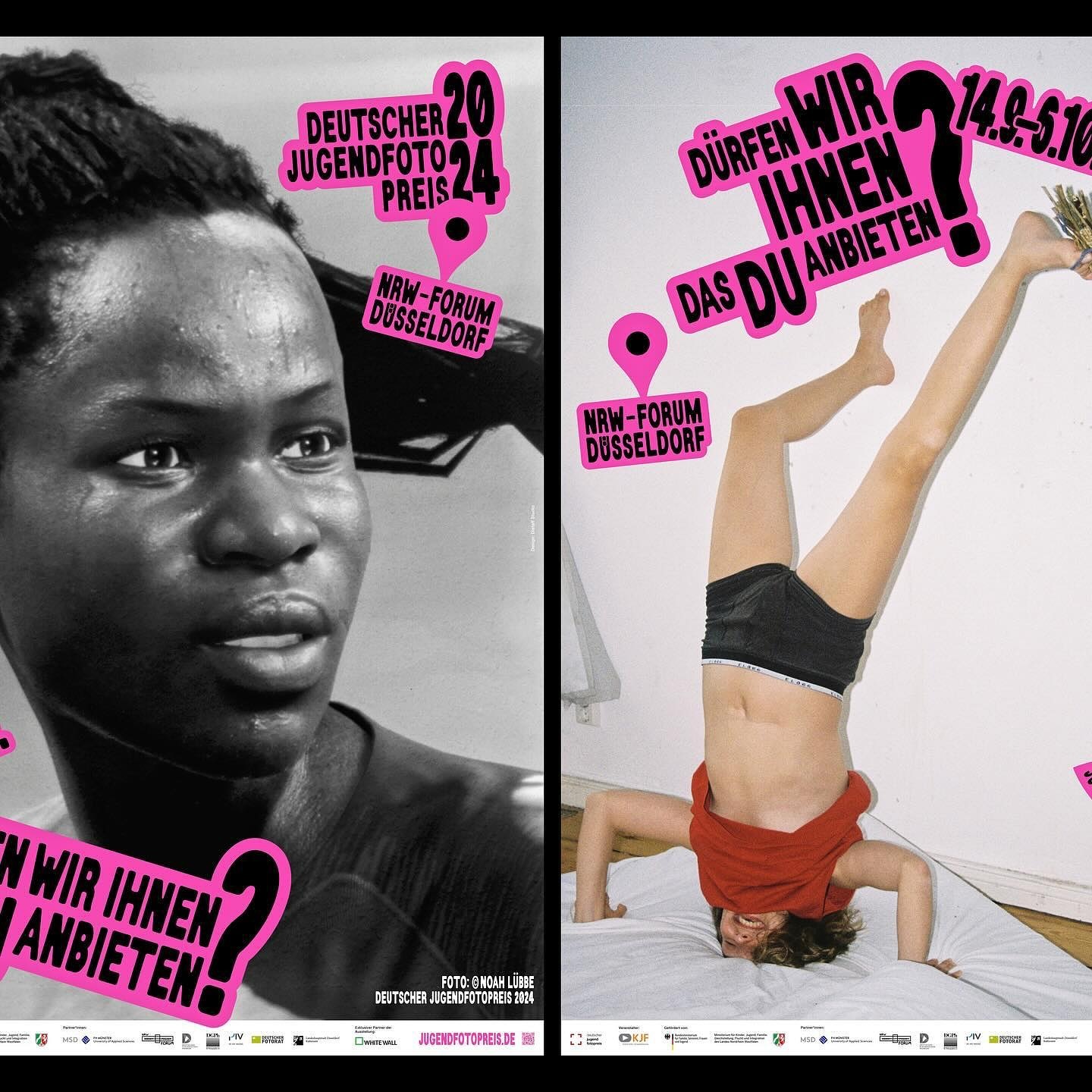
An identity made with stickers that follows no rules in the layouts. Distaff Studio used Serial A as the typeface for the image of this exhibition of the German Youth Photography Prize.