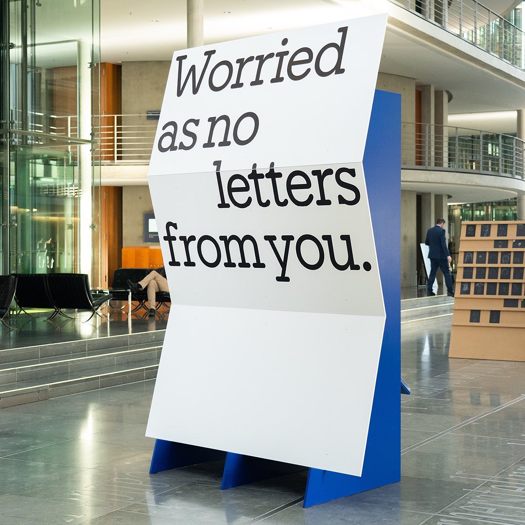
I said, ‘Auf Wiedersehen’ (I said ‘Goodbye’) displays the letters exchanged by five families separated during World War II, hoping to reunite one day. The texts are set in Repost, with supplementary texts in HAL Four Grotesk.
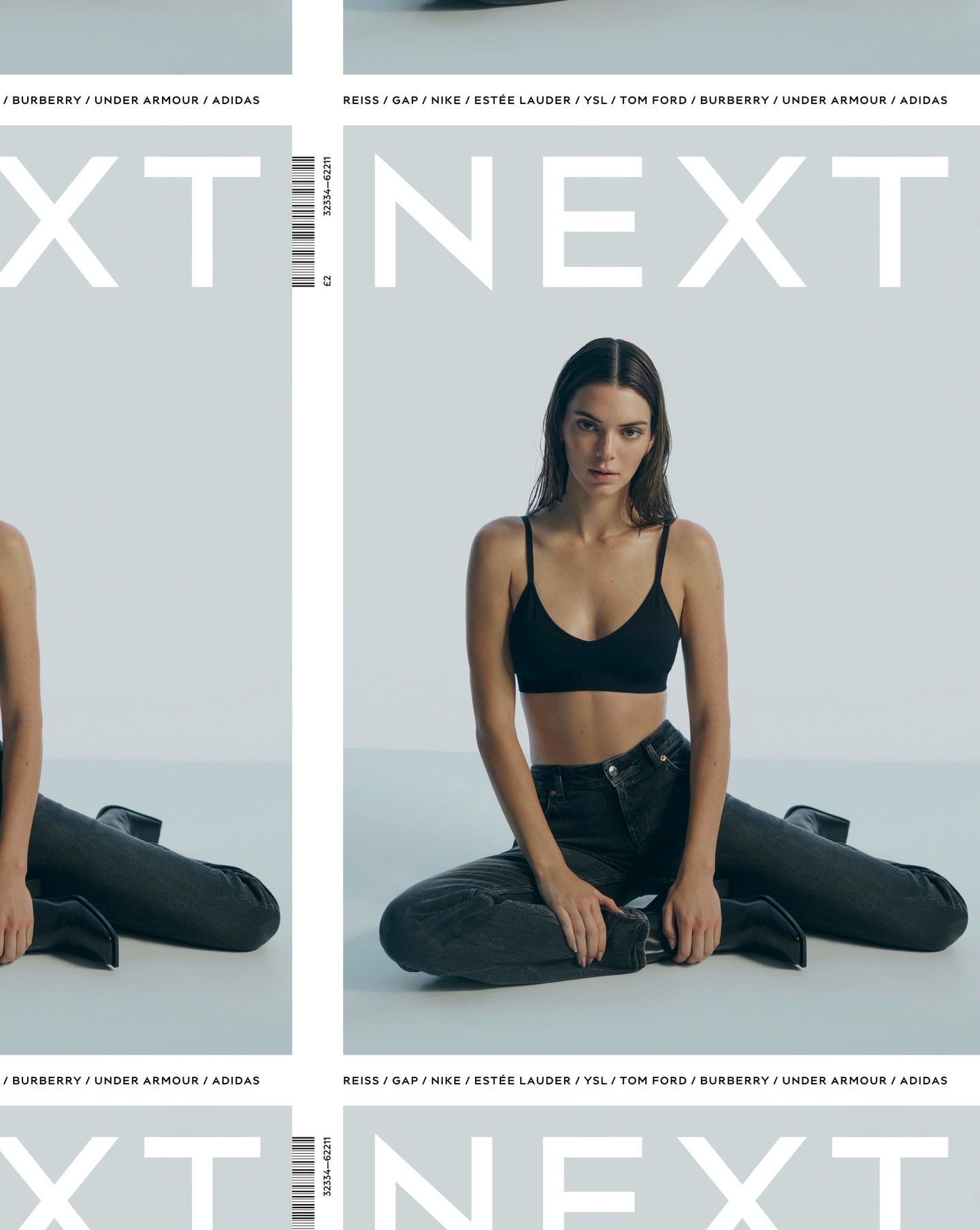
After designing the logo as part of the rebranding for the clothing brand Next, Frost was commissioned again by Six to create an entire typeface based on it.
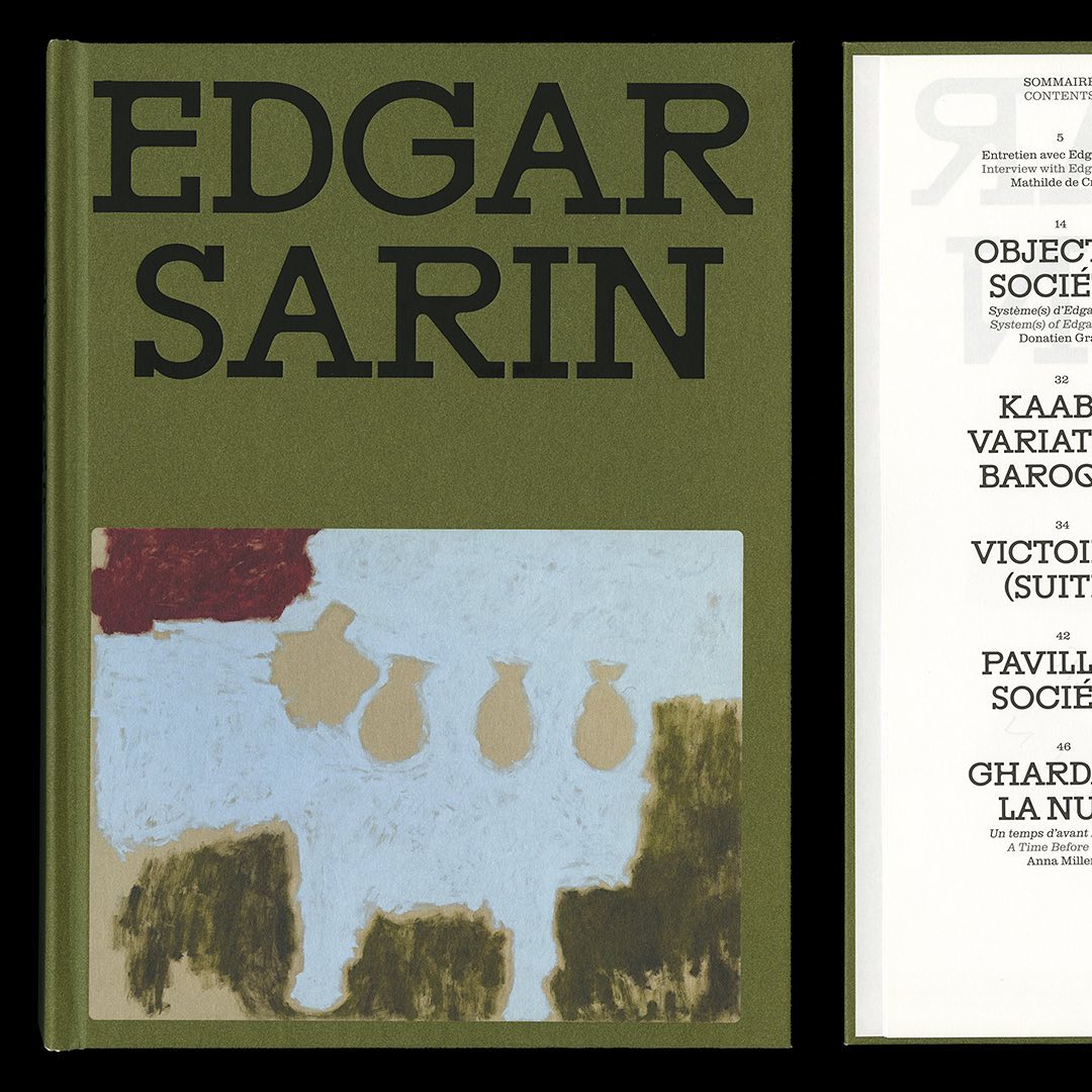
Resonanz B by Out of the Dark and Clarendon Graphic were the typefaces selected by Lisa Sturacci for the editorial design of this book about about Edgar Sarin’s work.
Address Arts leveraged the possibilities of Exposure by 205TF, a variable typeface whose weight was modified to achieve a solid and heavy logo.
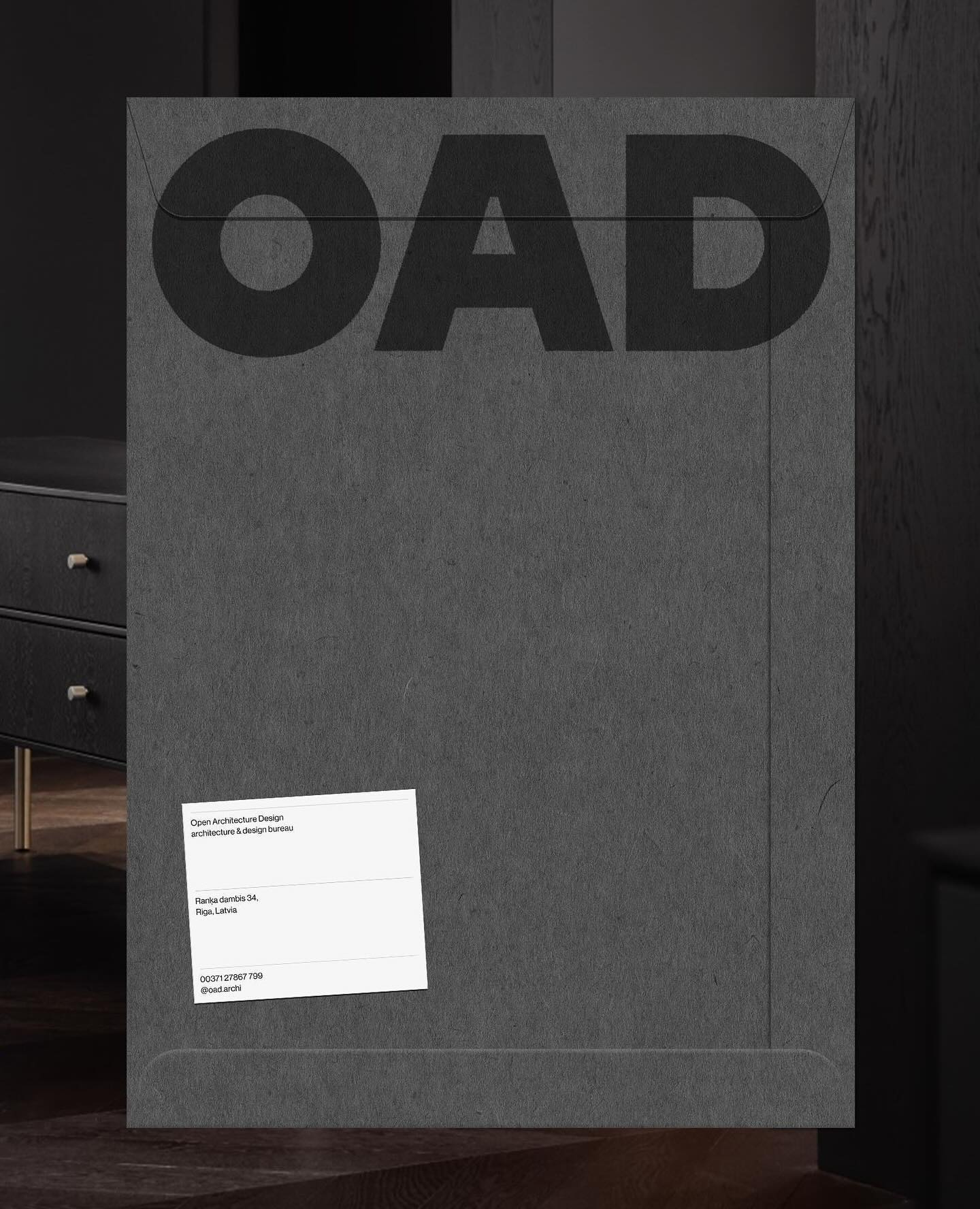
Just like its proposal, OAD (Open Architecture Design) has a strong and impactful lettering as a logo, complemented by Neue Haas Grotesk in its regular weight.
For the past 3 years, Chejo and SHDW studios have been sharing lunch, and in this book, they compile the recipes they’ve made. Serial A from DumDum fonts is used as the main typography.
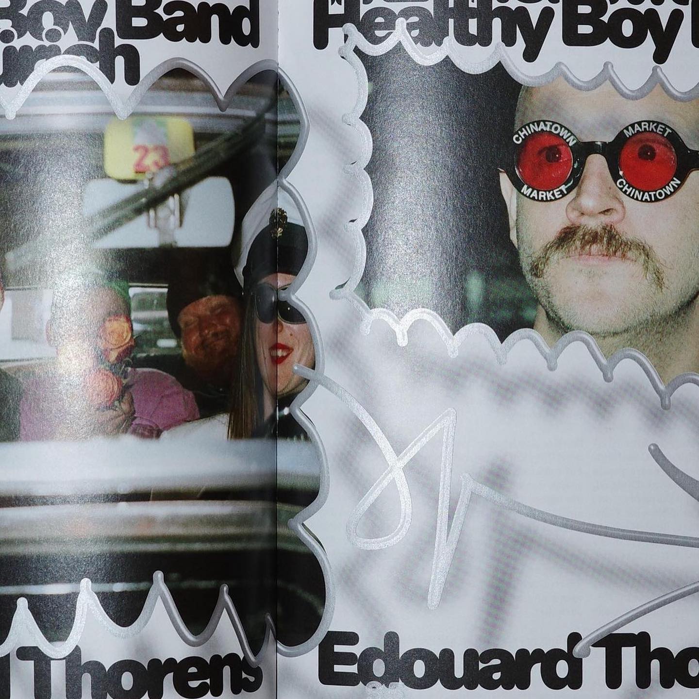
Diatype Rounded from ABC Dinamo is used in Healthy Boy Band, a cultural magazine that is a tribute to graphic design
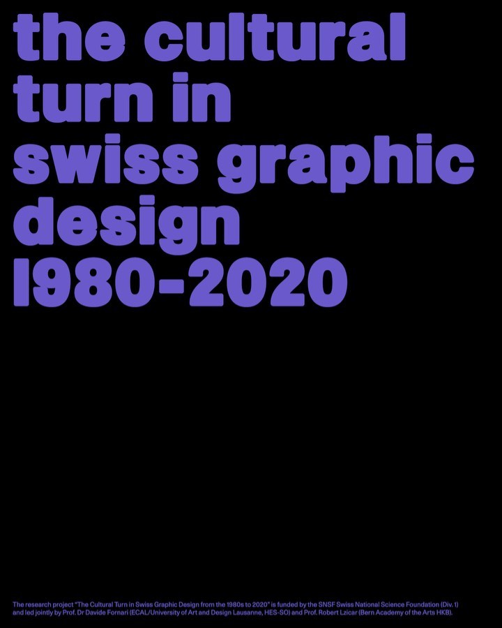
Trekking Sans is a lowercase typeface designed by Bureau Bernklau, for the research project Cultural Turn in Swiss Graphic Design (1980–2020).
The foundry From A+, built a wordmark, an alternate script version, and two monograms based on art deco letterforms, for the seafood Californian tavern, Bar Le Côte.
Studio Ard was commissioned to design 15 publications and the signage for the graduation exhibition of the RCA School of Architecture. All is typeset in Prisma Text by Lineto.