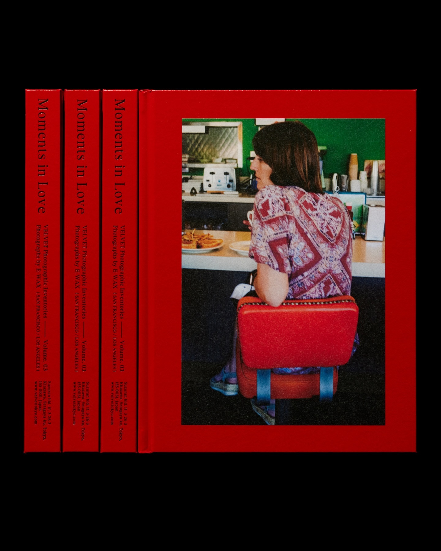
Moments in Love narrates a new way of portraying fashion, blending it with photos of passersby. Designed by the studio Siun, using FT Bureau.
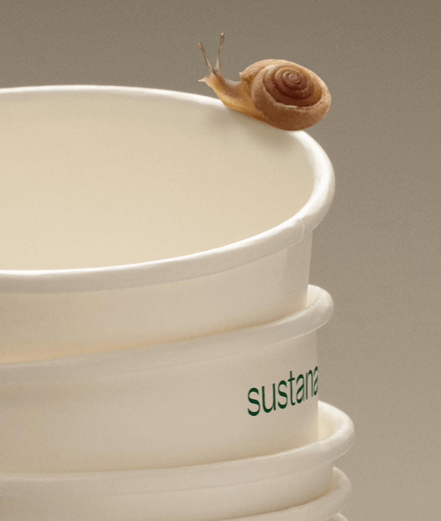
Paper made with clean materials; this was the twist COLLINS gave to this Canadian company, transforming it into Sustana. Custom typography by Sharp Type.
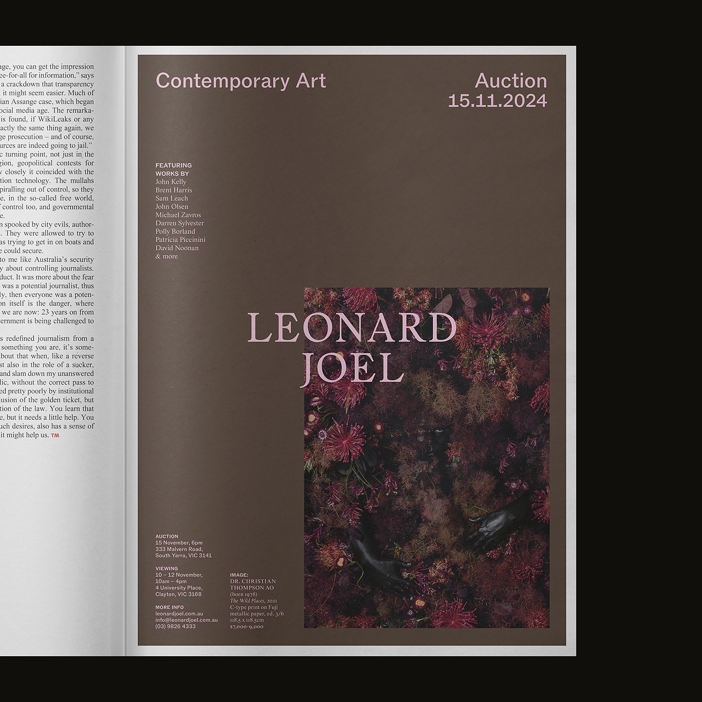
Leonard Joel, one of Australia’s top auction houses, refreshed its identity with Studio Doherty. The concept “Everything old is new again” blends heritage and modernity.
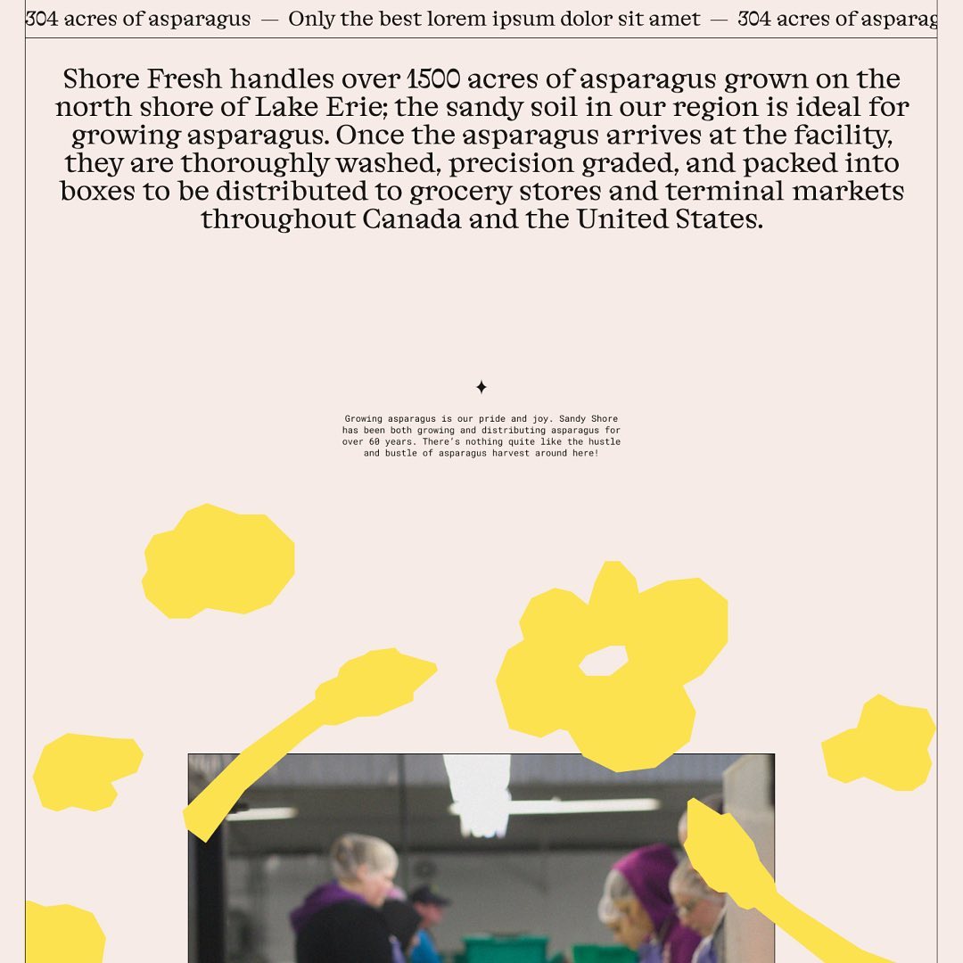
Alongside a colorful identity and illustrations, Studio Tux proposed Nordic Pavilion and Roboto Mono as the typefaces for this farm.
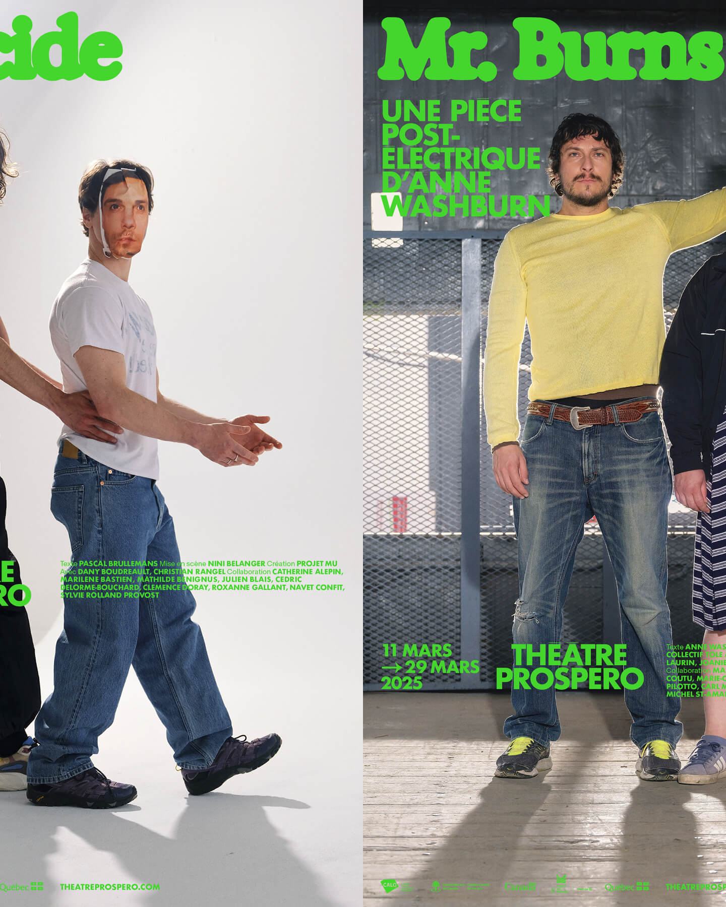
“After all, being together is revolutionary.” That was the main idea behind the 2024-2025 season campaign for Théâtre Prospero, directed and designed by Principal Estudio using Exposure.
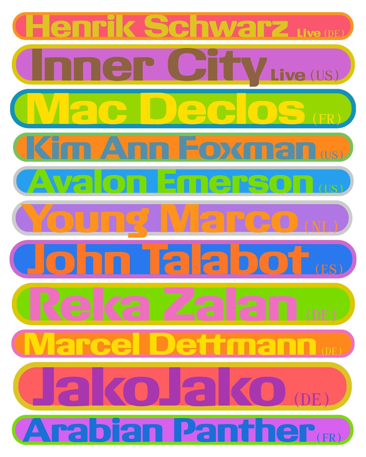
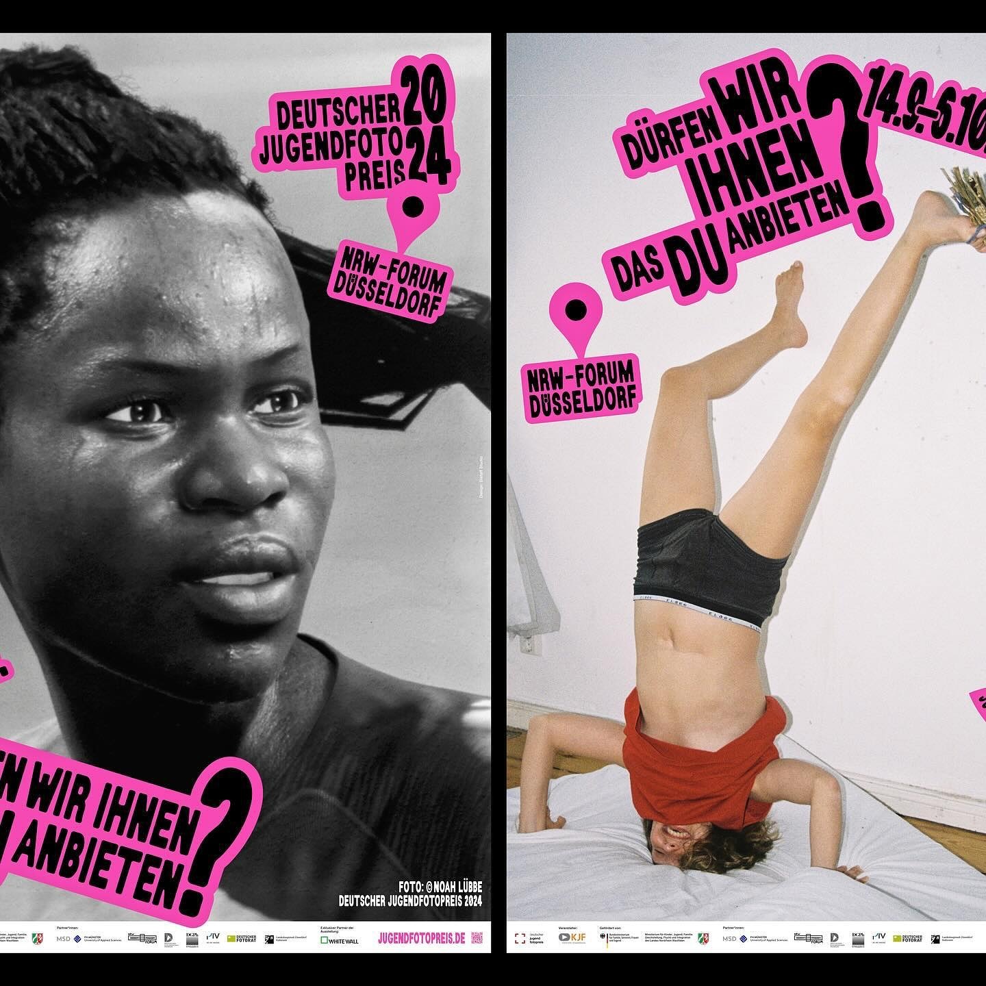
An identity made with stickers that follows no rules in the layouts. Distaff Studio used Serial A as the typeface for the image of this exhibition of the German Youth Photography Prize.
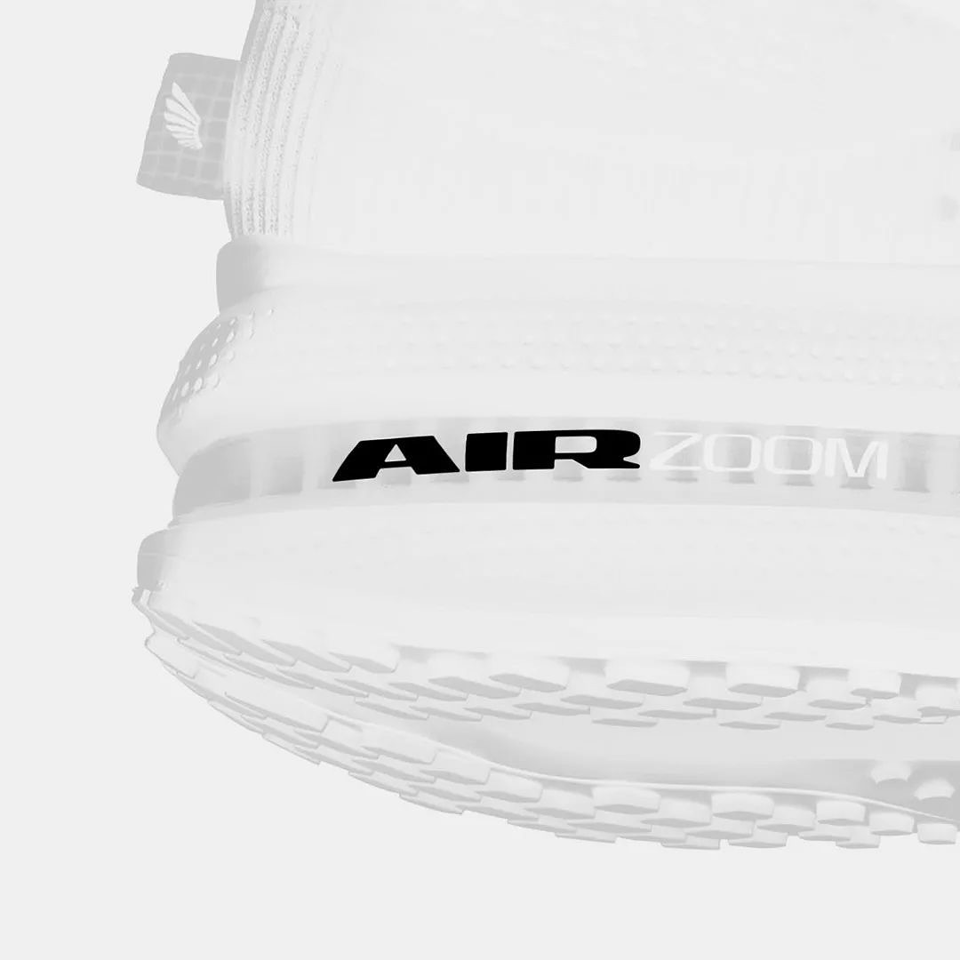
Win on Air is the name of the new Nike Air identity, where David Gobber and Hoang Nguyen were part of this project, designing the typography used in the logo, which is a custom version of Generation Mono, another typeface of their own creation.
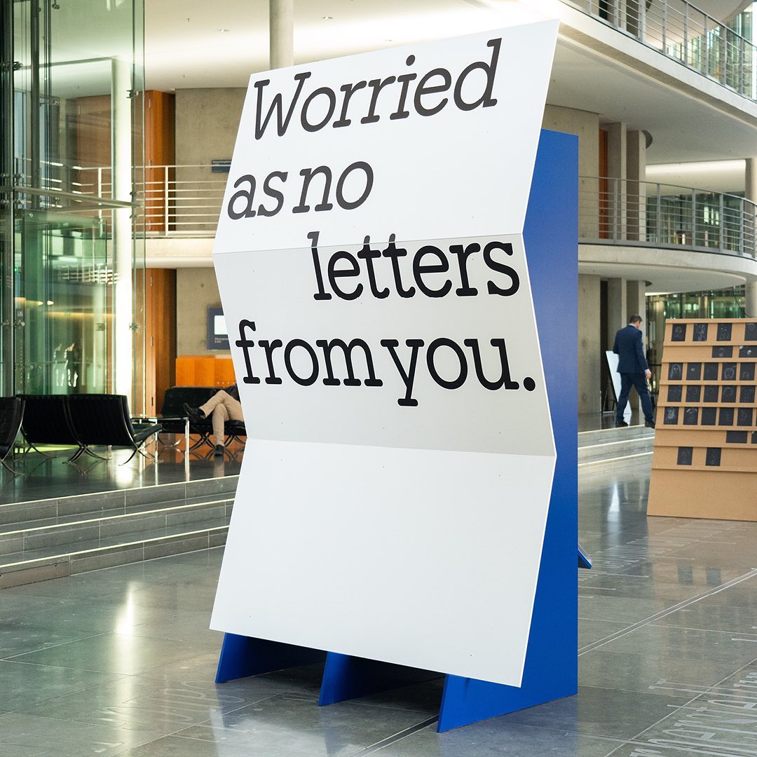
I said, ‘Auf Wiedersehen’ (I said ‘Goodbye’) displays the letters exchanged by five families separated during World War II, hoping to reunite one day. The texts are set in Repost, with supplementary texts in HAL Four Grotesk.
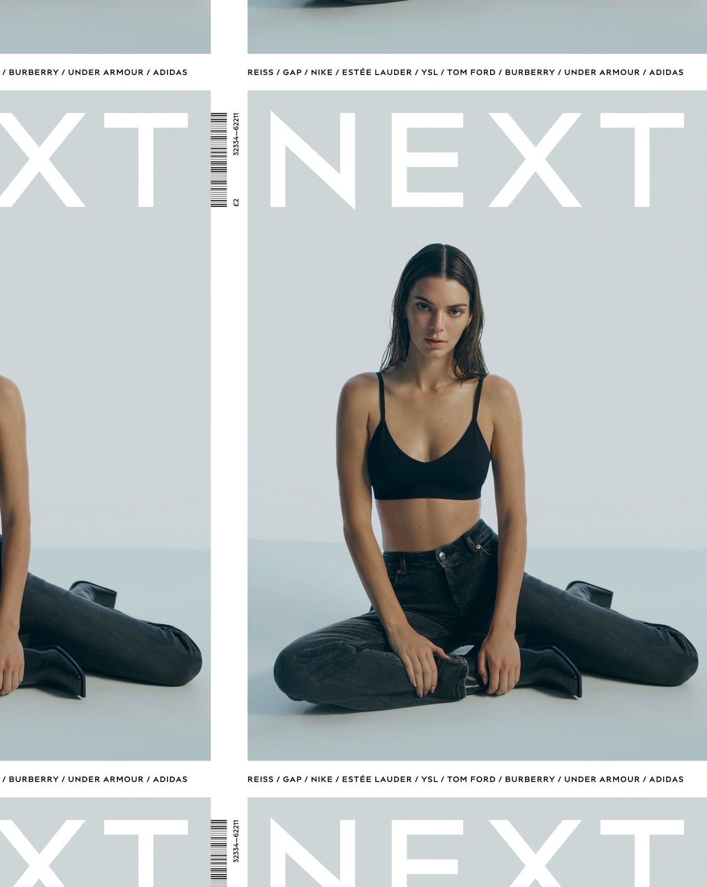
After designing the logo as part of the rebranding for the clothing brand Next, Frost was commissioned again by Six to create an entire typeface based on it.