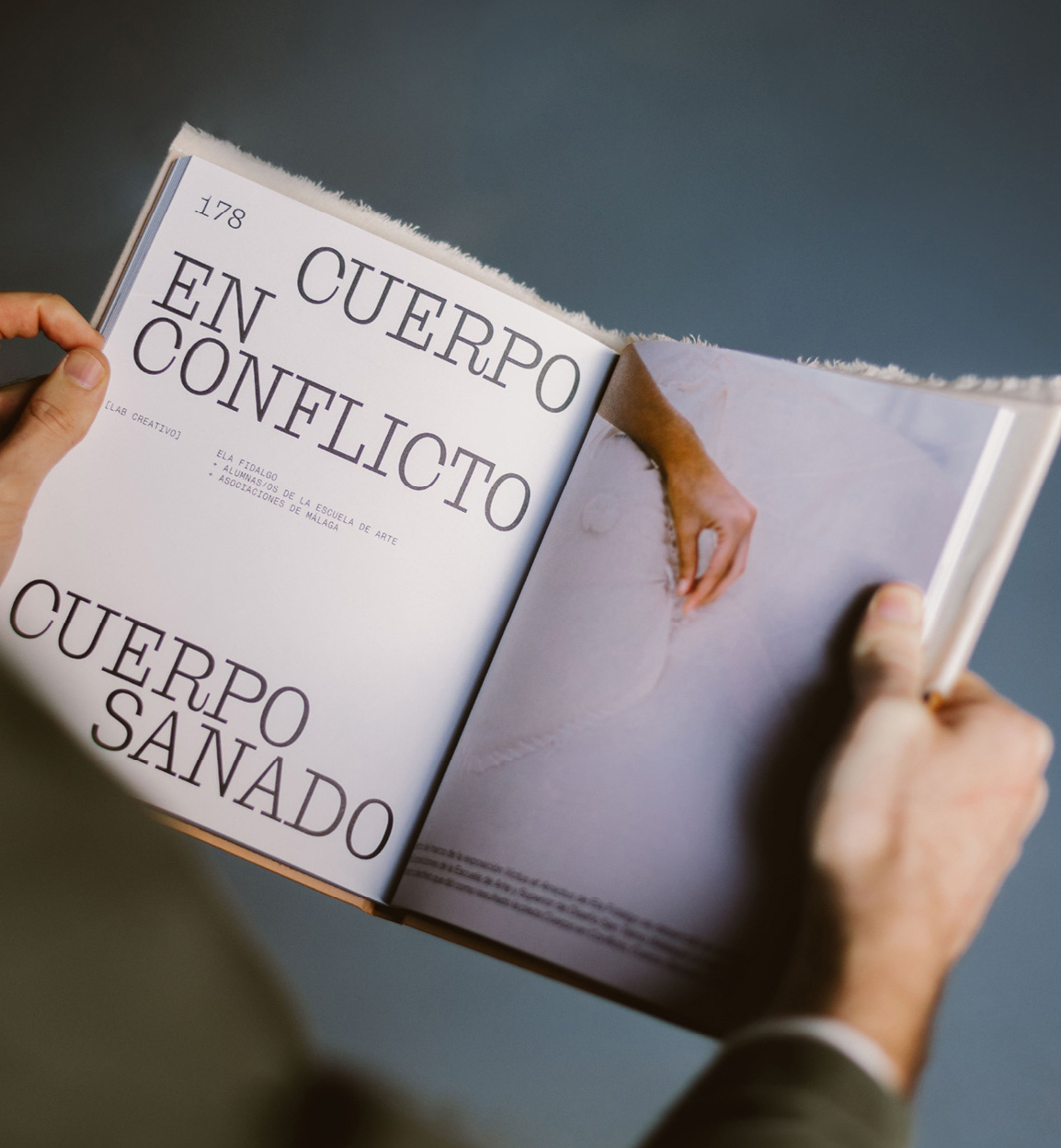
Mixture of materials, papers, and typefaces (Neue Montreal and Cucina); that’s how Tiquismiquis designed this editorial piece that covers Ela Fidalgo’s creative career.
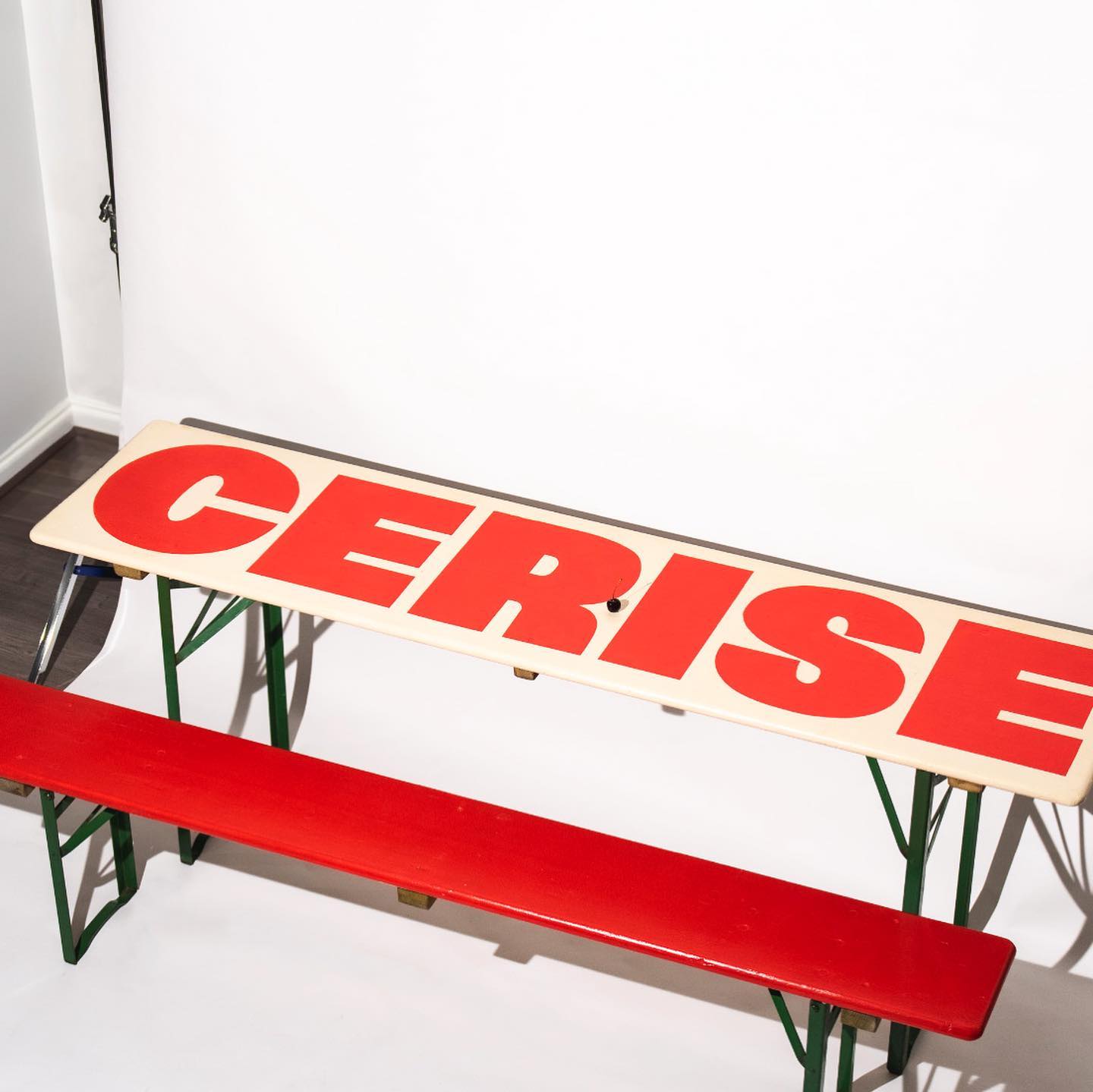
Studio Cerise, a colorful creative studio from East London, used Swinton by Nouvelle Noir for its logo.
Estudio República used a single weight of Basel Classic from Optimo Type and Courier Prime as complementary, to achieve a human and elegant identity for Rocio Navarro’s brand; RN Arquitectura™.
How to design the extension of –a very well-known– brand, while also making it unique. Order solves this question with the identity of Journal House, a branch of WSJ dedicated to events.
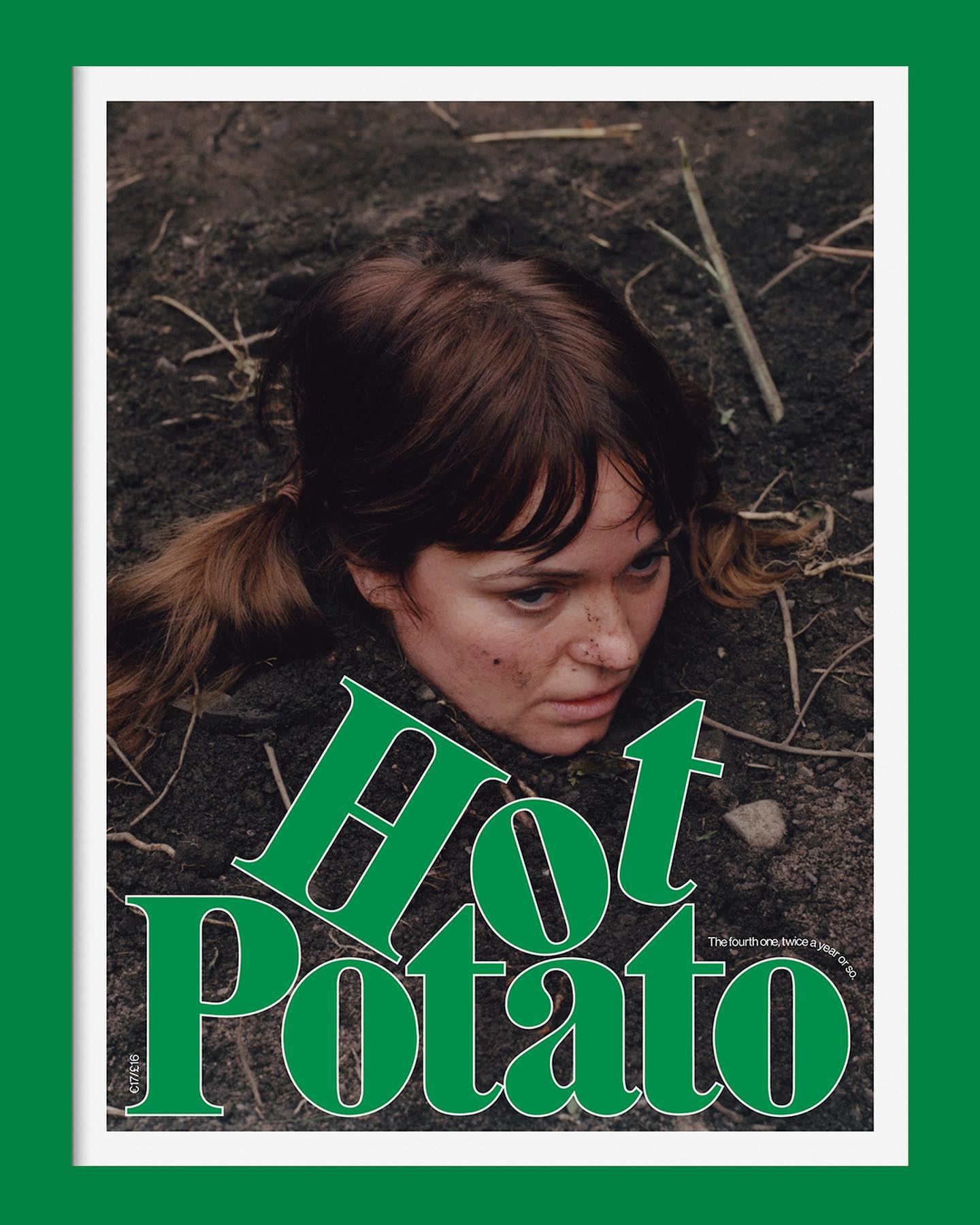
Neue Haas Grotesk is a common typeface on the blog, it works well in many scenarios, for example alongside Marfield in the fourth edition of Hot Potato magazine.
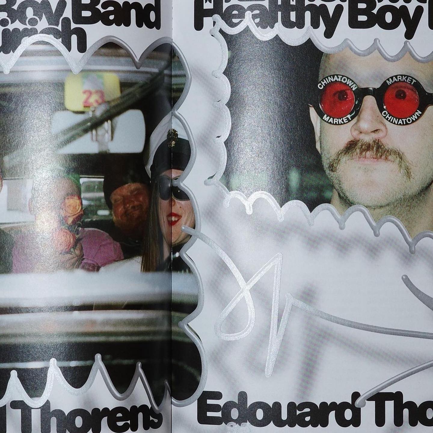
Diatype Rounded from ABC Dinamo is used in Healthy Boy Band, a cultural magazine that is a tribute to graphic design
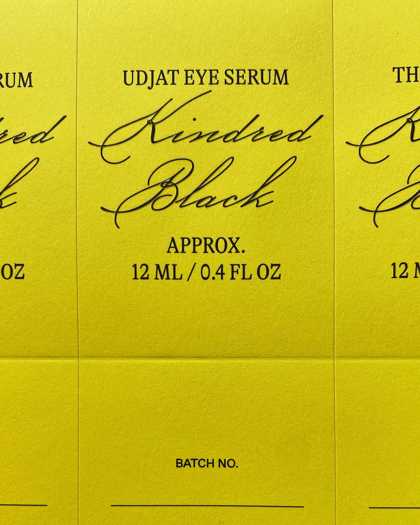
GT Alpina and Monument Grotesk are part of this packaging system that the creative studio Ania et Lucie devised for the glass bottle brand Kindred Black
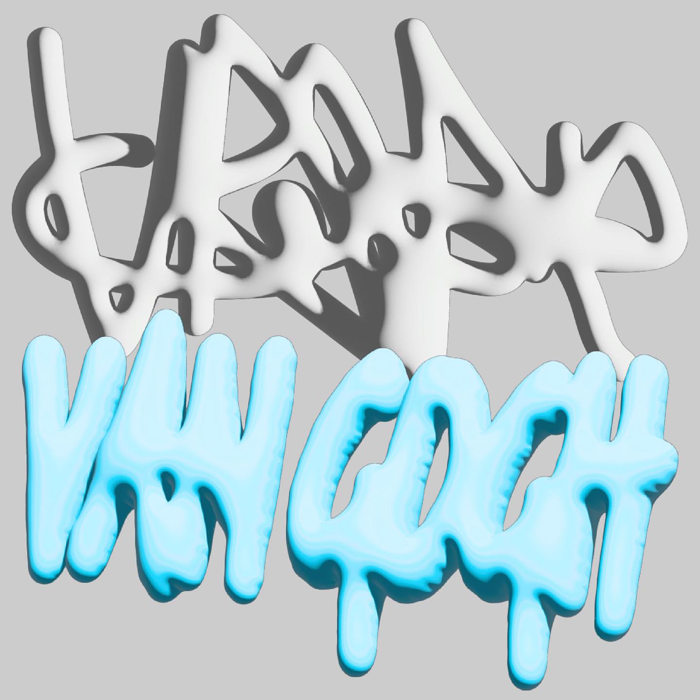
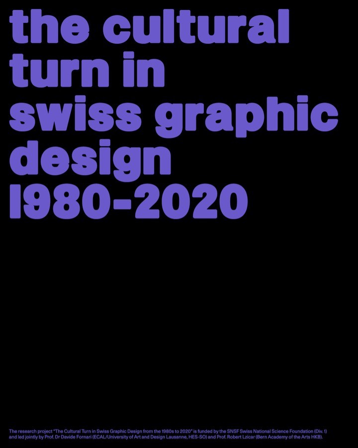
Trekking Sans is a lowercase typeface designed by Bureau Bernklau, for the research project Cultural Turn in Swiss Graphic Design (1980–2020).
The foundry From A+, built a wordmark, an alternate script version, and two monograms based on art deco letterforms, for the seafood Californian tavern, Bar Le Côte.