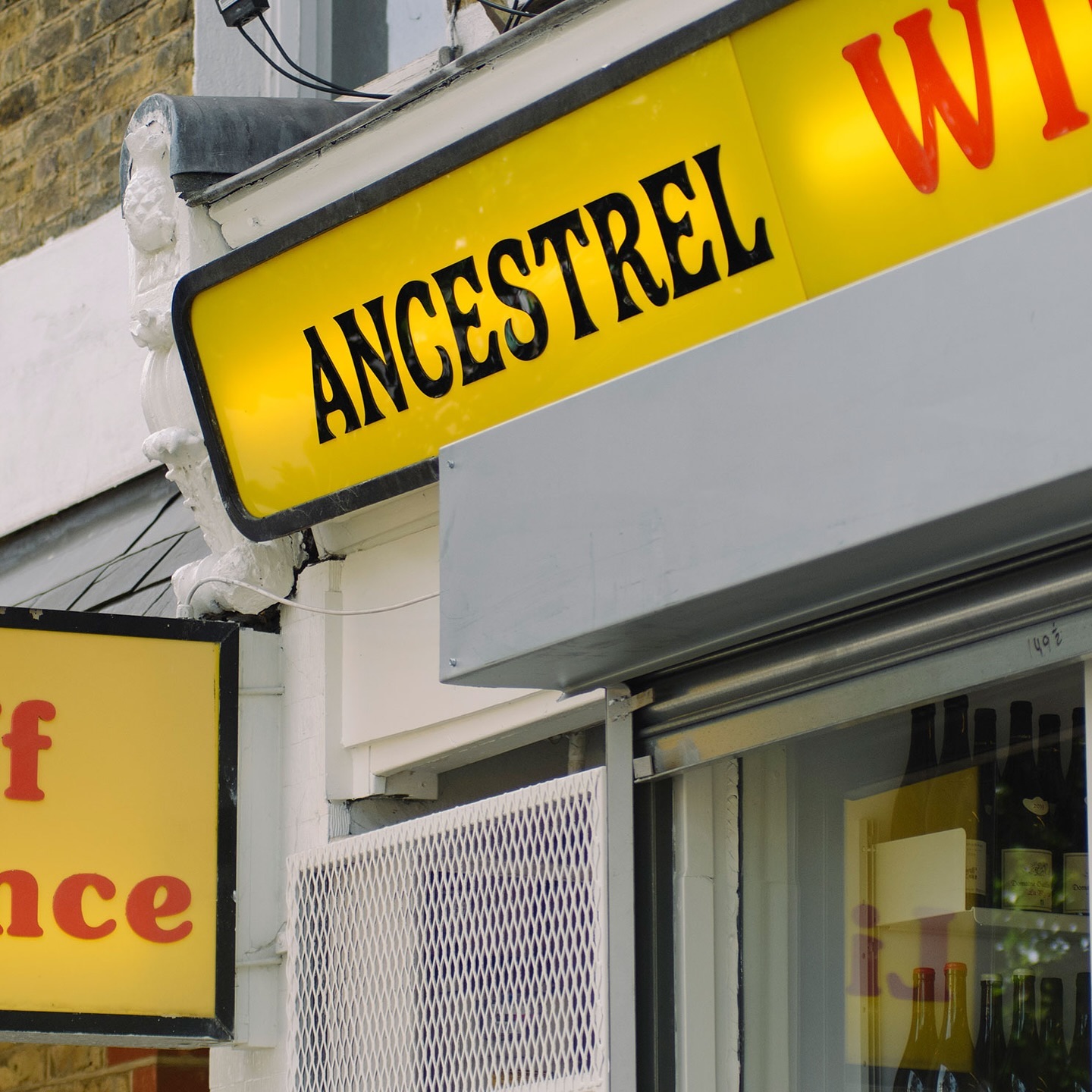
The first store to bring natural wine to the UK, Ancestral Wines, features an identity inspired by the winemaking process and a logo shaped like a grape cluster.
At the world’s largest sporting event, Nike embraced a modern, dynamic, and fluid typeface. In collaboration with Pizza Typefaces, they created the Nike Olympics fonts, a typeface inspired by twisting motion.
Elephant magazine showcases the rustic and imperfect details of the ZG Elephant typeface through these graphic spreads. Type and editorial design by Zak Group.
As fun as family movie nights, Moore by Eliott Grunewald was used in this list of films curated by A24 and approved by kids and adults alike. Designed by Jordi Ng and Elana Schlenker.
Logotype and lettering inspired by the baroque era of the internet, proposed by Muon Studio for Youhee’s visual identity.
Justin Sloane used this interesting mix of Gothic letters (Castilla by Sharptype) and sans serif (Octave by Josh Finklea) for a vinyl cover.
This series of keychains, the result of Pauline Esguerra’s exploration with laser cutting, uses, among other typefaces, Eurocat by Maxitype.
Rajola is a stencil and filled typeface designed by ErrorErrorStudio. It is inspired by and pays tribute to the iconic hexagonal tiles characteristic of the Mediterranean.
Logotype custom-designed by Bureau Bernklau, drawing inspiration from the distinctive features of Ehmcke Antiqua, an early 20th-century typeface.
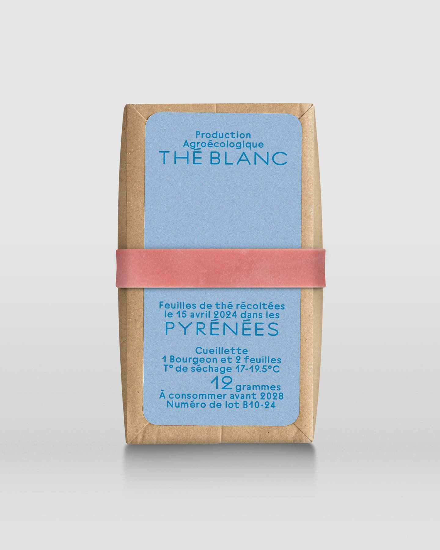
In a comprehensive project including handwriting, drawing, packaging conception, and global branding, Quentin gave @the.pyrenees an organic and approachable identity.