This old Dutch apple syrup design, featuring the Phyllis typeface by Heinrich Wieynck, reminds us that the good things always last.
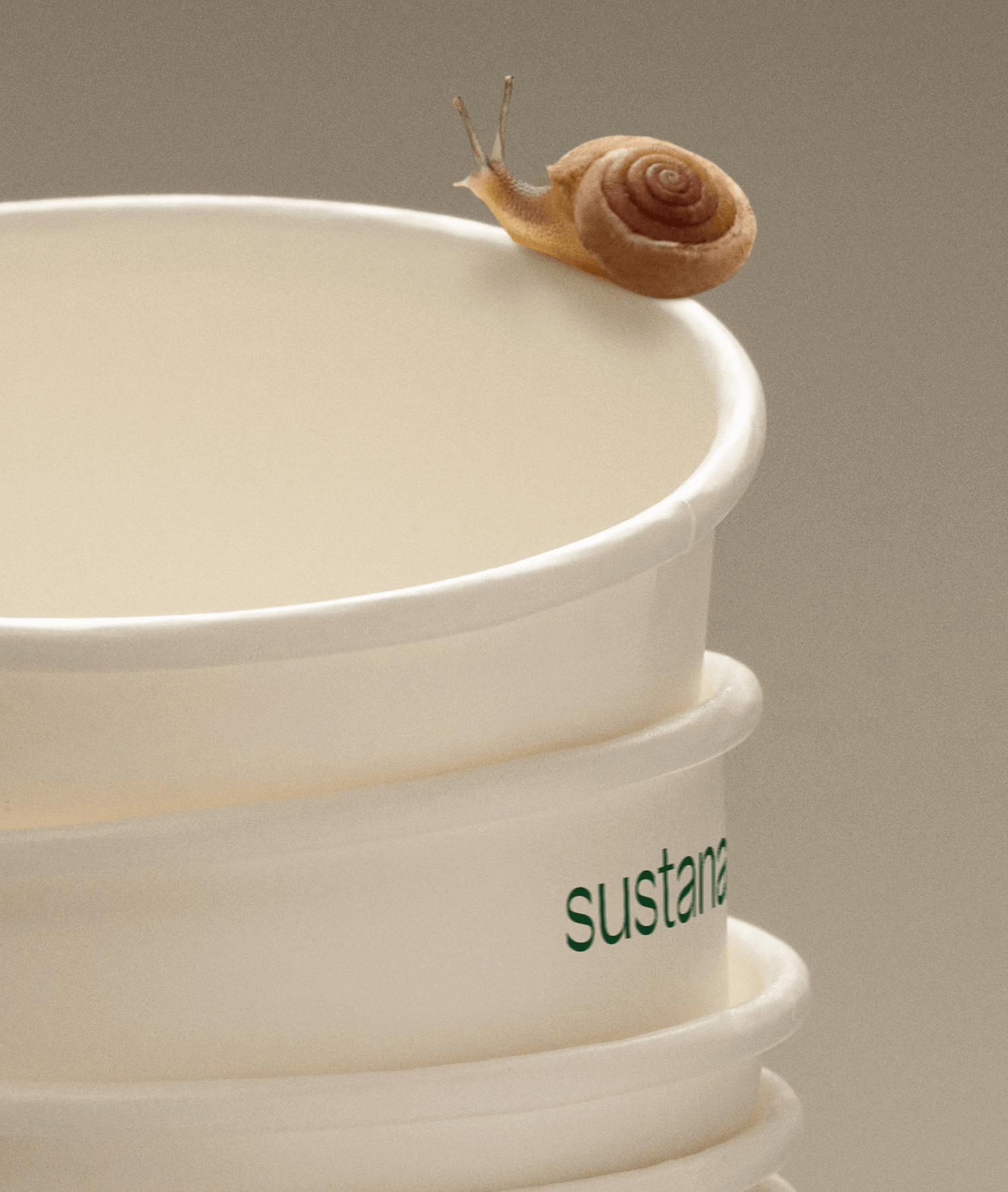
Paper made with clean materials; this was the twist COLLINS gave to this Canadian company, transforming it into Sustana. Custom typography by Sharp Type.
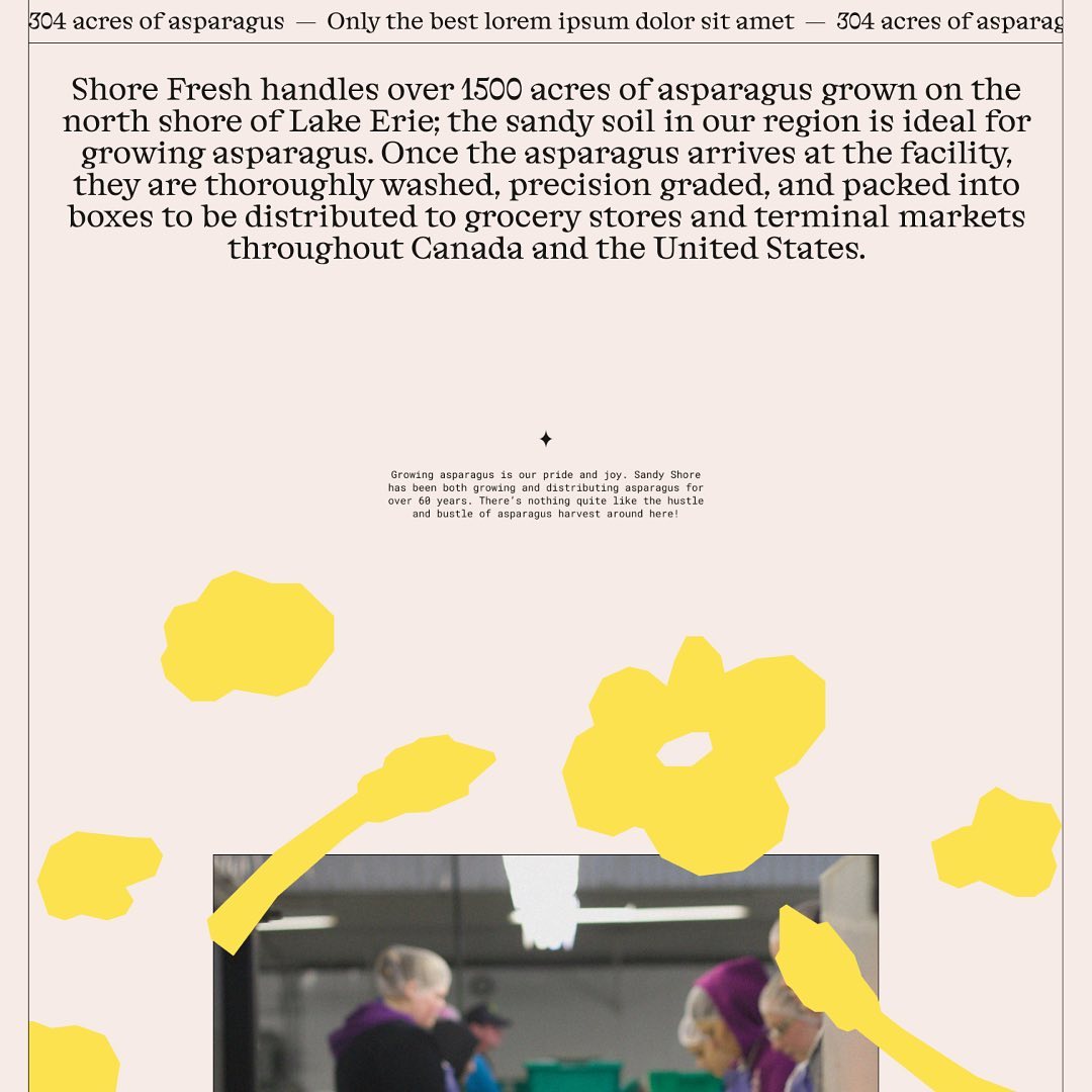
Alongside a colorful identity and illustrations, Studio Tux proposed Nordic Pavilion and Roboto Mono as the typefaces for this farm.
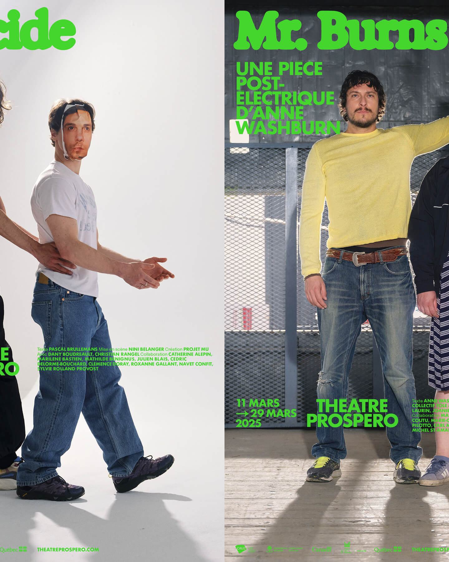
“After all, being together is revolutionary.” That was the main idea behind the 2024-2025 season campaign for Théâtre Prospero, directed and designed by Principal Estudio using Exposure.
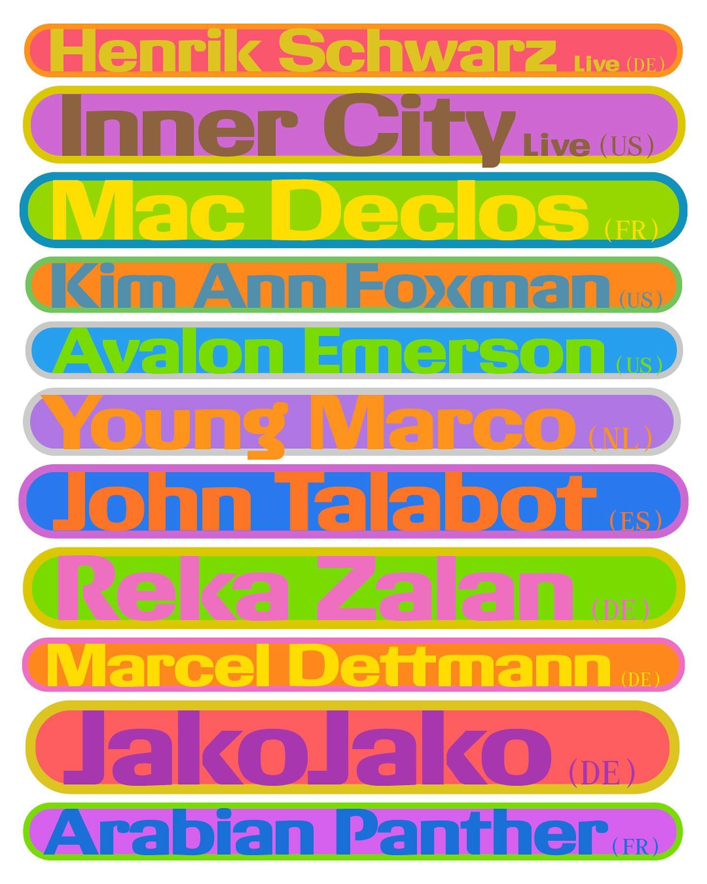
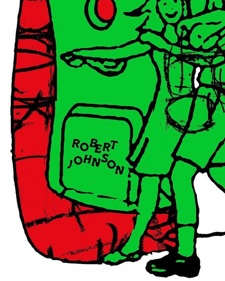
The Robert Johnson Club kicks off the 2024 season with these posters designed by Dominik Keller Studio. Typography used is Cosplay.
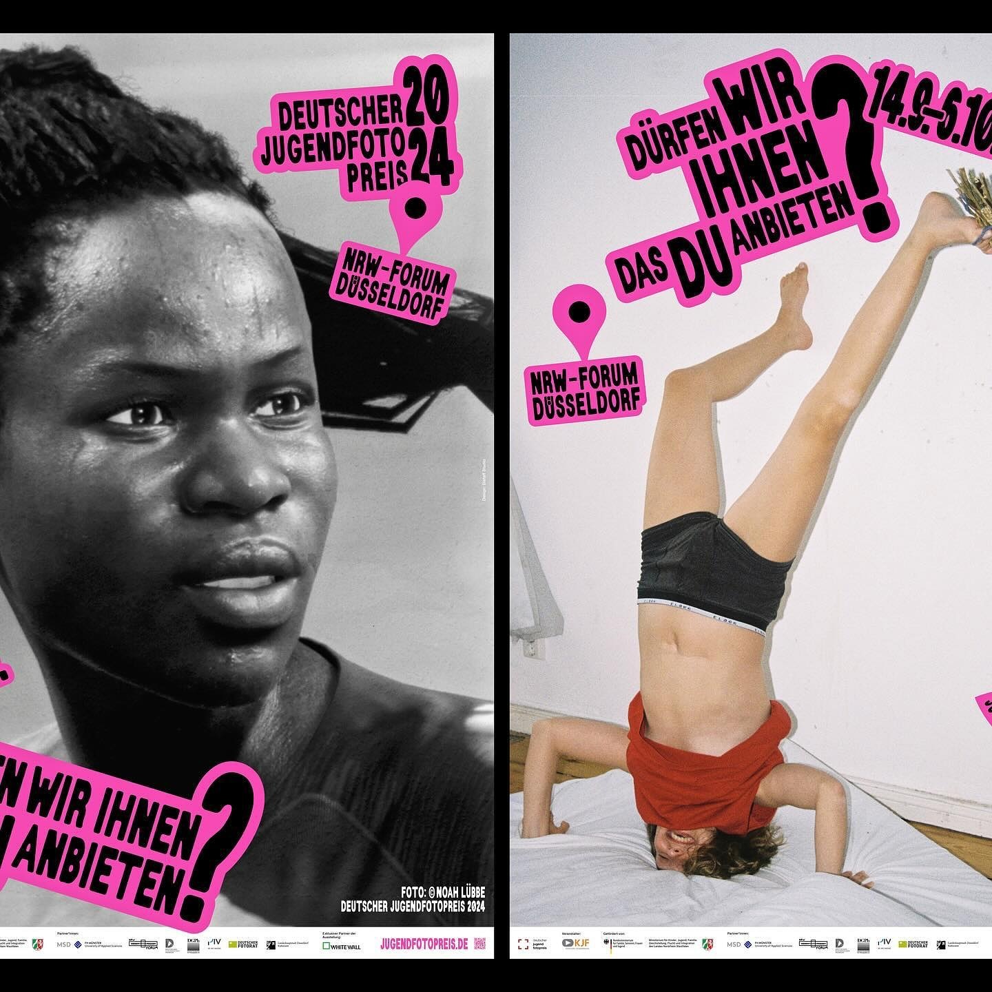
An identity made with stickers that follows no rules in the layouts. Distaff Studio used Serial A as the typeface for the image of this exhibition of the German Youth Photography Prize.
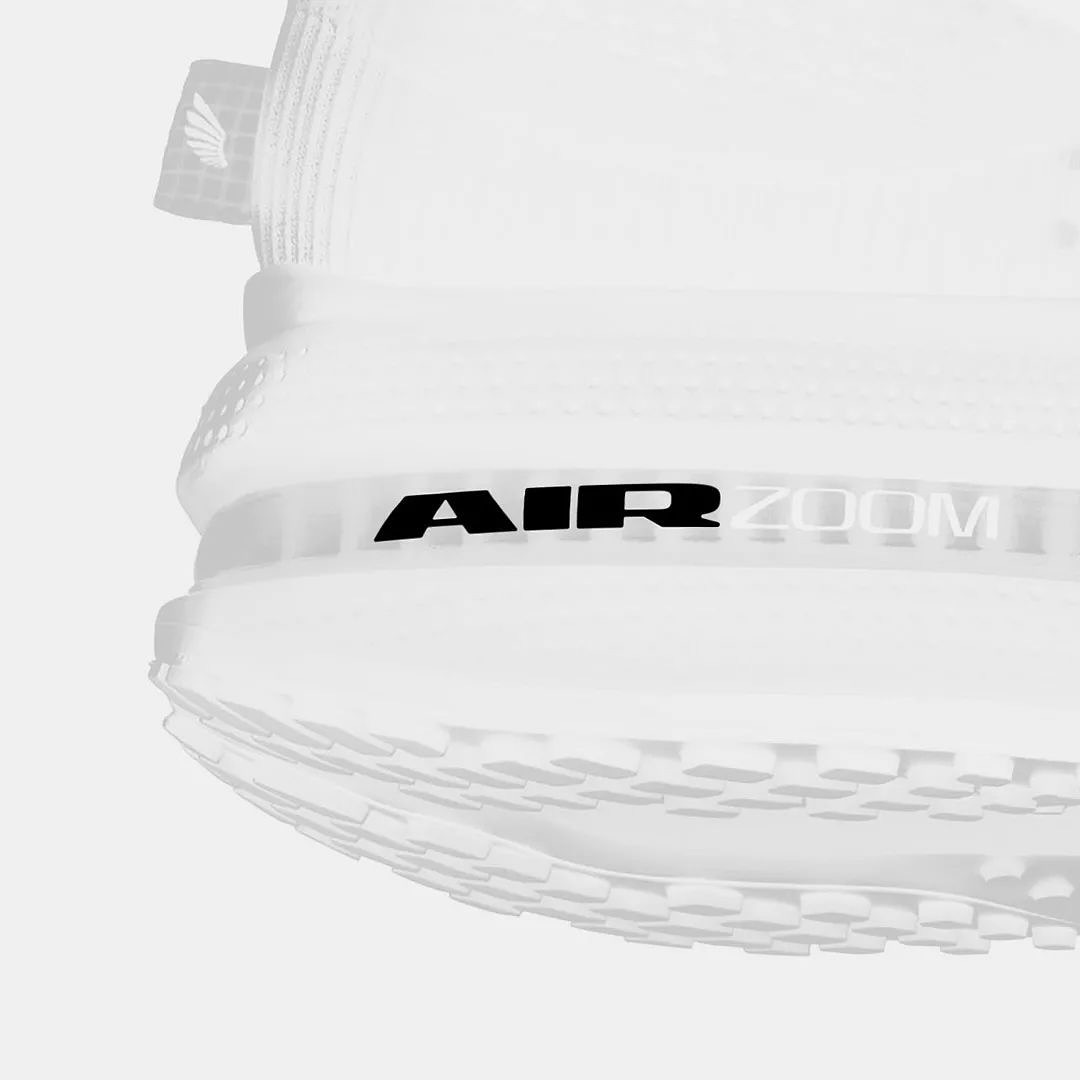
Win on Air is the name of the new Nike Air identity, where David Gobber and Hoang Nguyen were part of this project, designing the typography used in the logo, which is a custom version of Generation Mono, another typeface of their own creation.
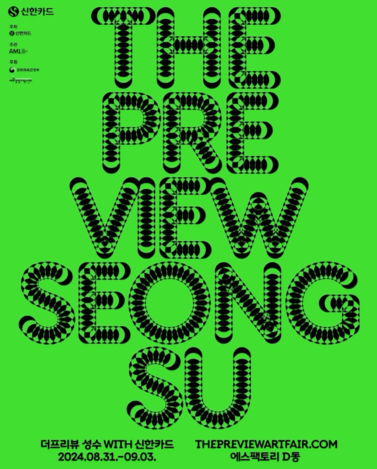
A typeface that –literally– shows its starting point and journey; the Korean graphic designer, @jun.works , included this along with other elements to create the visual identity for @thepreviewartfair.
An affair depicted through typography to create the identity for the Belgian Art and Design Affair, where @otisverhoeve,@bureauclaes, and @pino_type designed three different typefaces incorporating hearts into each letter.