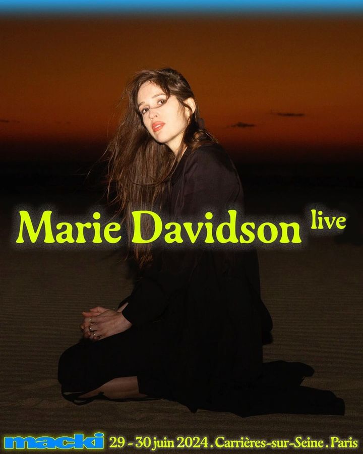
An electric identity designed by DR. ME and an organic serif typeface, Gaya, accompany the 2-day indie music festival hosted by Macki.
Asfalt will have its first edition featuring an identity filled with color blocks, sports images, a vertical logo using a customized version of Generation Mono, and texts using ABC Diatype.
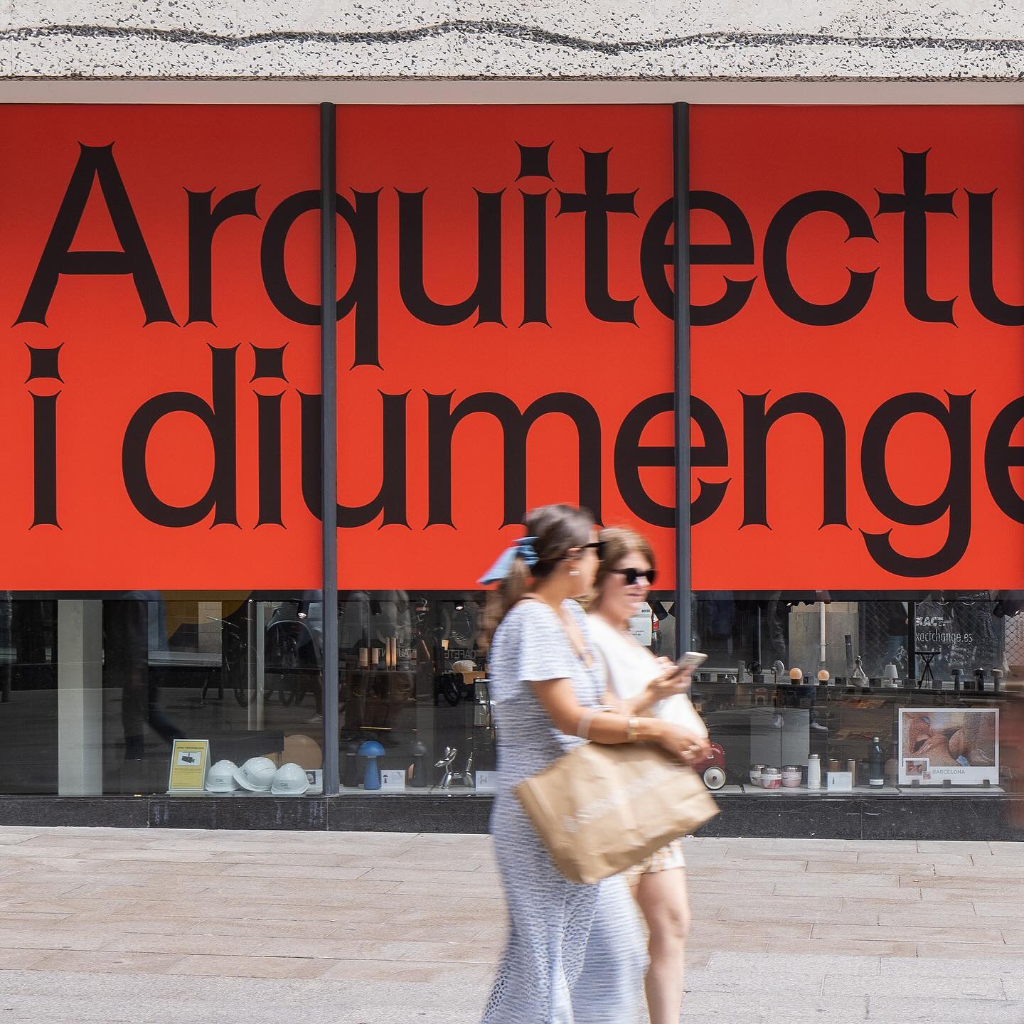
Graphic design for different spaces of this exhibition at the Architects’ Association of Catalonia, by PFP Disseny. Using Helveesti by Dinamo.
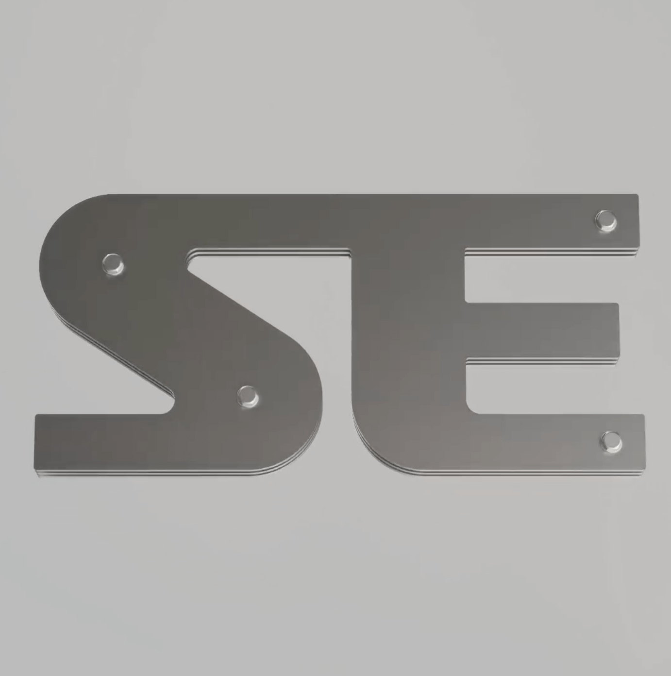
Workbyworks Studio designed this unconventional serif typeface and visual identity for Steffan Studio.
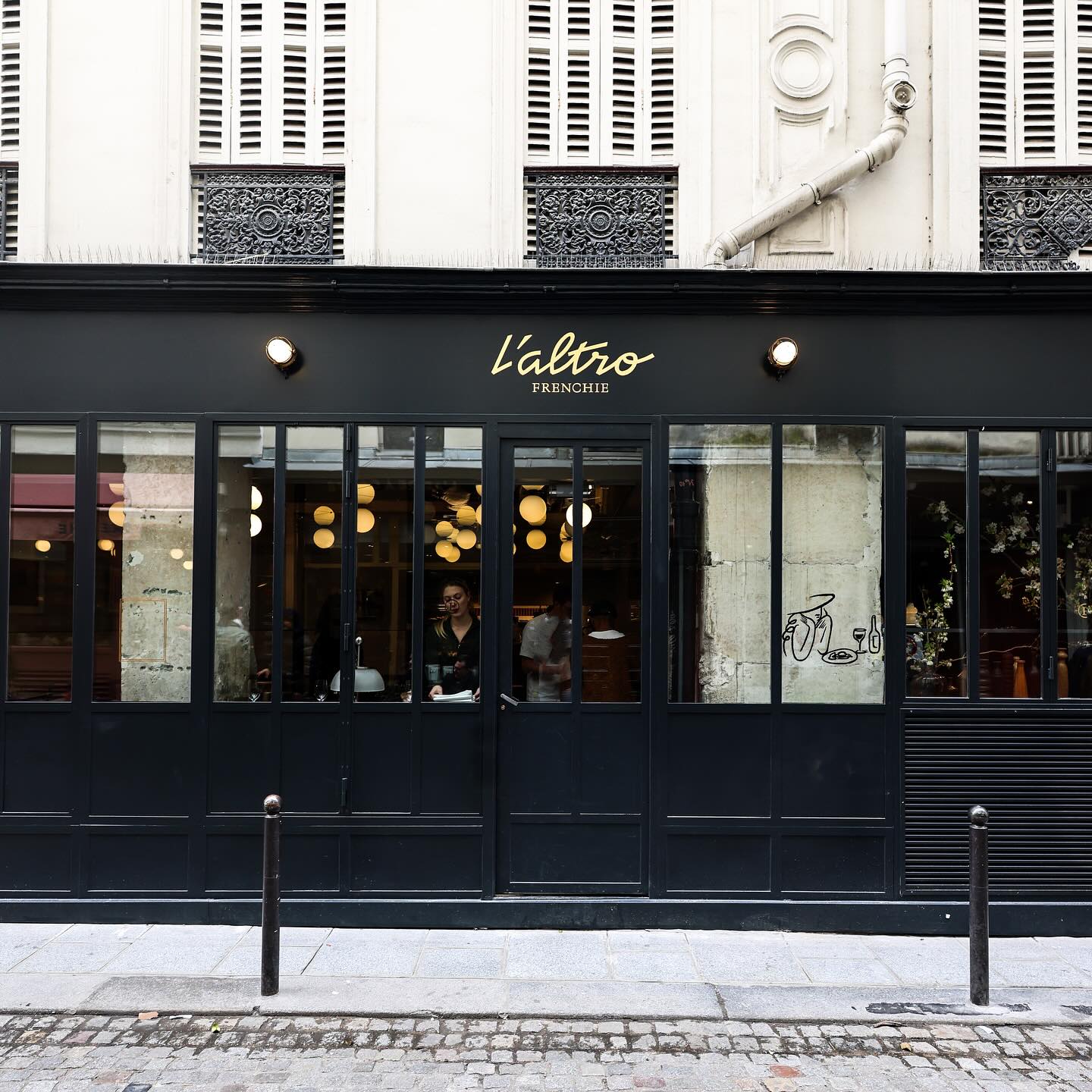
After 9 years, Abmo redesigned its own work, renewing the brand identity of this French restaurant. The typefaces used were Neuf by Eliott Grunewald, Traulha by Yoann Minet, and a custom logo by Keussel Studio.
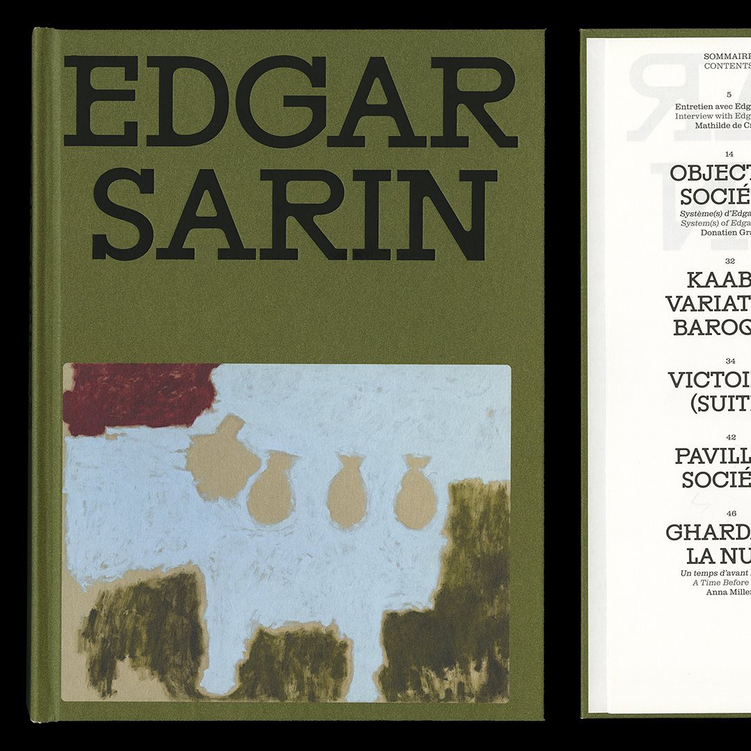
Resonanz B by Out of the Dark and Clarendon Graphic were the typefaces selected by Lisa Sturacci for the editorial design of this book about about Edgar Sarin’s work.
Apparat Bold + Buch Schmal, both from Kimera, were part of the update newkid made for Standard Equipment, a system of household objects.
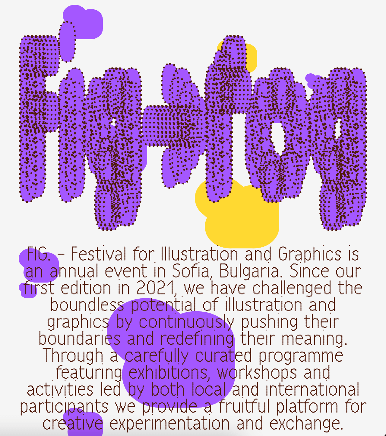
A festival that explores visual creativity to the point of blurring the lines between illustration and graphics; Miroslav Zhivkov created the identity of FIG (Festival for Illustration and Graphics) using Harber.
From Mexican cantinas and their traditional signage, Socker Studio drew inspiration to design the identity, interiors, and typography for the seafood restaurant Con Vista al Mar.
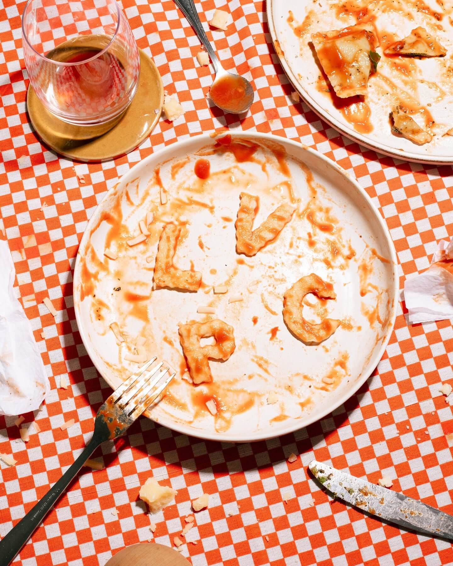
Andrés Higueros designed this custom typeface for the private dining experiences hosted by La Vera Pasta.