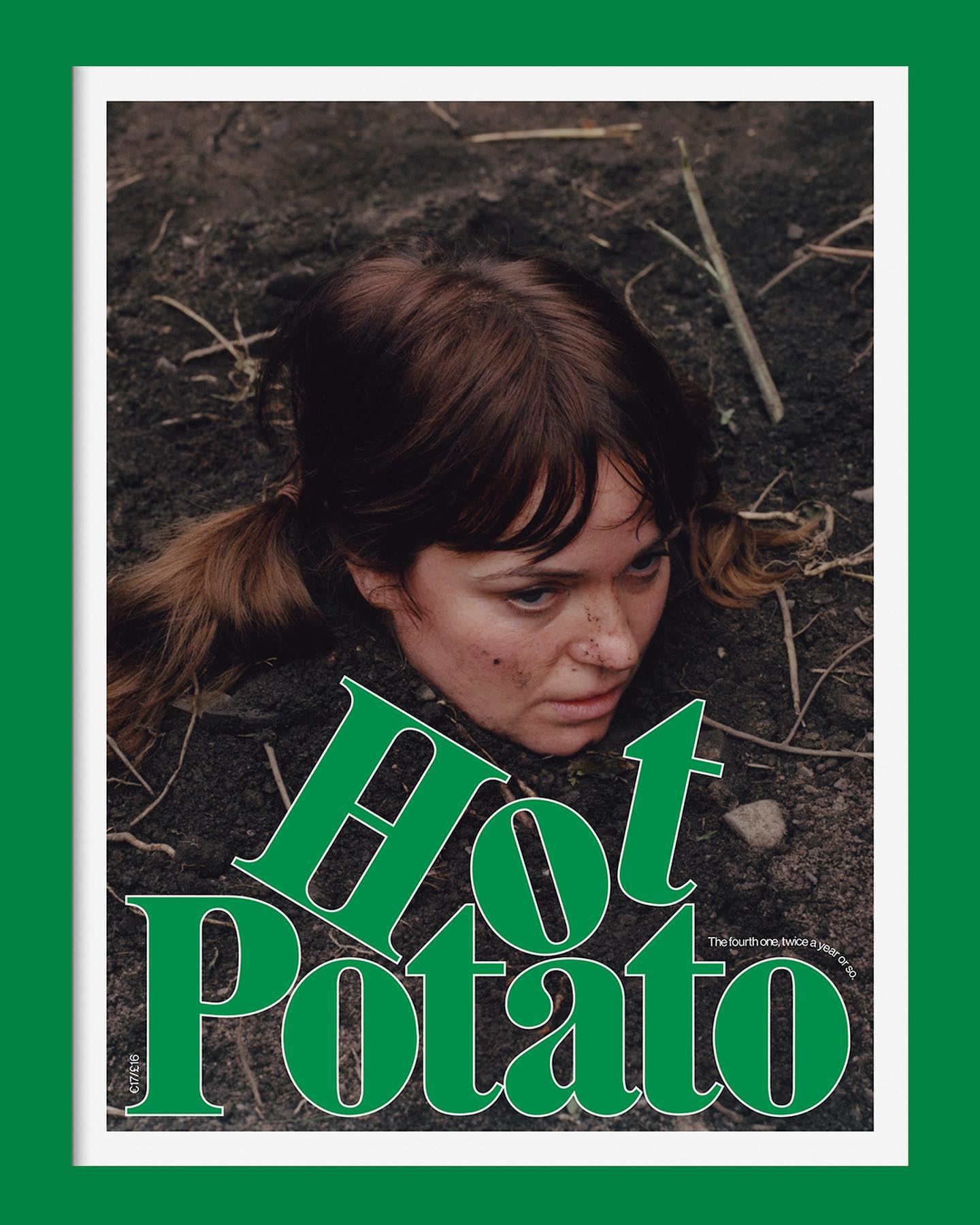
Neue Haas Grotesk is a common typeface on the blog, it works well in many scenarios, for example alongside Marfield in the fourth edition of Hot Potato magazine.
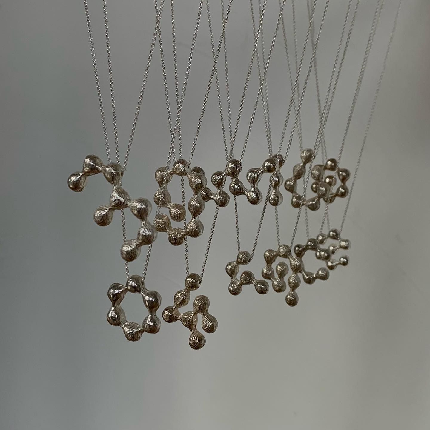
The Belgian design studio Vrints-Kolsteren collaborated with the jewelry brand Fleerackers to create ATOM, a collection of 16 different earrings.
The foundry From A+, built a wordmark, an alternate script version, and two monograms based on art deco letterforms, for the seafood Californian tavern, Bar Le Côte.
Supply stencil is the custom typeface Tric Studio inspired by streetwear, metal zines, tapes and the history of stencil, made as part of the identity system for Supply.
Handwritten sketches by Leandro Senna and The New Company made for the cultural center of gaming, 100 Thieves
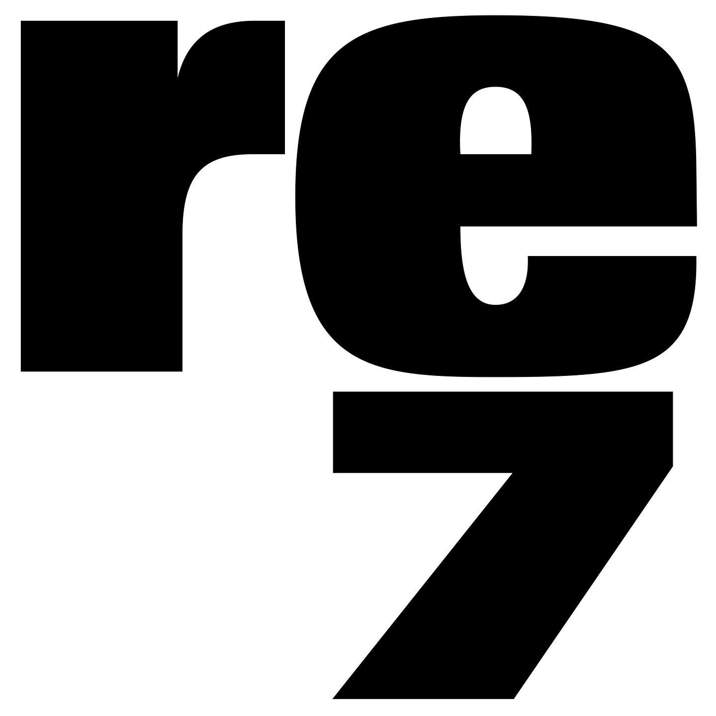
Rafael Ribas & Zoo designers graphiques teamed up to design a heavy and solid wordmark for Respect magazine.
A expressive custom Hardwear font by Supercontinente, under the creative direction of Gretel NYC, for the branding of Mountain Hardwear.
Experimentation and creativity in this unselected proposal for JoJo logotype, a London-based design practice.
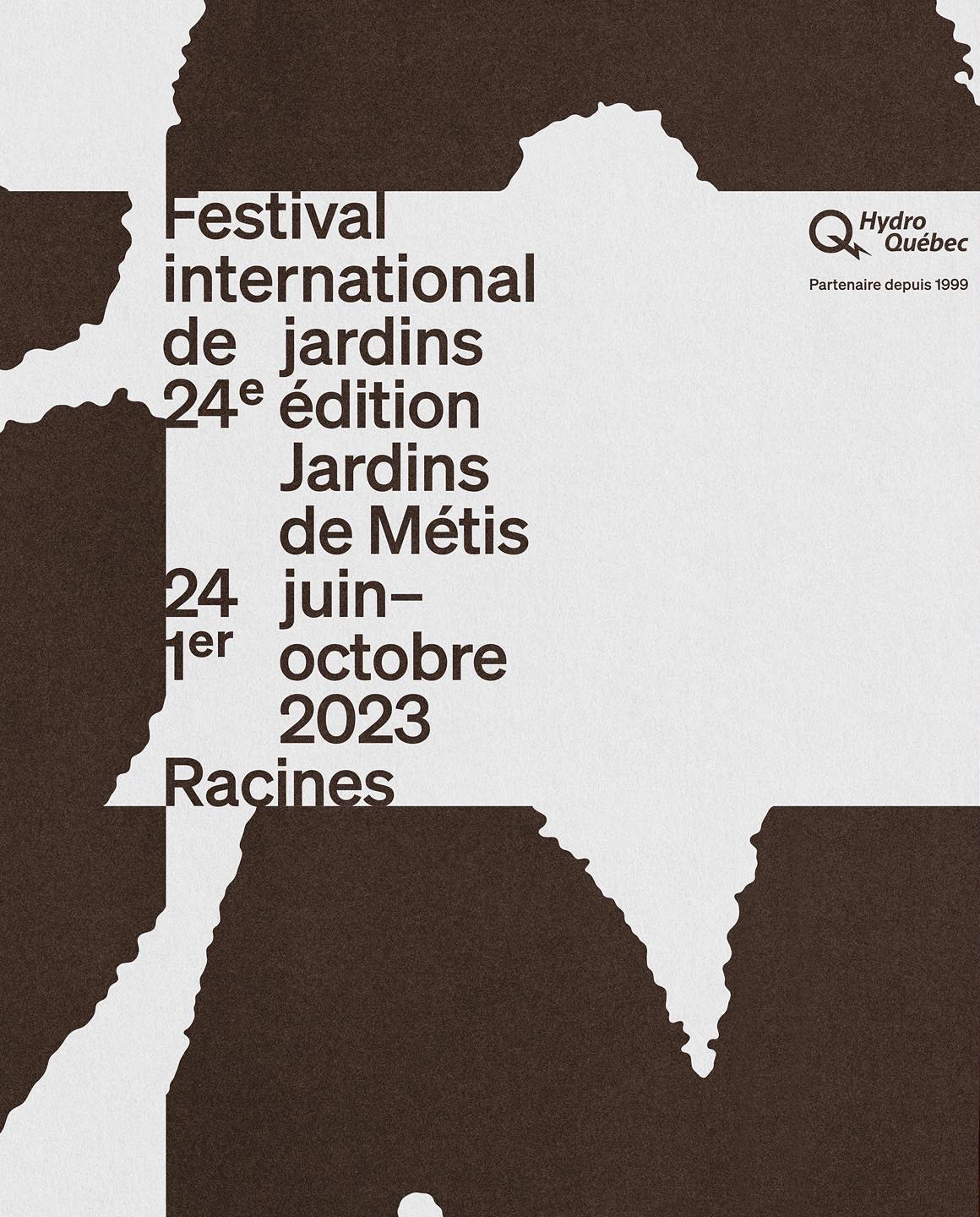
Contrasting an organic-shaped logo within a structured layout, Principal Studio was responsible for creating the 7th campaign for The International Garden Festival.
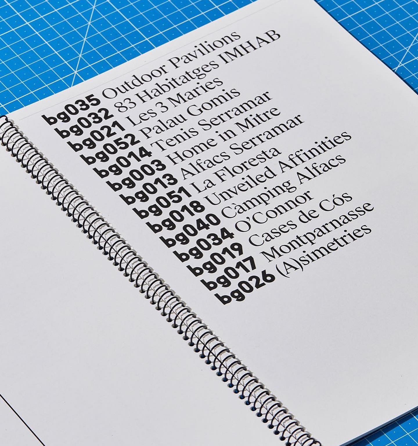
Leon Romero using Alias Ano by Alias and Suisse Works by Swiss Typefaces in the identity created for the Architecture office Bajet Giramé.