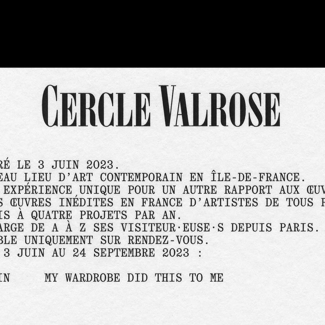
OTT Harker by Ornamental & Title Type is used in the logo for Cercle Valrose. The design is by Bizzarri-Rodriguez, who also created the typeface. Quadrant by Matter of Sorts is used for the supporting text.
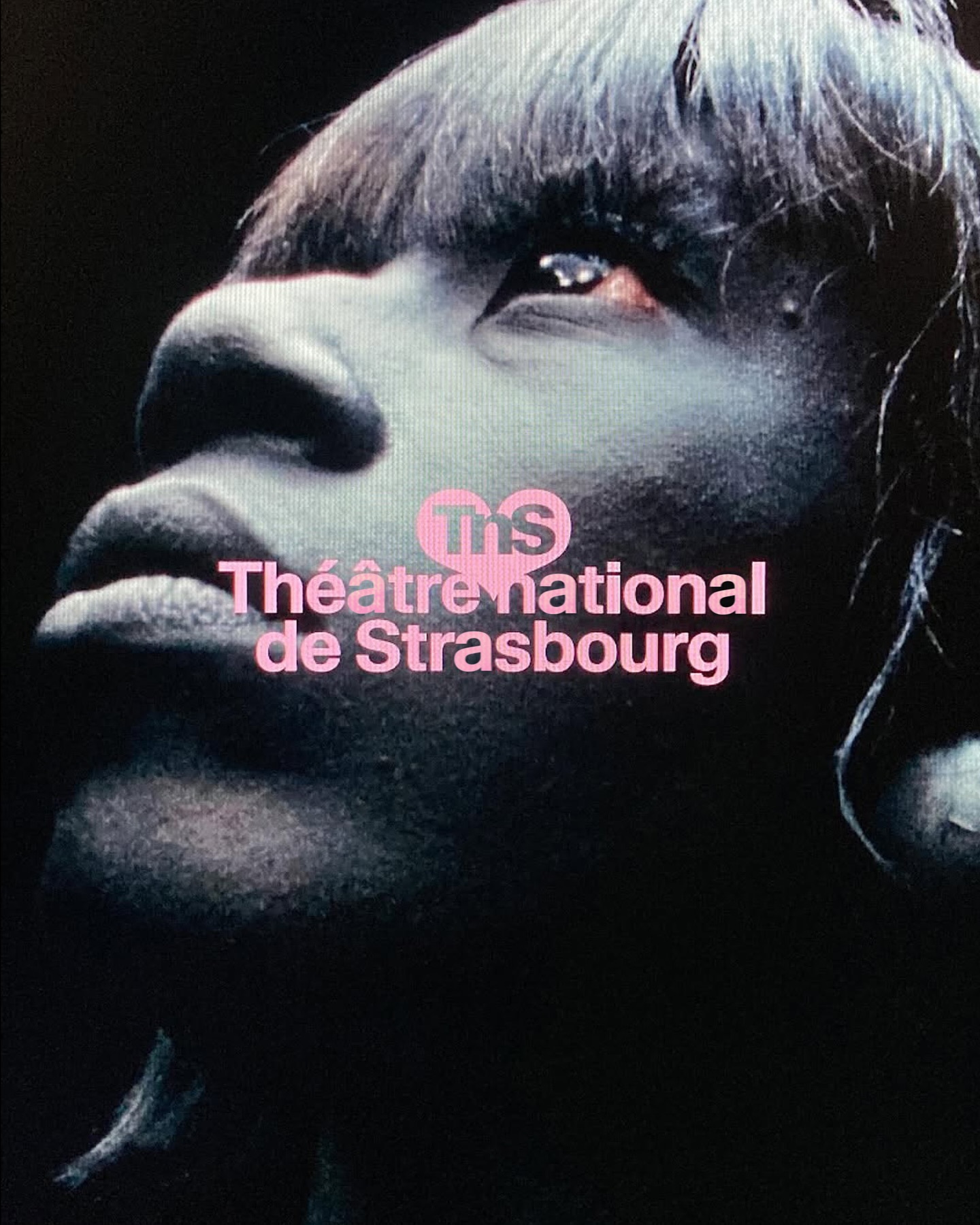
Different versions of the Waldenburg typeface by Kimera for the new identity of the Théâtre National de Strasbourg.
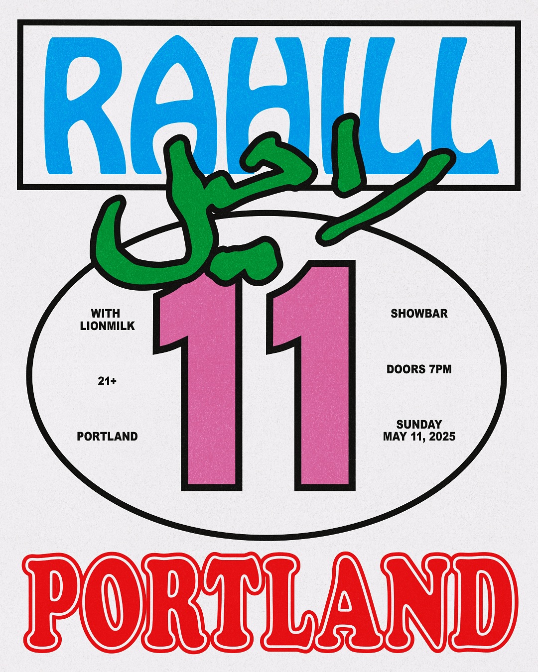
Flyer explorations by Bijan Herami, featuring lettering by his mother, Hobo, and a condensed version of Cooper Black, for Rahill Jamalifard’s show.
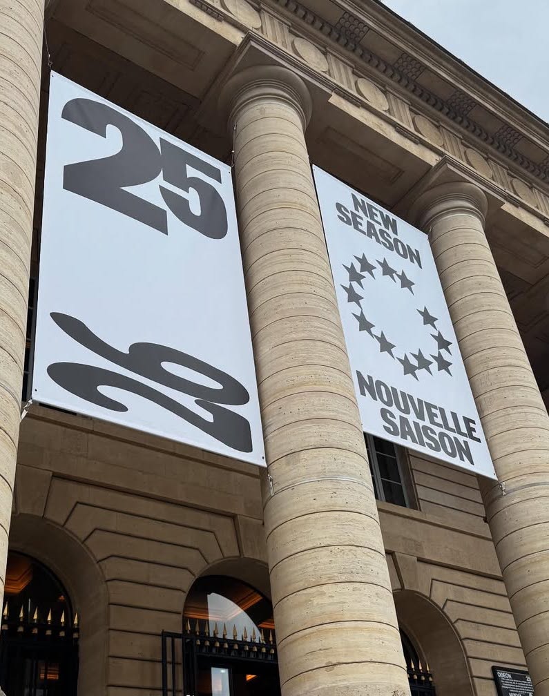
New visual identity for Théâtre de l’Odéon, designed by Atelier Choque Le Goff, featuring the large-scale Insitu typeface by Formagari.
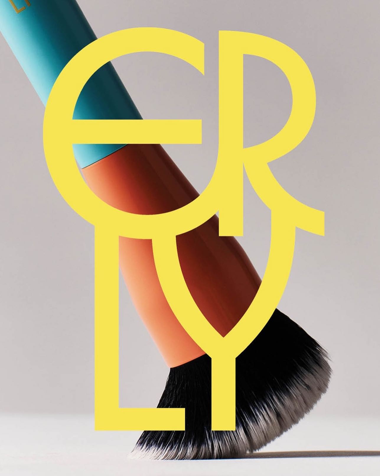
ERLY reinvents skincare with a fresh, typographic identity. Herbus Regular & Title Type, in the design by Studio Lotta Nieminen.
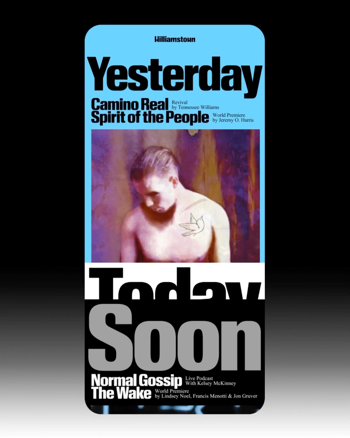
The identity that Pentagram created for the Williamstown Festival transforms the stage into a dynamic graphic system. A custom logo is complemented by Times New Roman and Review from Commercial Type.
Animo Typeface by Heavyweight shapes the identity of Grande Paolo, a pop-up sports bar in Prague for the Euro Championship.
Ottimo celebrates the tradition of olive oil with an identity designed by Somekind Studio, the brand takes shape with Edition by Elias Hanzer, a monolinear typeface that brings a timeless feel.
Designed by Copyright/Reserved, this special publication by @extensive.publishing and @greedydust features Cortese and Cortese Sans by Mark van Leeuwen.
The redesign of ArkDes in Stockholm by AM Stockholm features custom typefaces where dots and dashes create a unique typographic system. Alongside Diatype, these fonts redefine the museum’s identity.