Tetier, the jewelry brand using recycled materials that recently collaborated with Asics, features Octave by Faire Type in its logo and texts.
With dots inviting the creation of interconnected forms, the design by Atelier Tout va bien features Baste in The MV Festival 2024.
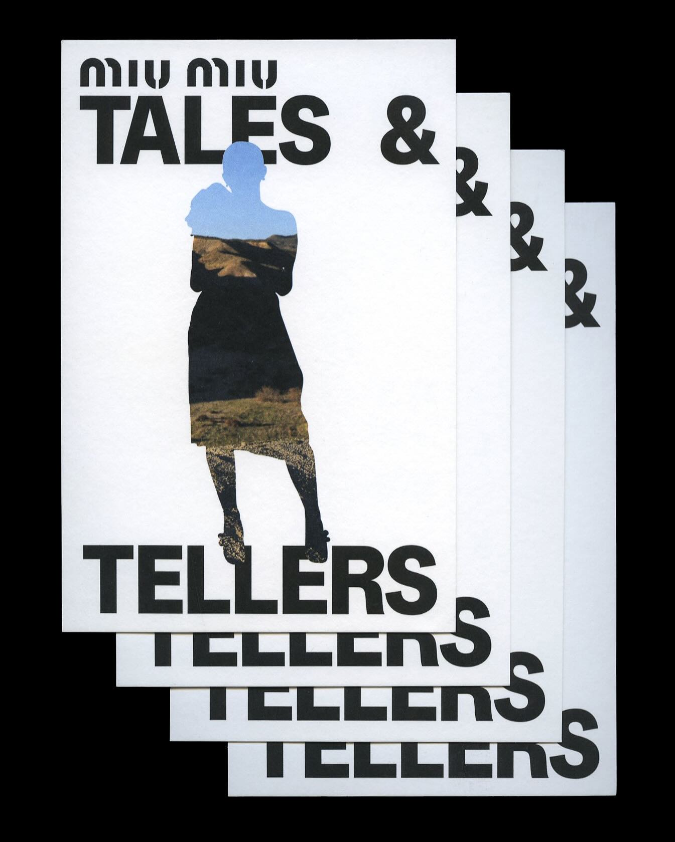
Kern typeface is featured in Tales & Tellers, a Miu Miu campaign that revisits various representations of femininity from past runway shows and short films.
AG Grafik created a brand identity for a poetry festival, blending experimental layouts with the classic elegance of Timezone.
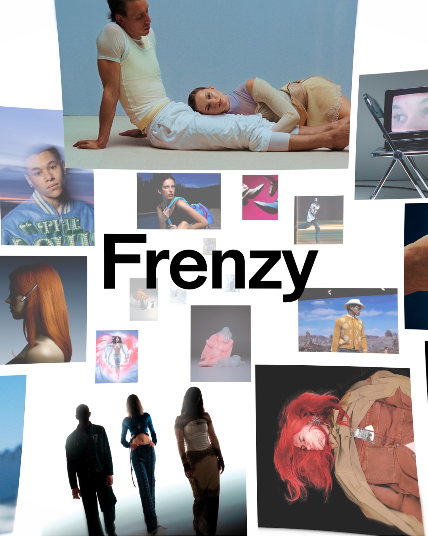
After more than a decade, the production company Frenzy has refreshed its image to show that its bold and contemporary vision remains as relevant as ever. Featuring Modale Antique by Formagari.
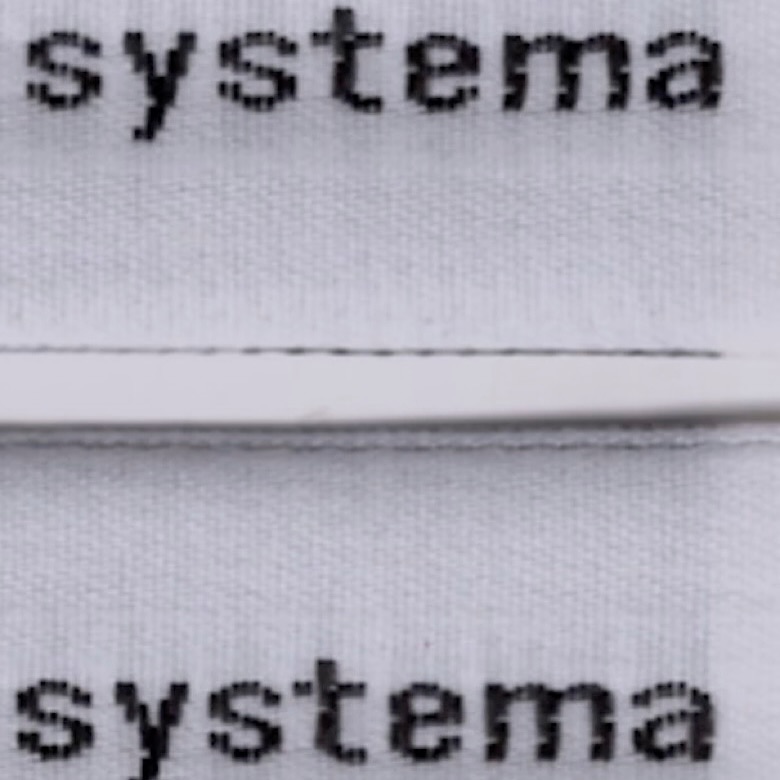
The French studio Plus Mûrs used Diatype Mono by Dinamo for the logo of the sophisticated sports brand, Counter Systema.
Horst Arts & Music 2024 debuts with a visual identity that connects disciplines, emotions, and practices through a network of symbols, featuring Oracle by Dinamo.
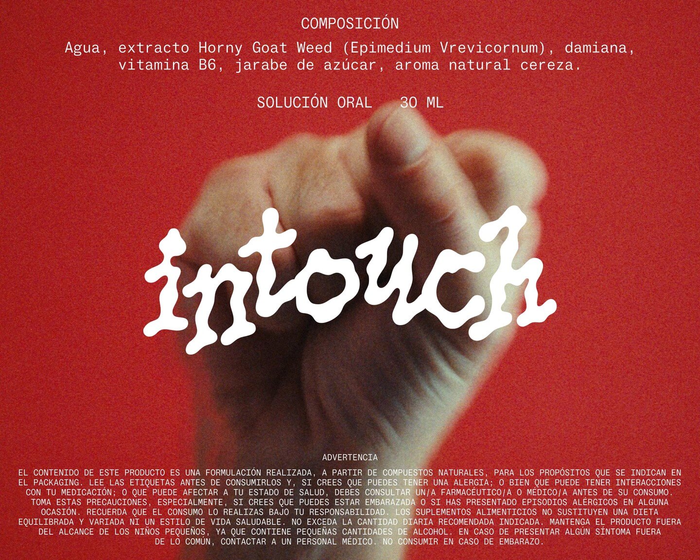
Technology has made our lives easier, but it seems everything comes at a price. INVOLUT introduces a range of supplements to combat the negative side effects of modern times. Featuring PicNic by Velvetyne.
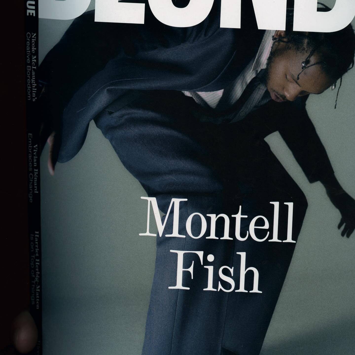
The type selection for Blonde Magazine’s redesign, managed by Hei Agenda, includes Contrast Foundry on the logo, Counter Forms for the serif (Eyla), and sans fonts by Lucas Liccini & Elias Hanzer (HAL Four Grotesk)