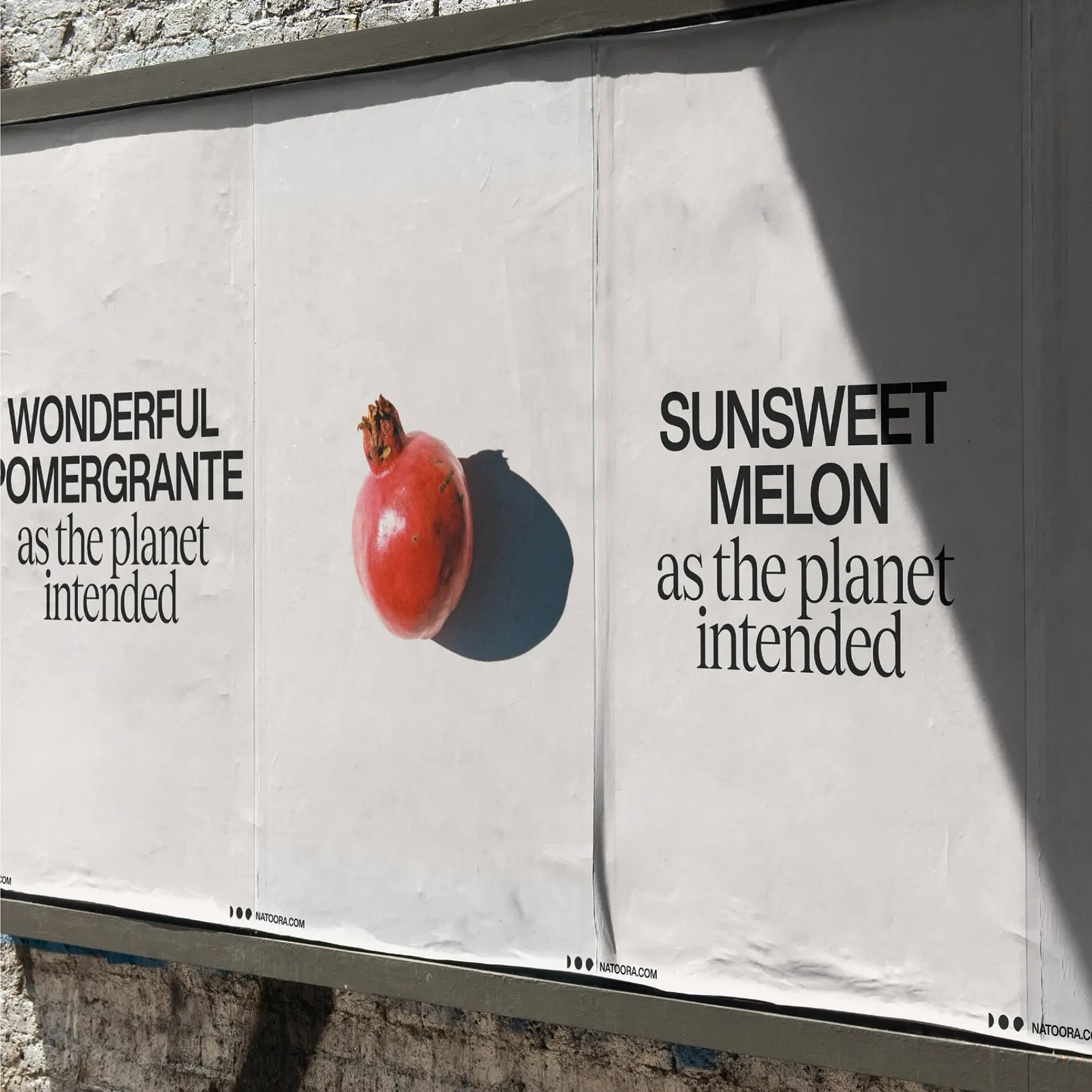
As authentic as nature can be, Justified Studio chose these two typefaces to be part of a sober yet sophisticated identity for the organic food producer Natoora.
Asfalt will have its first edition featuring an identity filled with color blocks, sports images, a vertical logo using a customized version of Generation Mono, and texts using ABC Diatype.
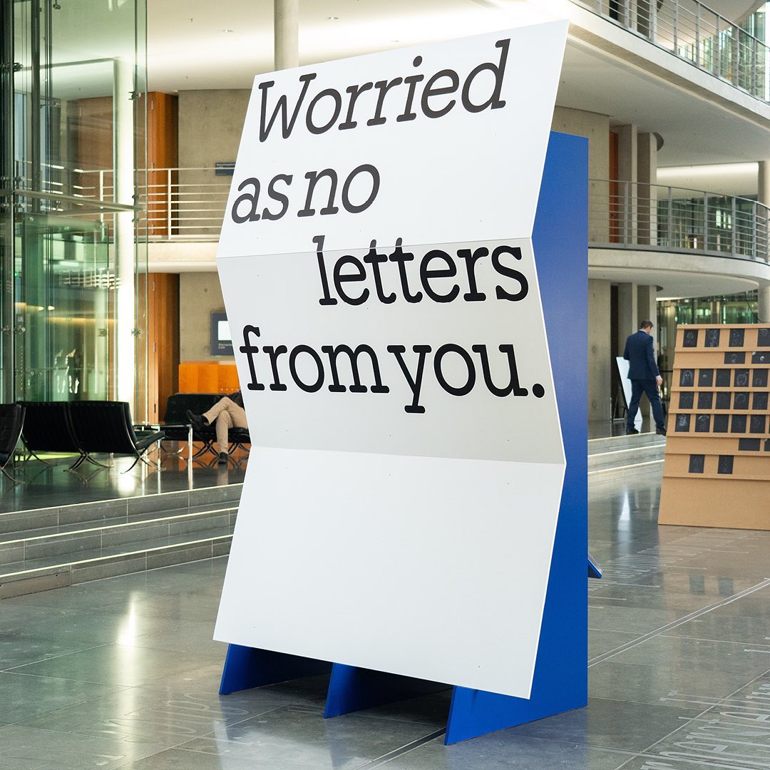
I said, ‘Auf Wiedersehen’ (I said ‘Goodbye’) displays the letters exchanged by five families separated during World War II, hoping to reunite one day. The texts are set in Repost, with supplementary texts in HAL Four Grotesk.
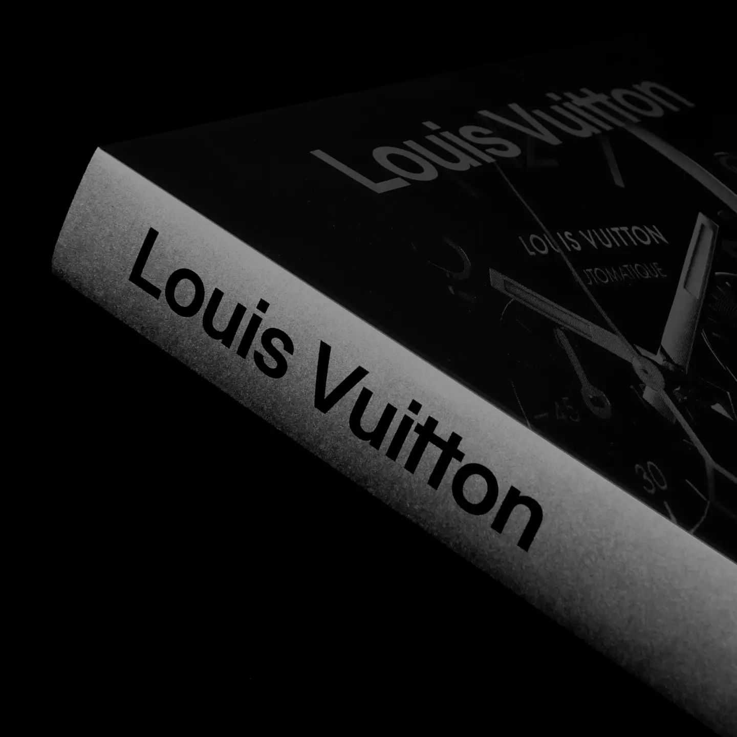
Maximage designed this book with great attention to detail. A custom version of Selecta developed by Maxitype.
An identity that balances between distinctive and sober is composed of a bold uppercase logo, vibrant colors, and two specially customized typefaces; Saans from Displaay Foundry and LL Ruder Plakat from Lineto. Designed by Porto Rocha.
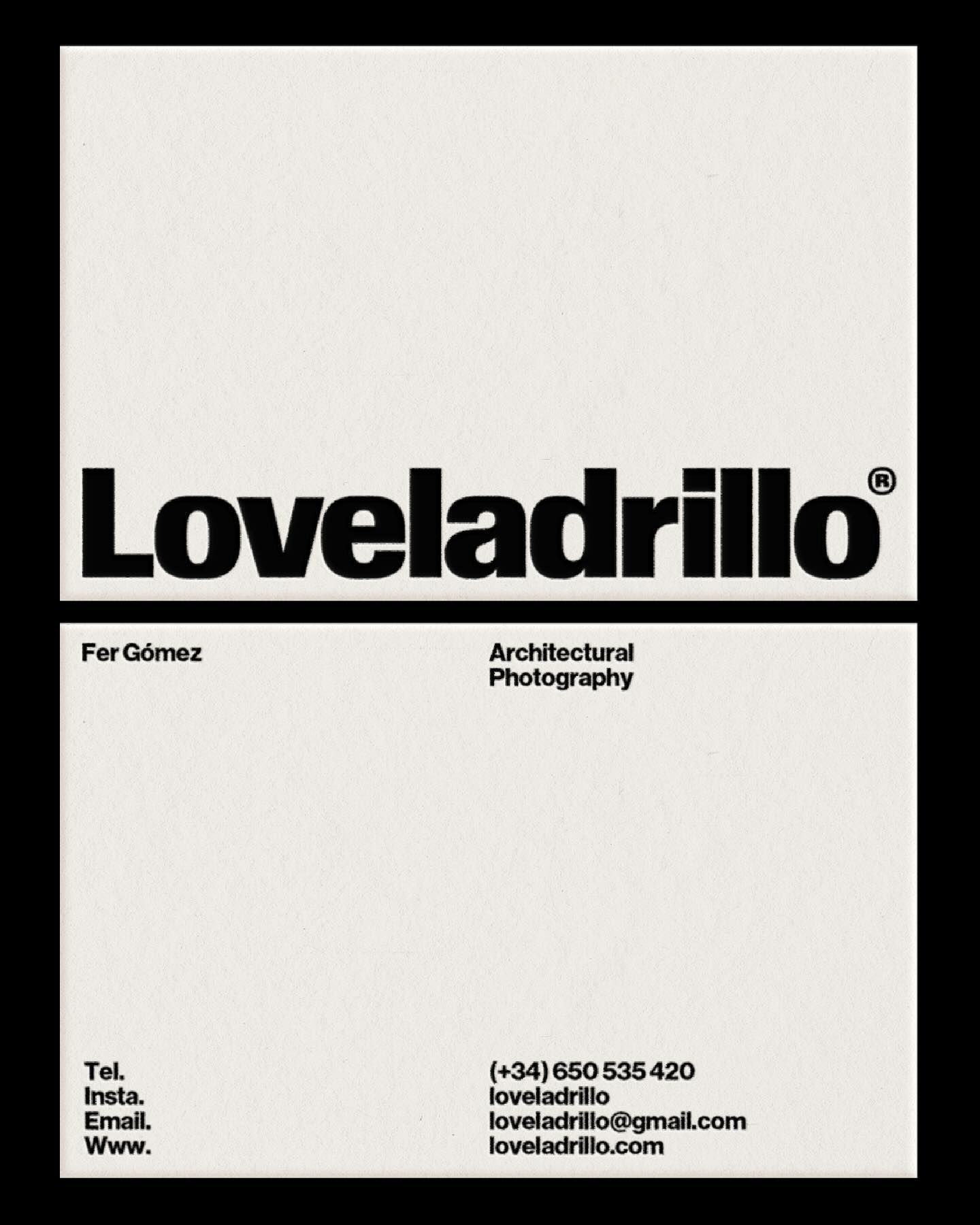
República Studio used Review from Commercial Type for this visual identity, aiming to communicate directly and consistently, while leaving the spotlight to the displayed photographs.
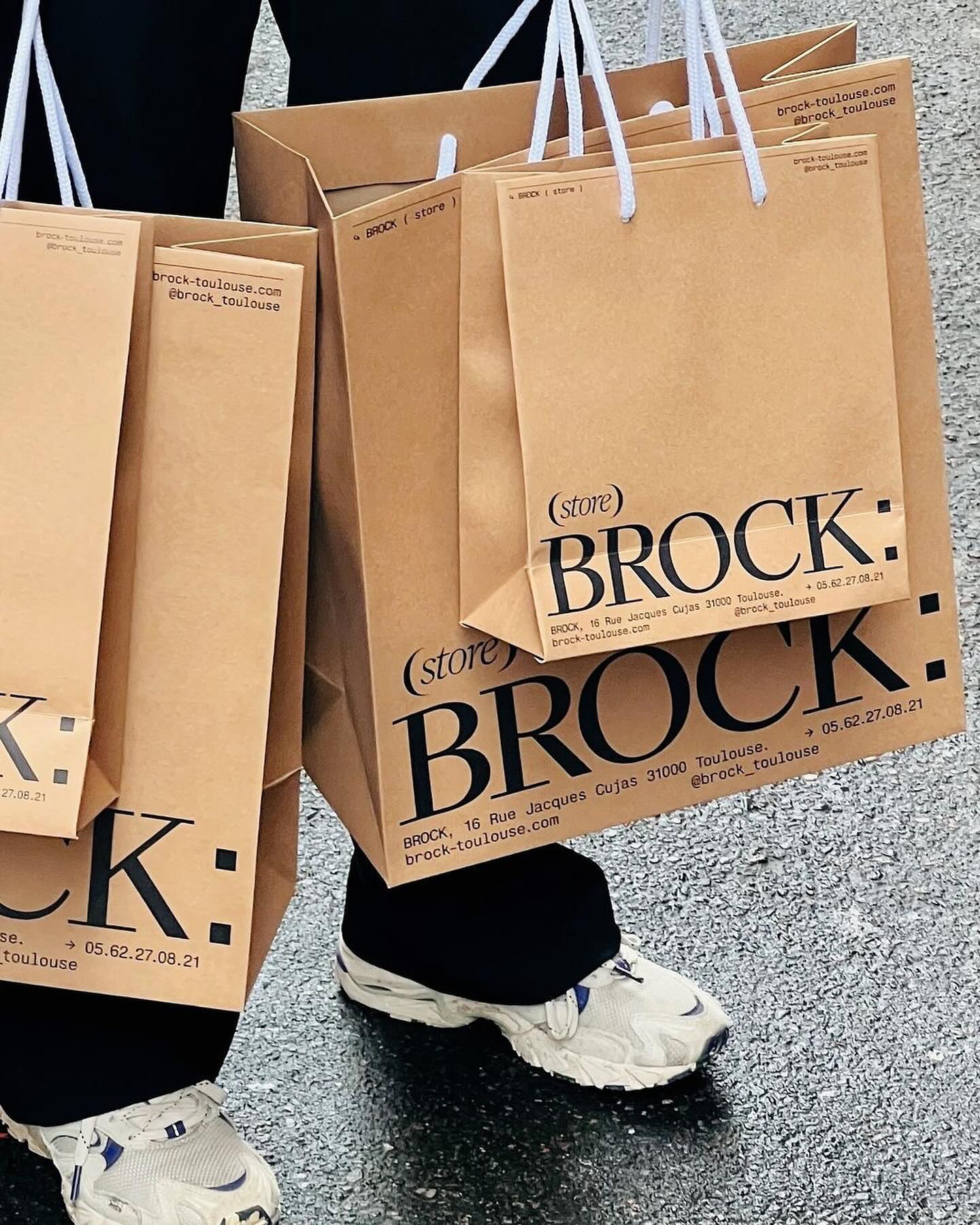
Quatrième Étage revamped the visual identity of the iconic Brock store, selecting the ES Face typeface for its logo, a 19th-century inspired serif with contemporary finishes.
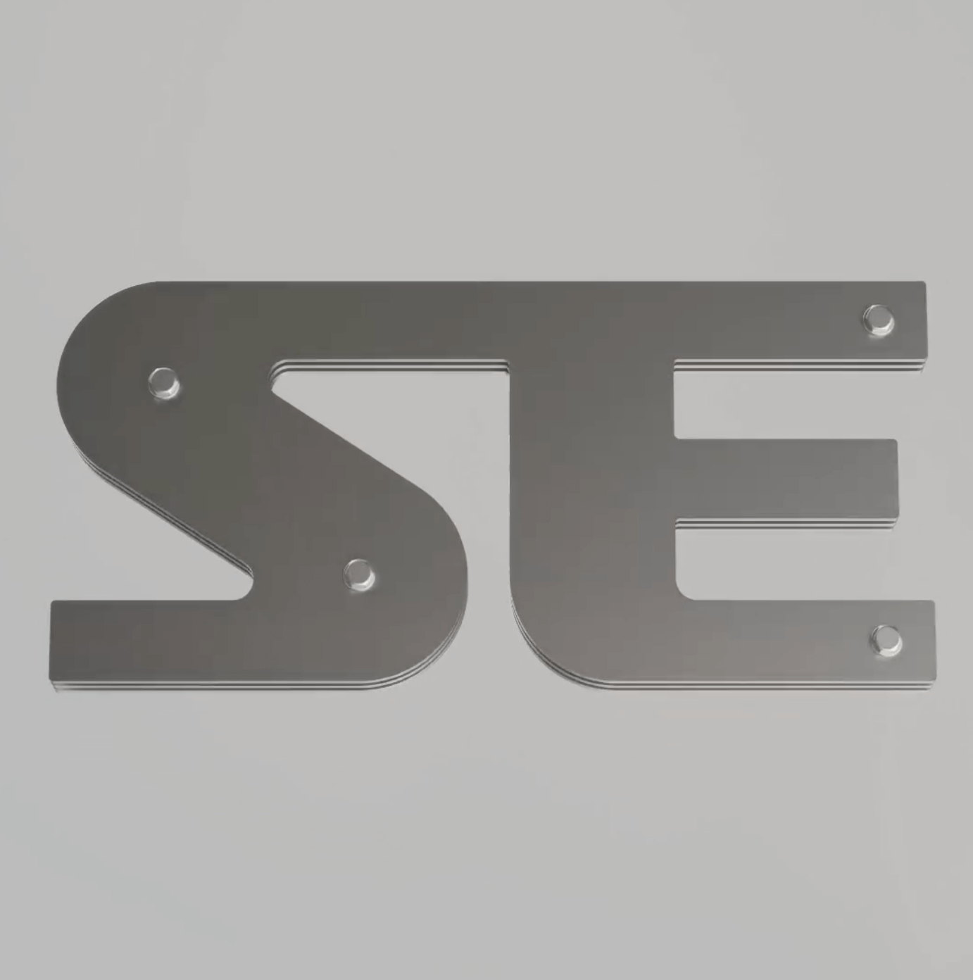
Apparat Bold + Buch Schmal, both from Kimera, were part of the update newkid made for Standard Equipment, a system of household objects.
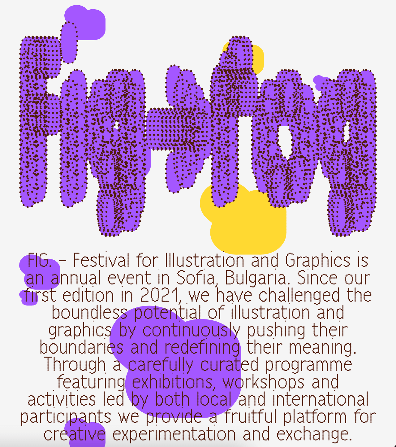
A festival that explores visual creativity to the point of blurring the lines between illustration and graphics; Miroslav Zhivkov created the identity of FIG (Festival for Illustration and Graphics) using Harber.
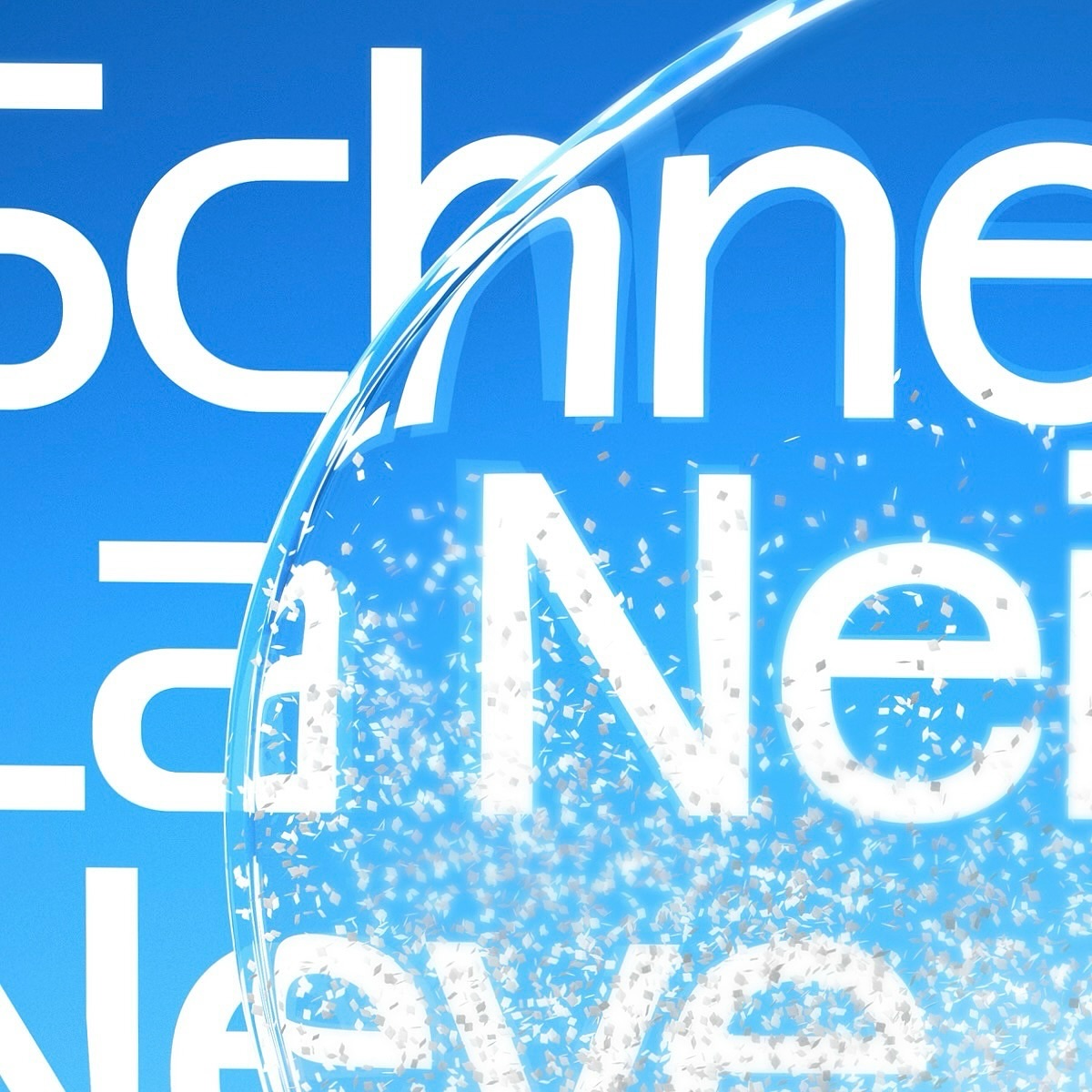
Maison Standard used Azeret from Displaay Typefaces for the identity of this exhibition at the National Library of Switzerland, which explains the impact of snow on our society.