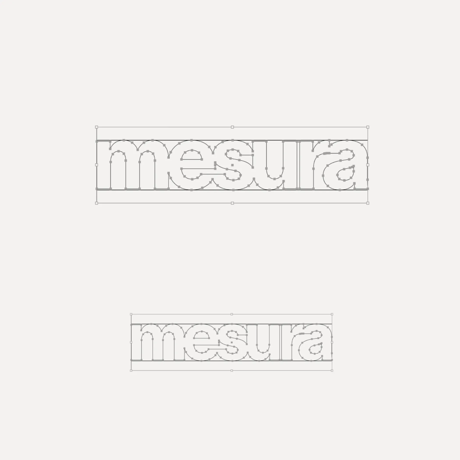
Flexibility was what Mouthwash studio aimed for with the typographic selection they made for the Messura . Kimera’s Waldenburg and Times LT were chosen to give solidity to the brand and possibilities to evolve.
Waldenburg from Kimera Corp was customized to be part of the visual identity for a new line of assistance for people with opioid addiction issues. Designed by Raw Materials and Service Plan
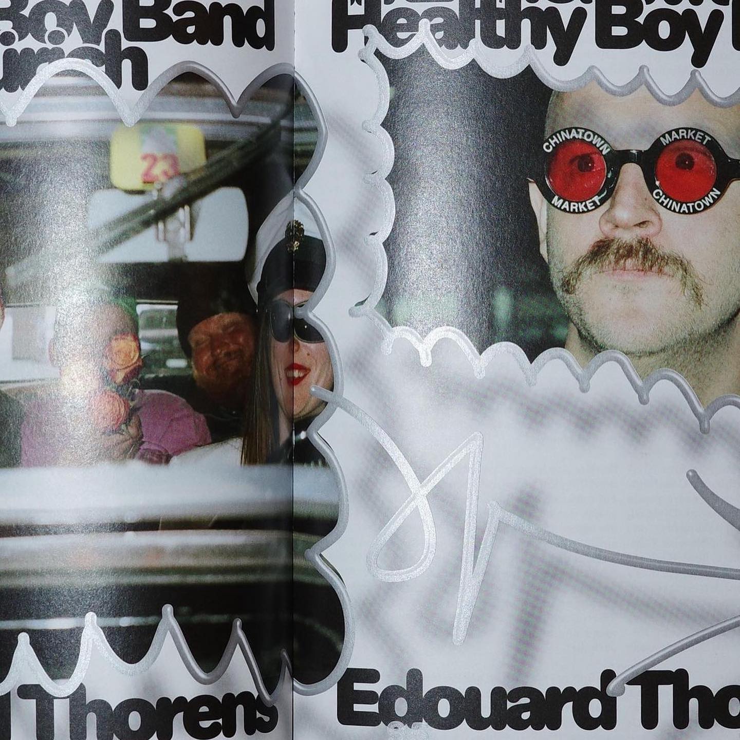
Diatype Rounded from ABC Dinamo is used in Healthy Boy Band, a cultural magazine that is a tribute to graphic design
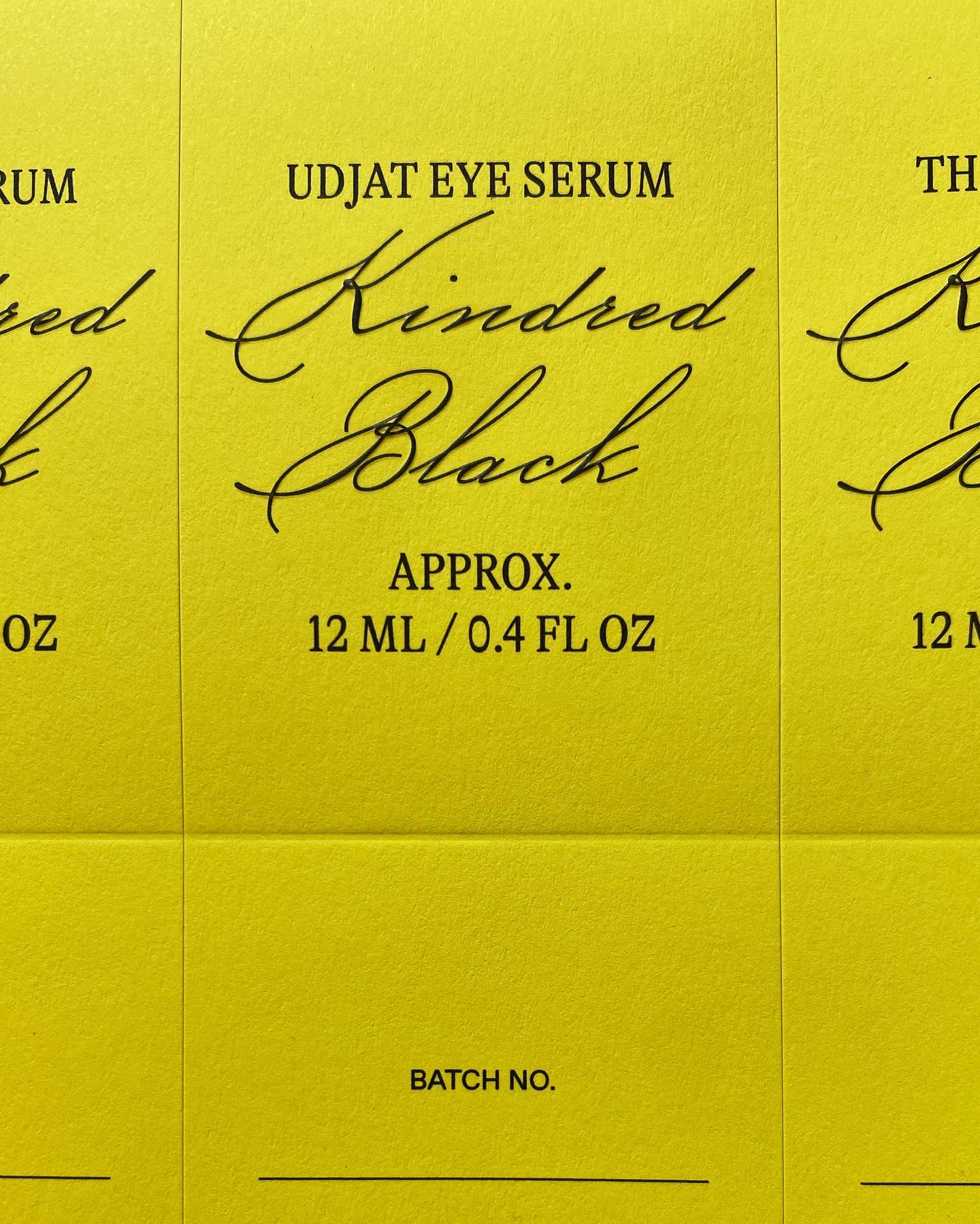
GT Alpina and Monument Grotesk are part of this packaging system that the creative studio Ania et Lucie devised for the glass bottle brand Kindred Black
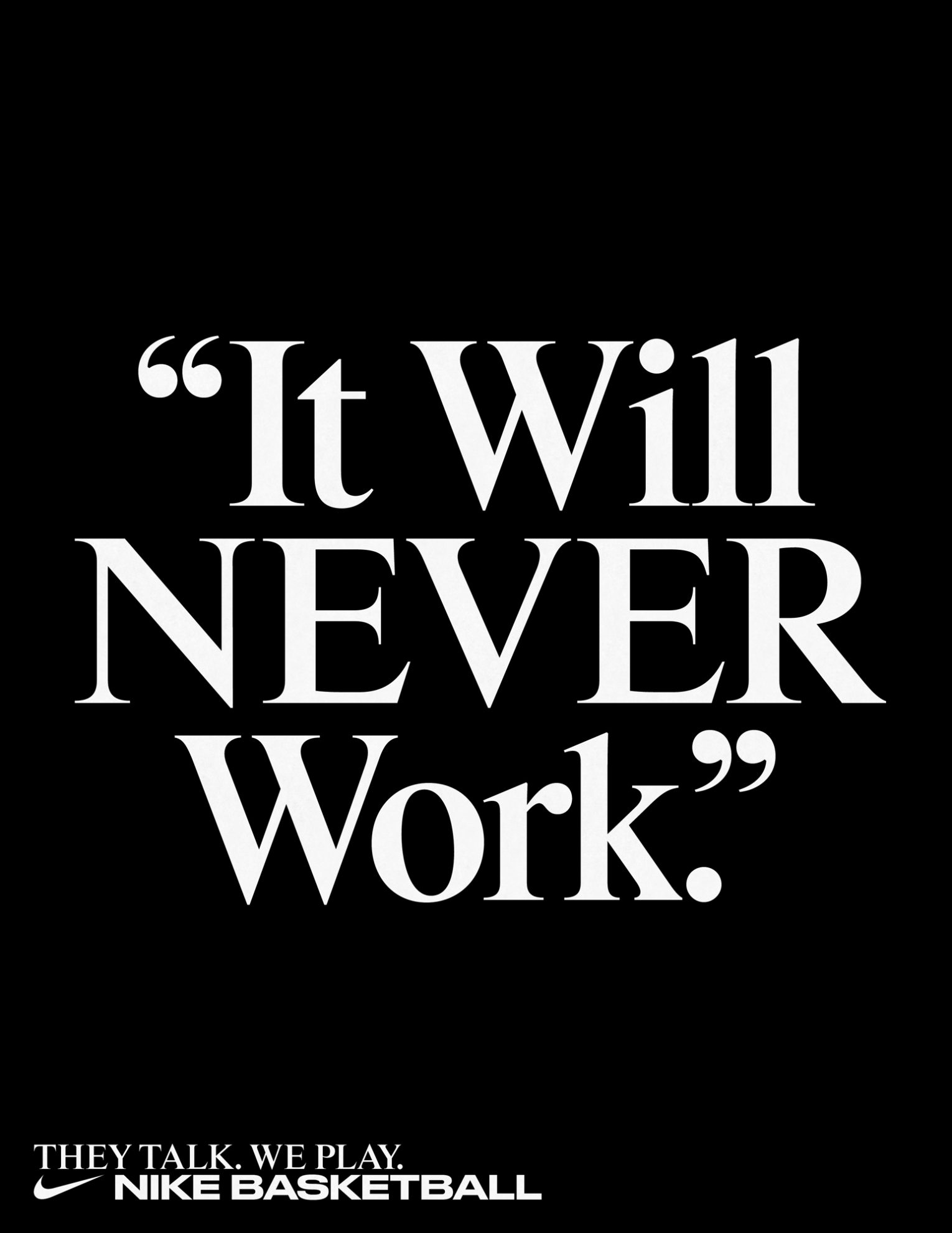
Rhymes by Maxitype in the 2017 campaign for the NBA Finals “They Talk We Play”. Design by Hort and Tim+Tim.
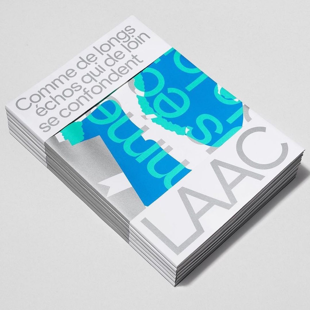
Studio Hudson Catty and Atelier Baudelaire used ES Klarheit Kurrent to design a set of three books celebrating the 40th anniversary of LAAC in Dunkirk.
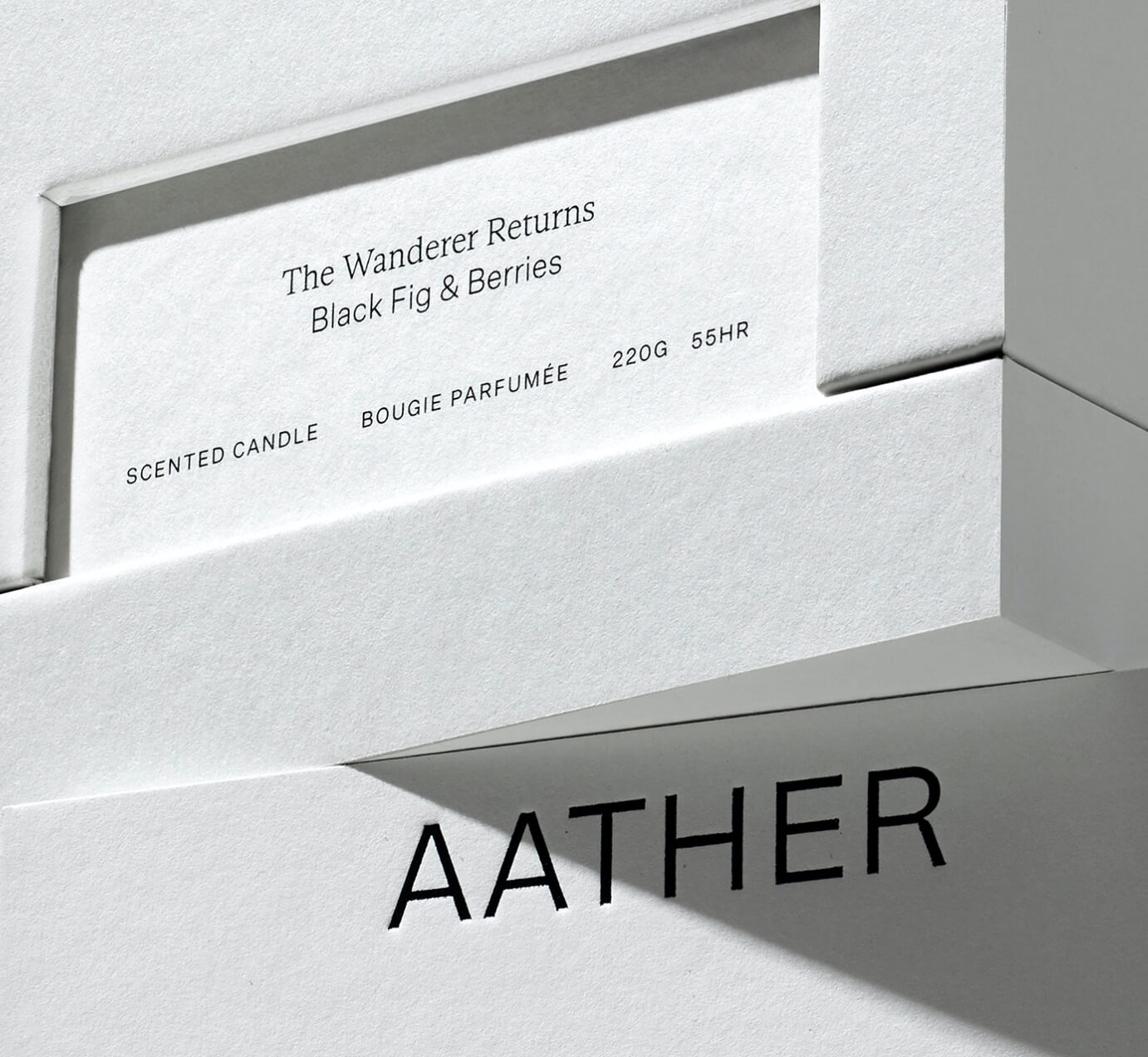
SOCIO Design used Untitled Sans from Klim Type Foundry and Gestura from Socio Type Foundry to complement the visual identity of AATHER’s high-quality candles.
Editorial New, ITC Franklin Gothic, and Antique No.6 were brought together by The Office of Ordinary Things to create contemporary compositions in the identity of Mad, a agriculture organization.
Studio Ard was commissioned to design 15 publications and the signage for the graduation exhibition of the RCA School of Architecture. All is typeset in Prisma Text by Lineto.
Pastiche Grotesque by Order Type Foundry was customized by Benjamin Tuttle to become the bespoke typeface for the First Choice brand, a new generation of travel lovers. Design by Ragged Edge.