Inspired by Chicago’s sign painting, the packaging of Foxtrot’s potato chips captures the essence of the iconic Maxwell Street Market hot dog.
Ottimo celebrates the tradition of olive oil with an identity designed by Somekind Studio, the brand takes shape with Edition by Elias Hanzer, a monolinear typeface that brings a timeless feel.
The redesign of ArkDes in Stockholm by AM Stockholm features custom typefaces where dots and dashes create a unique typographic system. Alongside Diatype, these fonts redefine the museum’s identity.
Tetier, the jewelry brand using recycled materials that recently collaborated with Asics, features Octave by Faire Type in its logo and texts.
AG Grafik created a brand identity for a poetry festival, blending experimental layouts with the classic elegance of Timezone.
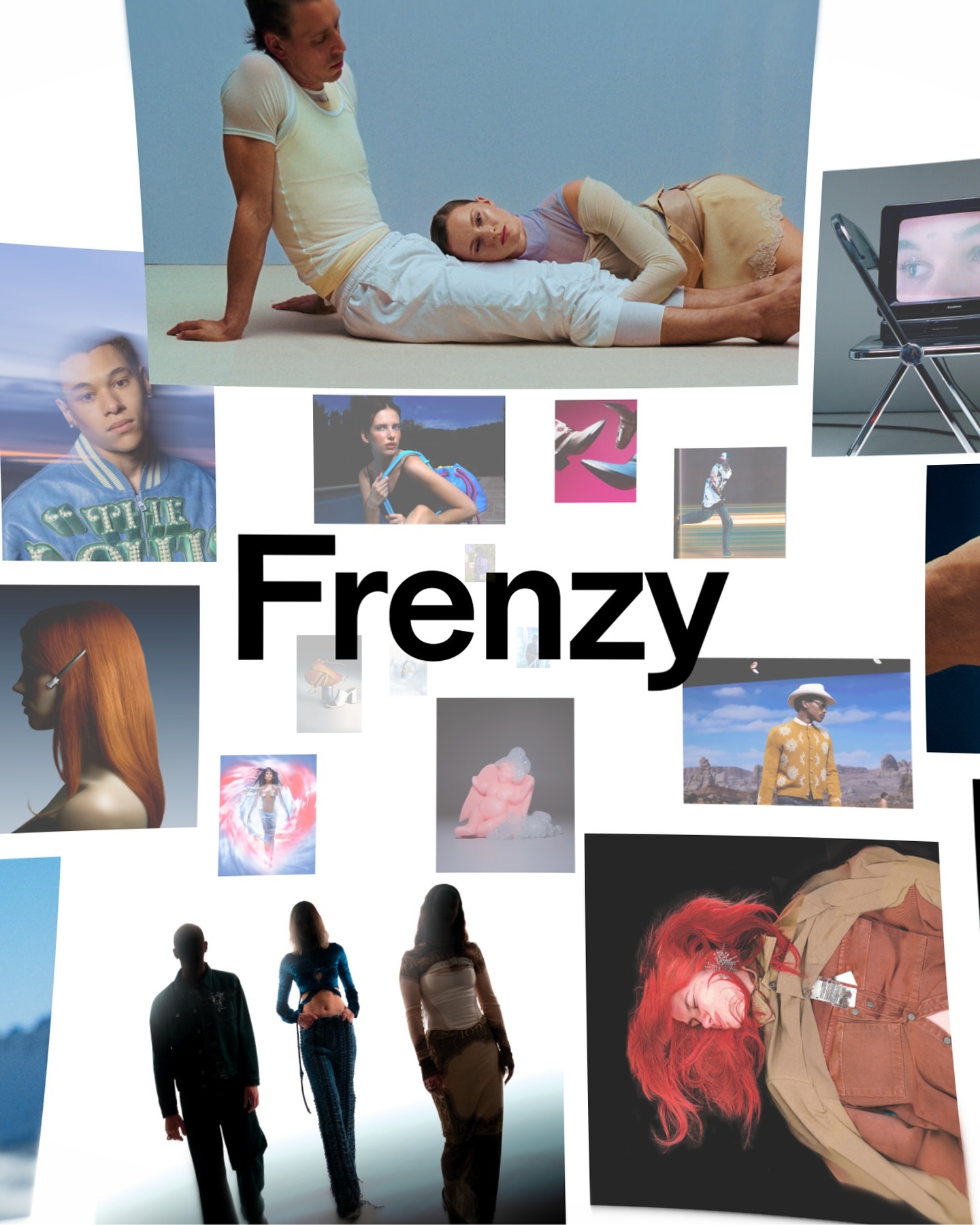
After more than a decade, the production company Frenzy has refreshed its image to show that its bold and contemporary vision remains as relevant as ever. Featuring Modale Antique by Formagari.
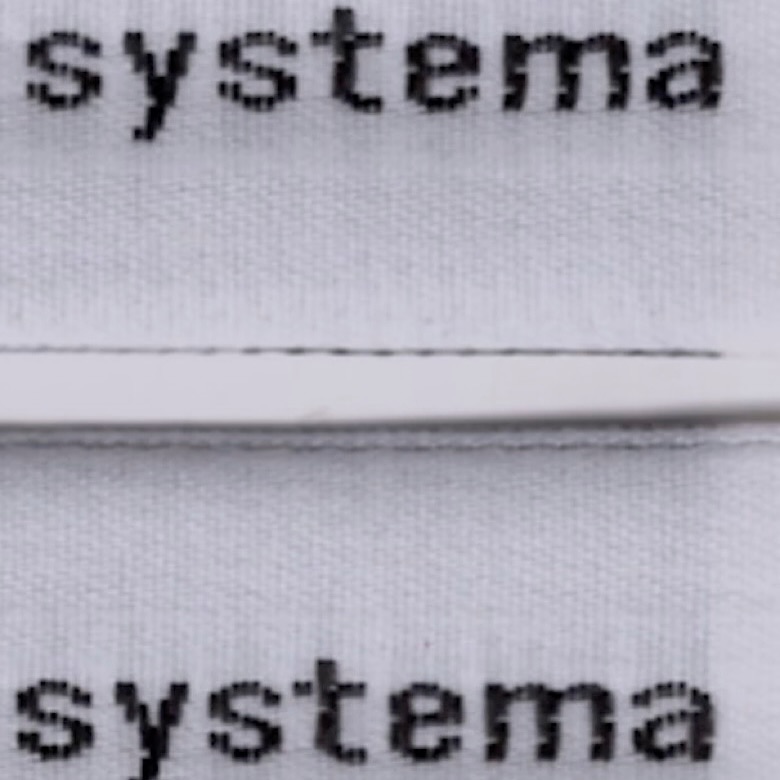
The French studio Plus Mûrs used Diatype Mono by Dinamo for the logo of the sophisticated sports brand, Counter Systema.
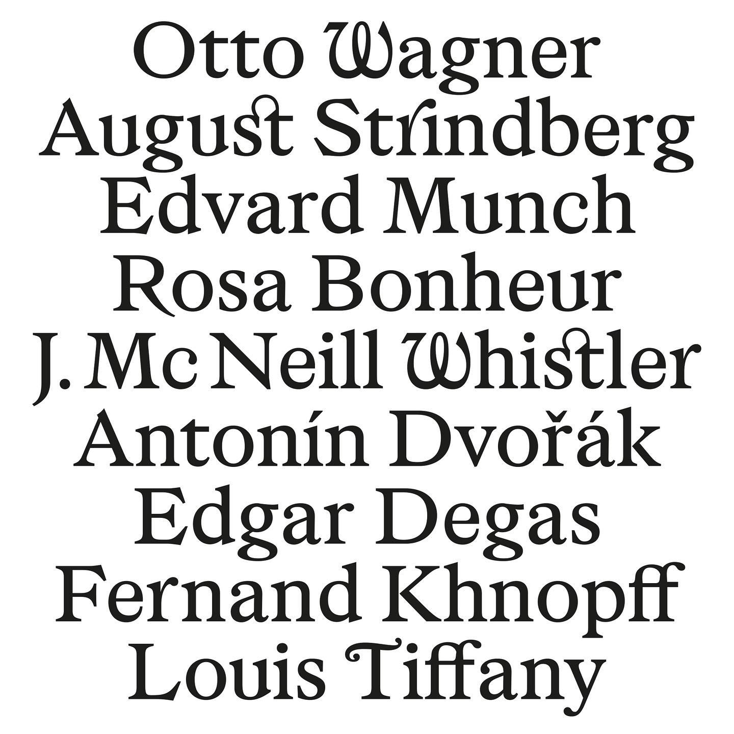
As part of Musée d’Orsay’s rebranding, Orsay Elzevir was created—a typeface inspired by La Belle Époque, reflecting the energy of the period the museum celebrates.
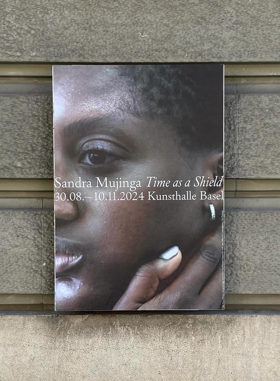
Three typefaces come together in this warm visual identity for an art exhibition in Paris: Minotaur by Production Type, Diatype by Dinamo, and Feature Deck by Commercial Type.
A typeface inspired by 16th-century characters being used in the identity of an exhibition 500 years later; Louise Verstraete used Holger for these posters.