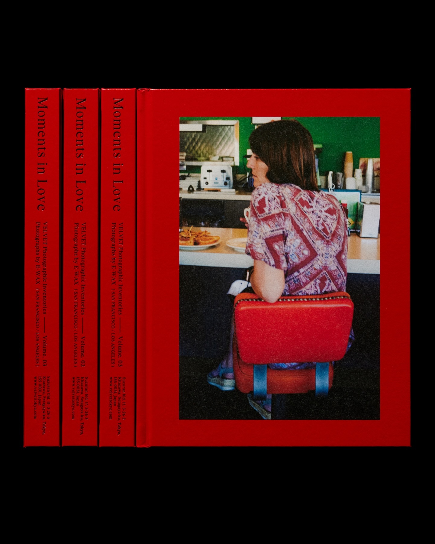
Moments in Love narrates a new way of portraying fashion, blending it with photos of passersby. Designed by the studio Siun, using FT Bureau.
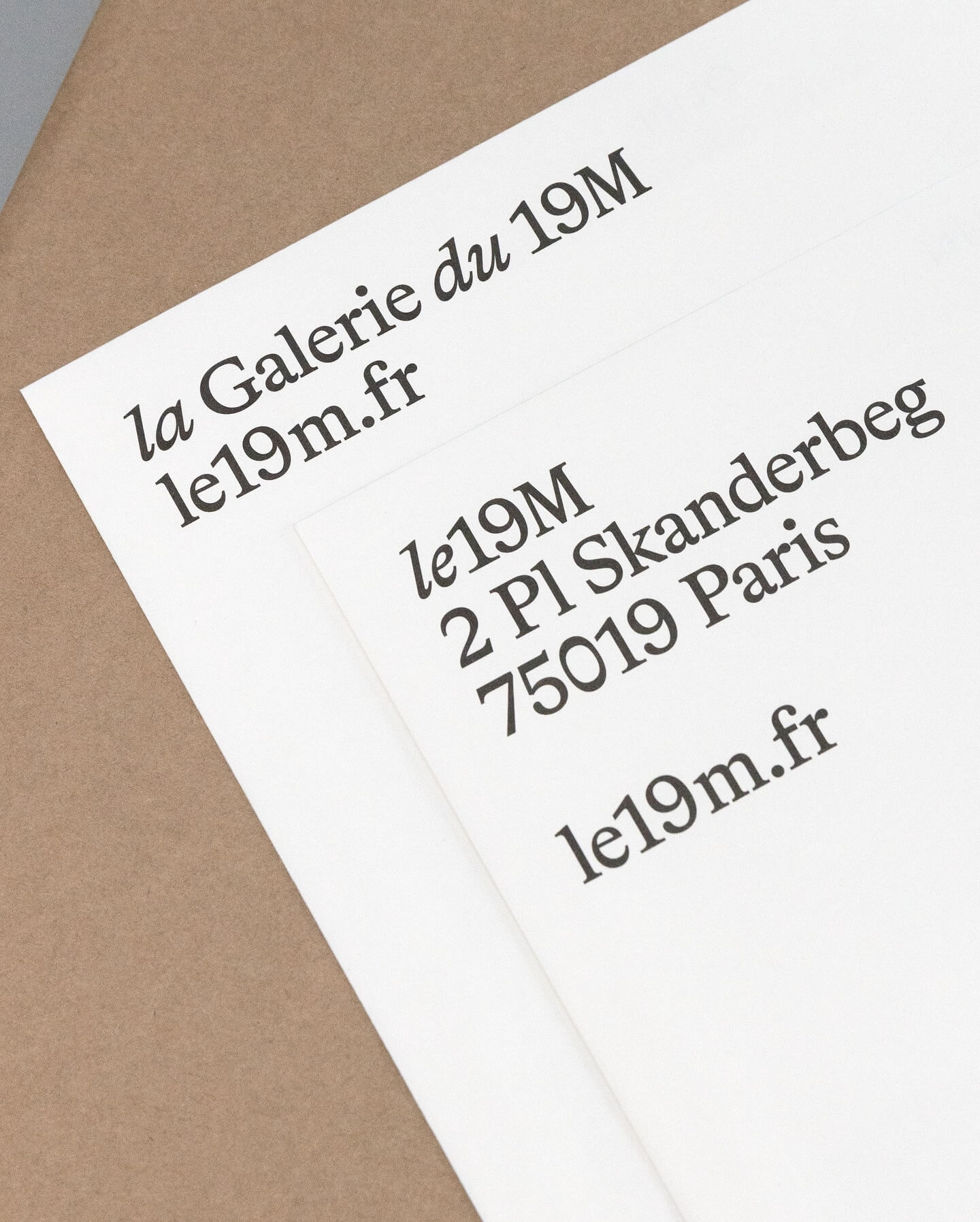
Hort Berlin used this serif typeface with classic and elegant forms (Bradford) for the visual identity they designed for the cultural center le 19M.
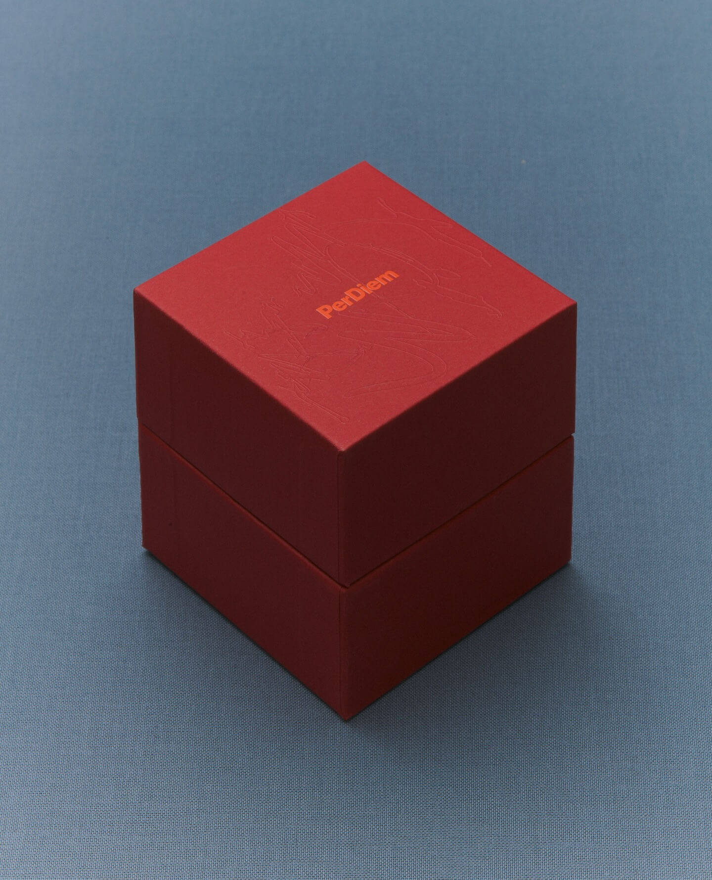
A jewelry brand that saves us from monotony and invites us to live creatively. Brand identity and art direction by Tino Nyman, featuring the typefaces Onsite, Exposure and GT Pressura.
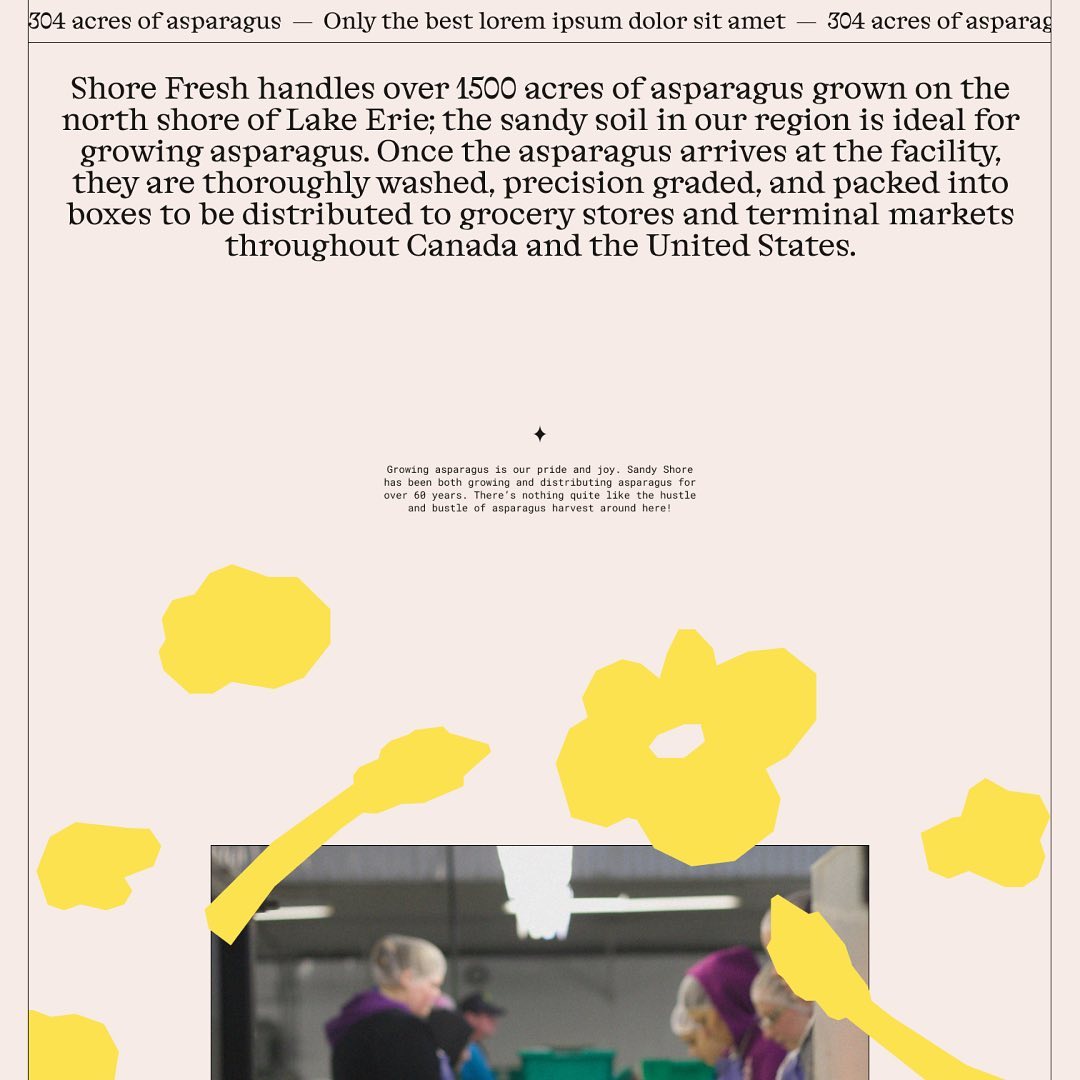
Alongside a colorful identity and illustrations, Studio Tux proposed Nordic Pavilion and Roboto Mono as the typefaces for this farm.
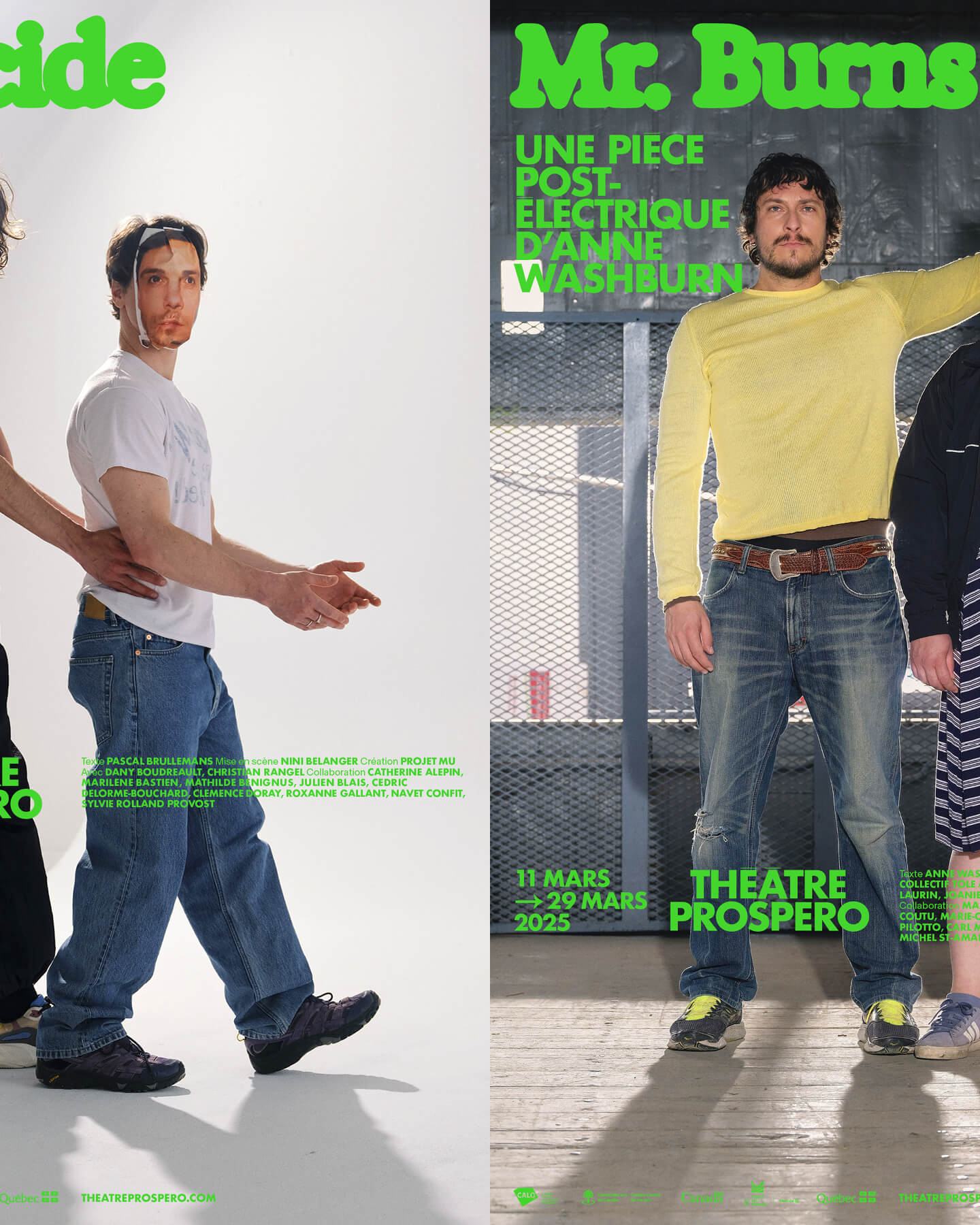
“After all, being together is revolutionary.” That was the main idea behind the 2024-2025 season campaign for Théâtre Prospero, directed and designed by Principal Estudio using Exposure.
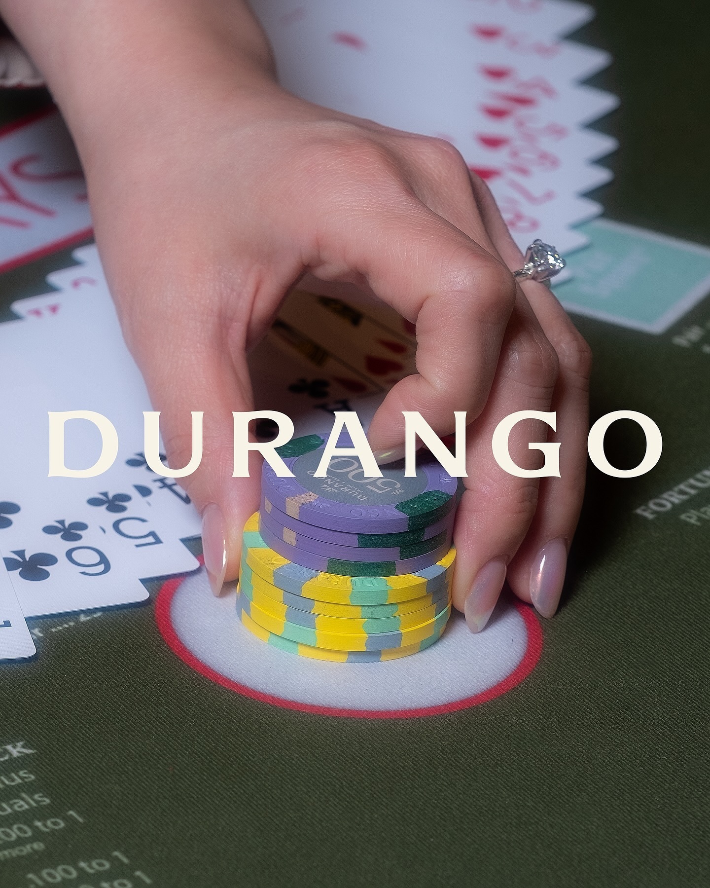
Inspired by its iconic location—Las Vegas—this hotel embraces warm, sun-faded colors, a custom sober logo with subtle serif hints, and uses National and Nib as its typefaces.
Classics with a modern twist; National 2, Atlas Grotesk, and Atlas Typewriter, were used by Play for the identity they created for Open Research.
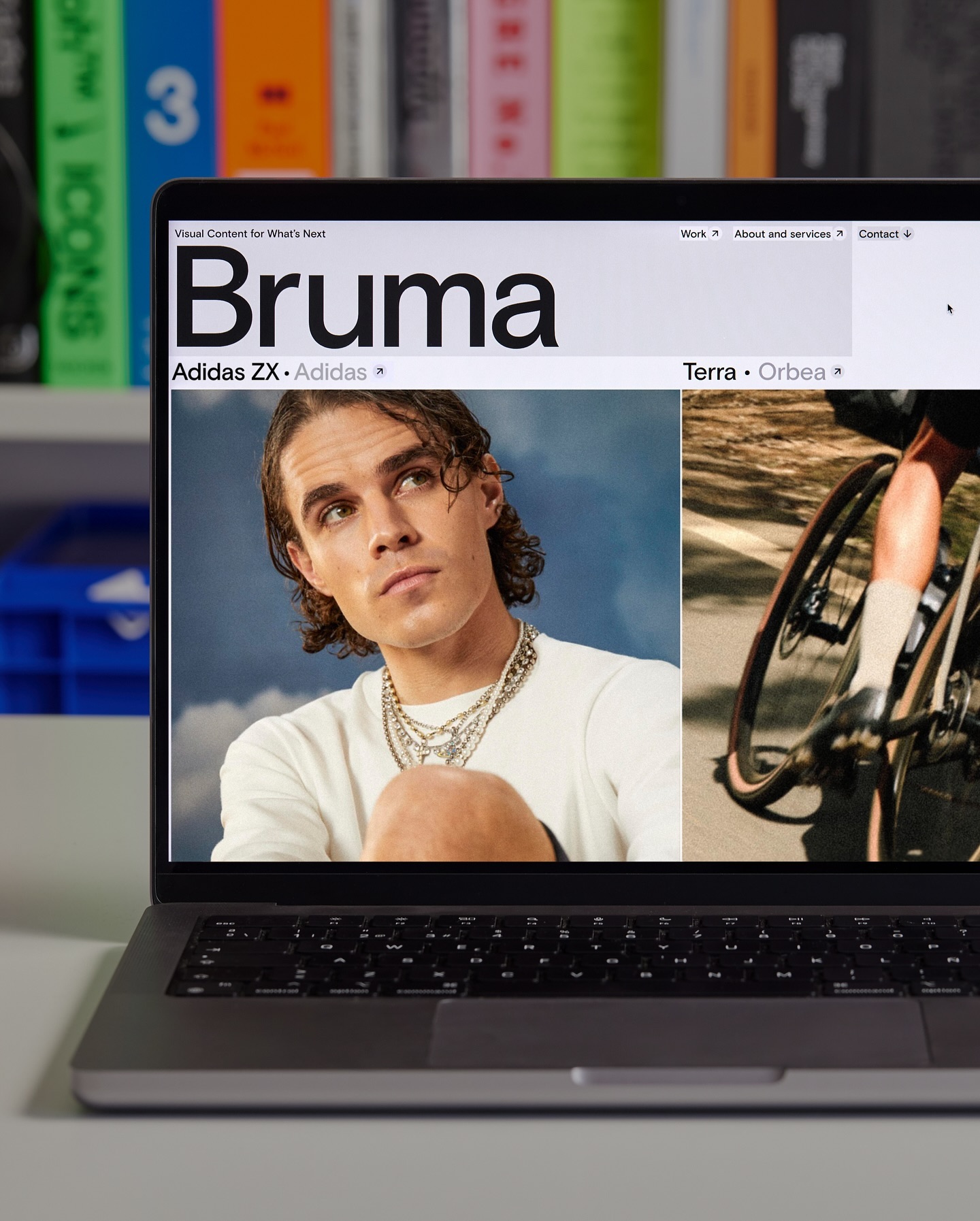
Basis Grotesque is the only typeface used in the identity and website of Studio Bruma, a creative production company to forward-thinking people and brands.
Architecture and how it becomes part of our everyday landscape. For Not Found, Mike Tully proposes an editorial design that plays with the visibility of certain elements using transparent varnish.
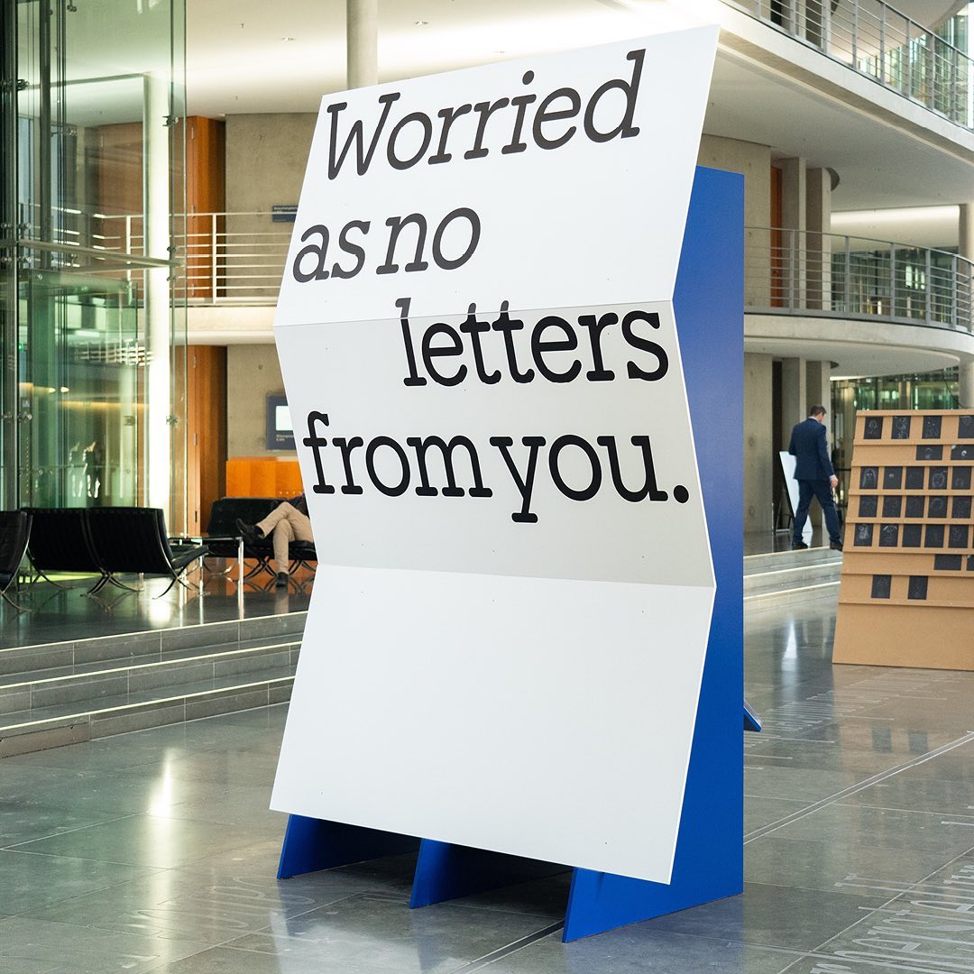
I said, ‘Auf Wiedersehen’ (I said ‘Goodbye’) displays the letters exchanged by five families separated during World War II, hoping to reunite one day. The texts are set in Repost, with supplementary texts in HAL Four Grotesk.