As a collectible object decorating a space, Christopher Doyle & Co. used Moulin for its unique and attractive features, along with Scto Grotesk, to achieve the elegance and sophistication that the interior design brand, Tom Mark Henry, aimed to convey with its new identity.
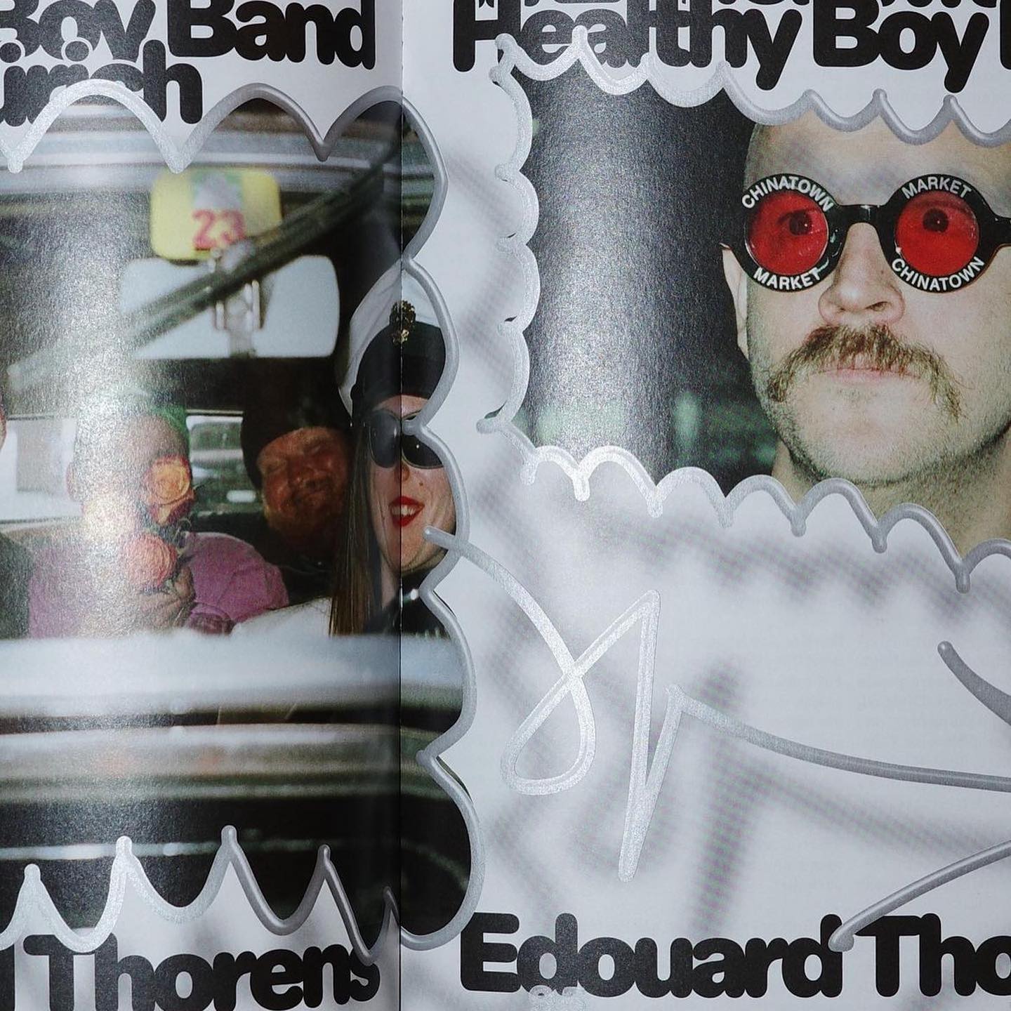
Diatype Rounded from ABC Dinamo is used in Healthy Boy Band, a cultural magazine that is a tribute to graphic design
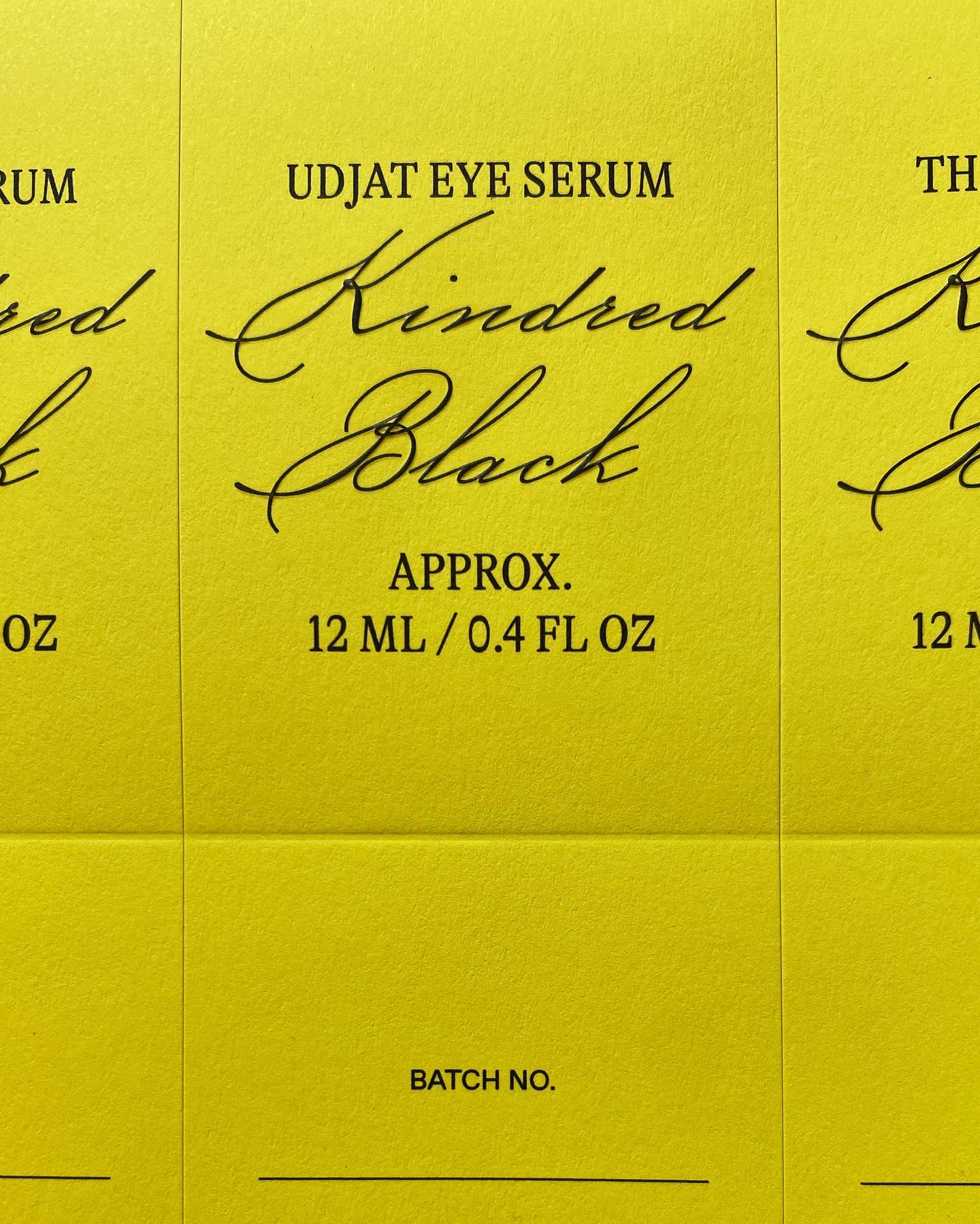
GT Alpina and Monument Grotesk are part of this packaging system that the creative studio Ania et Lucie devised for the glass bottle brand Kindred Black
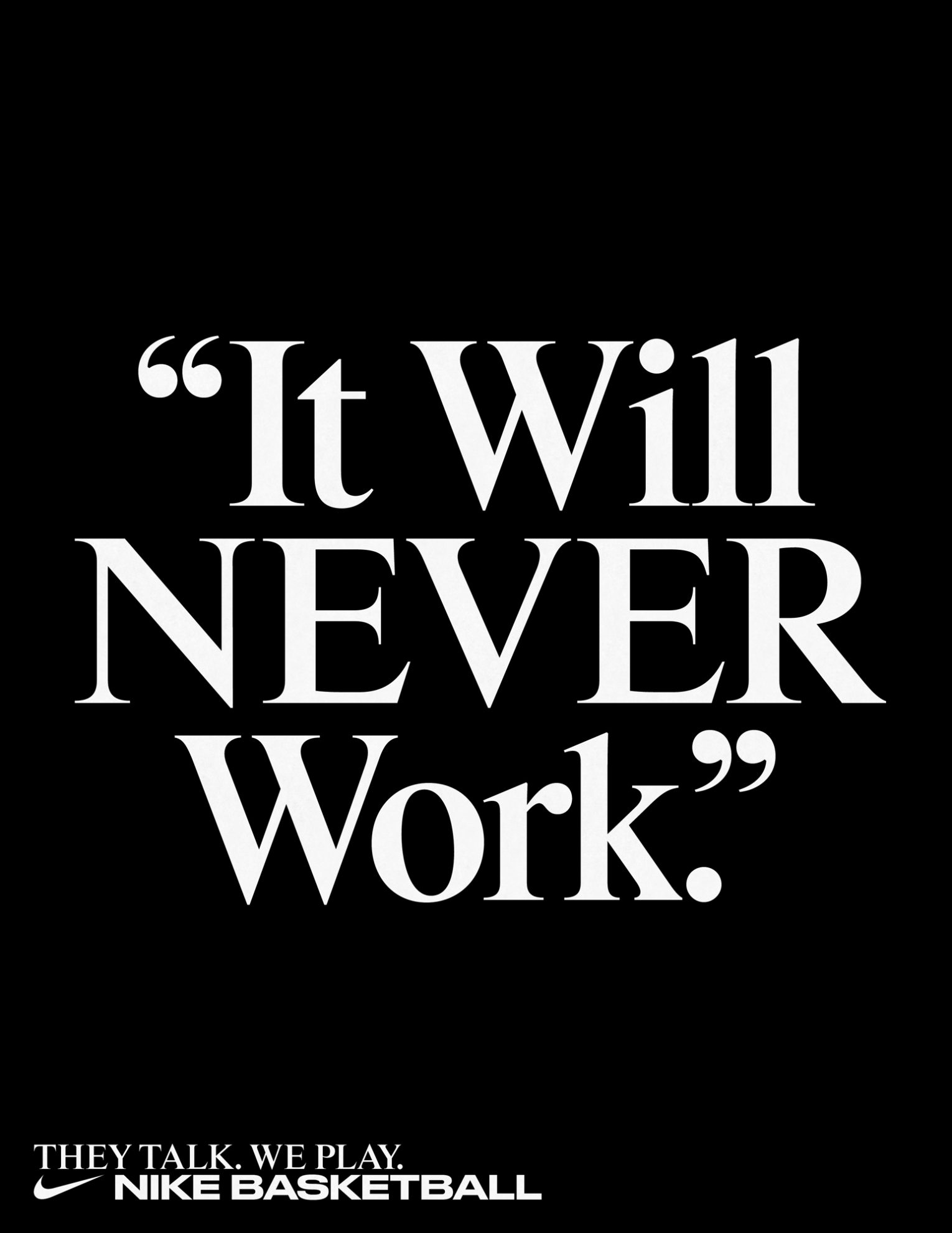
Rhymes by Maxitype in the 2017 campaign for the NBA Finals “They Talk We Play”. Design by Hort and Tim+Tim.
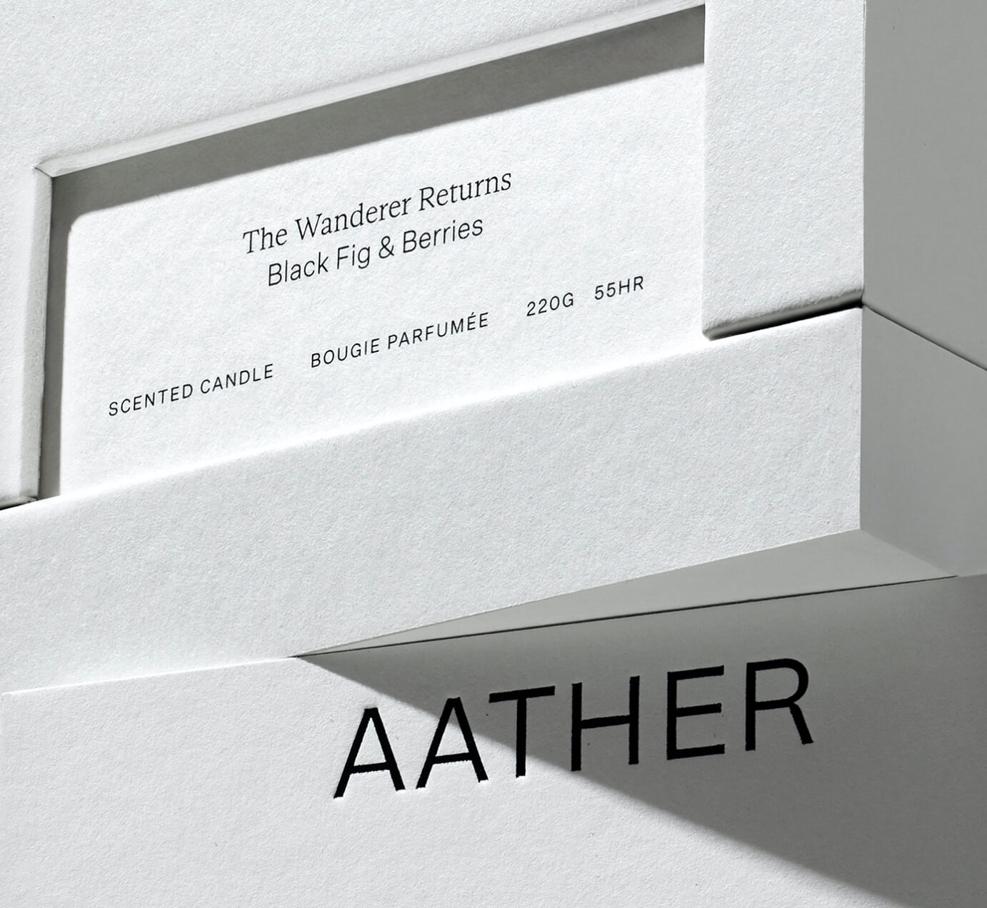
SOCIO Design used Untitled Sans from Klim Type Foundry and Gestura from Socio Type Foundry to complement the visual identity of AATHER’s high-quality candles.
Typeset in Rhymes by Maxitype in the book of photographer Werner Amann capturing the nightlife rave scene of the early 1990s. Design by Lamm & Kirch with Caspar Reuss
LL Catalogue by Lineto at the Grand Prix suisse d’art/Prix Meret Oppenheim, a event recognizing cultural creators in Switzerland.
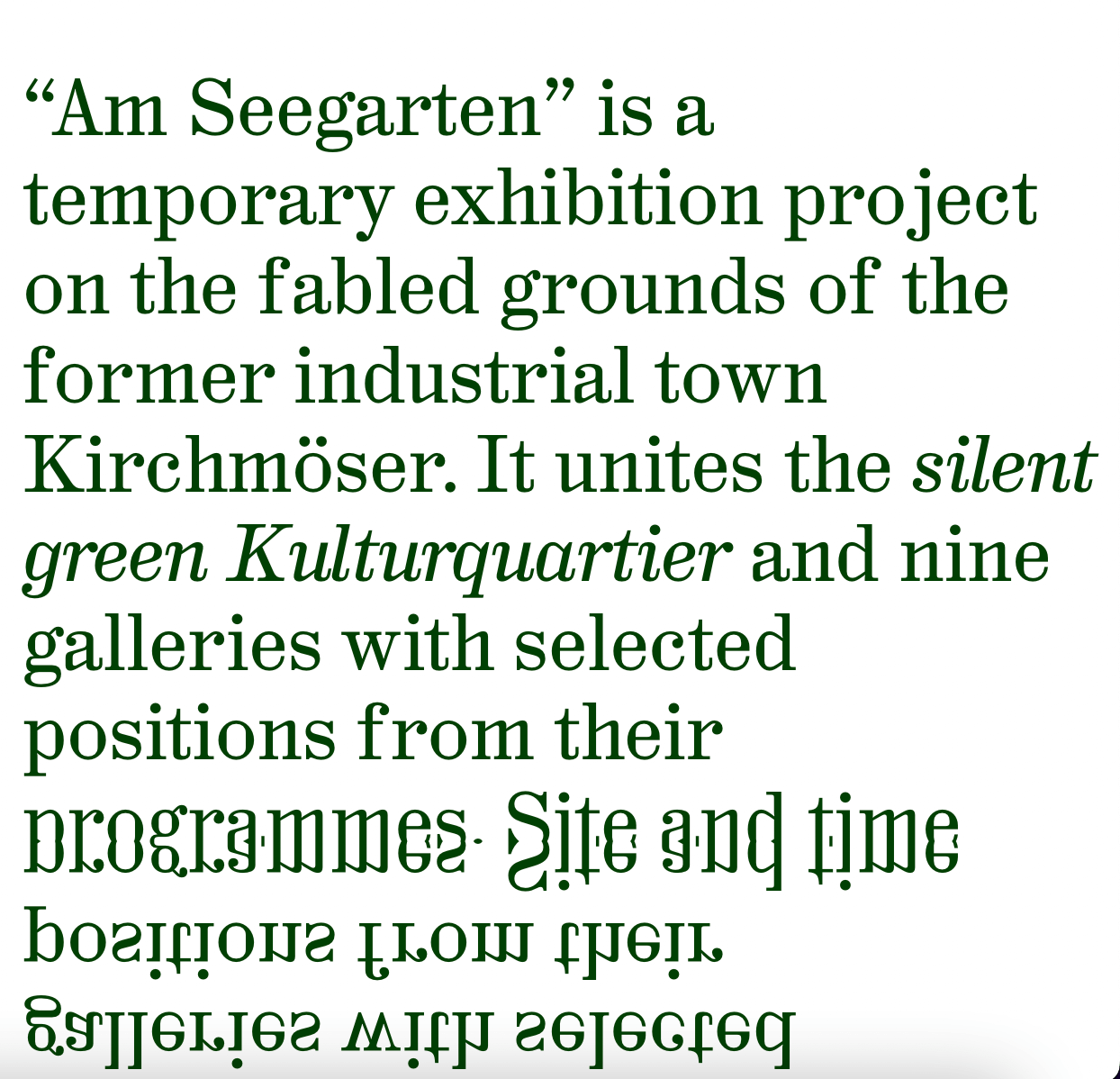
Hal Colant 2.0 (coming soon) on the website with a mirror effect for Am Seegarten, a temporary exhibition in Kirchmöser, Germany.
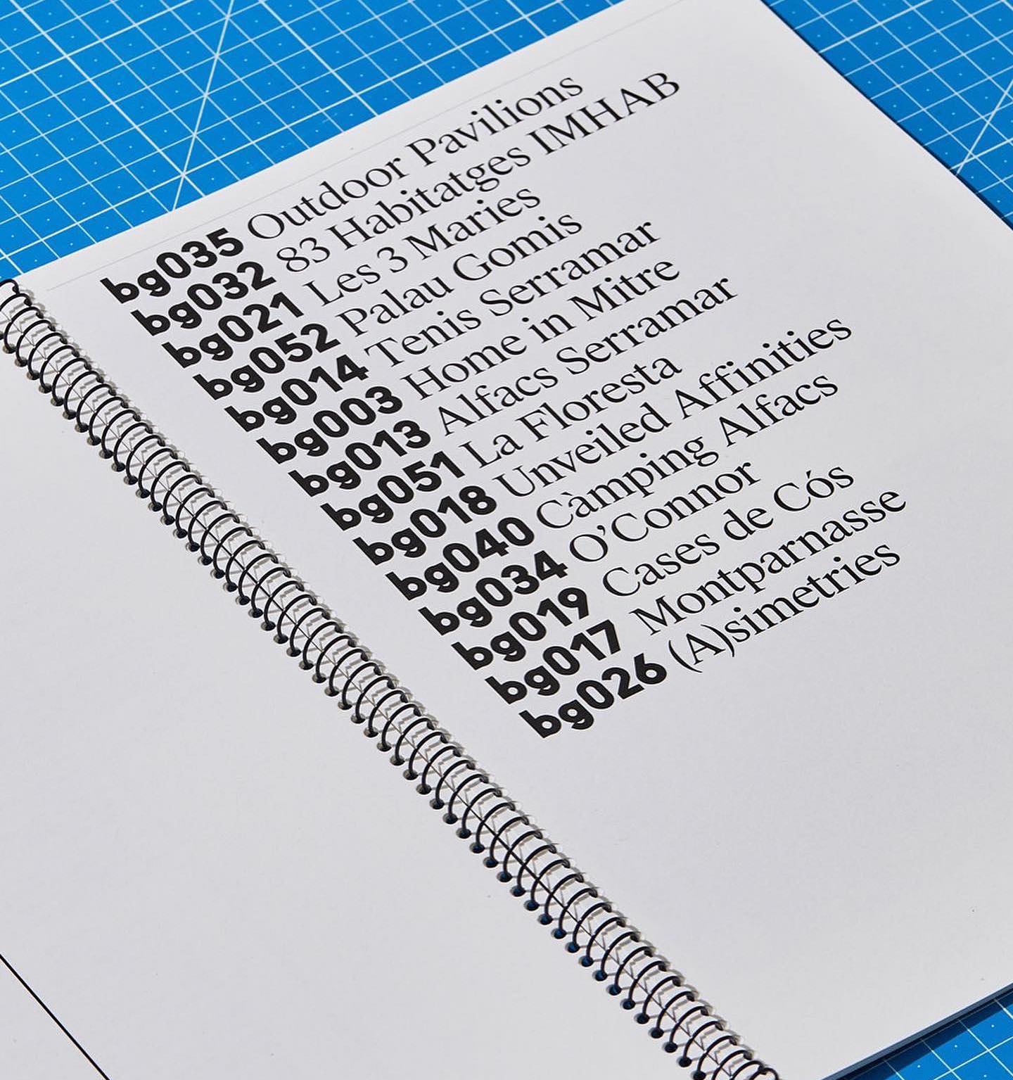
Leon Romero using Alias Ano by Alias and Suisse Works by Swiss Typefaces in the identity created for the Architecture office Bajet Giramé.
Mount Agency designed the identity and e-commerce for the clothing brand Flid, using WT Kormelink from Wise Type in the logo and communication.