HAL Timezone by Hal Typefaces in the typographic selection used for the book Pocket Call by Paul Spengemann, designed by Hanzer Liccini.
Arizona Flare by Dinamo in the identity of Guild, a new corporate that serves as a bridge between education and employment.
Olssøn Barbieri used Cheltenham by Bitstream and Ostia Antica by Bureau Brut in its identity for urban cheese factory Stavanger Ysteri in Norway.
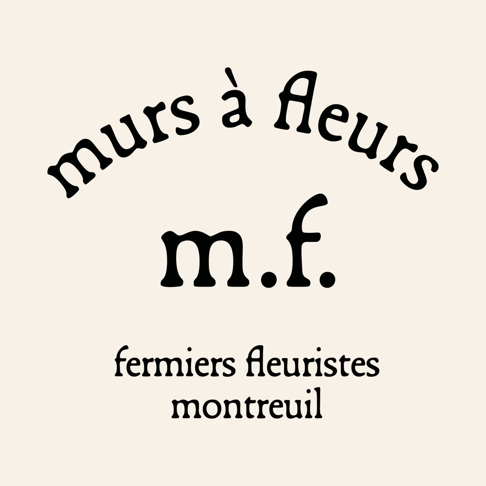
Murs à fleurs identity reunites two generations of type designers by using Trabis and Francesco fonts, designed by student and teacher.
Gill Sans Ultra Bold Condensed as a contrast to heavy serif wordmark for giant sandwich shop. By TRiC Studio
For Inka.world, Ayer deck by Miguel Reyes, part of Commercial Type’s catalog. Elizabeth Goodspeed behind the design.
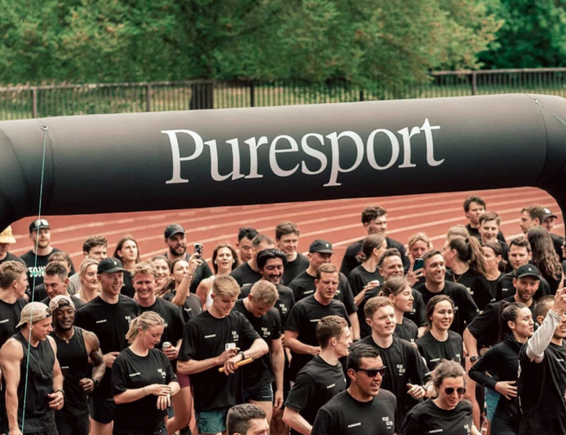
Tiempos by Klim Type Foundry, the world’s first range of natural products for drug-tested athletes, Puresport. Designed by Field of Play.
Global rebranding for Théâtre national de la Danse, by Zoo Designers Graphiques, using Lineto’s Supreme Display.