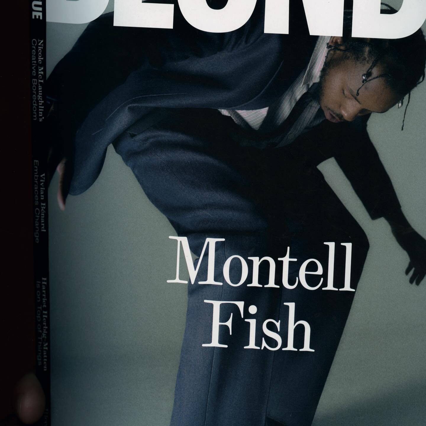
The type selection for Blonde Magazine’s redesign, managed by Hei Agenda, includes Contrast Foundry on the logo, Counter Forms for the serif (Eyla), and sans fonts by Lucas Liccini & Elias Hanzer (HAL Four Grotesk)
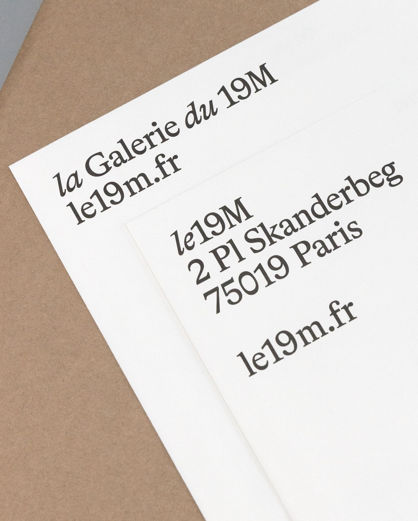
Hort Berlin used this serif typeface with classic and elegant forms (Bradford) for the visual identity they designed for the cultural center le 19M.
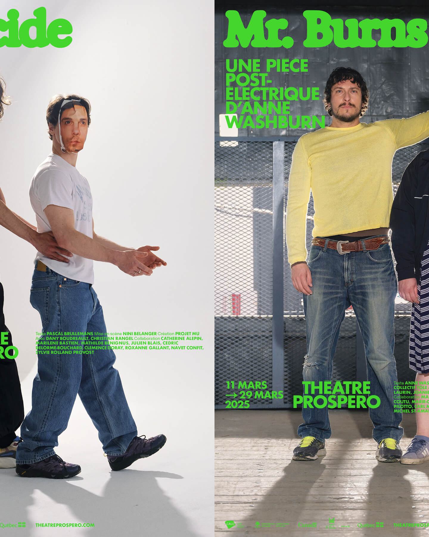
“After all, being together is revolutionary.” That was the main idea behind the 2024-2025 season campaign for Théâtre Prospero, directed and designed by Principal Estudio using Exposure.
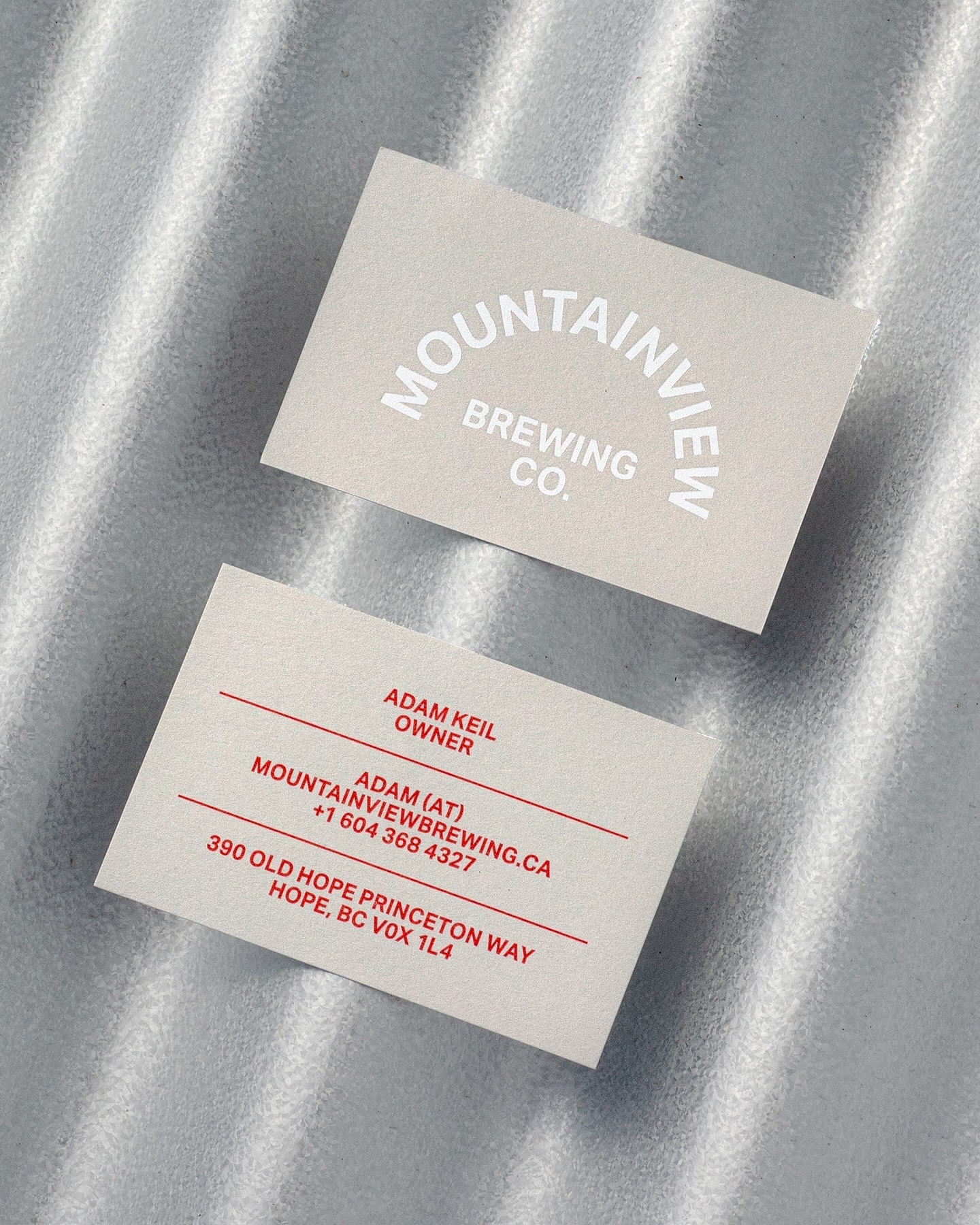
Memory Studio was inspired by vintage elements, like old book covers, and used Aktiv Grotesk to create the identity for this craft brewery.
Hiro builds developer tools that bring Web3 to Bitcoin. In its identity, Porto Rocha chose several fonts from the Aeonik family – Mono, Fono, and Bold –
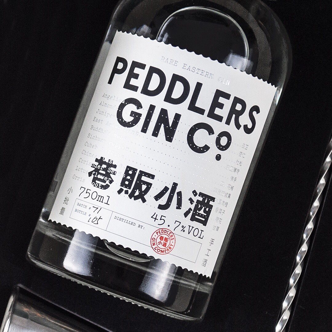
OMSE and Family Type collaborated to give live to China’s first craft gin with a custom logo and typeface.
CF Panoptik, a font from Fonts.gr, used in the branding, signage, and communication of The Twenty One, a luxury hotel located in Athens.