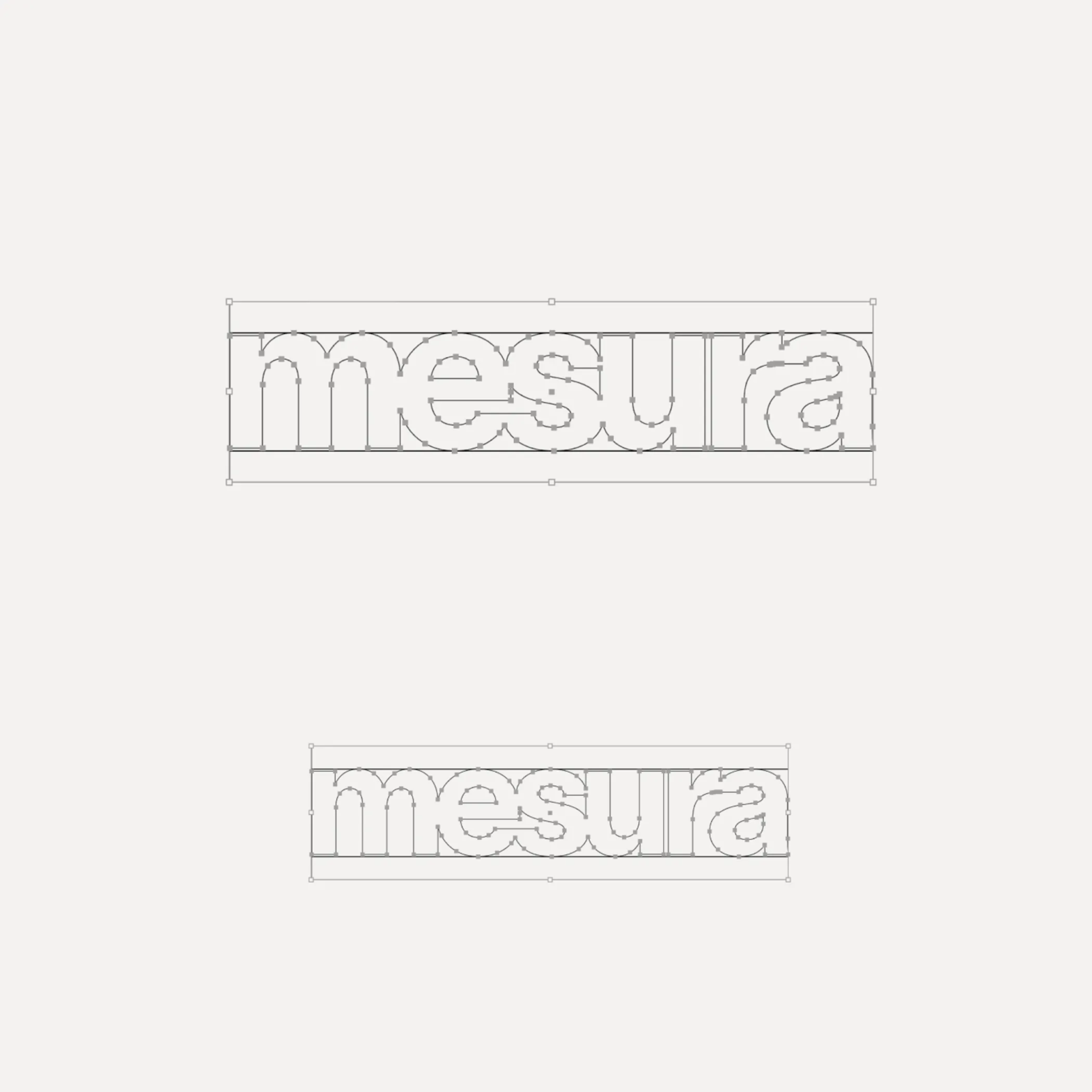
Flexibility was what Mouthwash studio aimed for with the typographic selection they made for the Messura . Kimera’s Waldenburg and Times LT were chosen to give solidity to the brand and possibilities to evolve.
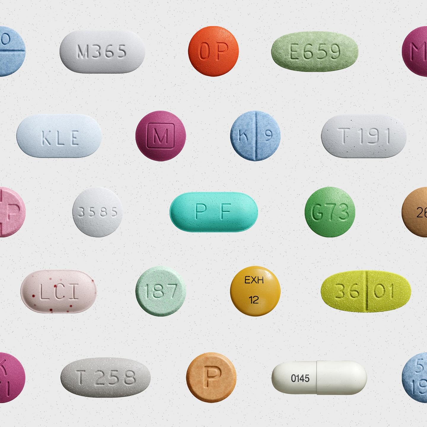
Waldenburg from Kimera Corp was customized to be part of the visual identity for a new line of assistance for people with opioid addiction issues. Designed by Raw Materials and Service Plan
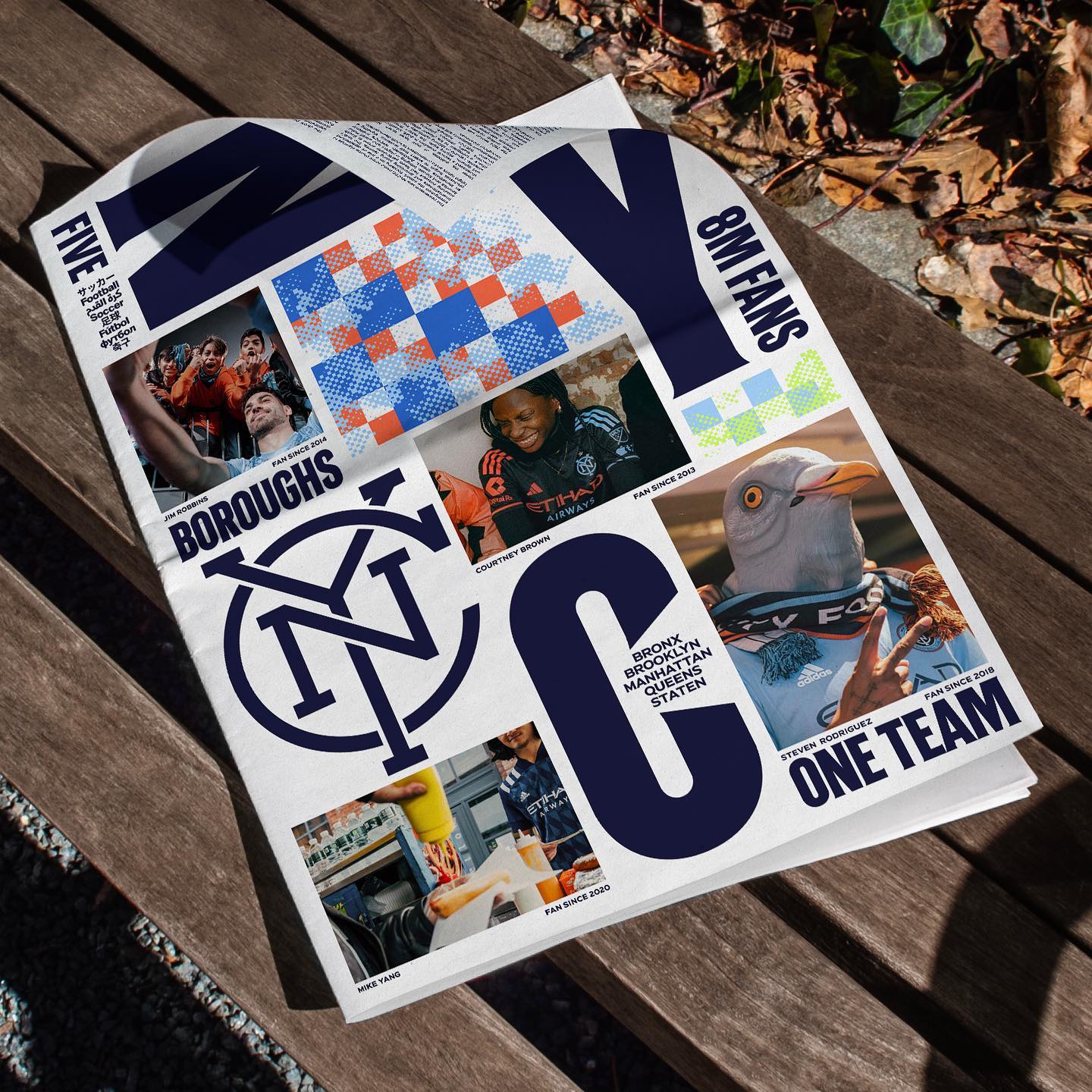
Express” and “Local” are the typefaces created for New York City FC in the rebranding process carried out by Gretel, in collaboration with the type design studio Frere-Jones.
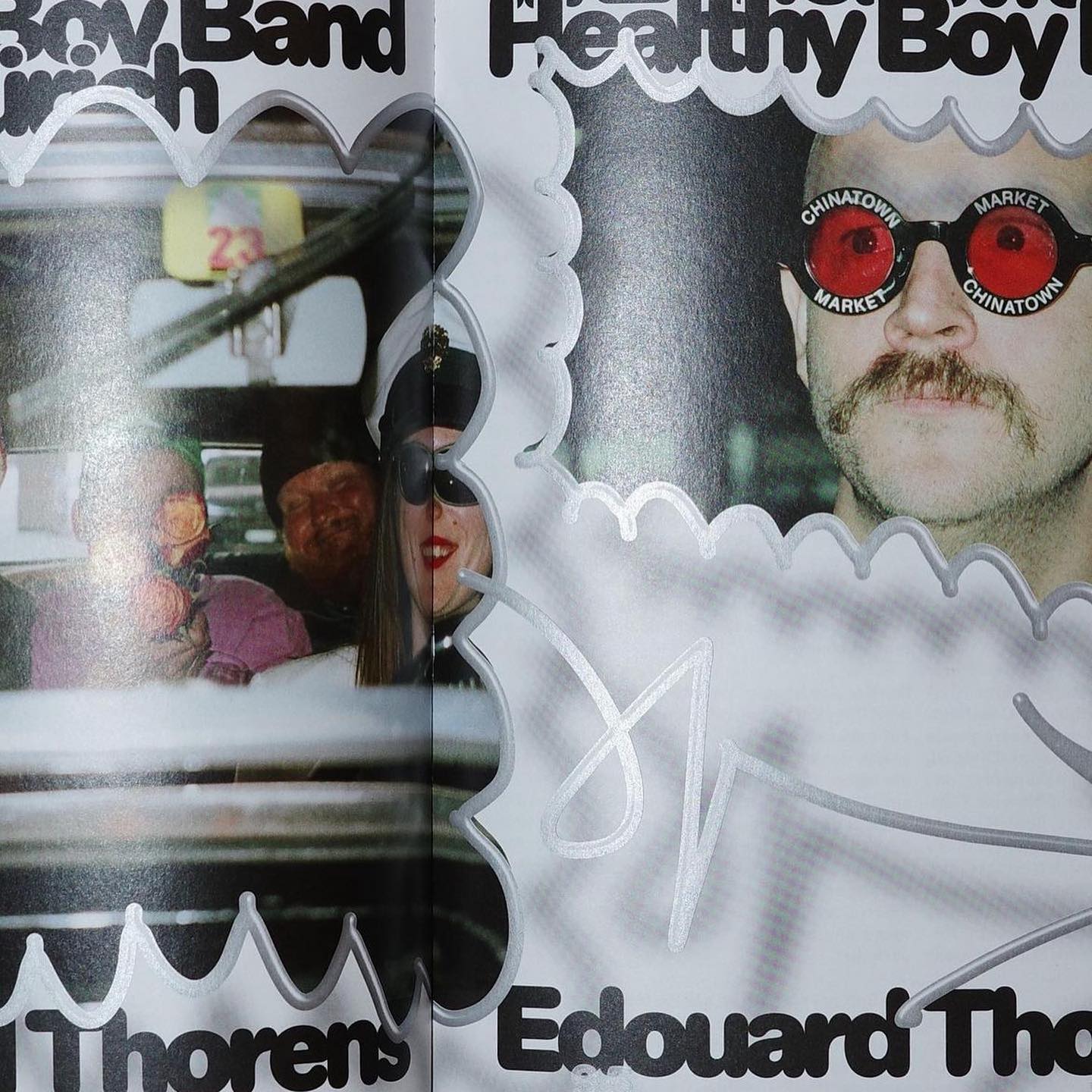
Diatype Rounded from ABC Dinamo is used in Healthy Boy Band, a cultural magazine that is a tribute to graphic design
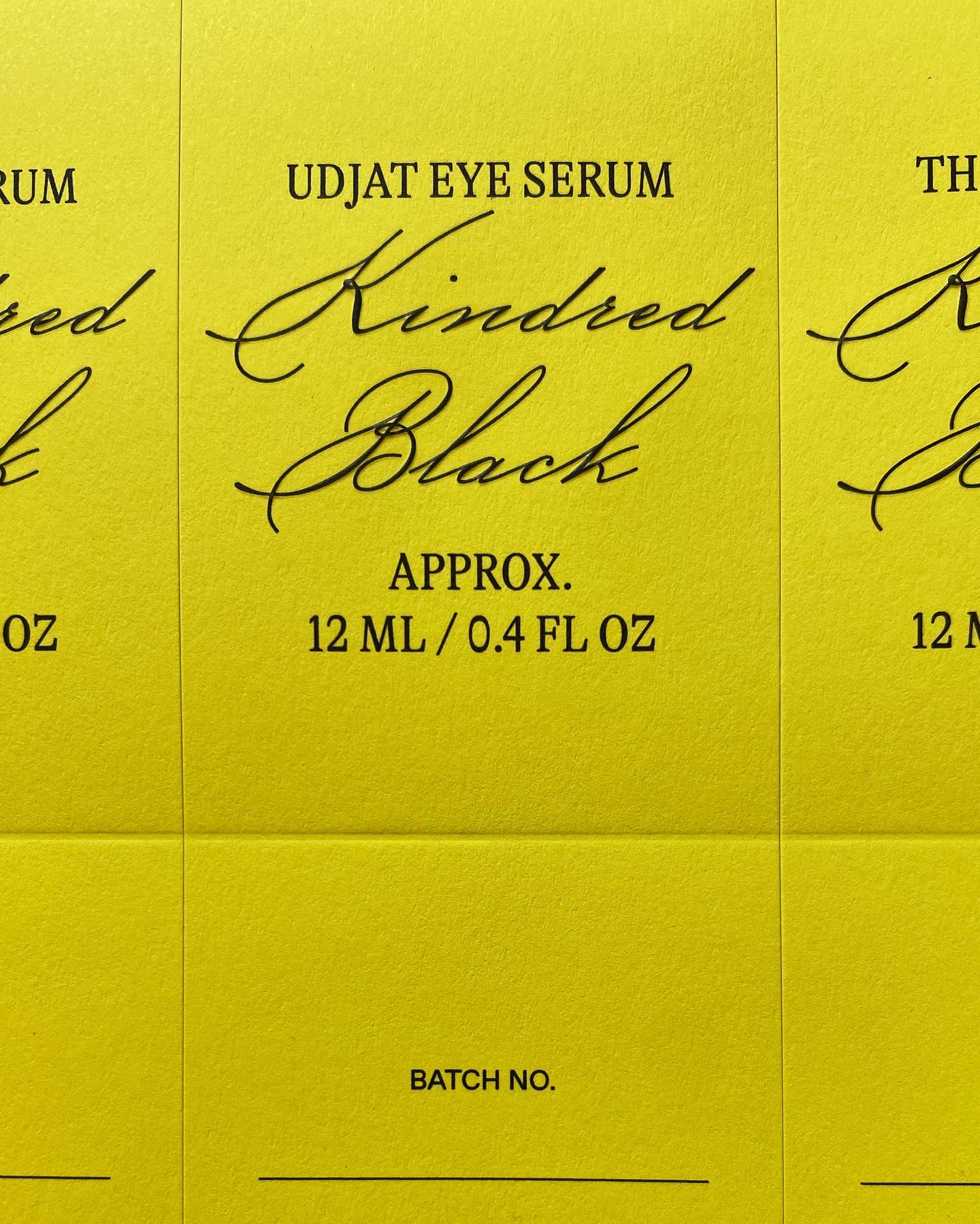
GT Alpina and Monument Grotesk are part of this packaging system that the creative studio Ania et Lucie devised for the glass bottle brand Kindred Black
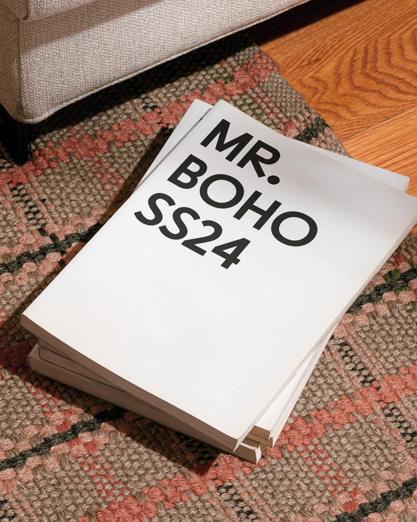
For being the first to create ocular accessories, the Inuit people and their syllabic writing system inspired a custom typeface and a new brand image for Mr Boho eyewear.
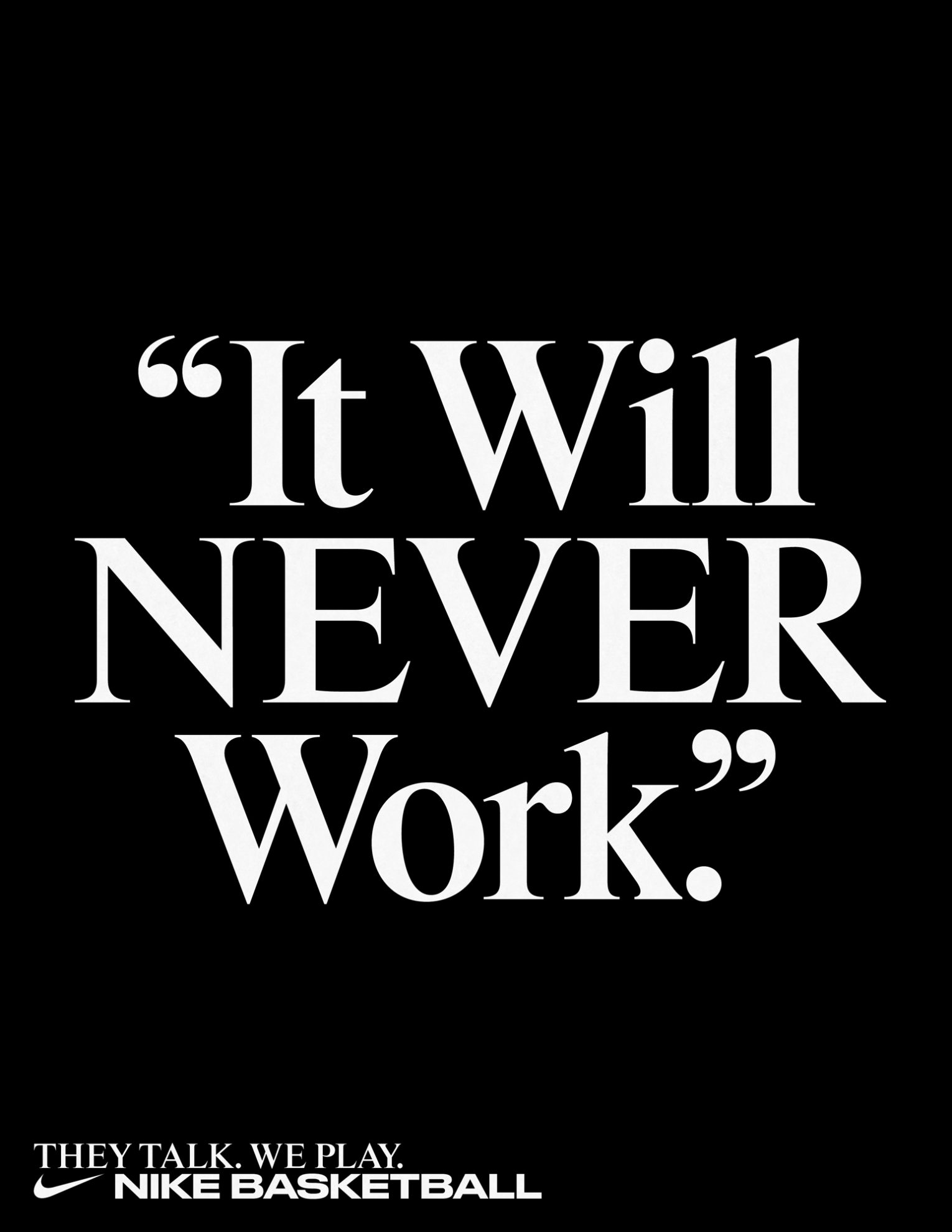
Rhymes by Maxitype in the 2017 campaign for the NBA Finals “They Talk We Play”. Design by Hort and Tim+Tim.
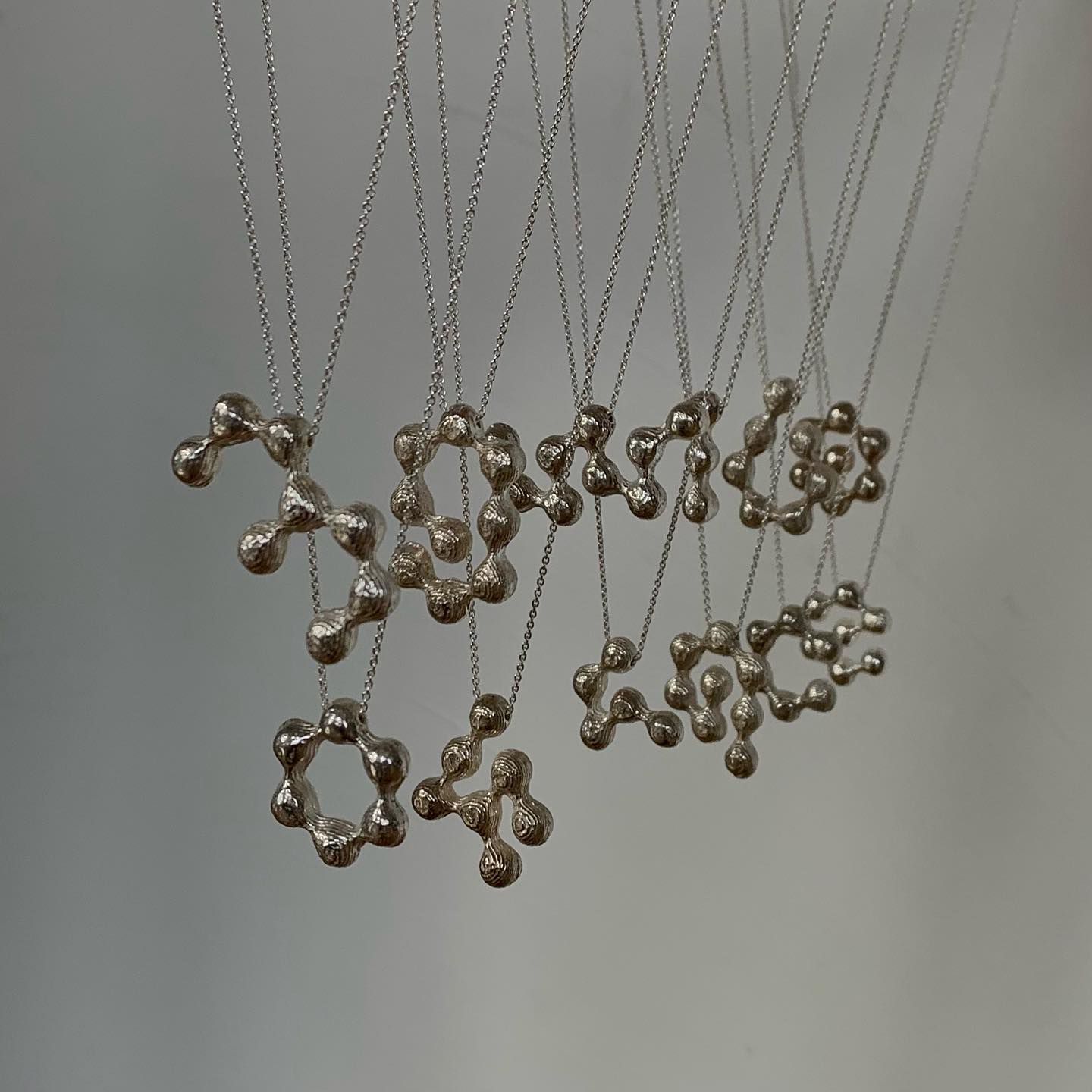
The Belgian design studio Vrints-Kolsteren collaborated with the jewelry brand Fleerackers to create ATOM, a collection of 16 different earrings.
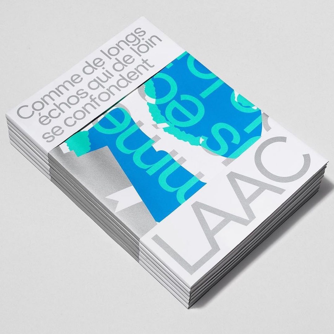
Studio Hudson Catty and Atelier Baudelaire used ES Klarheit Kurrent to design a set of three books celebrating the 40th anniversary of LAAC in Dunkirk.
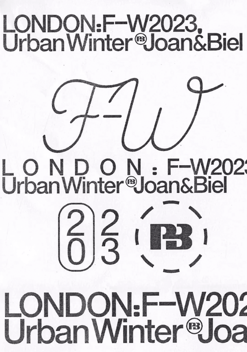
Simple and dynamic, these explorations by Paula de Álvaro use brand elements and basic information to present the Pull&Bear London AW 2023 collection.