Designed by Copyright/Reserved, this special publication by @extensive.publishing and @greedydust features Cortese and Cortese Sans by Mark van Leeuwen.
The redesign of ArkDes in Stockholm by AM Stockholm features custom typefaces where dots and dashes create a unique typographic system. Alongside Diatype, these fonts redefine the museum’s identity.
Storefronts have served as stages for performances, for experimentation, and part of the art itself. Fresh Window at Museum Tinguely explores this connection with an identity using Stabilo Boss.
Tetier, the jewelry brand using recycled materials that recently collaborated with Asics, features Octave by Faire Type in its logo and texts.
EXTRALESS, a Japanese clothing brand reflected its ethos in a custom typeface by British Standard Type embodying simplicity and shared humanity.
Elisava has a new visual identity inspired by its original logo, and Folch designed Elisava Sans, a variable typeface created to work in any context.
OFFSHORE created these materials using a display typeface with spiral shapes, designed for the public programs of the Harvard Graduate School of Design in 2024.
With dots inviting the creation of interconnected forms, the design by Atelier Tout va bien features Baste in The MV Festival 2024.
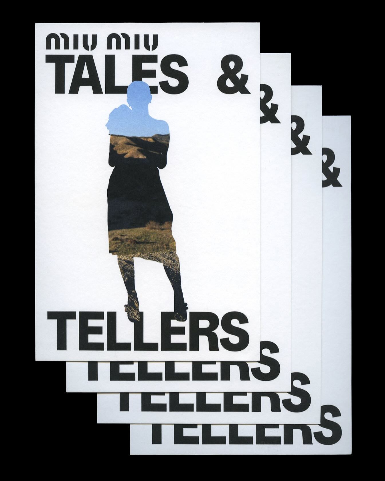
Kern typeface is featured in Tales & Tellers, a Miu Miu campaign that revisits various representations of femininity from past runway shows and short films.