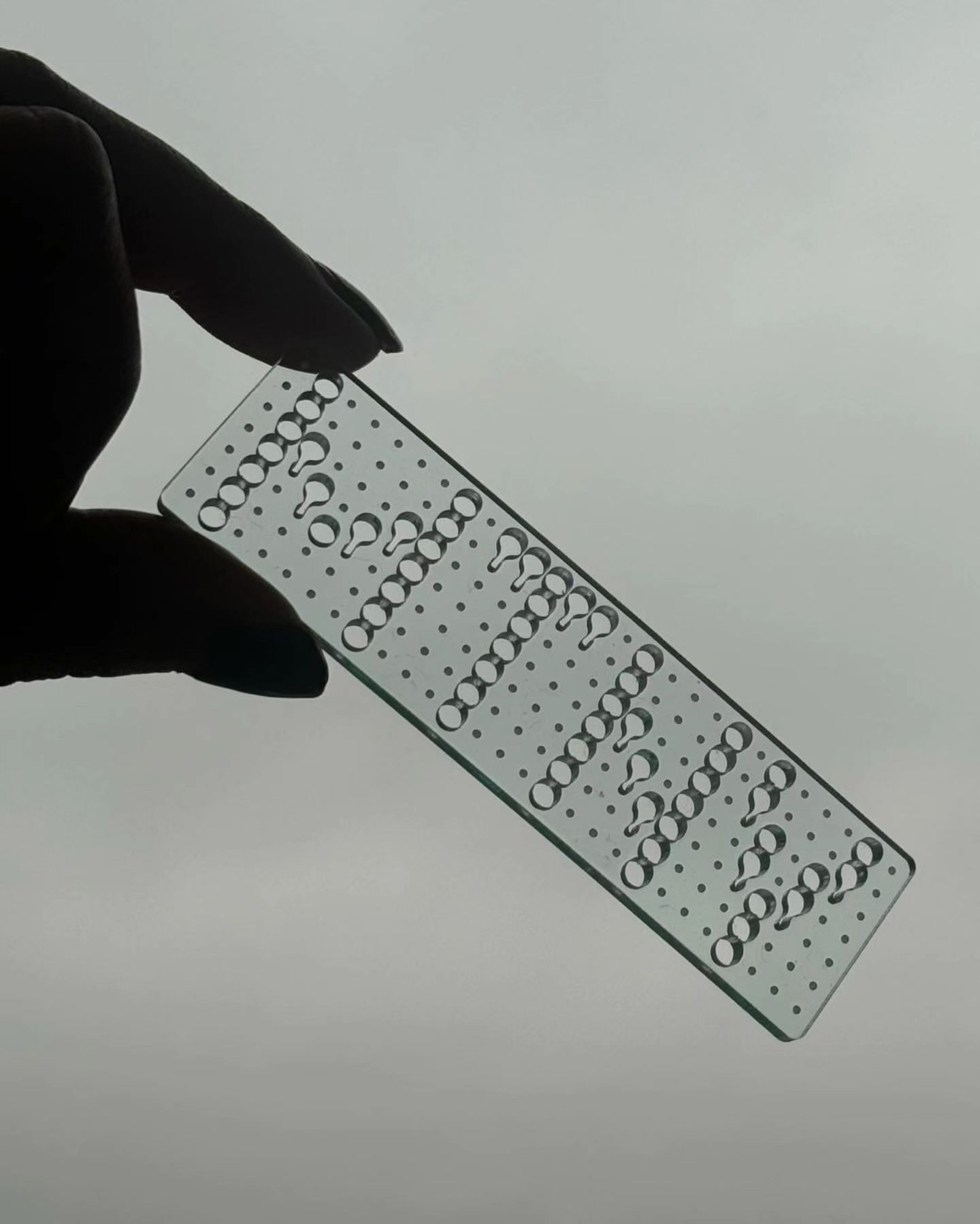
This series of keychains, the result of Pauline Esguerra’s exploration with laser cutting, uses, among other typefaces, Eurocat by Maxitype.
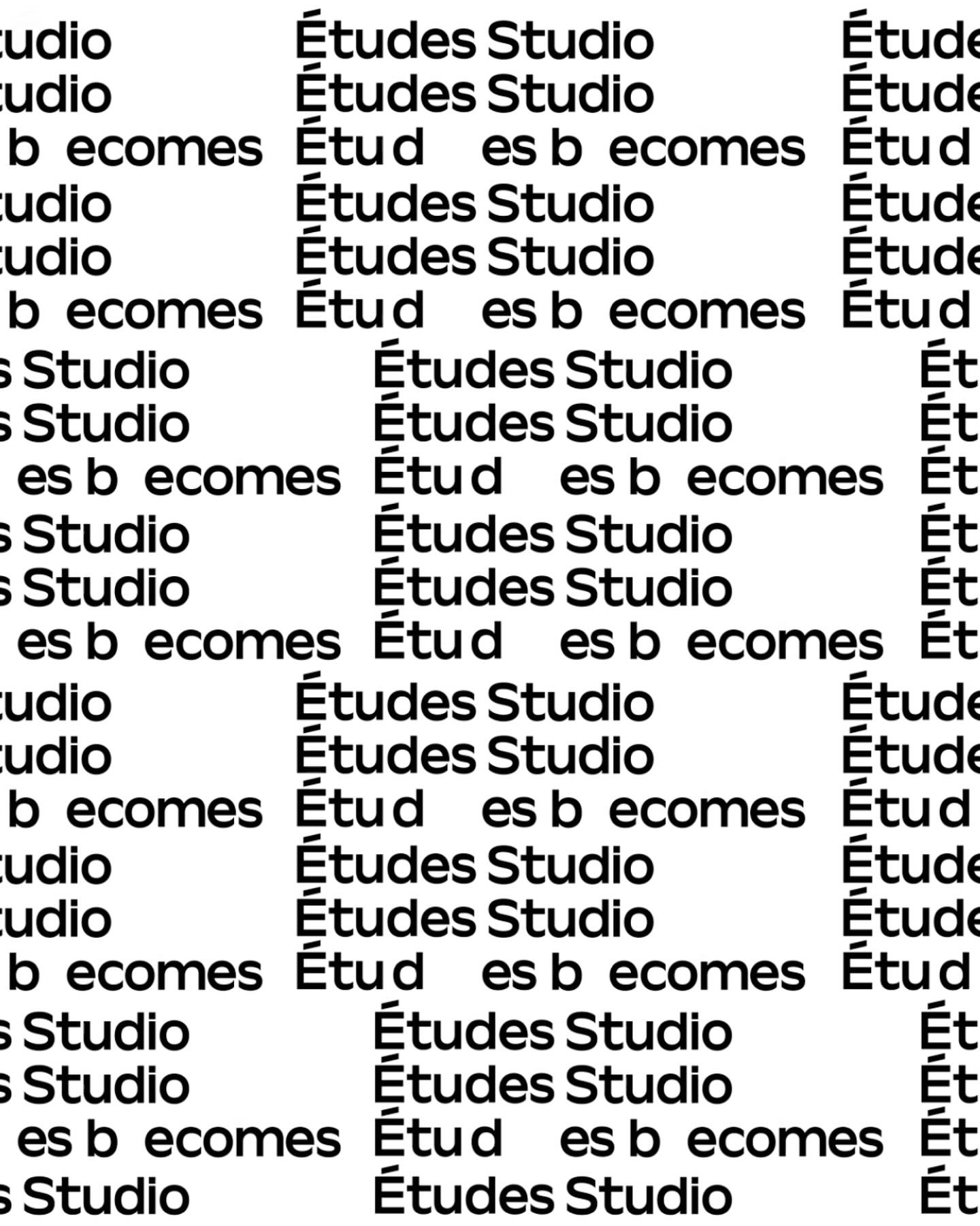
A geometric typeface with humanist features, crafted by Spassky Fischer, for the new identity of Études.
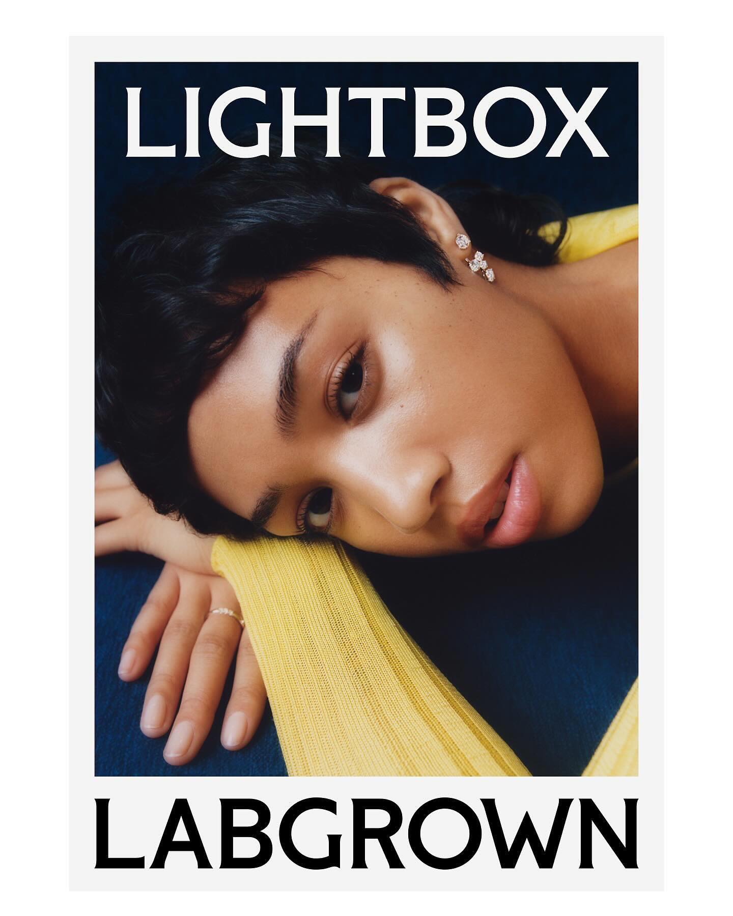
Decade created this visual identity to position an innovative lab-grown diamond brand, proposing a custom flare logo designed by Colophon Foundry.
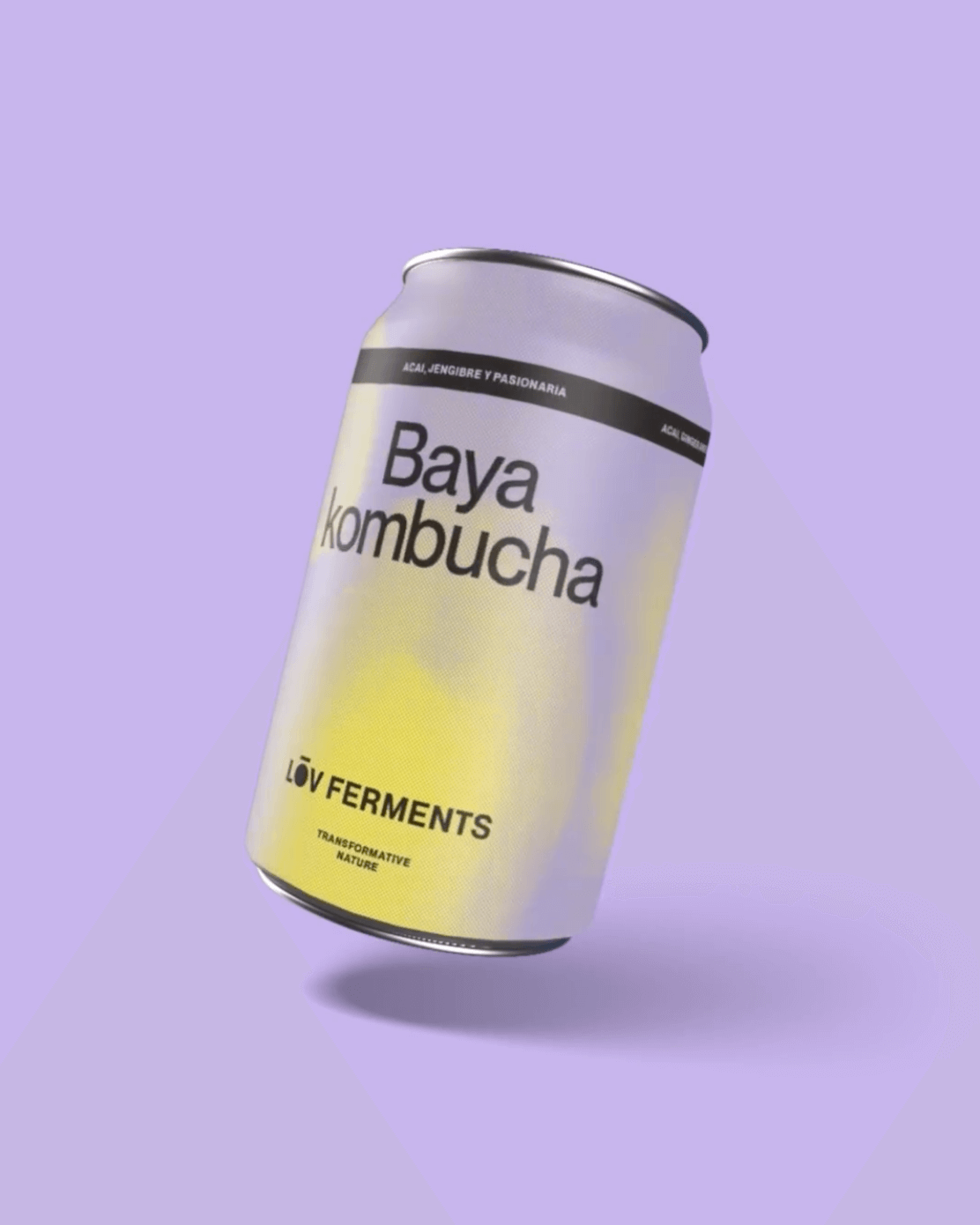
Casa Bien used Neue Montreal by Pangram Pangram and Items by Schick Toikka to build the visual identity for LOV Ferments, a brand set to change the beverage market.
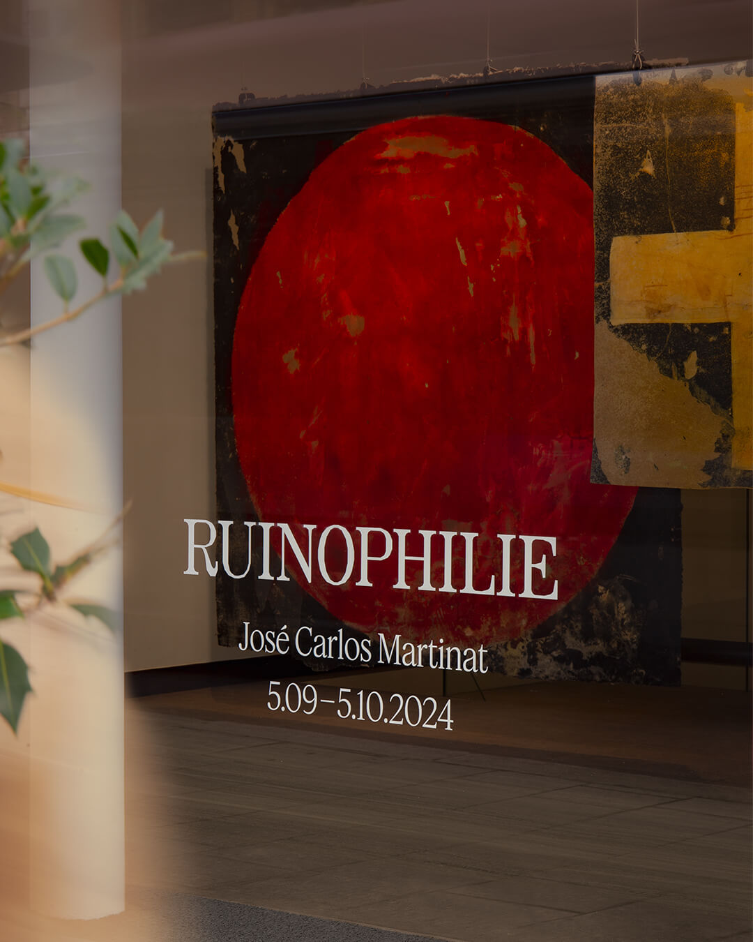
Three typefaces come together in this warm visual identity for an art exhibition in Paris: Minotaur by Production Type, Diatype by Dinamo, and Feature Deck by Commercial Type.
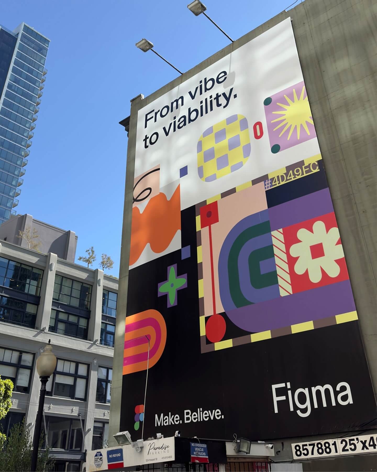
Grilli Type took on this ambitious project and proposed Figma Sans; a typeface with personality but practical, focused on efficiency, and free of unnecessary embellishments.
Rajola is a stencil and filled typeface designed by ErrorErrorStudio. It is inspired by and pays tribute to the iconic hexagonal tiles characteristic of the Mediterranean.
Logotype custom-designed by Bureau Bernklau, drawing inspiration from the distinctive features of Ehmcke Antiqua, an early 20th-century typeface.
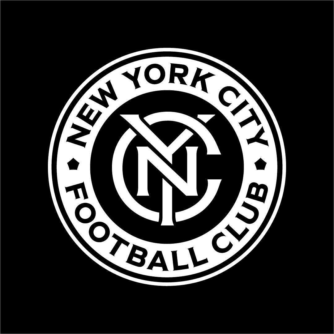
Frere-Jones was tasked with redesigning the New York City Football Club badge, and carefully adjusting each character to fit the circular arc of the badge.
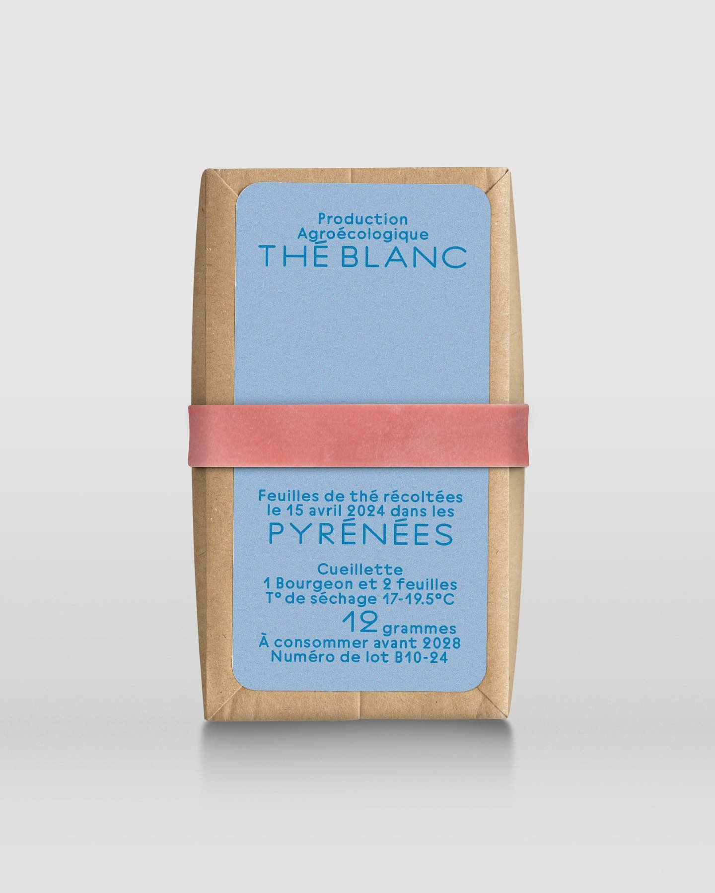
In a comprehensive project including handwriting, drawing, packaging conception, and global branding, Quentin gave @the.pyrenees an organic and approachable identity.