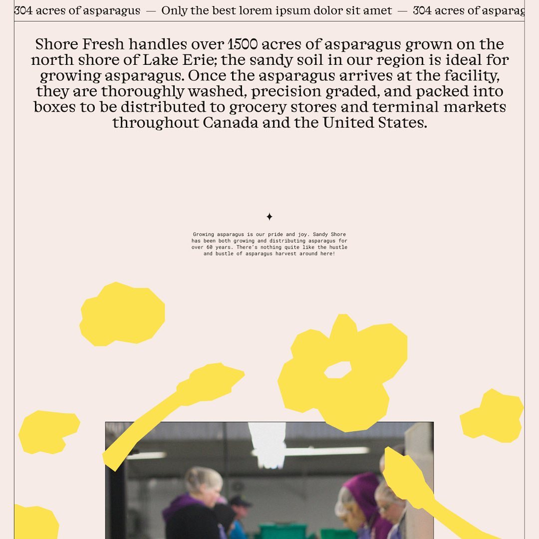
Alongside a colorful identity and illustrations, Studio Tux proposed Nordic Pavilion and Roboto Mono as the typefaces for this farm.
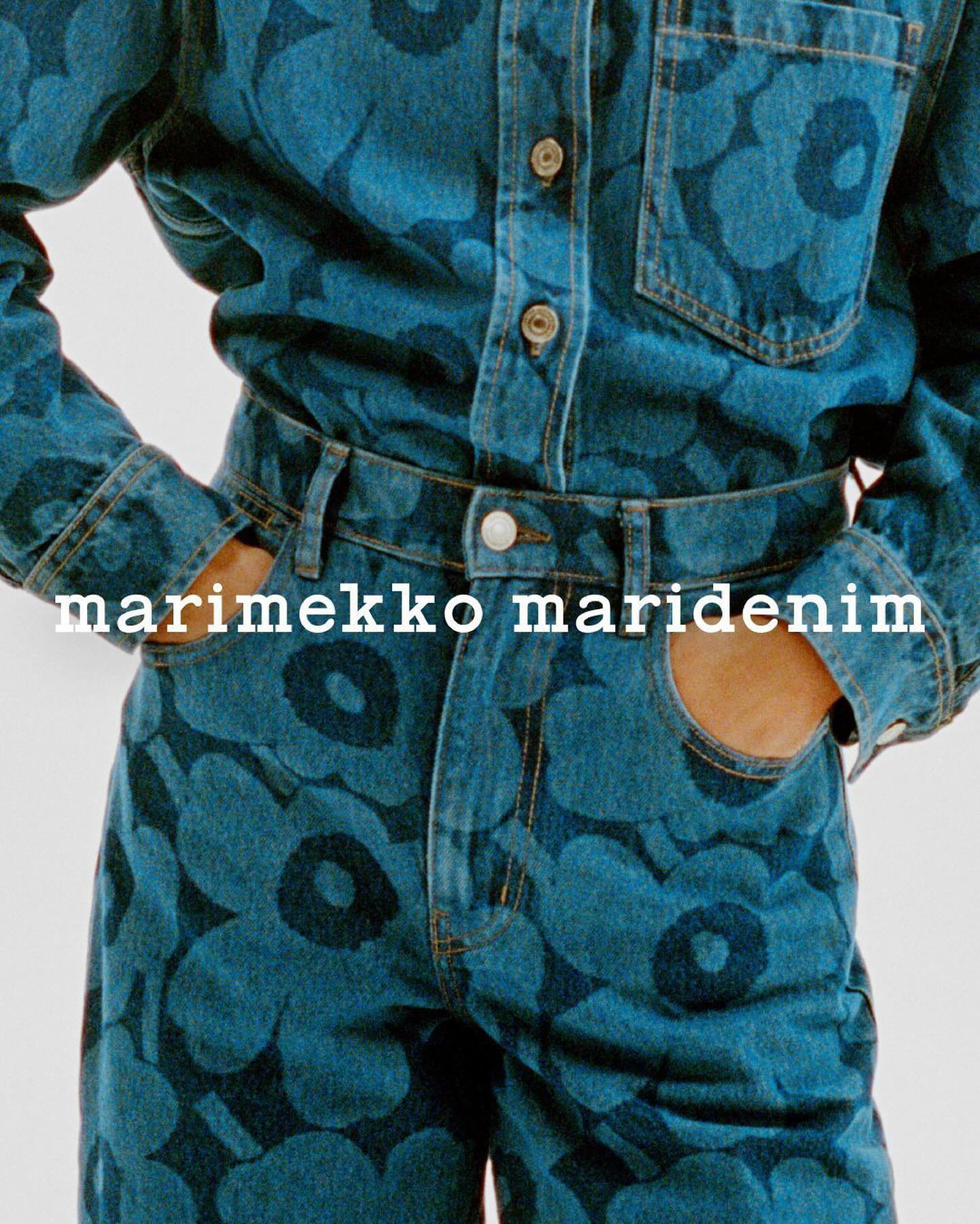
Maridenim just made its debut at the Fall/Winter 2024 show during Copenhagen Fashion Week. Blending their iconic bold designs with a fresh denim twist.
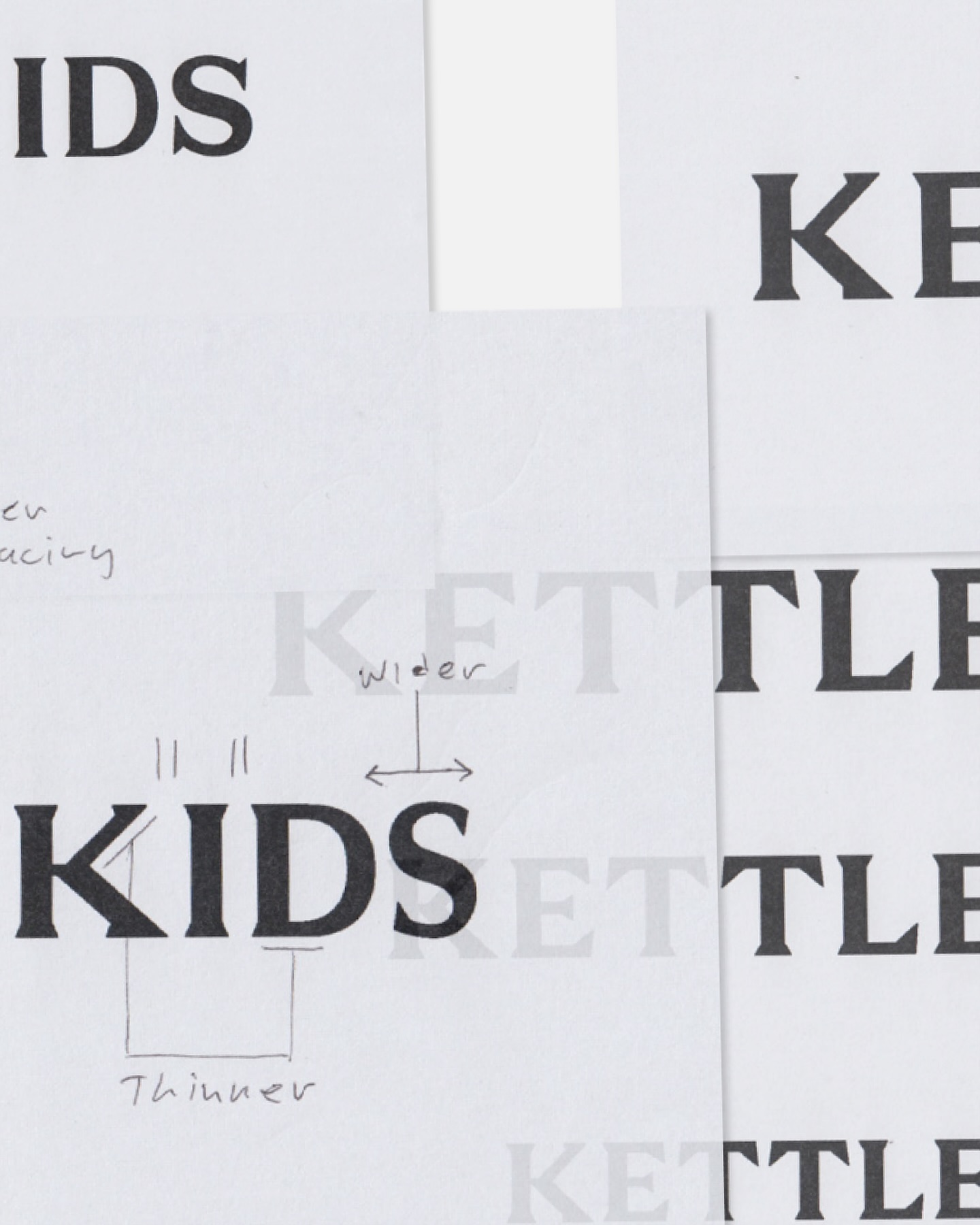
Two Times Elliot designed the logo, typography, and monogram for Kettle Kids, drawing inspiration from London’s historic architecture and signage.
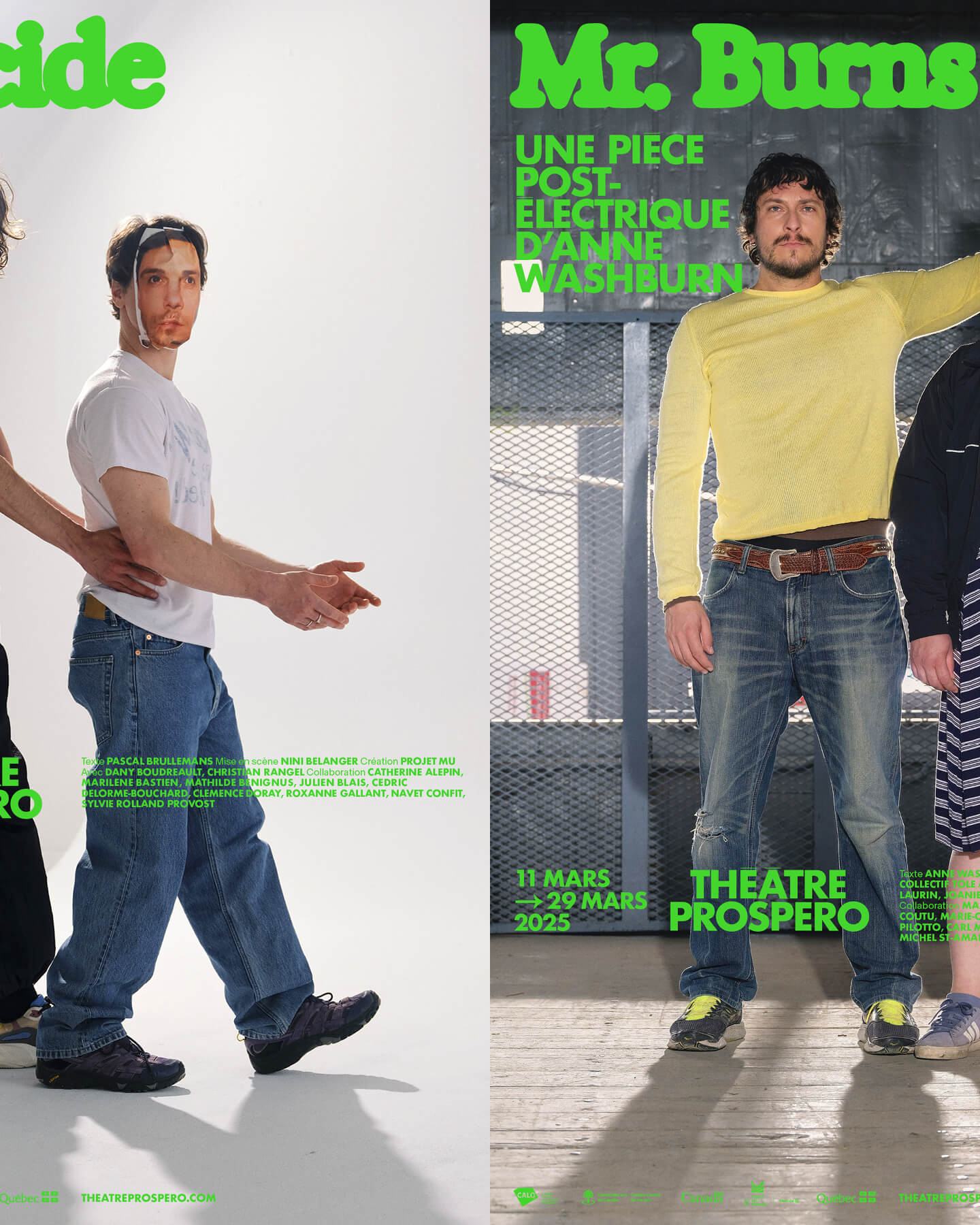
“After all, being together is revolutionary.” That was the main idea behind the 2024-2025 season campaign for Théâtre Prospero, directed and designed by Principal Estudio using Exposure.
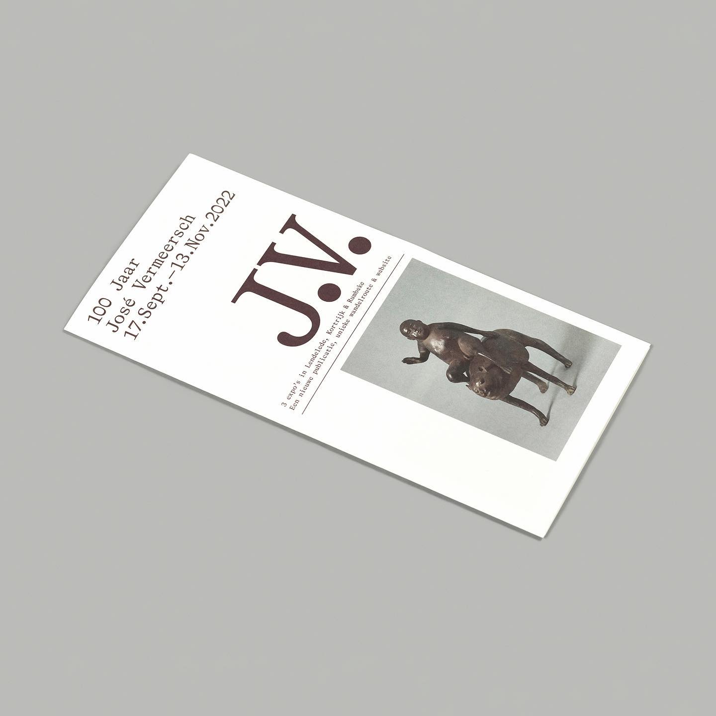
On the 100th birthday of artist José Vermeersch, an exhibition was held to celebrate his work, where the Bradford Mono typeface played a crucial role.
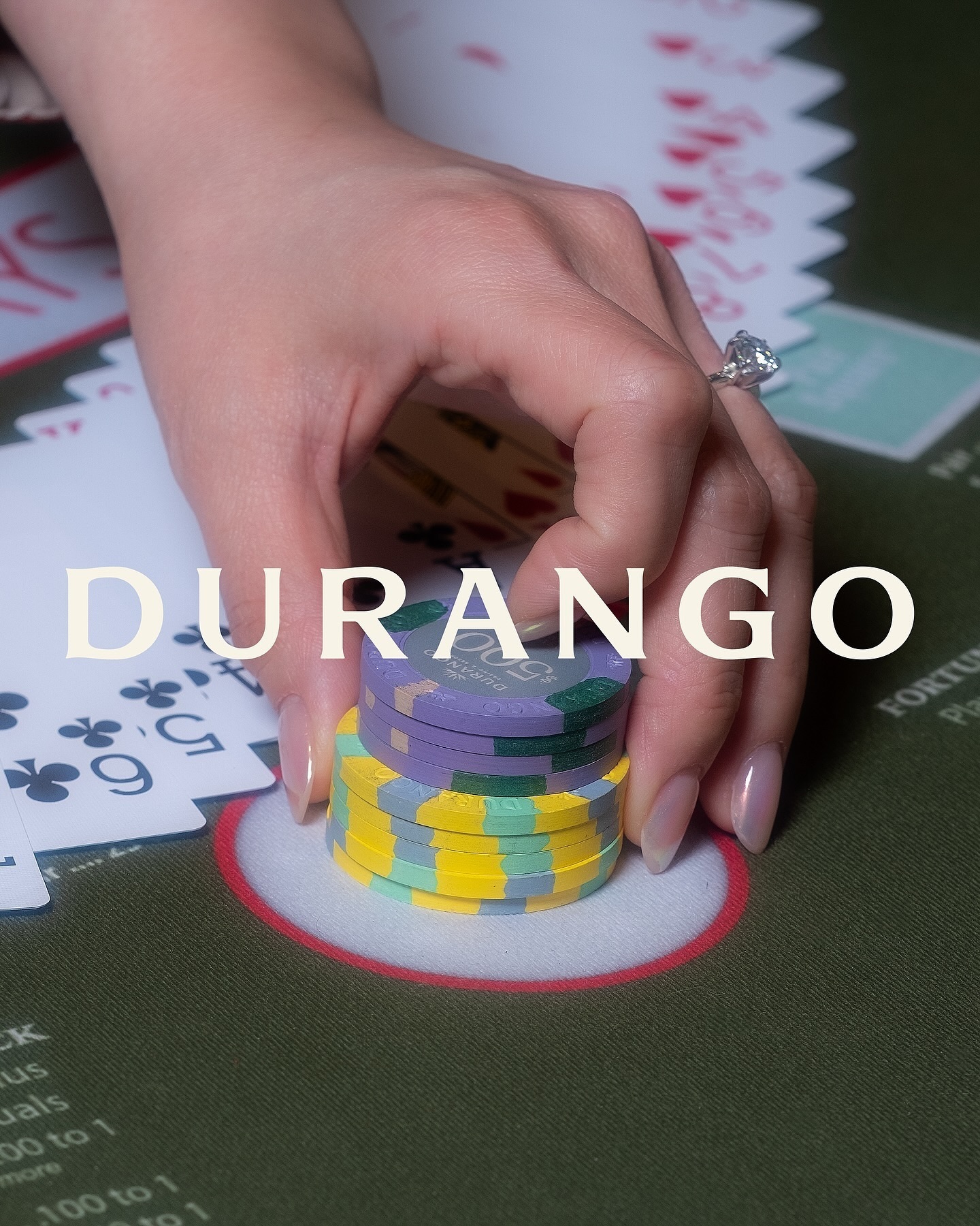
Inspired by its iconic location—Las Vegas—this hotel embraces warm, sun-faded colors, a custom sober logo with subtle serif hints, and uses National and Nib as its typefaces.
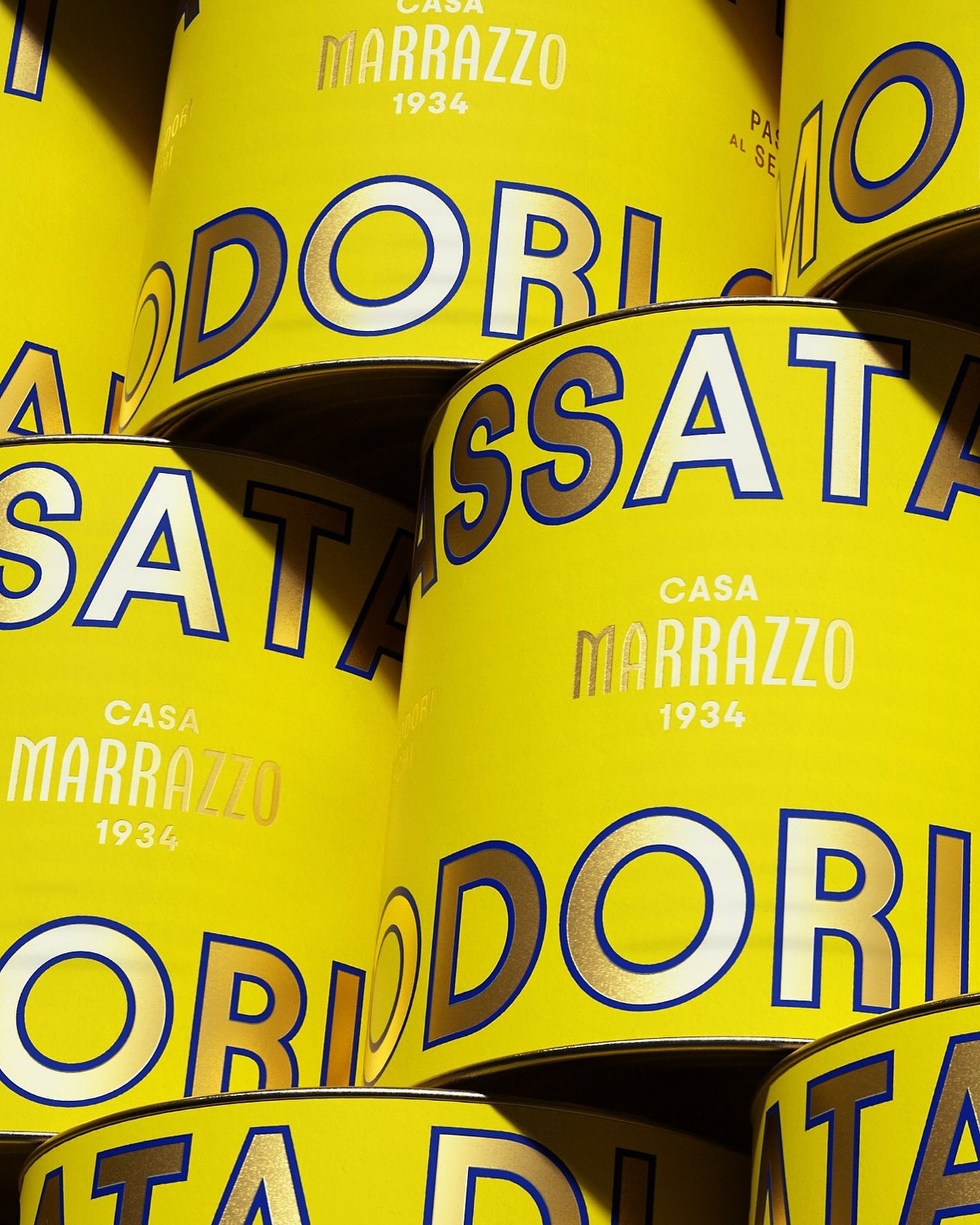
A clean layout, lots of gold, and the Avantt typeface were the elements that the Italian agency Auge Design used for these canned foods full of tradition and flavor.
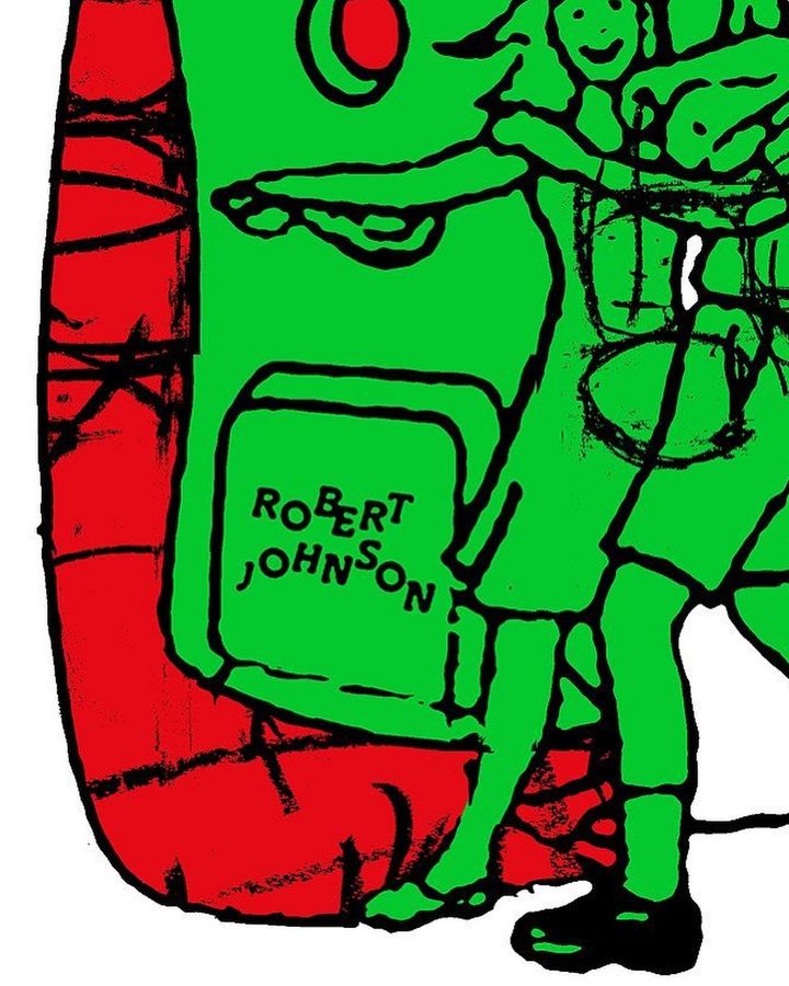
The Robert Johnson Club kicks off the 2024 season with these posters designed by Dominik Keller Studio. Typography used is Cosplay.
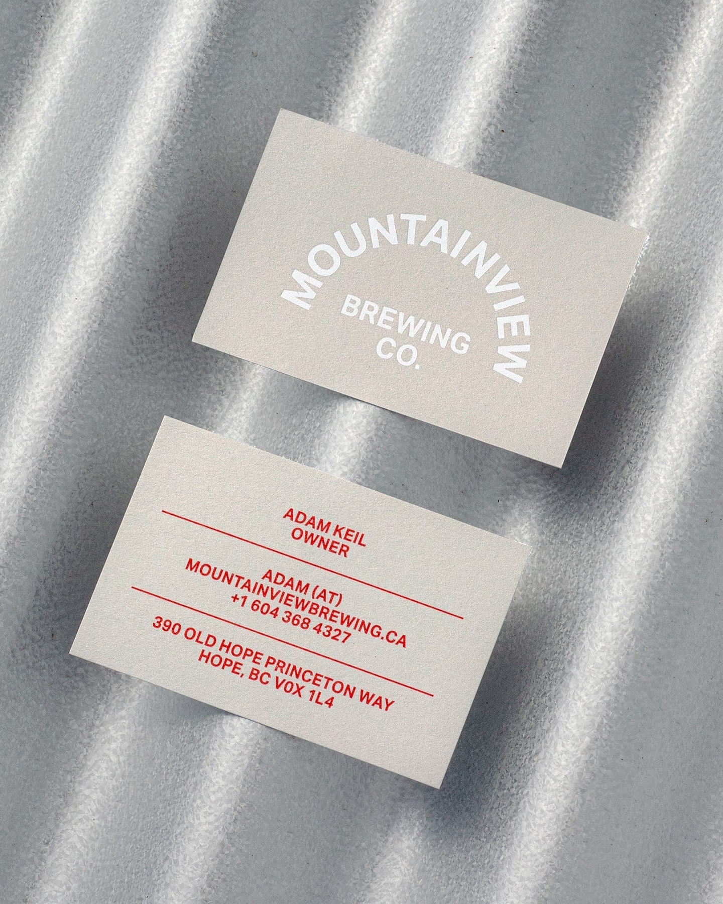
Memory Studio was inspired by vintage elements, like old book covers, and used Aktiv Grotesk to create the identity for this craft brewery.
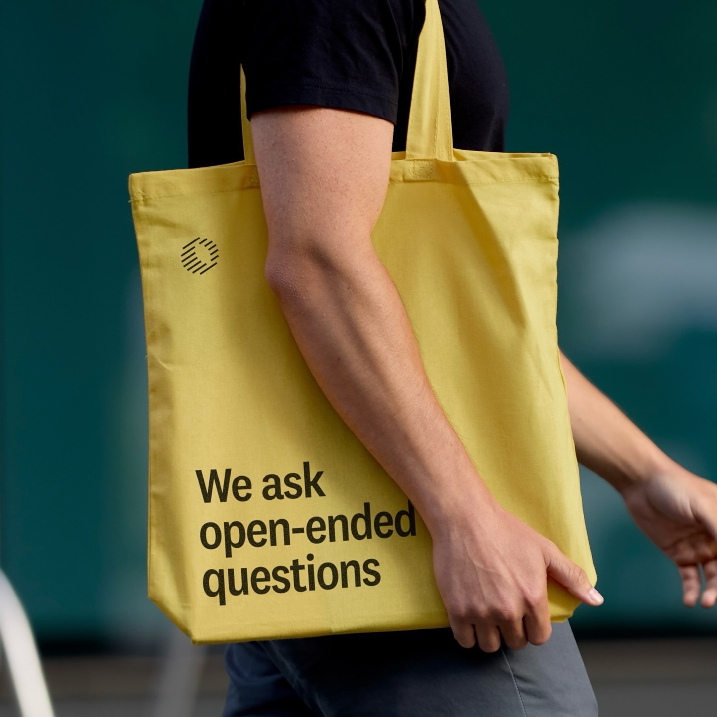
Classics with a modern twist; National 2, Atlas Grotesk, and Atlas Typewriter, were used by Play for the identity they created for Open Research.