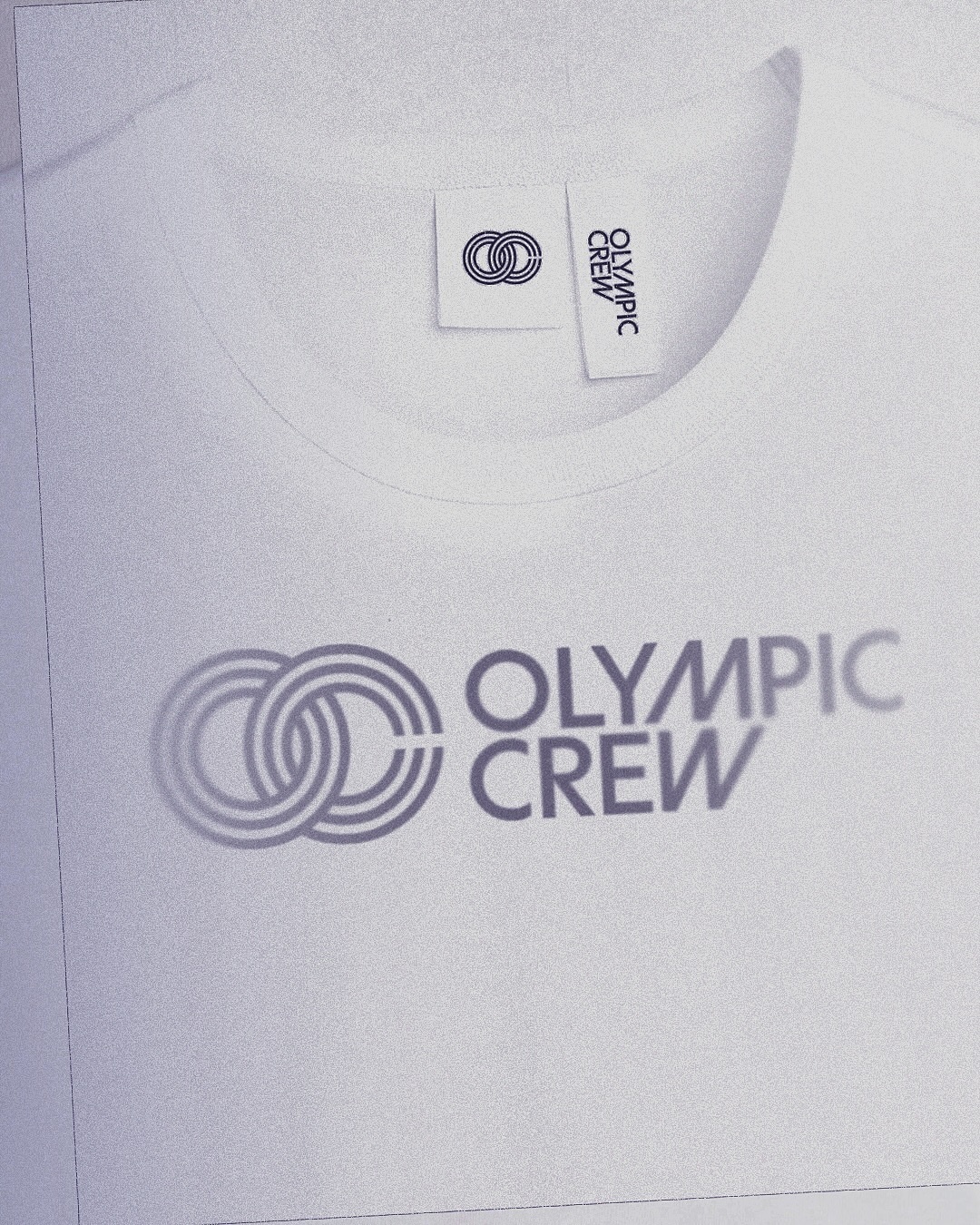
BonTemps studio designed the identity for Olympic Crew, combining the custom logotype and the iconic OC symbol to capture collaboration and modernity. They used the Univers Condensed Bold typeface.
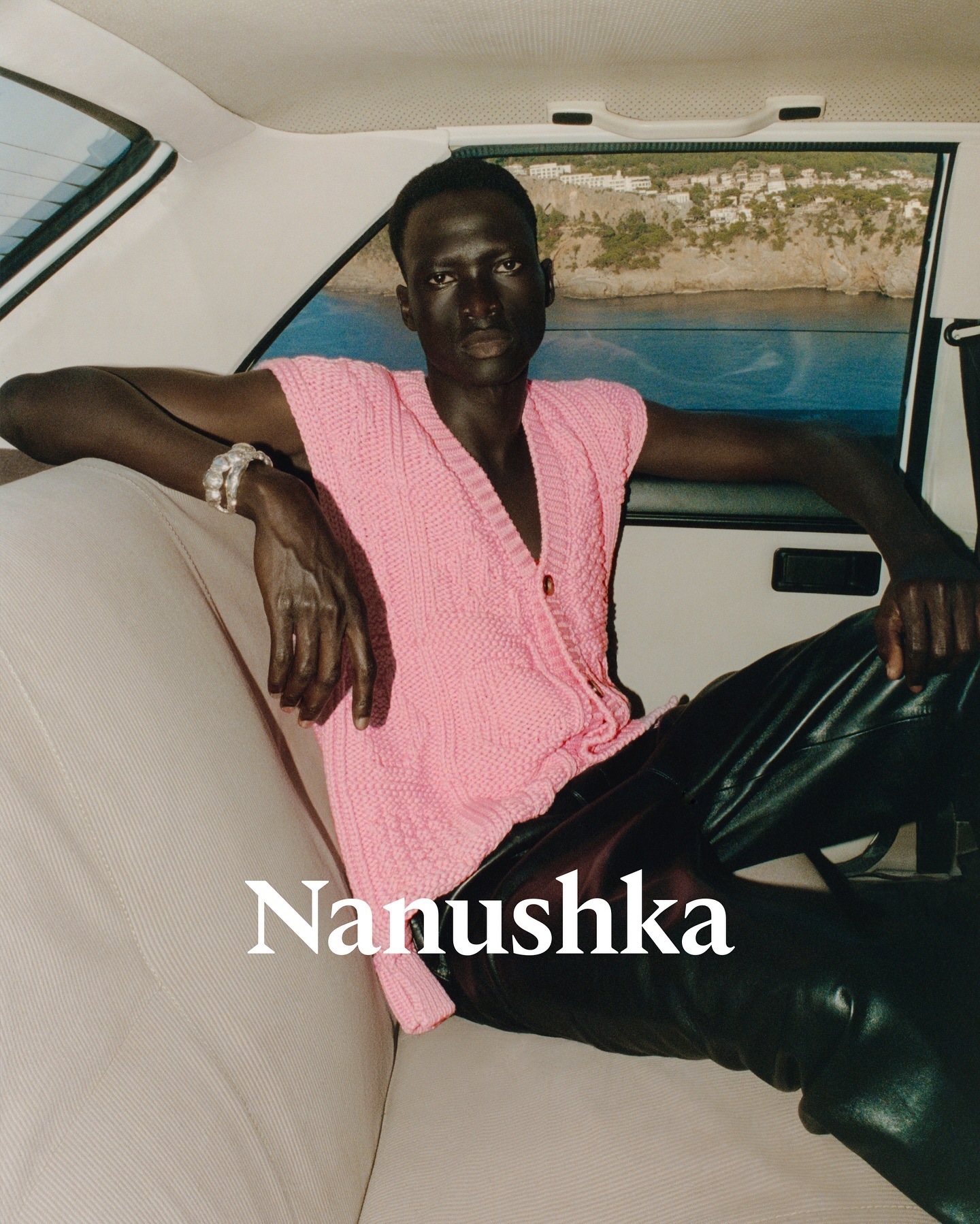
Nanushka is making its mark in the fashion market with inspiration drawn from Hungarian history as well as a wordmark and visual identity rooted in traditional symbols.
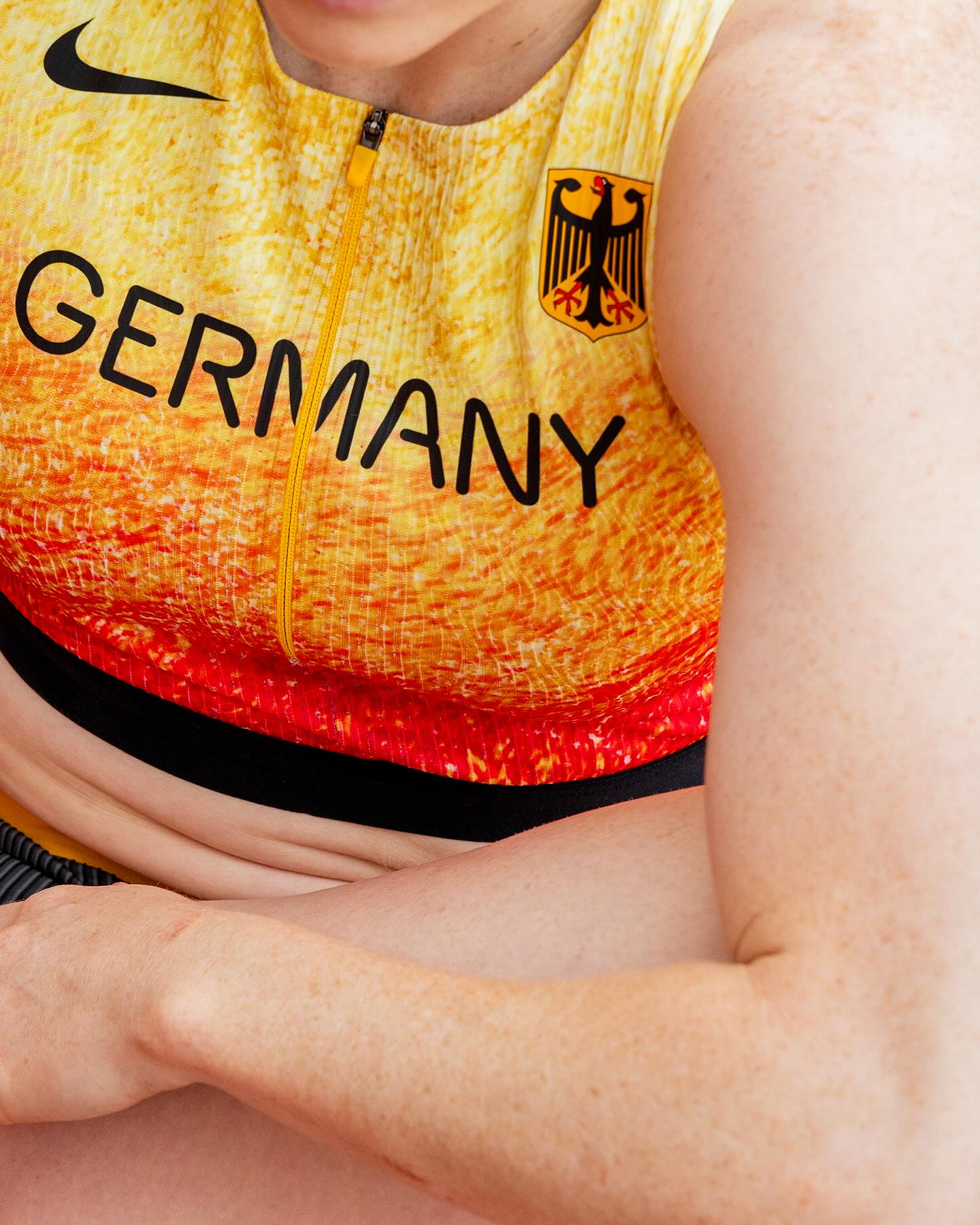
At the world’s largest sporting event, Nike embraced a modern, dynamic, and fluid typeface. In collaboration with Pizza Typefaces, they created the Nike Olympics fonts, a typeface inspired by twisting motion.
A classic typeface that reinvents itself by being interactive; Bonjour Garçon used Neue Haas Unica W1G Black, applying a negative effect in the web redesign they created for the art agency Pedro Booking.
Elephant magazine showcases the rustic and imperfect details of the ZG Elephant typeface through these graphic spreads. Type and editorial design by Zak Group.
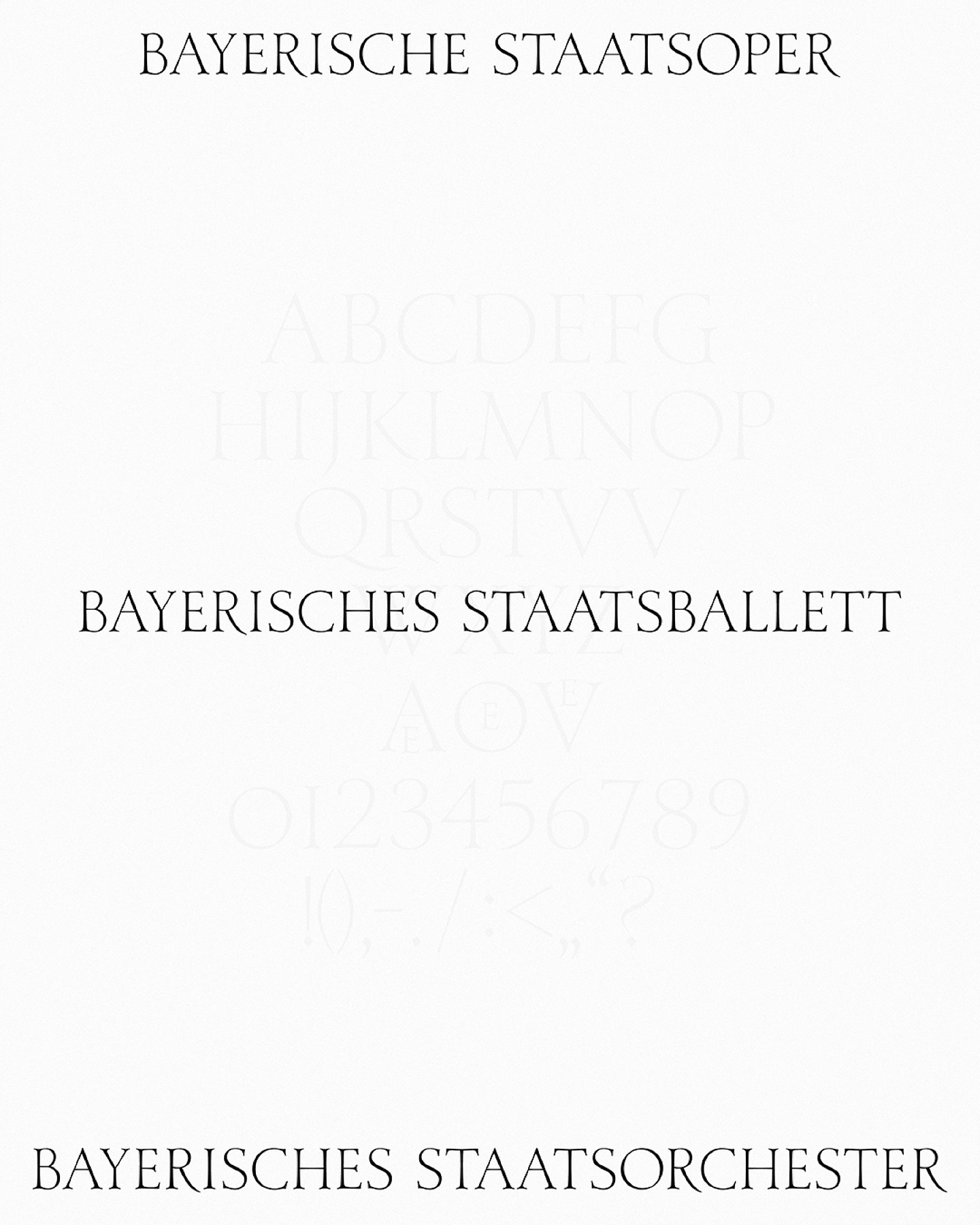
As part of the visual identity that Bureau Borsche created for the Bavarian State Opera, a digitized typeface —developed by Samara Keller— was created, based on a design found in the opera’s facilities.
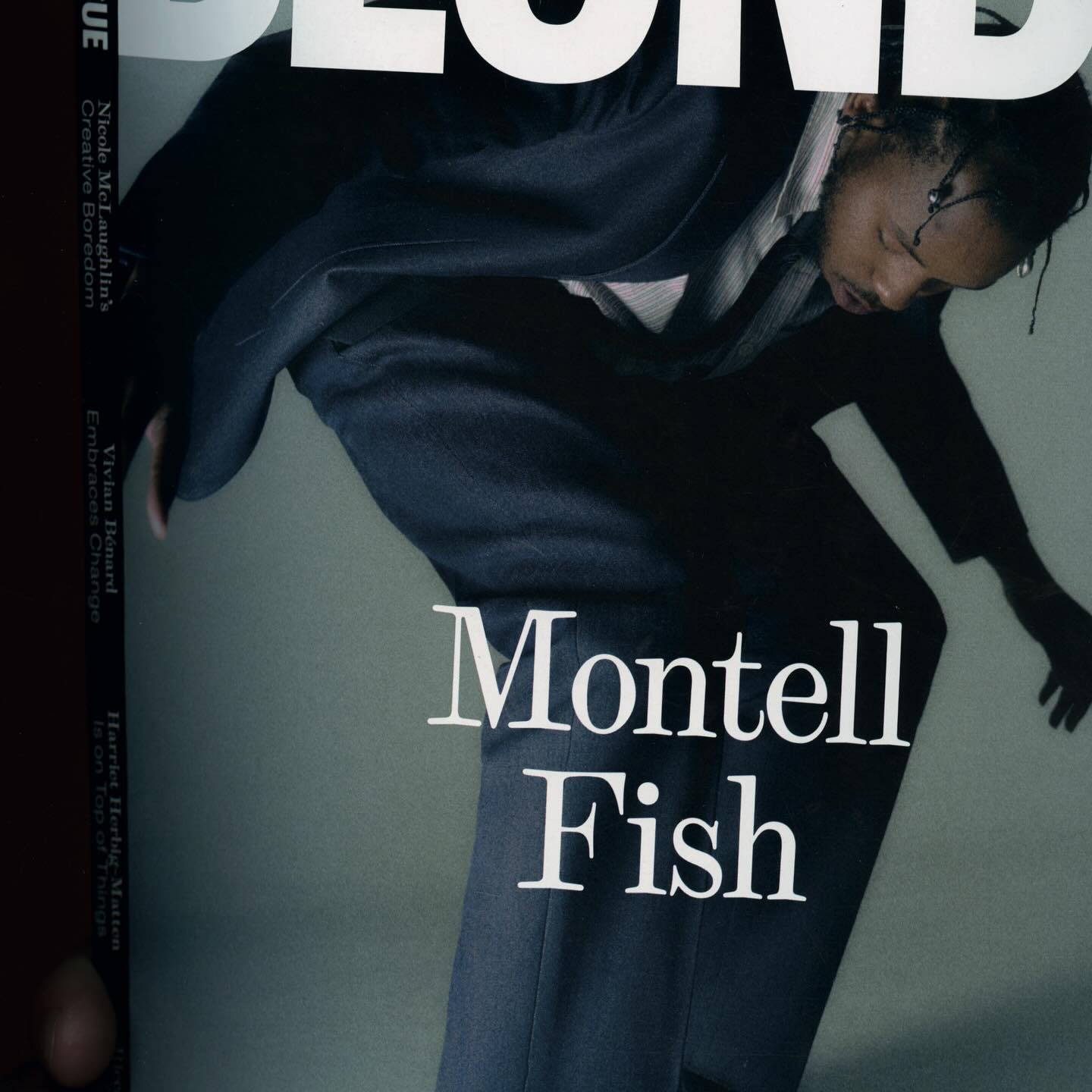
The type selection for Blonde Magazine’s redesign, managed by Hei Agenda, includes Contrast Foundry on the logo, Counter Forms for the serif (Eyla), and sans fonts by Lucas Liccini & Elias Hanzer (HAL Four Grotesk)
As fun as family movie nights, Moore by Eliott Grunewald was used in this list of films curated by A24 and approved by kids and adults alike. Designed by Jordi Ng and Elana Schlenker.
Logotype and lettering inspired by the baroque era of the internet, proposed by Muon Studio for Youhee’s visual identity.
Justin Sloane used this interesting mix of Gothic letters (Castilla by Sharptype) and sans serif (Octave by Josh Finklea) for a vinyl cover.