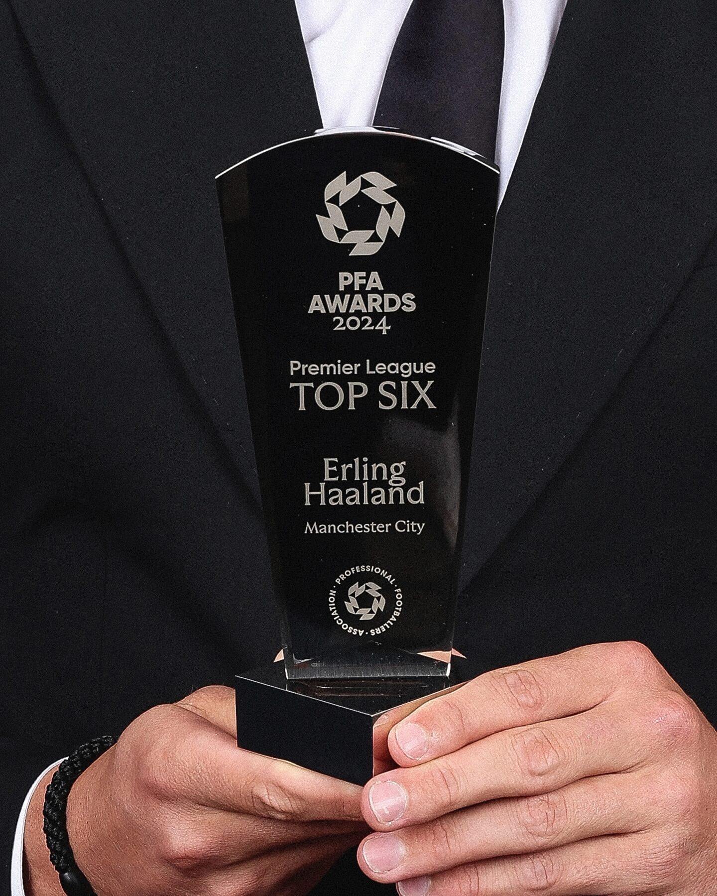
Realm by Approximate Type being used in this annual award ceremony for the best player of the year in the English league.
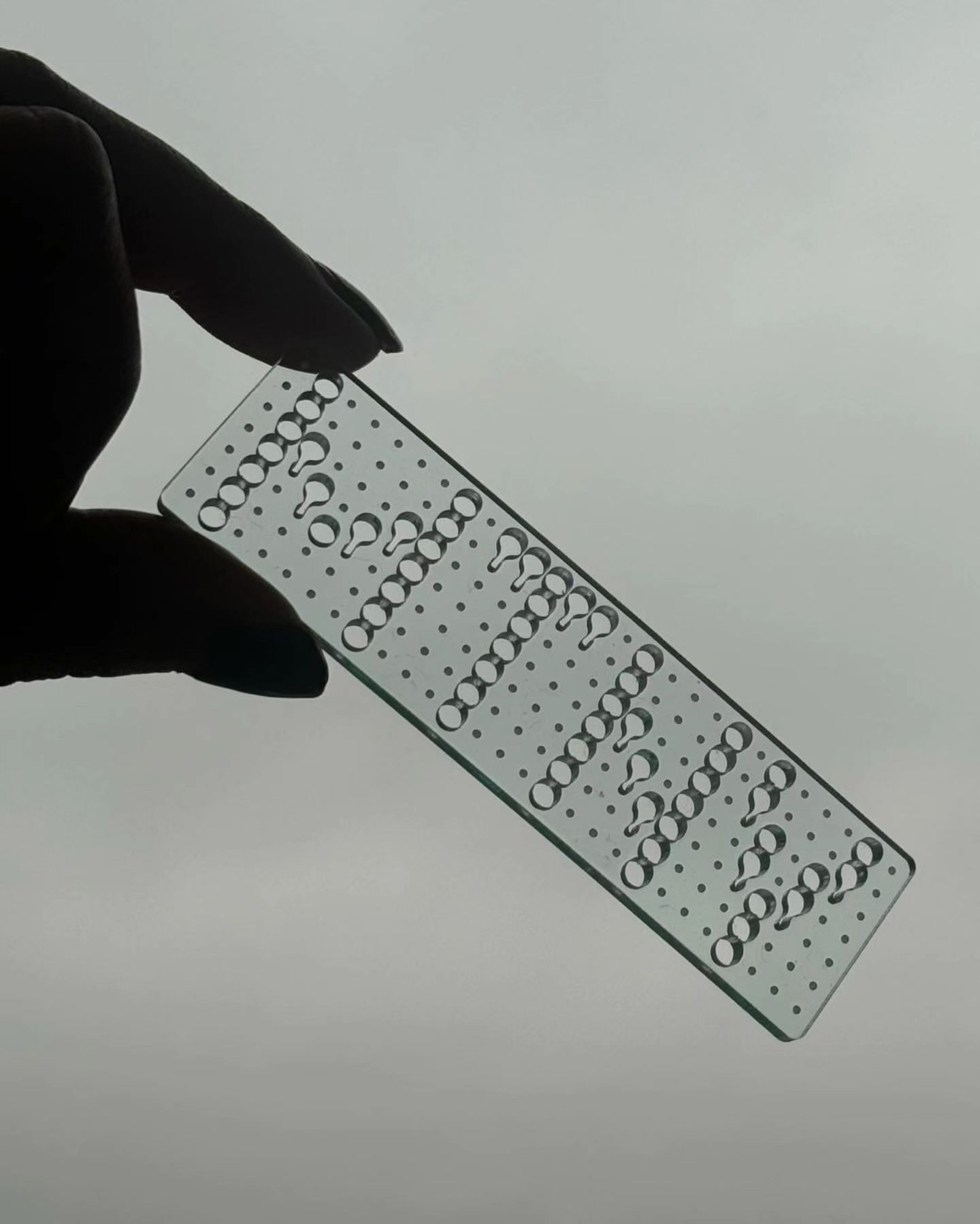
This series of keychains, the result of Pauline Esguerra’s exploration with laser cutting, uses, among other typefaces, Eurocat by Maxitype.
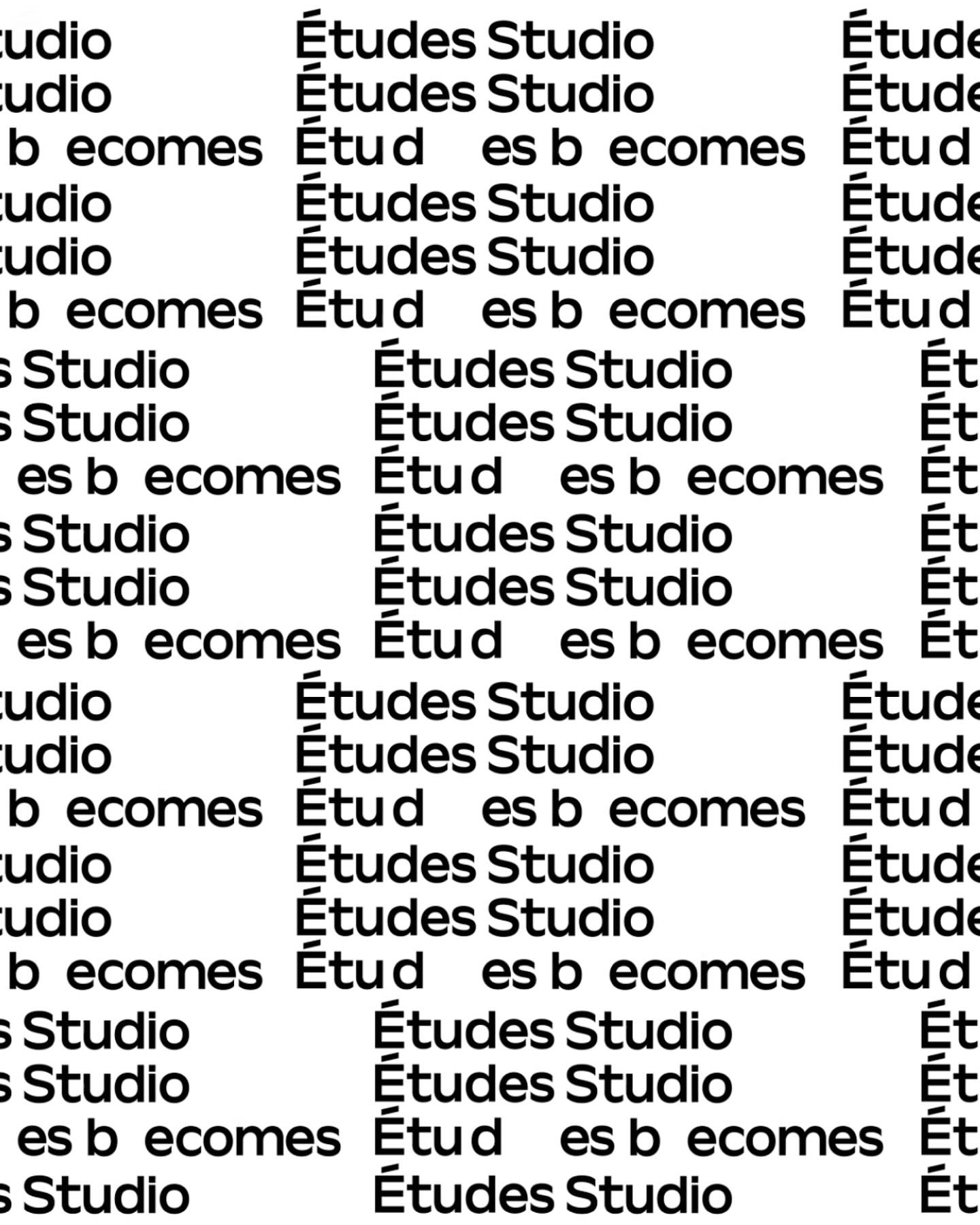
A geometric typeface with humanist features, crafted by Spassky Fischer, for the new identity of Études.
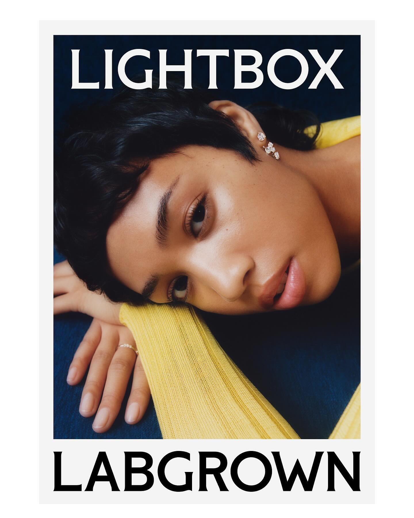
Decade created this visual identity to position an innovative lab-grown diamond brand, proposing a custom flare logo designed by Colophon Foundry.
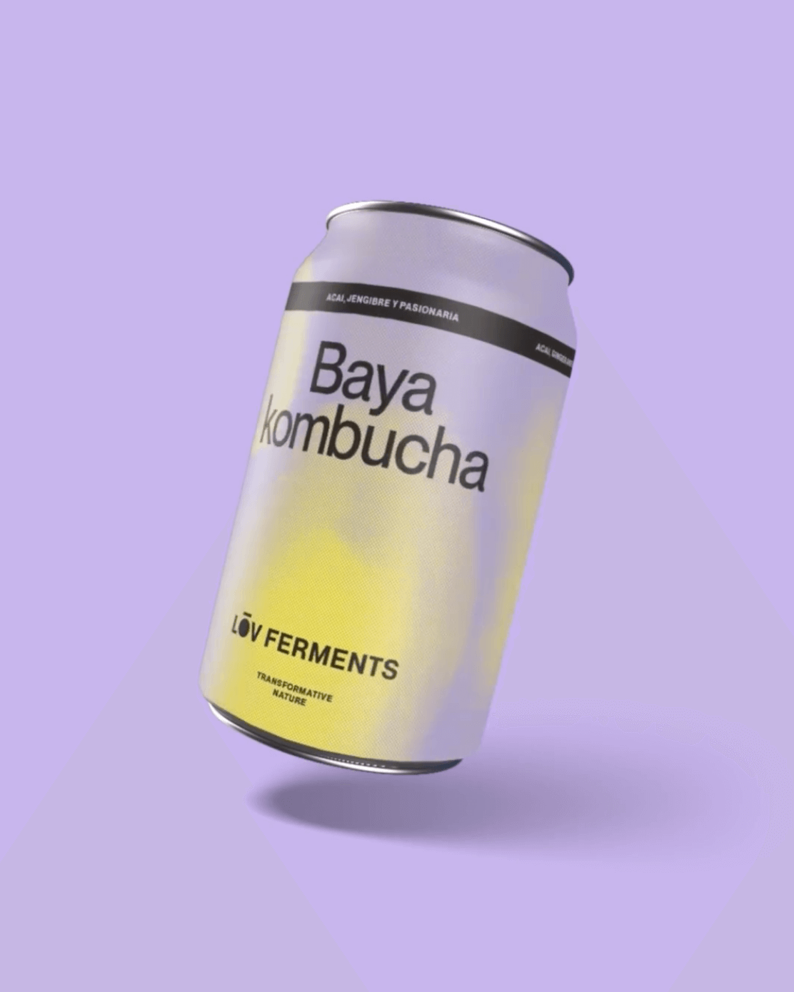
Casa Bien used Neue Montreal by Pangram Pangram and Items by Schick Toikka to build the visual identity for LOV Ferments, a brand set to change the beverage market.
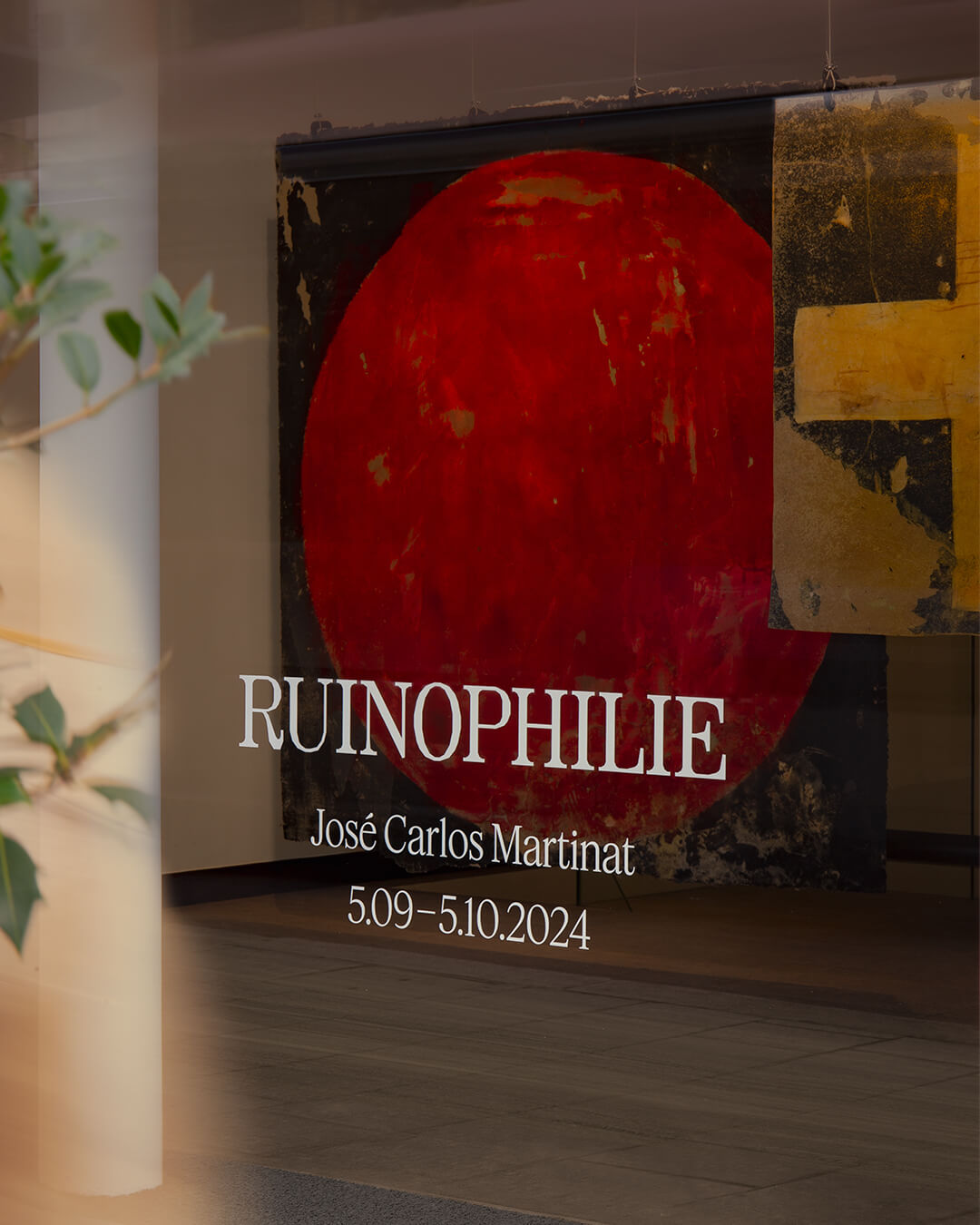
Three typefaces come together in this warm visual identity for an art exhibition in Paris: Minotaur by Production Type, Diatype by Dinamo, and Feature Deck by Commercial Type.
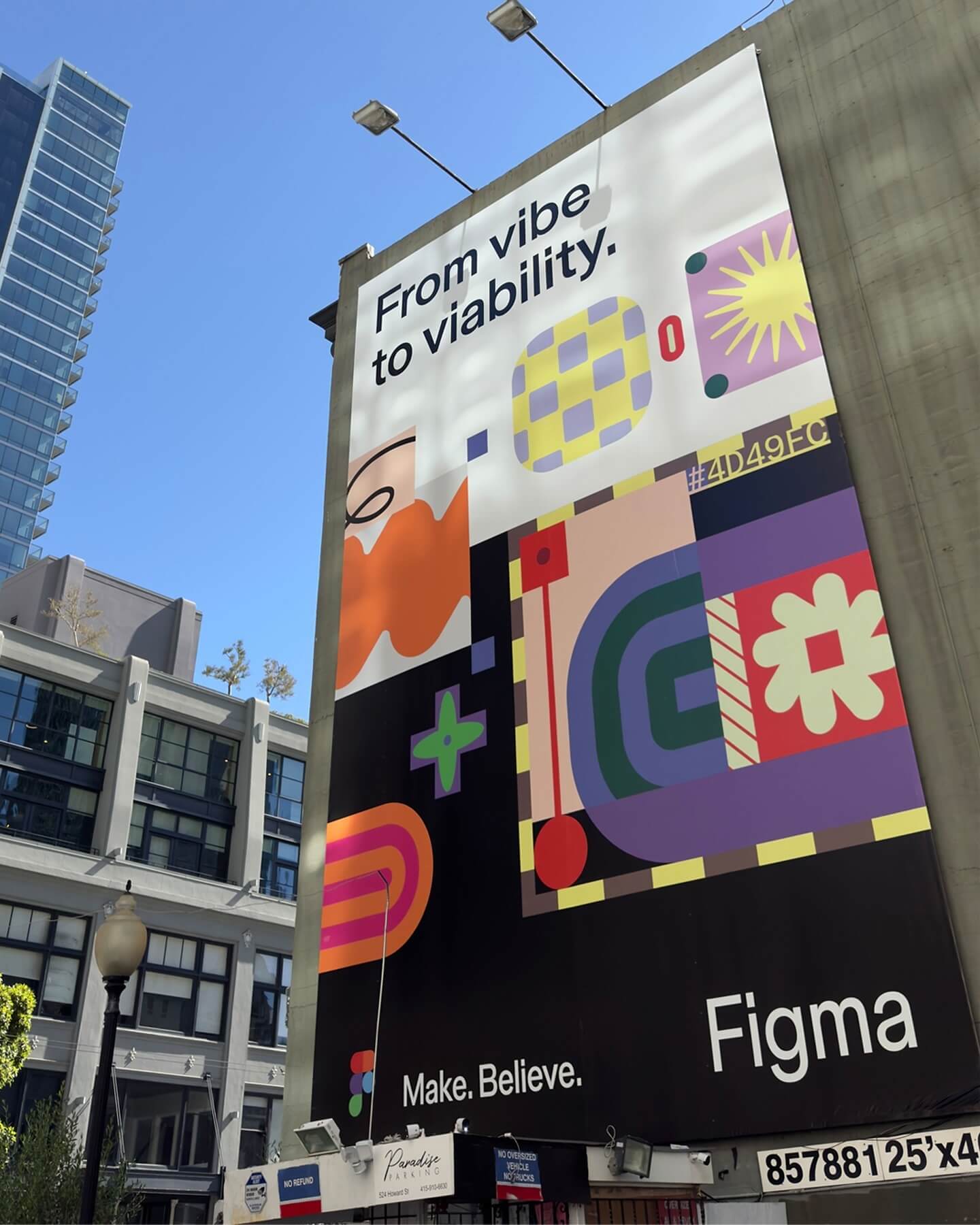
Grilli Type took on this ambitious project and proposed Figma Sans; a typeface with personality but practical, focused on efficiency, and free of unnecessary embellishments.
Rajola is a stencil and filled typeface designed by ErrorErrorStudio. It is inspired by and pays tribute to the iconic hexagonal tiles characteristic of the Mediterranean.
Logotype custom-designed by Bureau Bernklau, drawing inspiration from the distinctive features of Ehmcke Antiqua, an early 20th-century typeface.
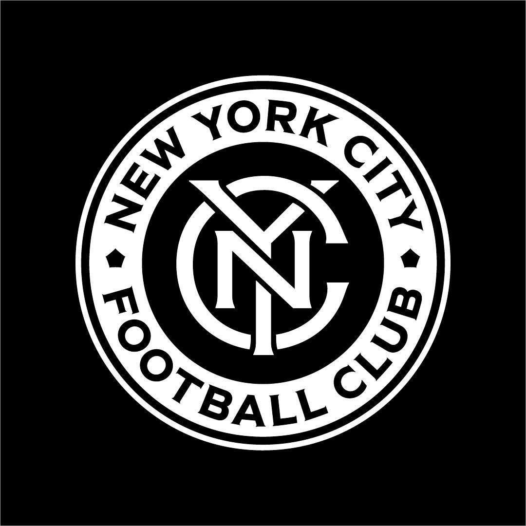
Frere-Jones was tasked with redesigning the New York City Football Club badge, and carefully adjusting each character to fit the circular arc of the badge.