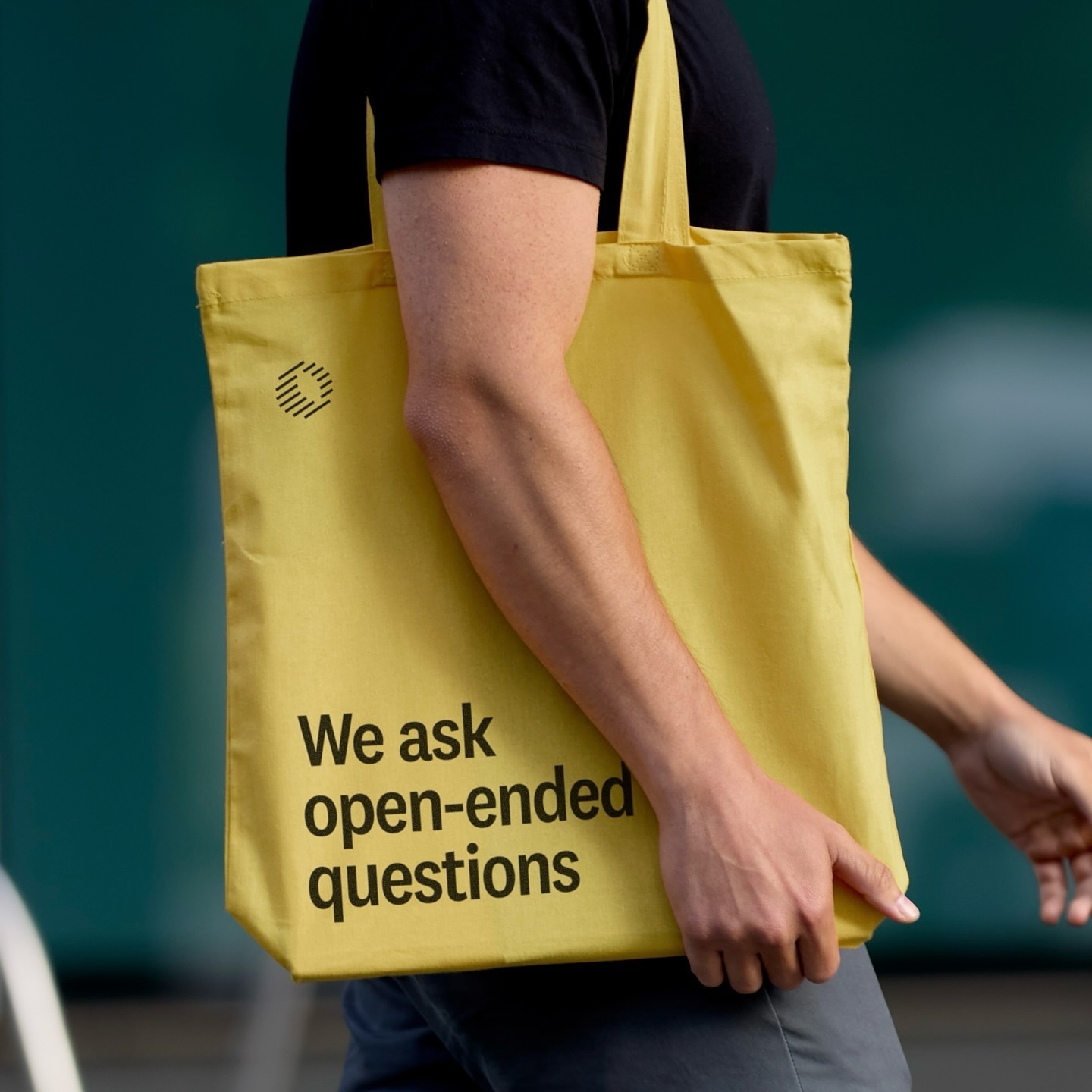
Classics with a modern twist; National 2, Atlas Grotesk, and Atlas Typewriter, were used by Play for the identity they created for Open Research.
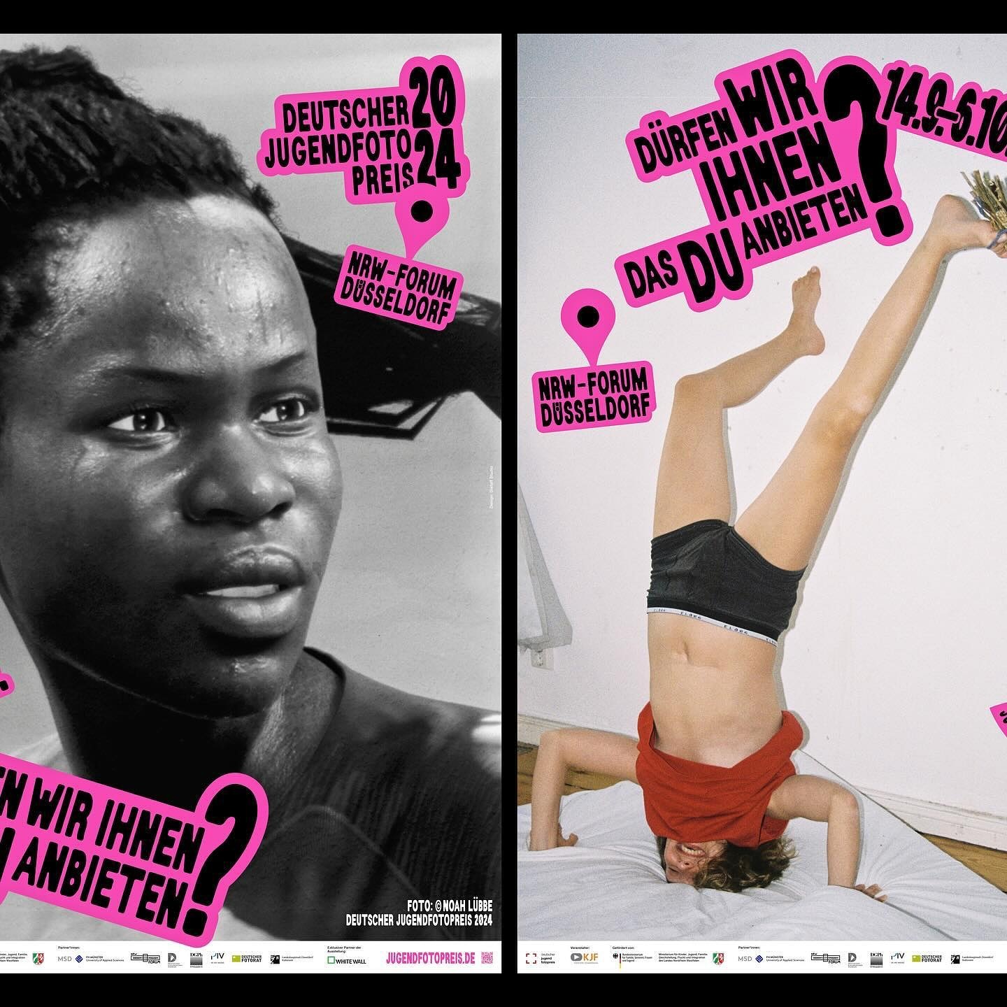
An identity made with stickers that follows no rules in the layouts. Distaff Studio used Serial A as the typeface for the image of this exhibition of the German Youth Photography Prize.
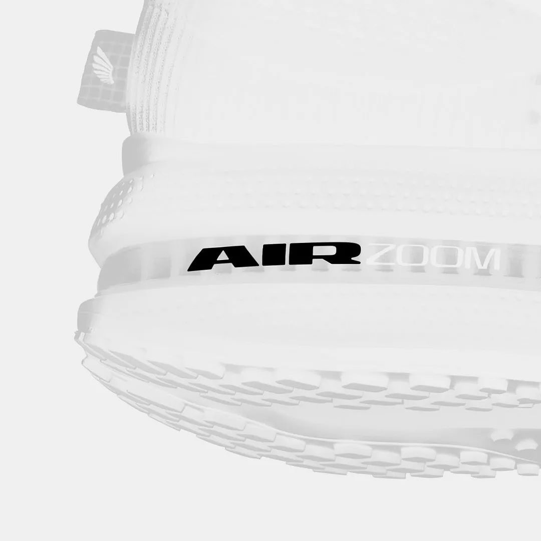
Win on Air is the name of the new Nike Air identity, where David Gobber and Hoang Nguyen were part of this project, designing the typography used in the logo, which is a custom version of Generation Mono, another typeface of their own creation.
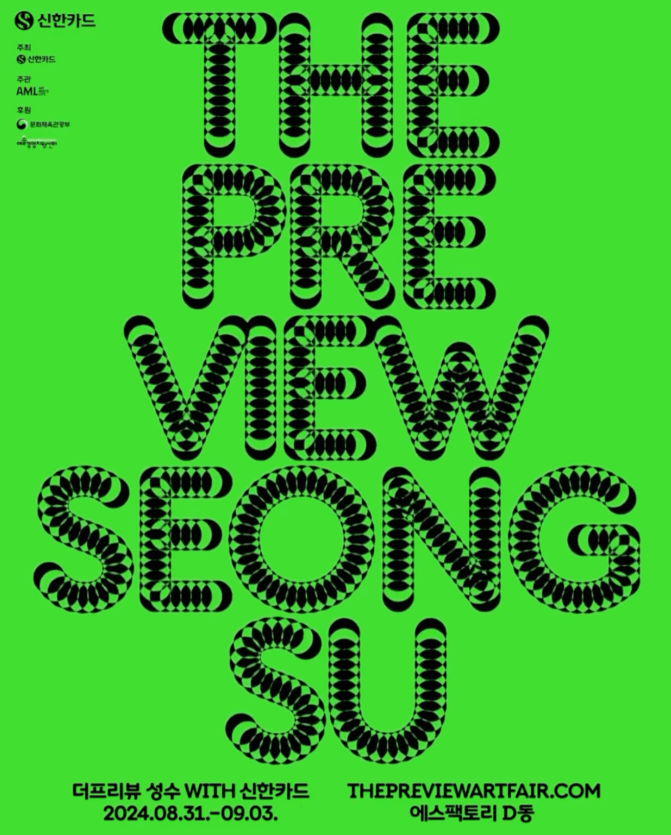
A typeface that –literally– shows its starting point and journey; the Korean graphic designer, @jun.works , included this along with other elements to create the visual identity for @thepreviewartfair.
An affair depicted through typography to create the identity for the Belgian Art and Design Affair, where @otisverhoeve,@bureauclaes, and @pino_type designed three different typefaces incorporating hearts into each letter.
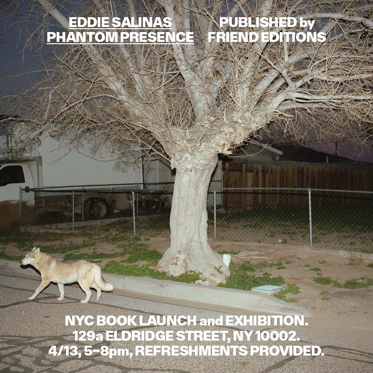
Made to showcase the dramatic and captivating work of Eddie Salinas, the book Phantom Presence was designed by Friend Editions, using All Purpose Grotesk for its interiors.
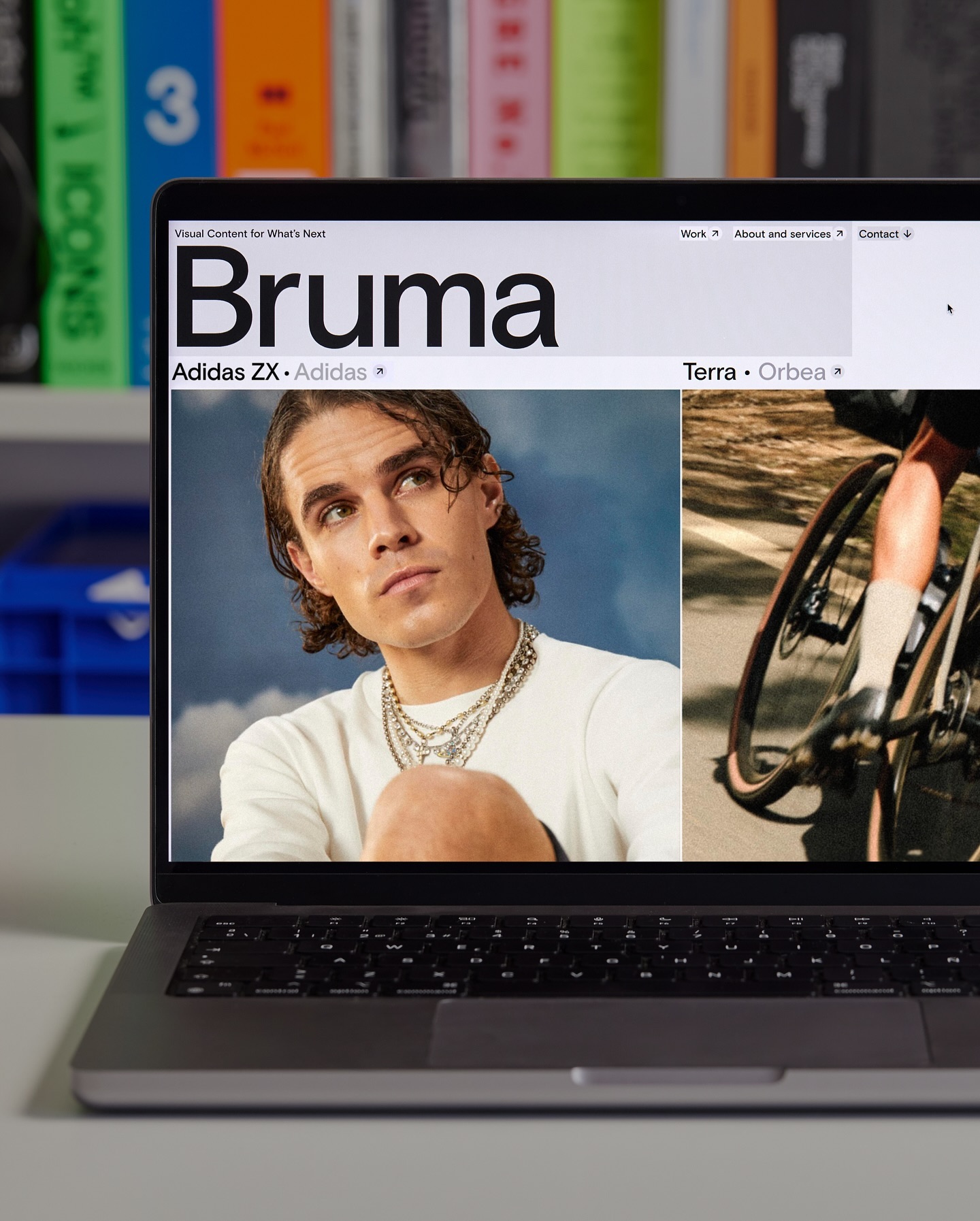
Basis Grotesque is the only typeface used in the identity and website of Studio Bruma, a creative production company to forward-thinking people and brands.
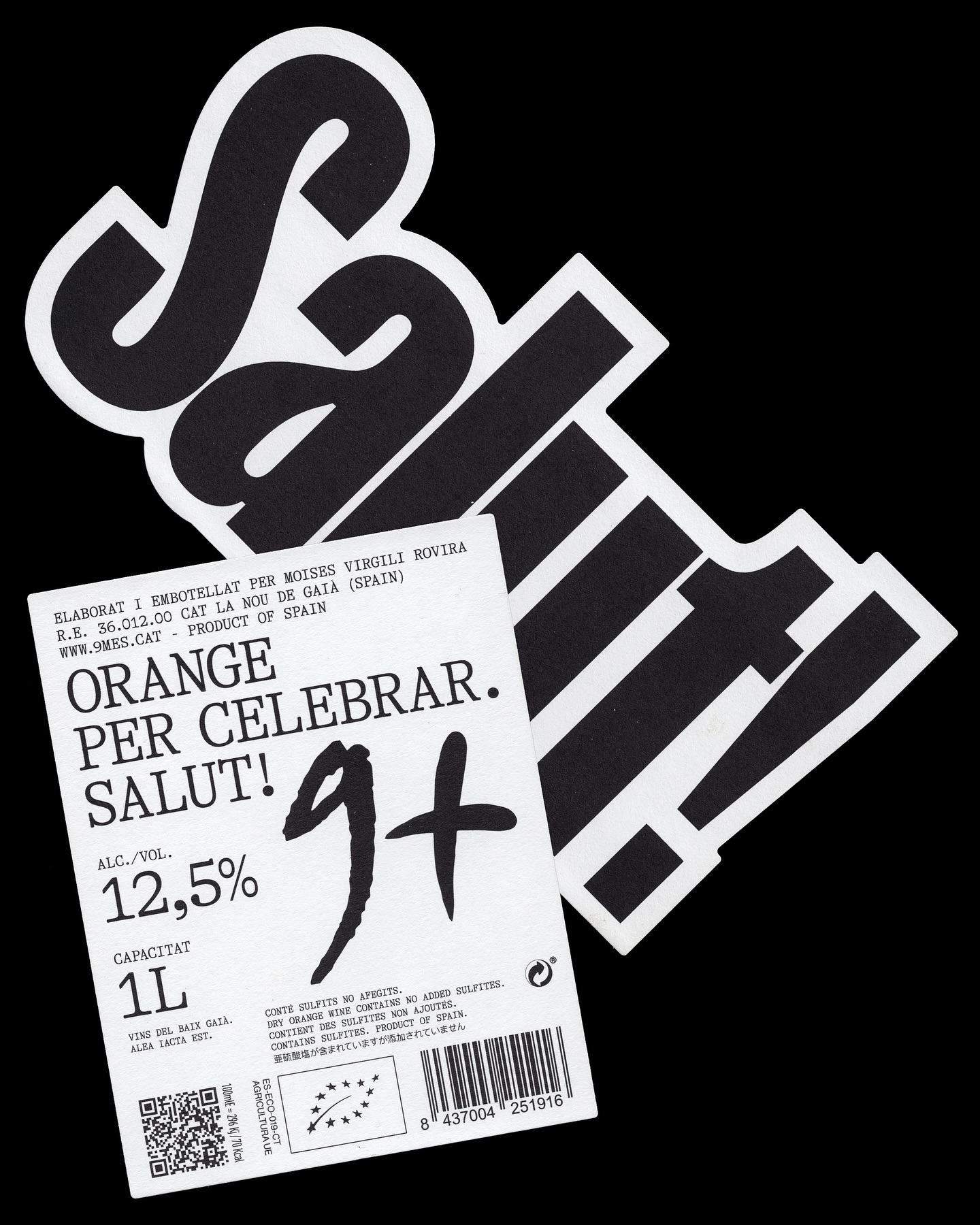
A simple and powerful label for a wine made to celebrate. Principi Studi used FK Screamer for the logo and GT Alpina for the complementary typography.
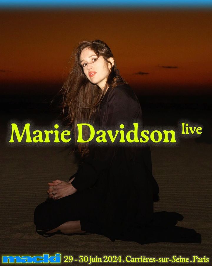
An electric identity designed by DR. ME and an organic serif typeface, Gaya, accompany the 2-day indie music festival hosted by Macki.
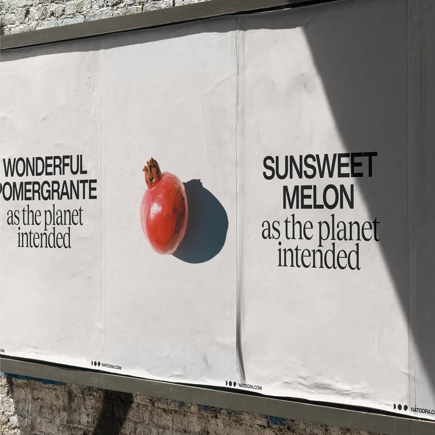
As authentic as nature can be, Justified Studio chose these two typefaces to be part of a sober yet sophisticated identity for the organic food producer Natoora.