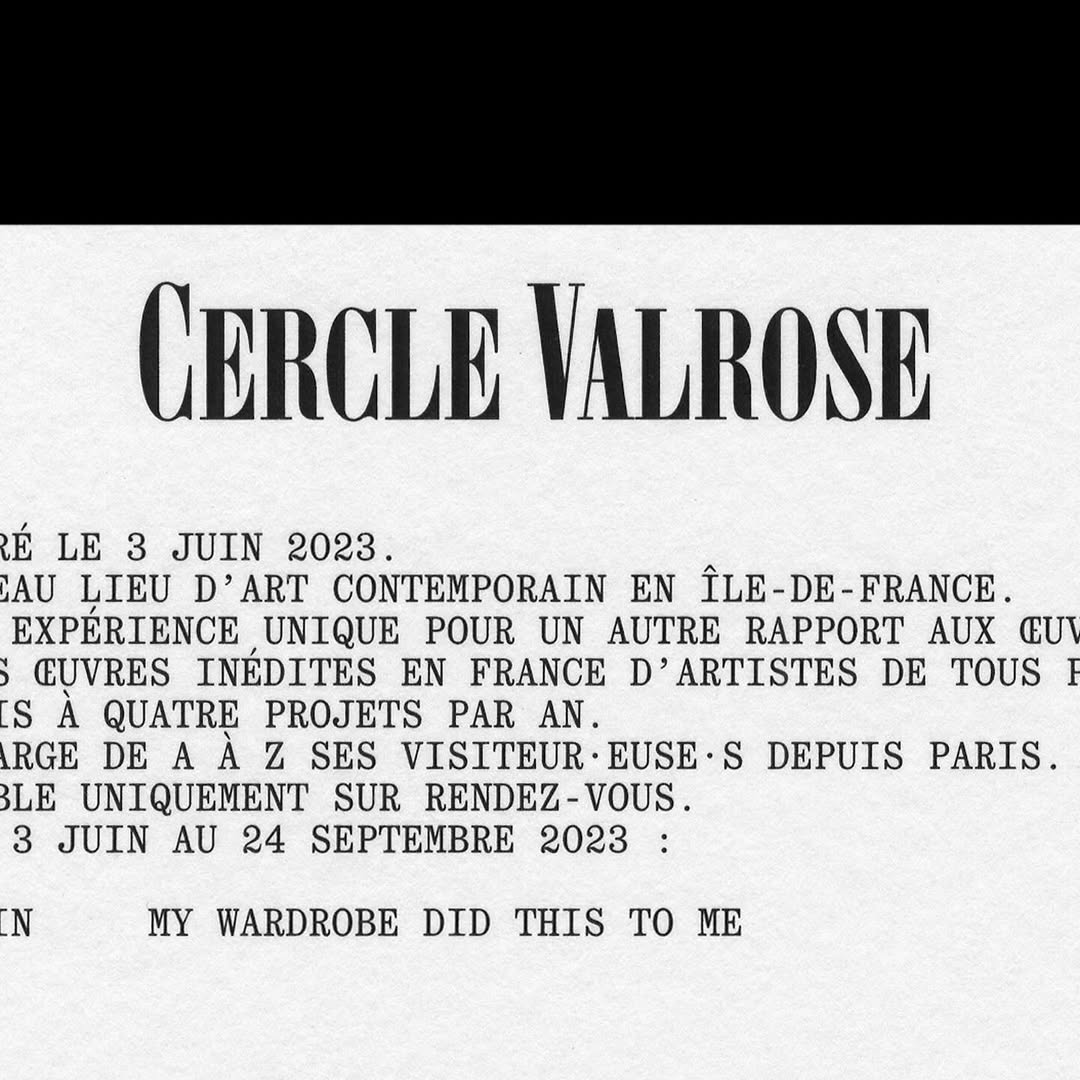
OTT Harker by Ornamental & Title Type is used in the logo for Cercle Valrose. The design is by Bizzarri-Rodriguez, who also created the typeface. Quadrant by Matter of Sorts is used for the supporting text.
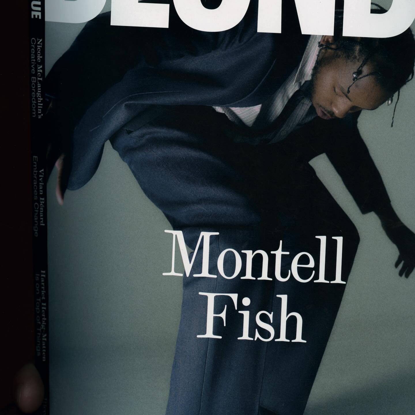
The type selection for Blonde Magazine’s redesign, managed by Hei Agenda, includes Contrast Foundry on the logo, Counter Forms for the serif (Eyla), and sans fonts by Lucas Liccini & Elias Hanzer (HAL Four Grotesk)
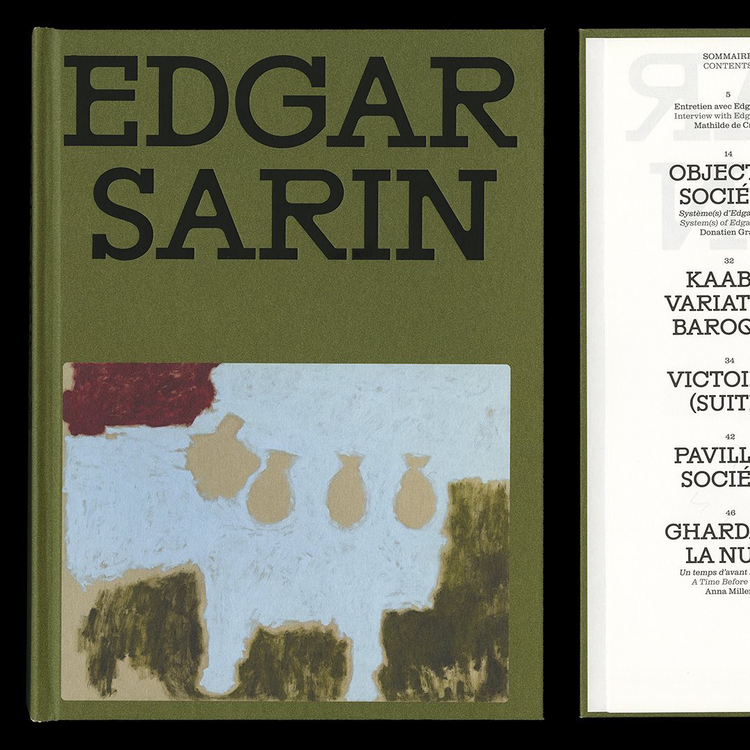
Resonanz B by Out of the Dark and Clarendon Graphic were the typefaces selected by Lisa Sturacci for the editorial design of this book about about Edgar Sarin’s work.
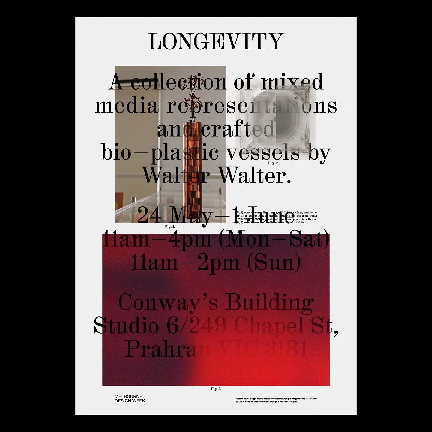
M. Geisser used HAL Colant from HAL Typefaces and ROM from Dinamo for the poster and invitation for the Walter Walter Longevity exhibition.
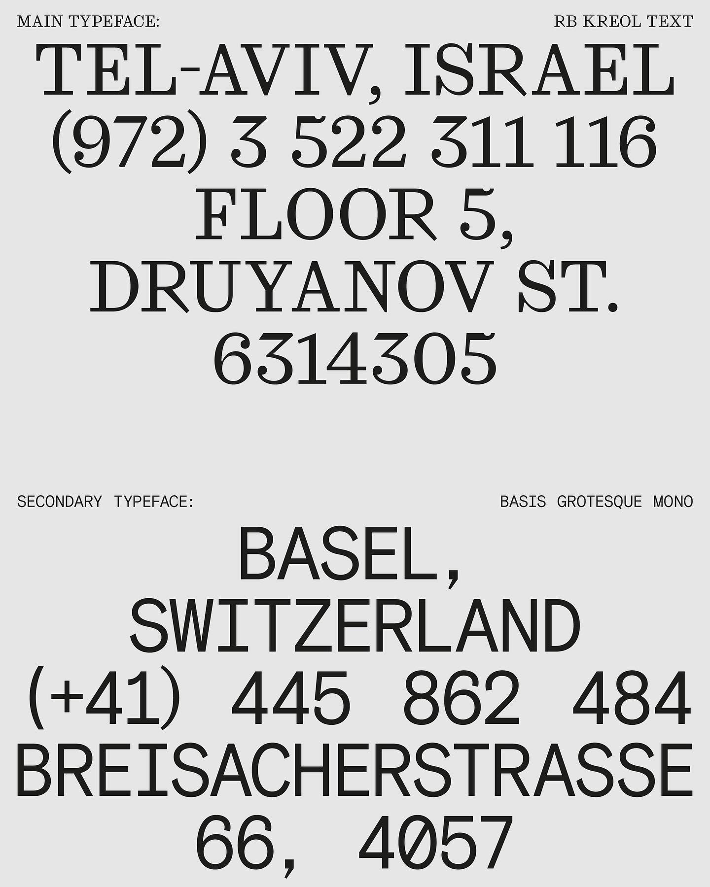
In this website with two main columns constantly changing size, Atipus Studio used RB Kreol Text from Studio René Bieder.
How to design the extension of –a very well-known– brand, while also making it unique. Order solves this question with the identity of Journal House, a branch of WSJ dedicated to events.
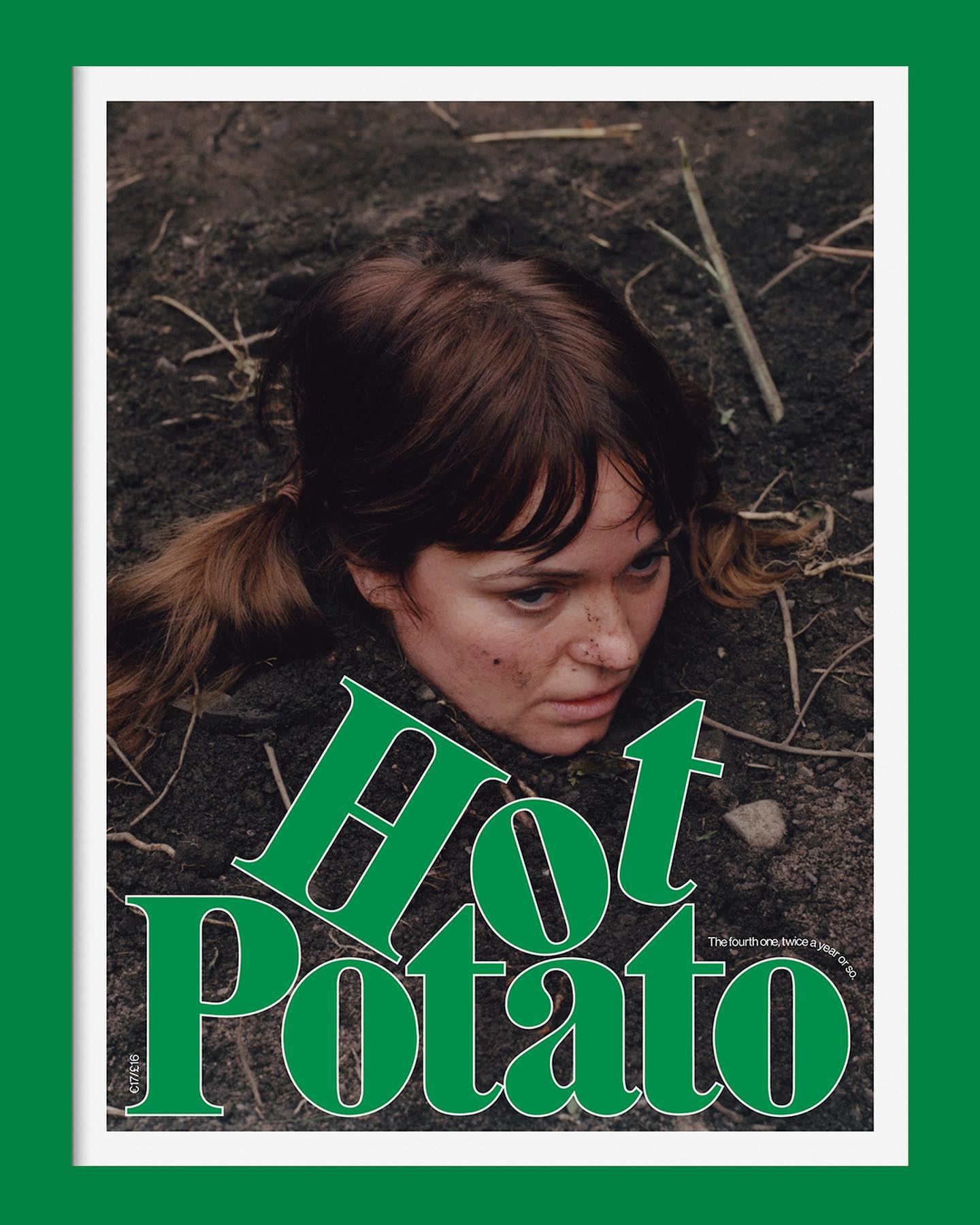
Neue Haas Grotesk is a common typeface on the blog, it works well in many scenarios, for example alongside Marfield in the fourth edition of Hot Potato magazine.
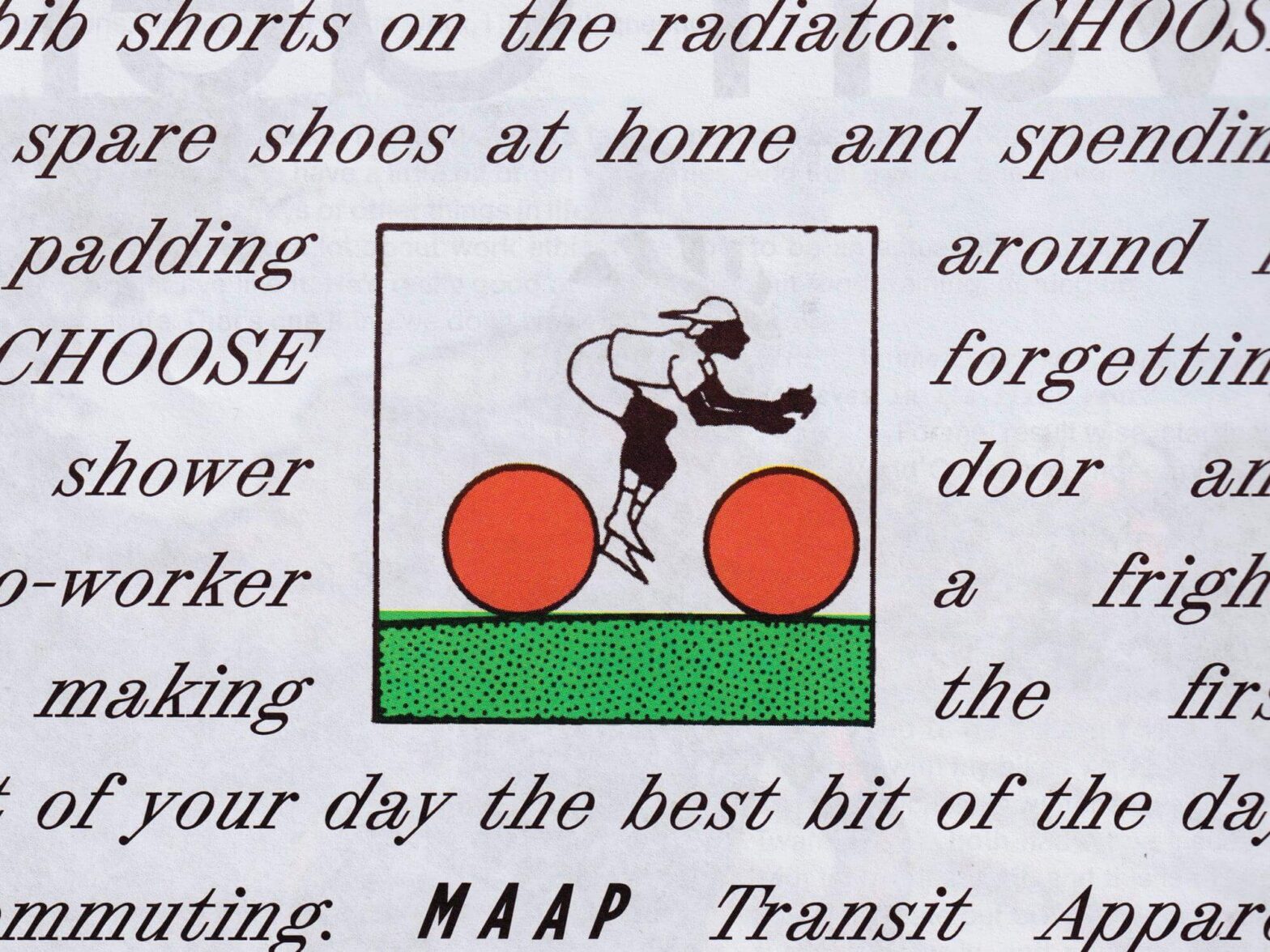
Tric Studio in charge of the design and art direction of second issue of the MAAP publication, Off The Front. The fonts used are ABC Synt and ABC Oracle by Dinamo, and Base Monospace by Emigre.