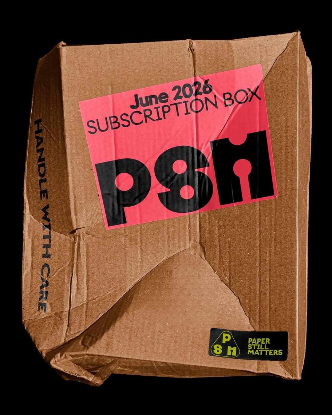
Giulia Boggio designed the identity for Paper Still Matters, a TYPE01 Studio shop aiming to connect with the creative community. The logotype features custom lettering and Onlysans by Daria Cohen, with ALT Riviera from ALT.tf as the supporting typeface.
In Arte Tracks and Arte Tracks East, typography breaks into lines and reconfigures into ever-evolving graphics. Logotype, visual identity, and generic system by H5paris.
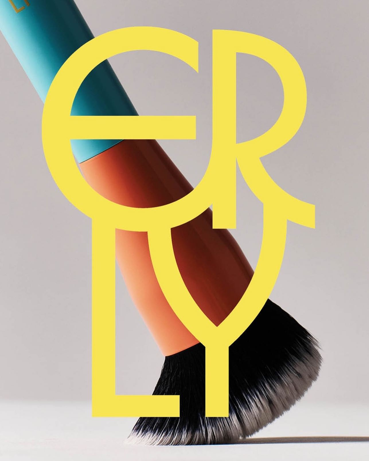
ERLY reinvents skincare with a fresh, typographic identity. Herbus Regular & Title Type, in the design by Studio Lotta Nieminen.
Animo Typeface by Heavyweight shapes the identity of Grande Paolo, a pop-up sports bar in Prague for the Euro Championship.
Ottimo celebrates the tradition of olive oil with an identity designed by Somekind Studio, the brand takes shape with Edition by Elias Hanzer, a monolinear typeface that brings a timeless feel.
Designed by Copyright/Reserved, this special publication by @extensive.publishing and @greedydust features Cortese and Cortese Sans by Mark van Leeuwen.
EXTRALESS, a Japanese clothing brand reflected its ethos in a custom typeface by British Standard Type embodying simplicity and shared humanity.
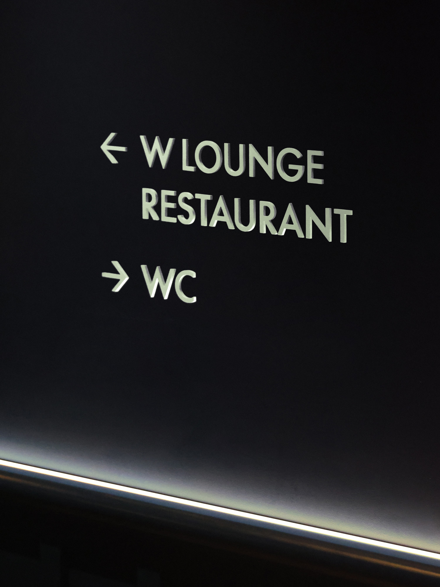
With the aim of redefining elegance, Porto Rocha developed a new brand identity for W Hotels, in collaboration with Lineto, created W Supreme.
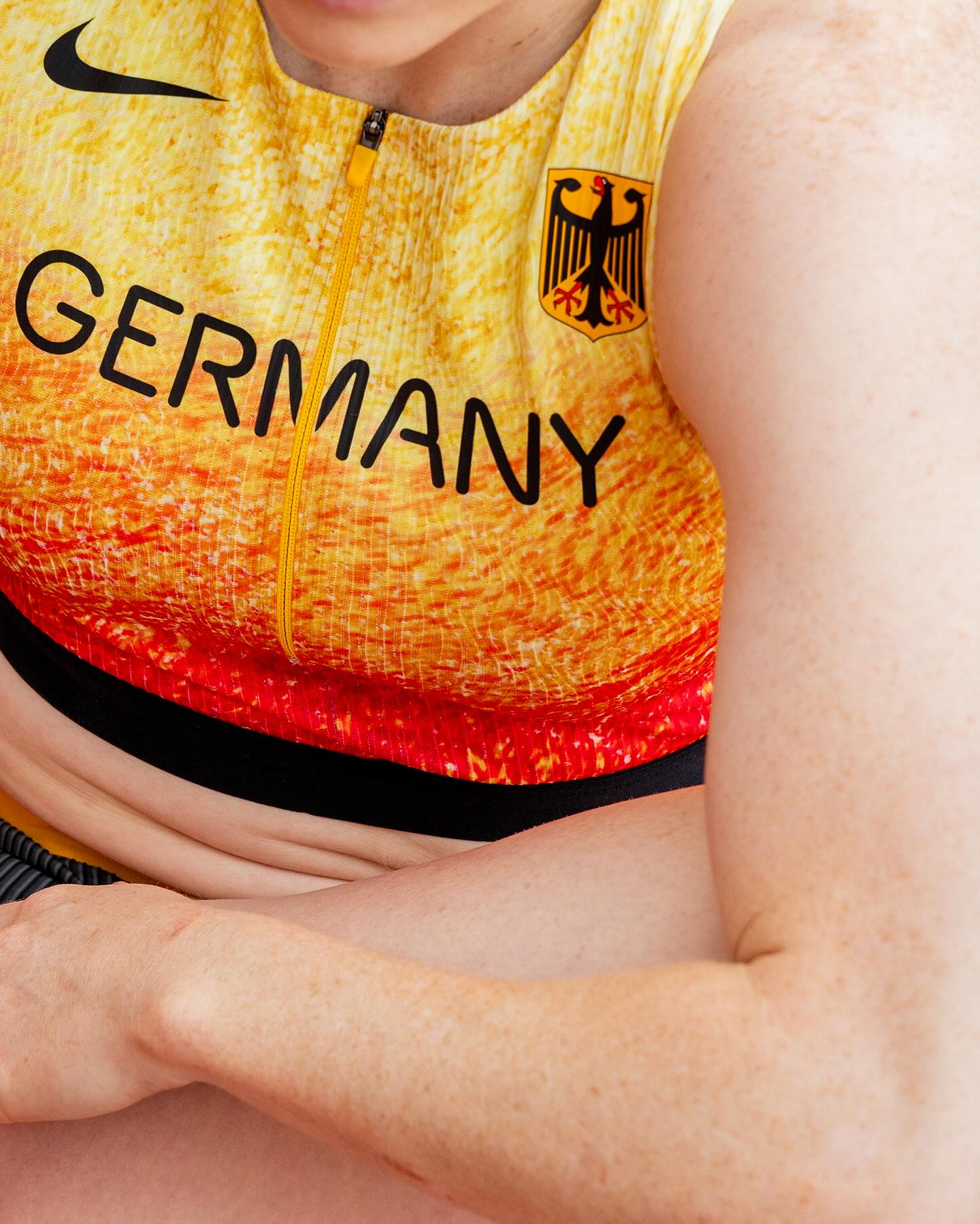
At the world’s largest sporting event, Nike embraced a modern, dynamic, and fluid typeface. In collaboration with Pizza Typefaces, they created the Nike Olympics fonts, a typeface inspired by twisting motion.
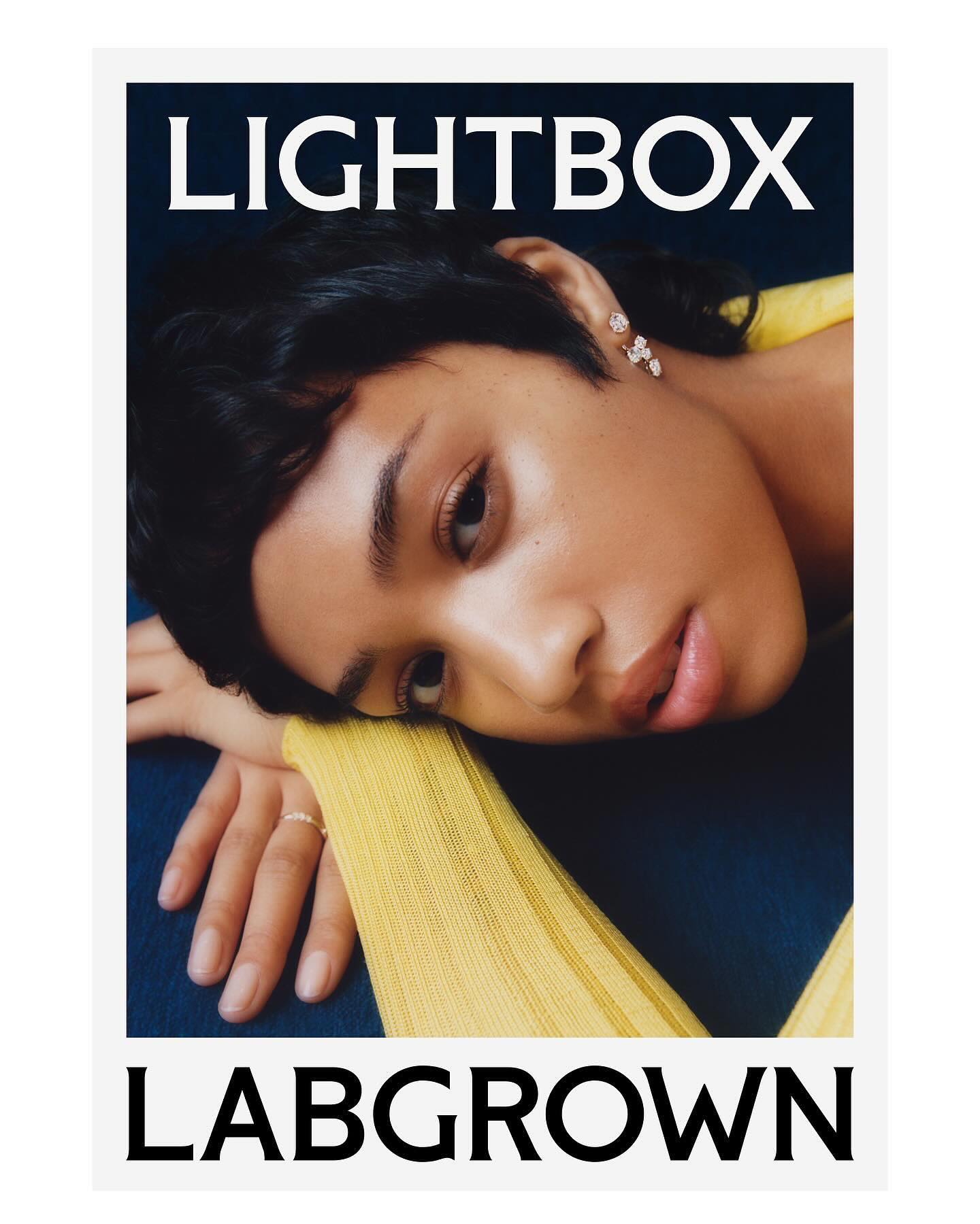
Decade created this visual identity to position an innovative lab-grown diamond brand, proposing a custom flare logo designed by Colophon Foundry.