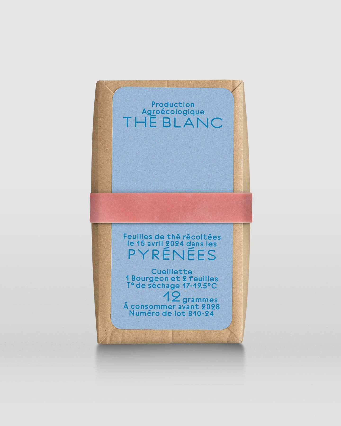
In a comprehensive project including handwriting, drawing, packaging conception, and global branding, Quentin gave @the.pyrenees an organic and approachable identity.
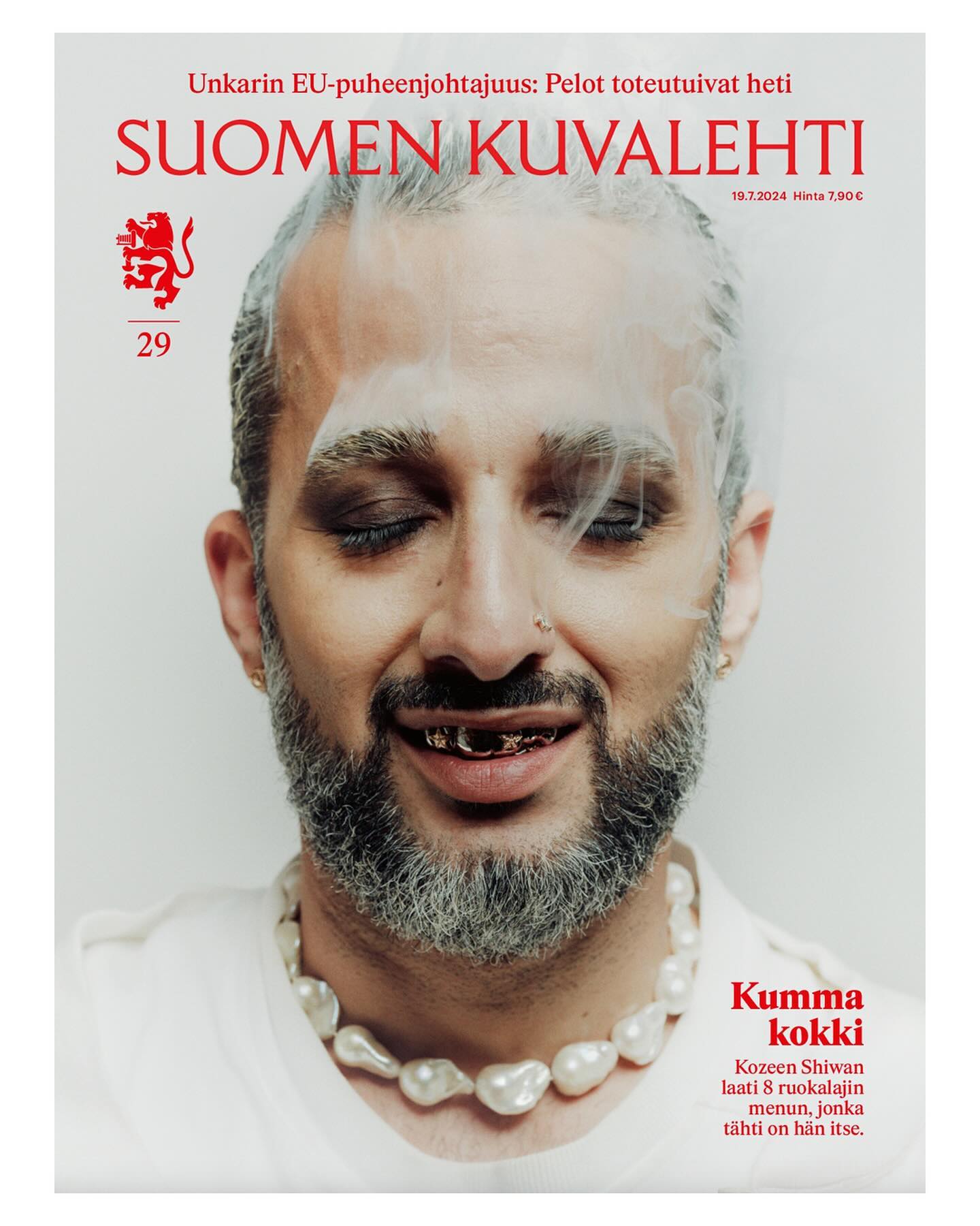
This historic Finnish newspaper refreshed its image with a new logo, using a custom typeface created by Schick Toikka, drawing inspiration from the newspaper’s earlier logos from the 1920s to 1940s.
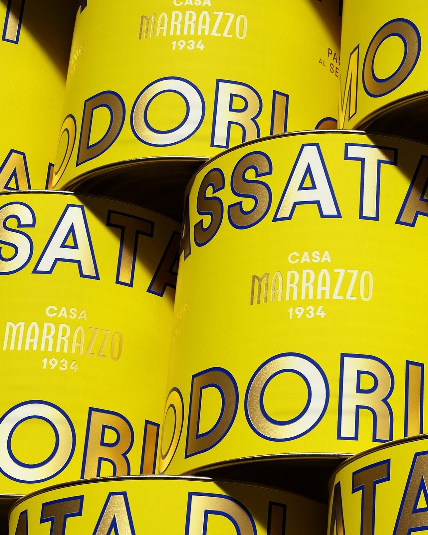
A clean layout, lots of gold, and the Avantt typeface were the elements that the Italian agency Auge Design used for these canned foods full of tradition and flavor.
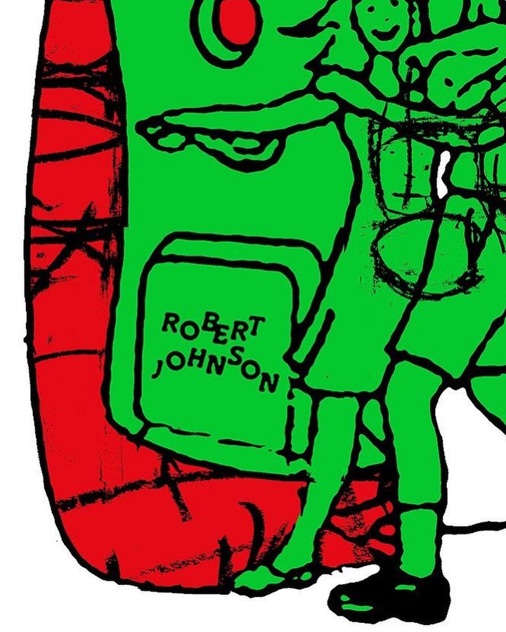
The Robert Johnson Club kicks off the 2024 season with these posters designed by Dominik Keller Studio. Typography used is Cosplay.
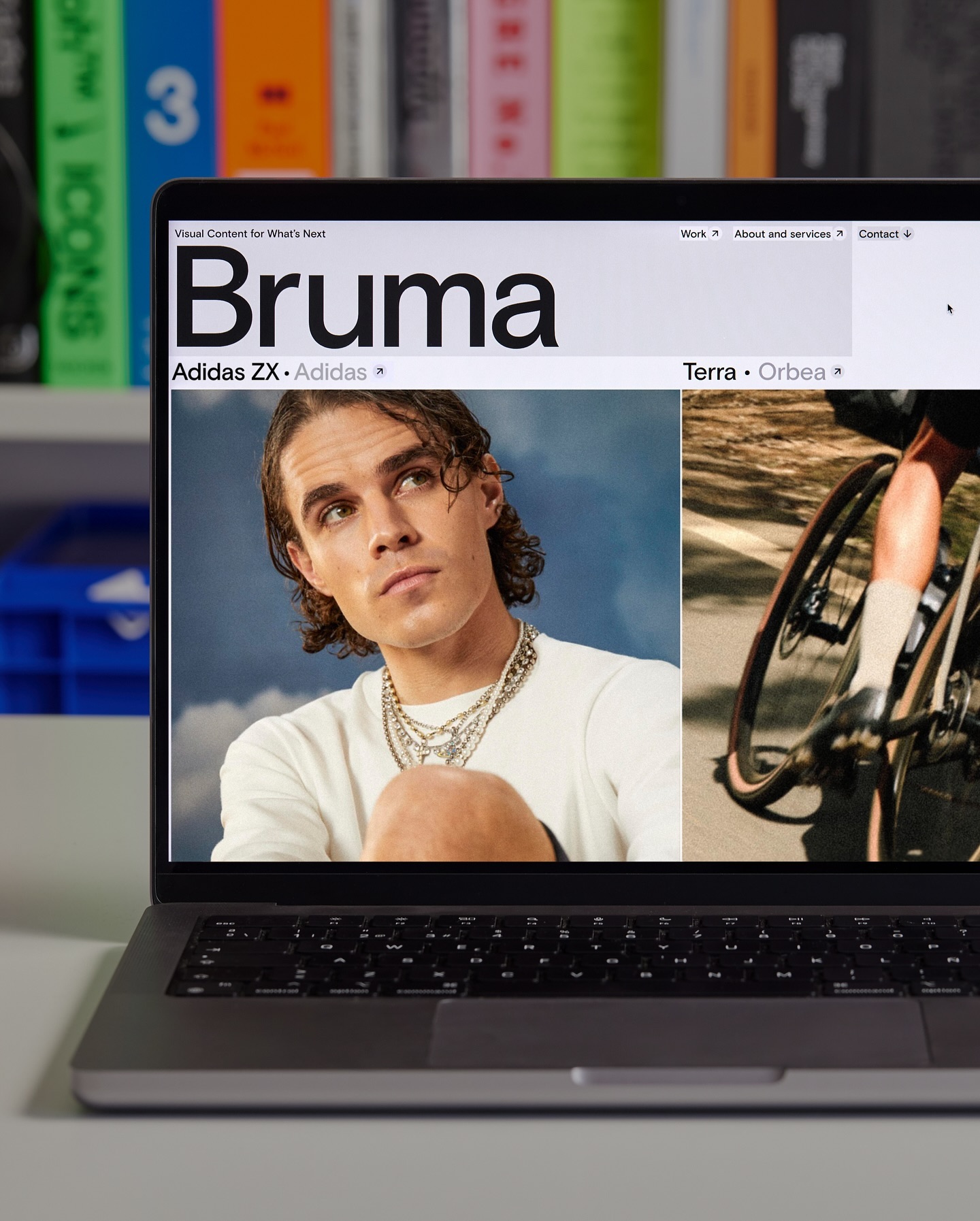
Basis Grotesque is the only typeface used in the identity and website of Studio Bruma, a creative production company to forward-thinking people and brands.
Asfalt will have its first edition featuring an identity filled with color blocks, sports images, a vertical logo using a customized version of Generation Mono, and texts using ABC Diatype.
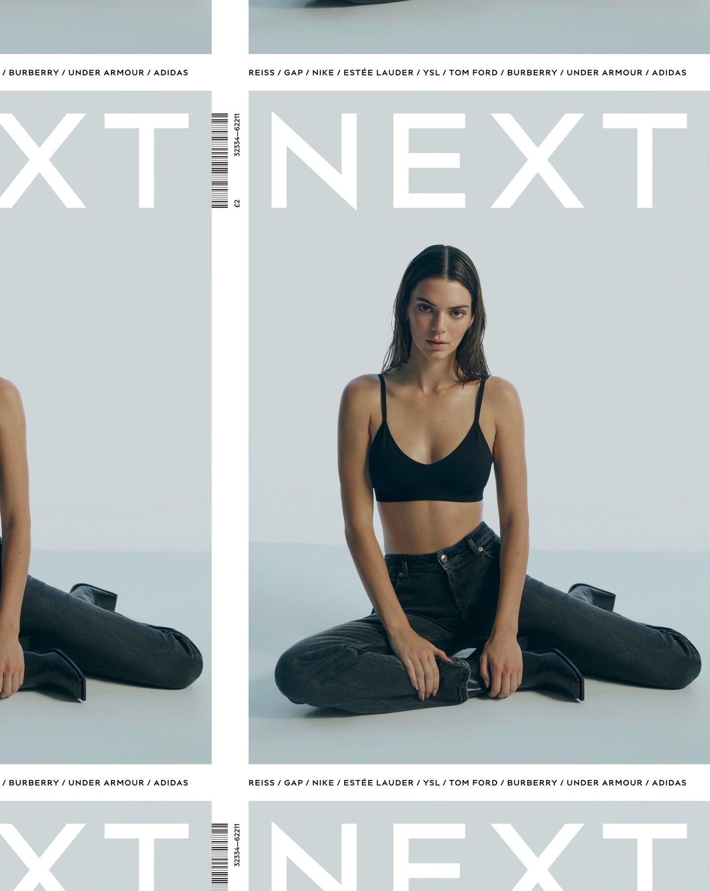
After designing the logo as part of the rebranding for the clothing brand Next, Frost was commissioned again by Six to create an entire typeface based on it.
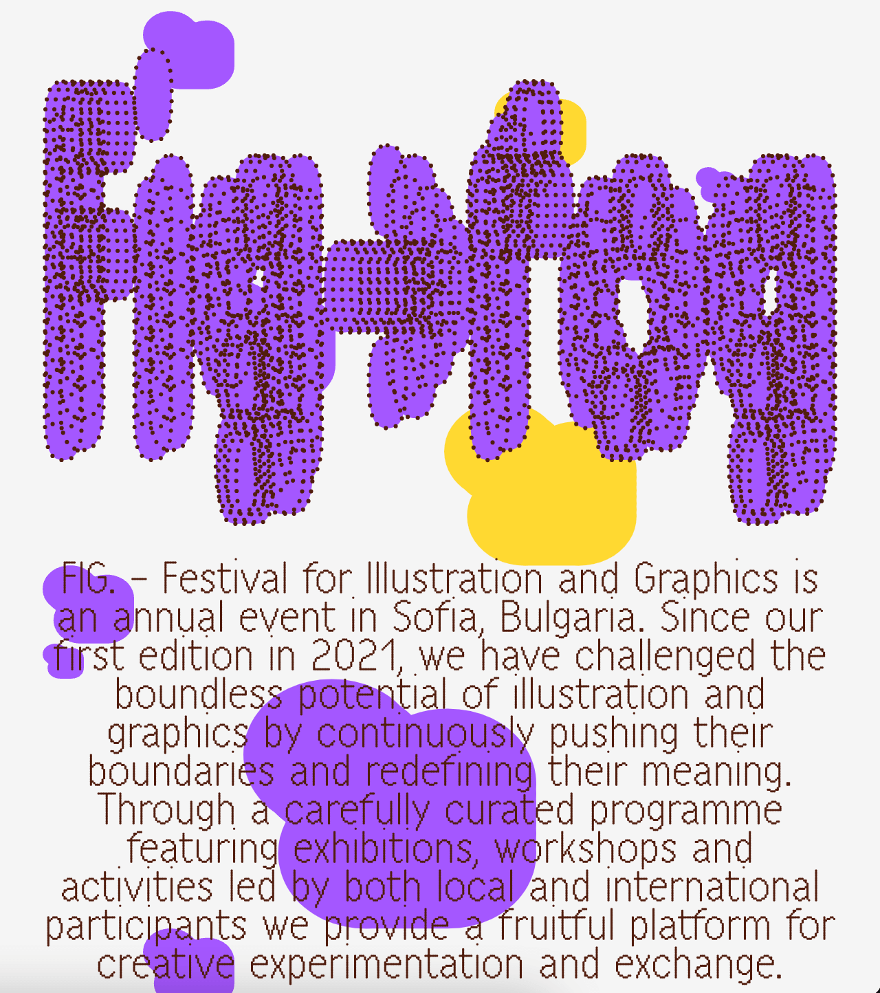
A festival that explores visual creativity to the point of blurring the lines between illustration and graphics; Miroslav Zhivkov created the identity of FIG (Festival for Illustration and Graphics) using Harber.
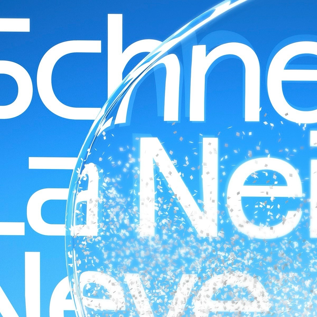
Maison Standard used Azeret from Displaay Typefaces for the identity of this exhibition at the National Library of Switzerland, which explains the impact of snow on our society.
Vibrant and loud, just like the conversations after an excellent dinner in Italy, that’s how Grand Bacàn Sans is, a custom typeface created by Pentagram for the Italian restaurant in Brooklyn; Bacàn