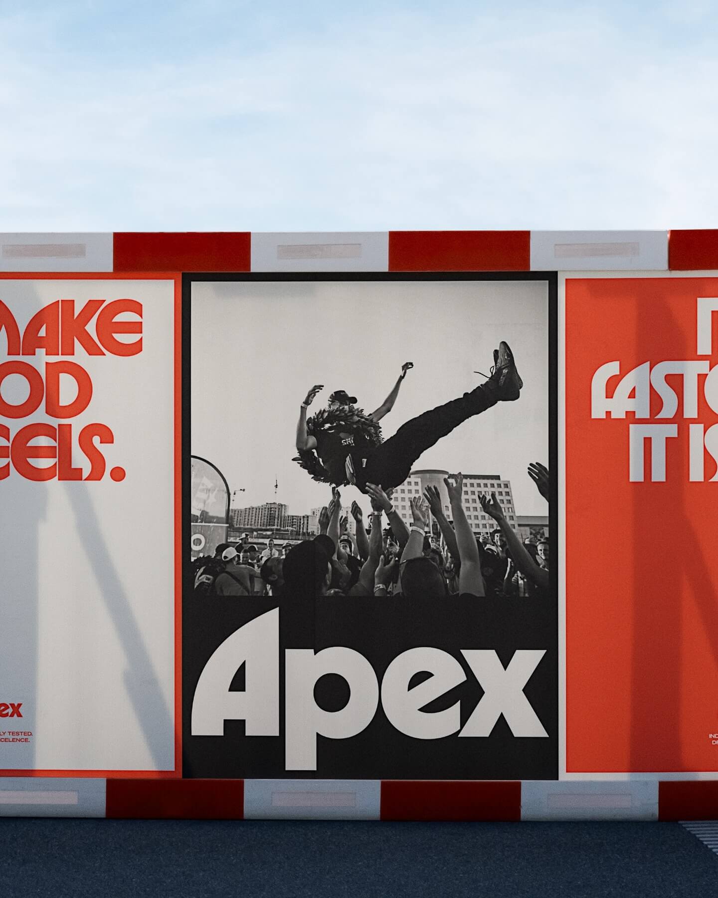
Seeking to stand out in the market, Gold Font created this custom logo for Apex, a premium tire brand, inspired by ITC typefaces.
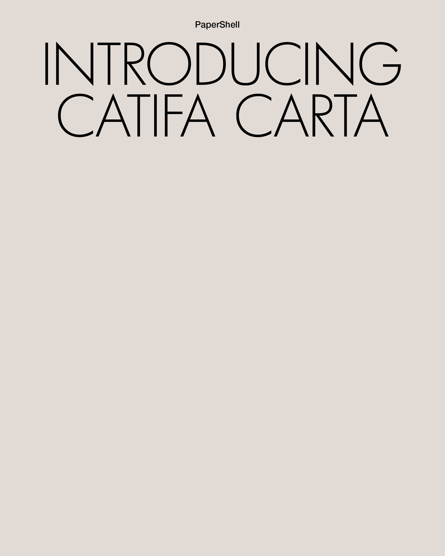
Lightweight like its structure and organic like its composition, Clase BCN proposes using Futura LT Light for headlines and Helvetica Neue for body text in the narrative of Carta Catifa, a chair made with biodegradable materials.
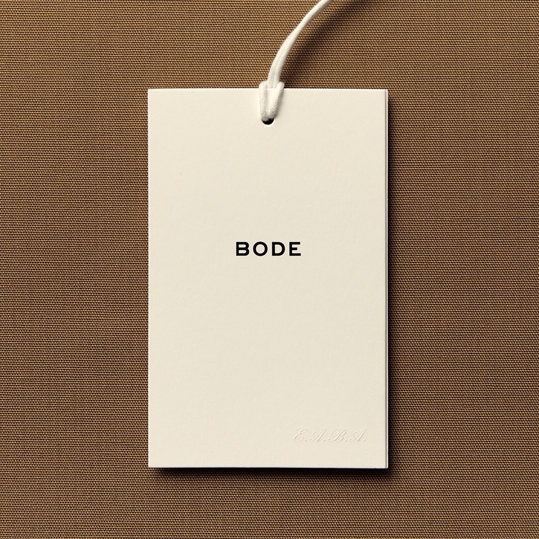
With the minimal amount of elements, Eric Wrenn designed the logo and visual identity for Bode, a New York-based clothing brand.
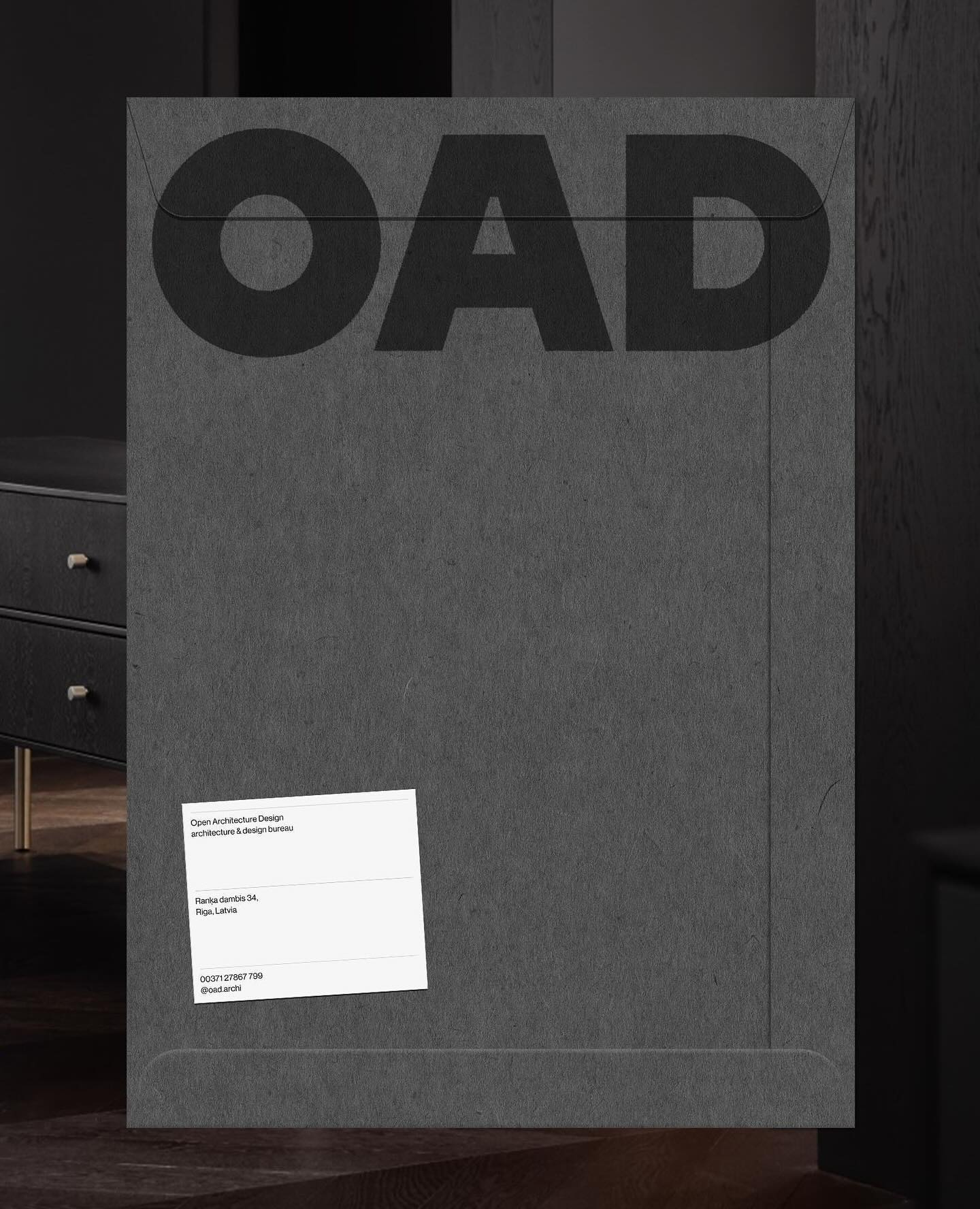
Just like its proposal, OAD (Open Architecture Design) has a strong and impactful lettering as a logo, complemented by Neue Haas Grotesk in its regular weight.
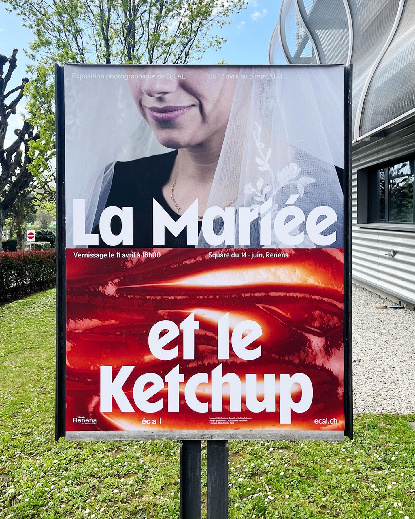
WaterPolo Display by @dontnotdon was used in this series of posters portraying the ordinary and extraordinary aspects of Renens.
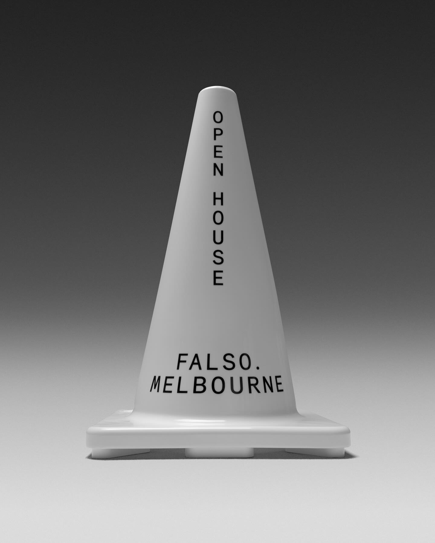
Studio Sly used Modern Era Mono to make Falso Melbourne stand out among all the other real estate agencies.
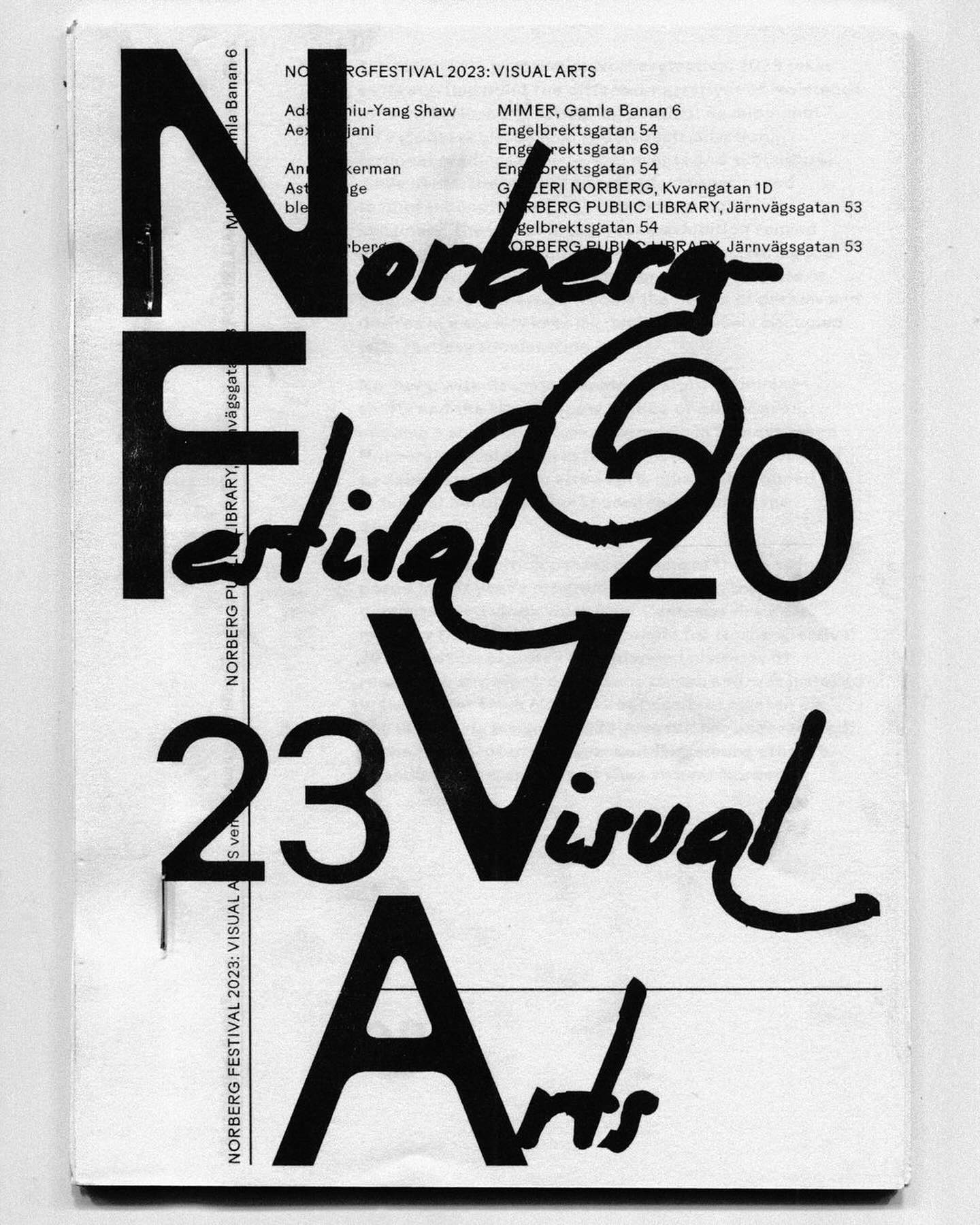
Rauschen B Regular and JHA Times Now Light filled the visual arts program of the Norbergfestival 2023 with personality. Designed by Agga Stage and Alexander Söder.
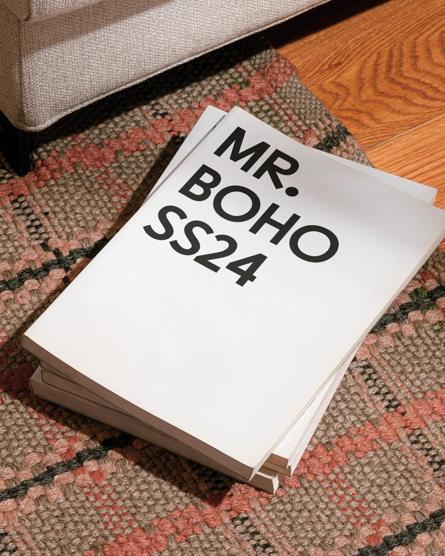
For being the first to create ocular accessories, the Inuit people and their syllabic writing system inspired a custom typeface and a new brand image for Mr Boho eyewear.
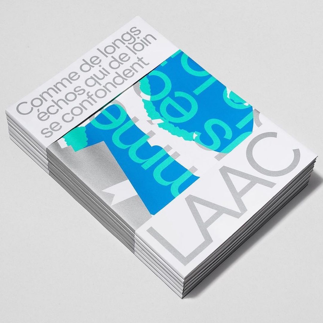
Studio Hudson Catty and Atelier Baudelaire used ES Klarheit Kurrent to design a set of three books celebrating the 40th anniversary of LAAC in Dunkirk.
Studio Ard was commissioned to design 15 publications and the signage for the graduation exhibition of the RCA School of Architecture. All is typeset in Prisma Text by Lineto.