New custom typeface for La Fabra Centre d’Art designed by Fonts From Folch. A design that reflects the institution’s contemporary spirit, with refinements that ensure versatility, precision, and smooth composition.
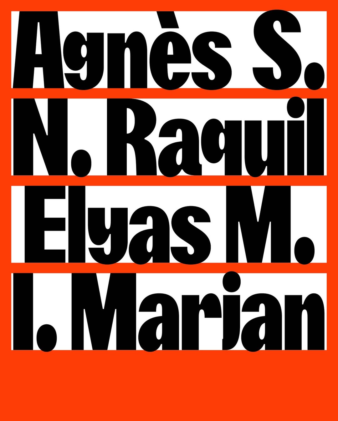
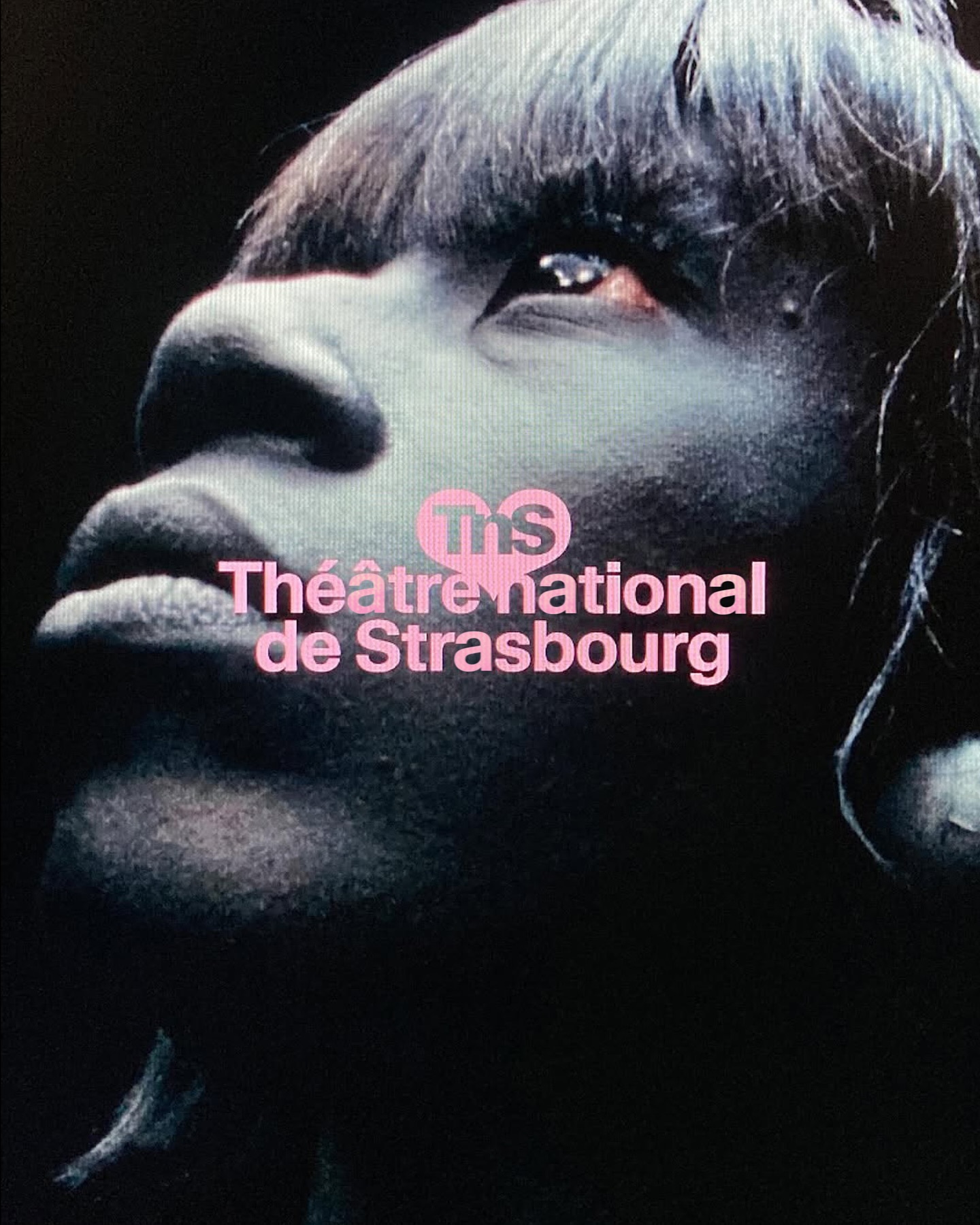
Different versions of the Waldenburg typeface by Kimera for the new identity of the Théâtre National de Strasbourg.
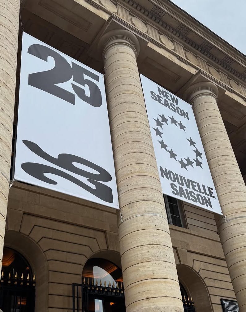
New visual identity for Théâtre de l’Odéon, designed by Atelier Choque Le Goff, featuring the large-scale Insitu typeface by Formagari.
NASK Studio chose Clarendon Graphic Light by Optimo Foundry to shape a refined typographic system that frames the photographic content of JB Books & Projects.
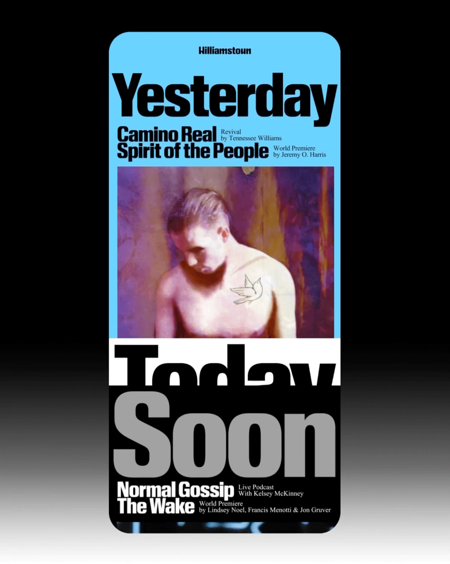
The identity that Pentagram created for the Williamstown Festival transforms the stage into a dynamic graphic system. A custom logo is complemented by Times New Roman and Review from Commercial Type.
The redesign of ArkDes in Stockholm by AM Stockholm features custom typefaces where dots and dashes create a unique typographic system. Alongside Diatype, these fonts redefine the museum’s identity.
Elisava has a new visual identity inspired by its original logo, and Folch designed Elisava Sans, a variable typeface created to work in any context.
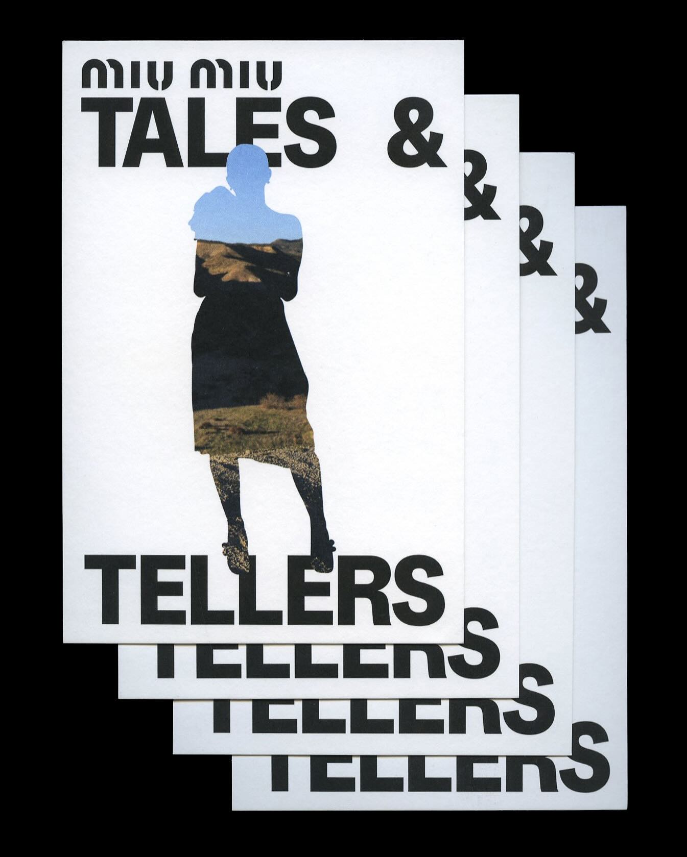
Kern typeface is featured in Tales & Tellers, a Miu Miu campaign that revisits various representations of femininity from past runway shows and short films.
AG Grafik created a brand identity for a poetry festival, blending experimental layouts with the classic elegance of Timezone.