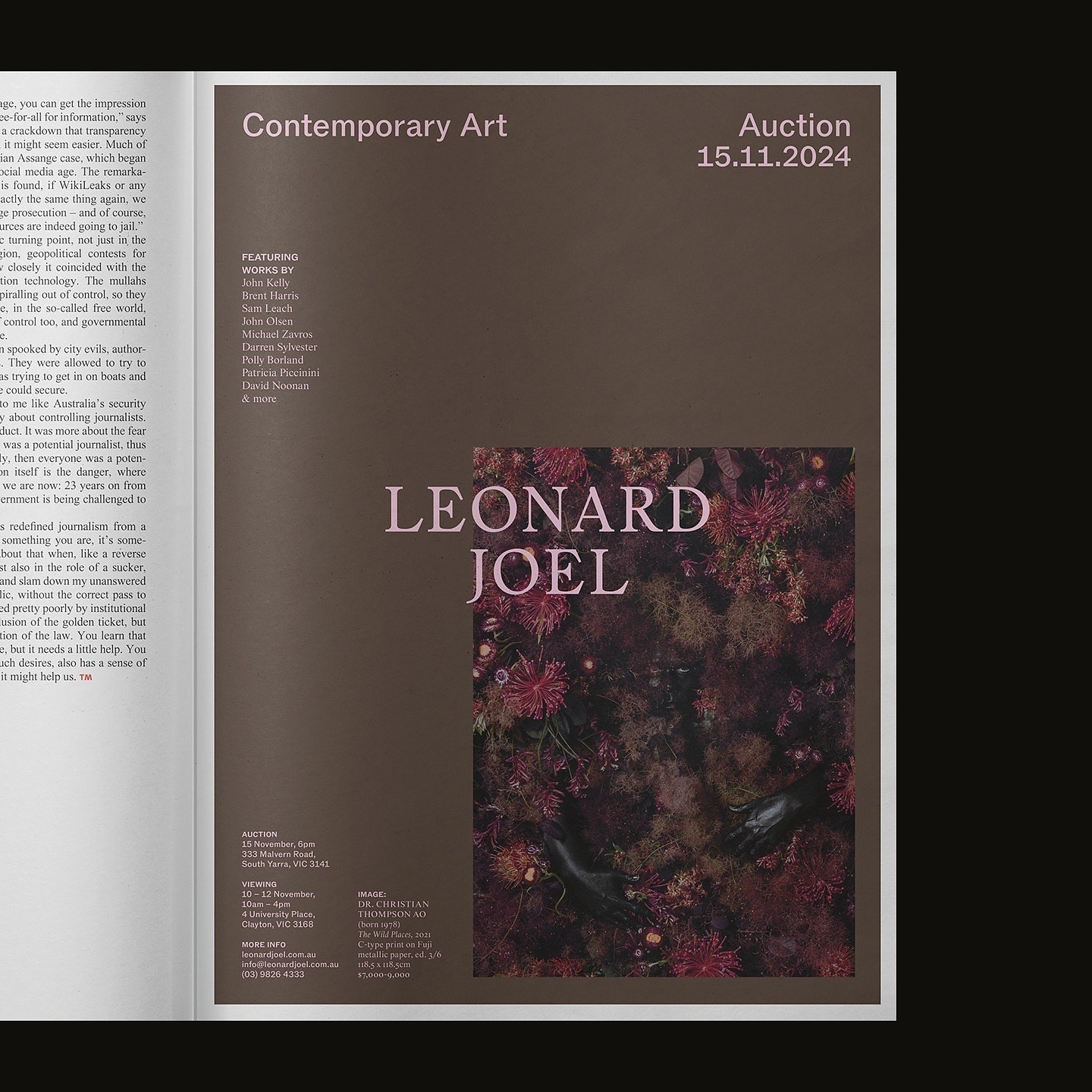
Leonard Joel, one of Australia’s top auction houses, refreshed its identity with Studio Doherty. The concept “Everything old is new again” blends heritage and modernity.
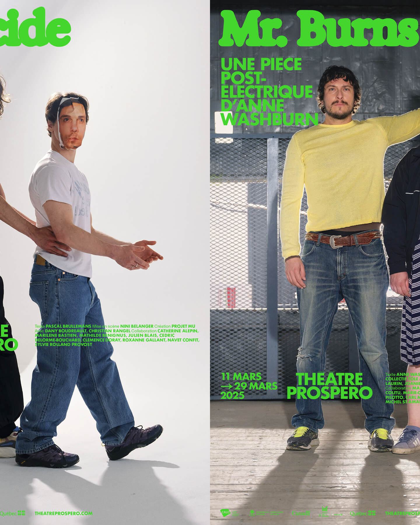
“After all, being together is revolutionary.” That was the main idea behind the 2024-2025 season campaign for Théâtre Prospero, directed and designed by Principal Estudio using Exposure.
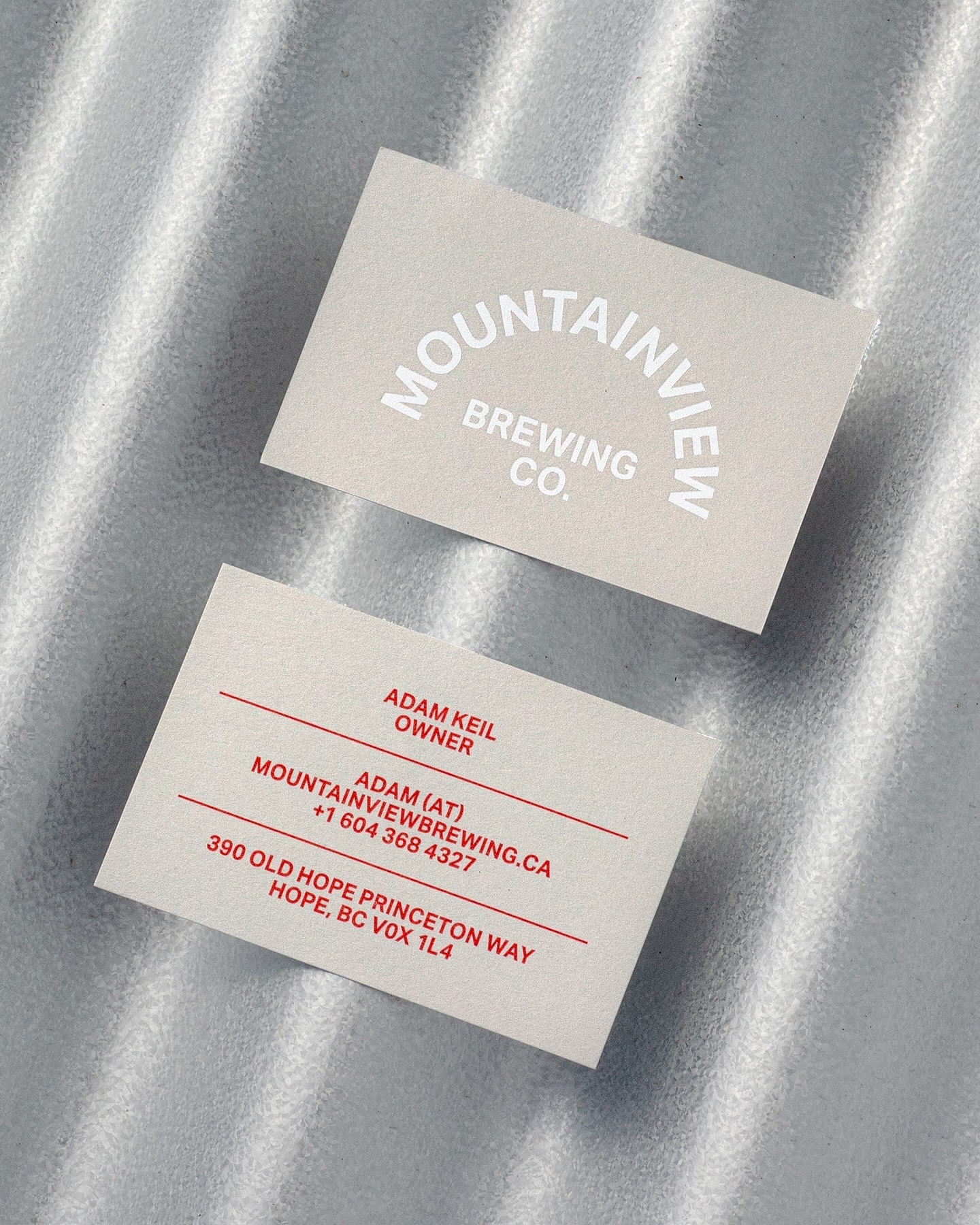
Memory Studio was inspired by vintage elements, like old book covers, and used Aktiv Grotesk to create the identity for this craft brewery.
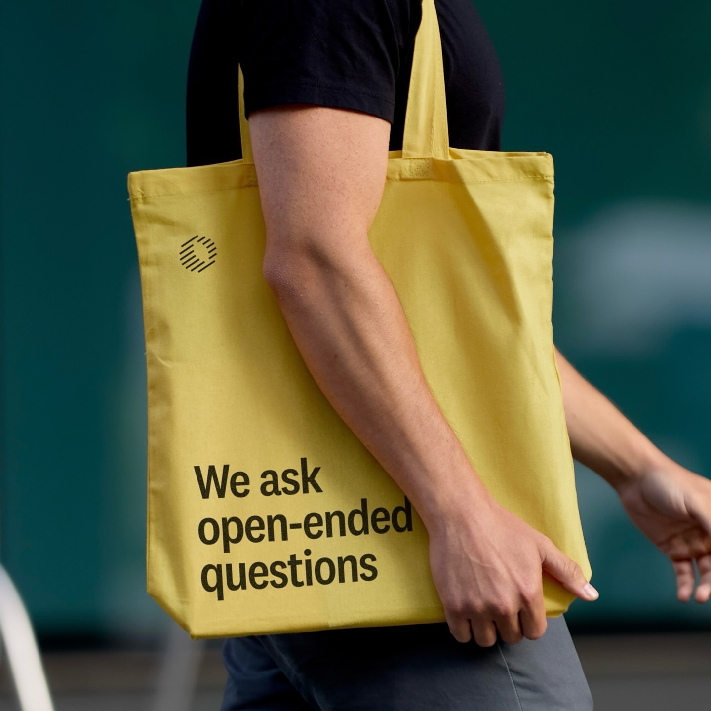
Classics with a modern twist; National 2, Atlas Grotesk, and Atlas Typewriter, were used by Play for the identity they created for Open Research.
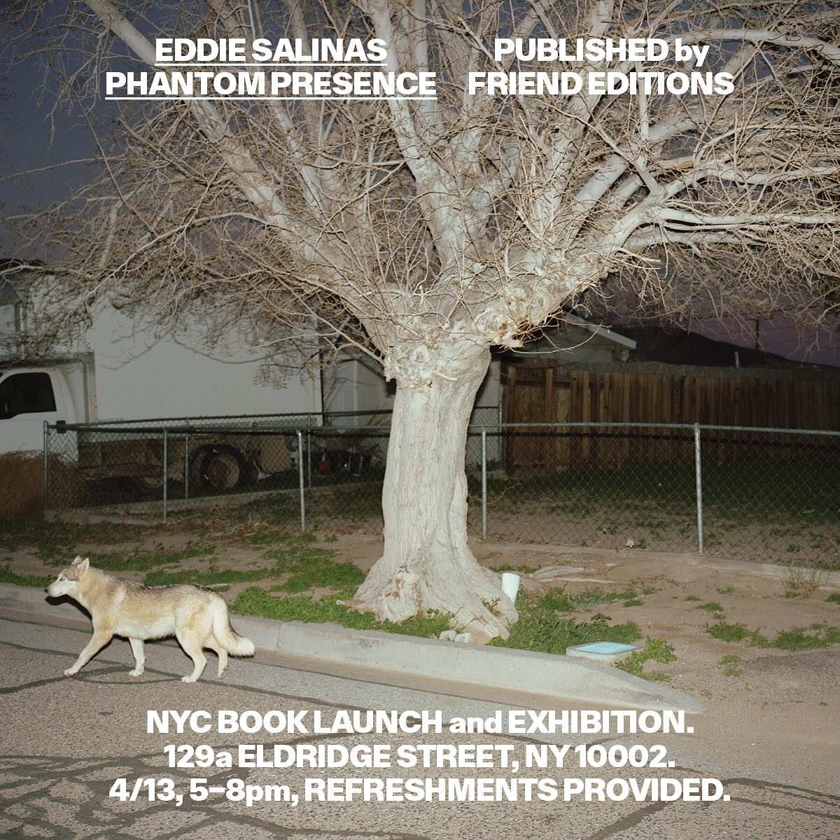
Made to showcase the dramatic and captivating work of Eddie Salinas, the book Phantom Presence was designed by Friend Editions, using All Purpose Grotesk for its interiors.
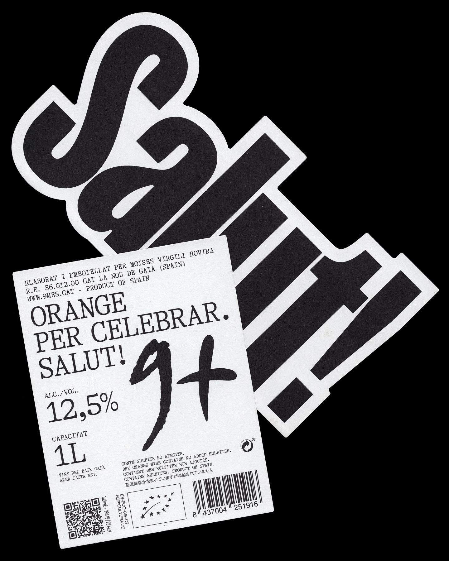
A simple and powerful label for a wine made to celebrate. Principi Studi used FK Screamer for the logo and GT Alpina for the complementary typography.
Architecture and how it becomes part of our everyday landscape. For Not Found, Mike Tully proposes an editorial design that plays with the visibility of certain elements using transparent varnish.
Maximage designed this book with great attention to detail. A custom version of Selecta developed by Maxitype.
An identity that balances between distinctive and sober is composed of a bold uppercase logo, vibrant colors, and two specially customized typefaces; Saans from Displaay Foundry and LL Ruder Plakat from Lineto. Designed by Porto Rocha.
República Studio used Review from Commercial Type for this visual identity, aiming to communicate directly and consistently, while leaving the spotlight to the displayed photographs.