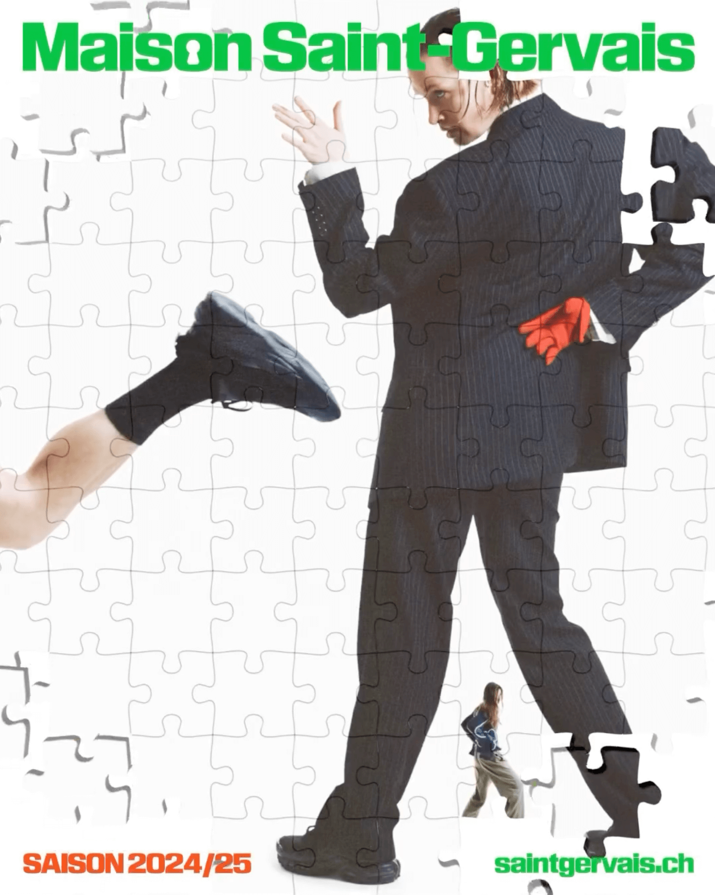
The Swiss graphic design studio Dual Room renewed the image of the Maison Saint-Gervais theater, using KTF Rublena Black.
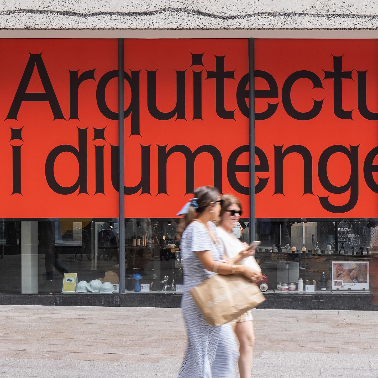
Graphic design for different spaces of this exhibition at the Architects’ Association of Catalonia, by PFP Disseny. Using Helveesti by Dinamo.
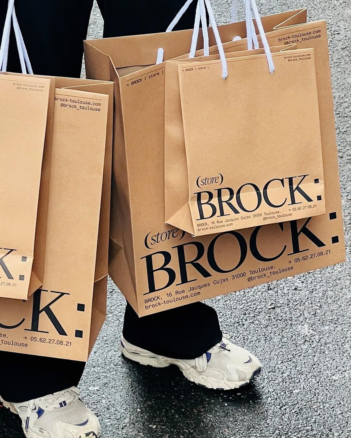
Quatrième Étage revamped the visual identity of the iconic Brock store, selecting the ES Face typeface for its logo, a 19th-century inspired serif with contemporary finishes.
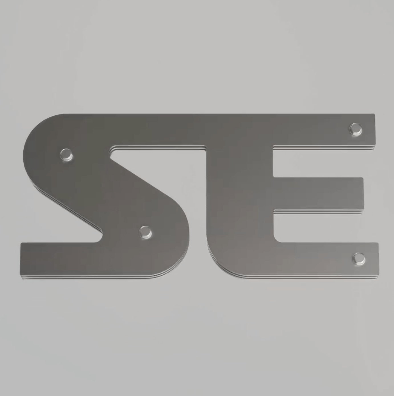
Apparat Bold + Buch Schmal, both from Kimera, were part of the update newkid made for Standard Equipment, a system of household objects.
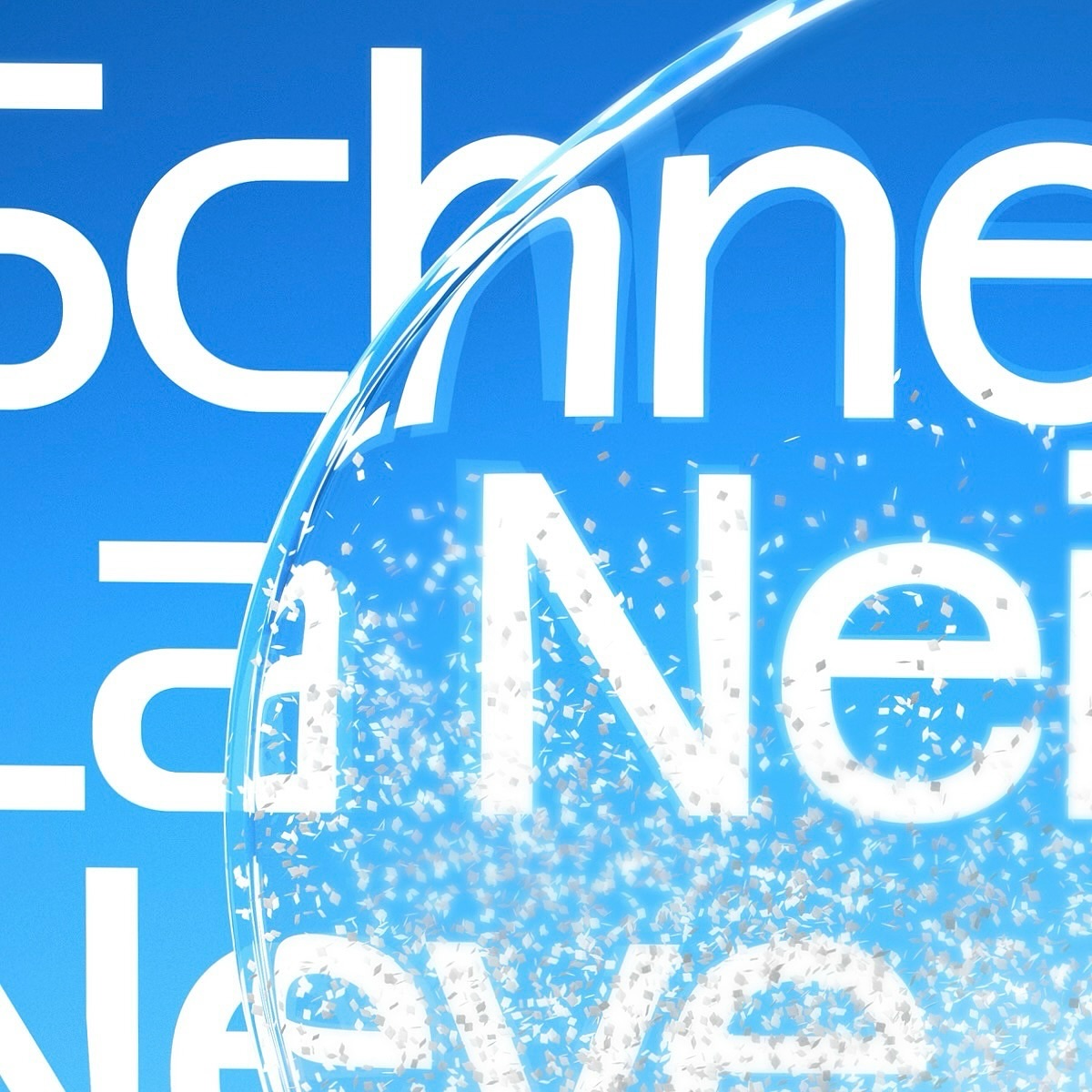
Maison Standard used Azeret from Displaay Typefaces for the identity of this exhibition at the National Library of Switzerland, which explains the impact of snow on our society.
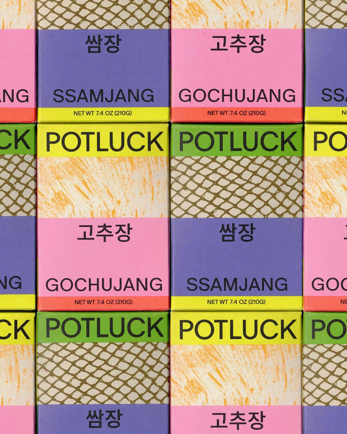
Regrets Only created a visual identity just like Potluck works; bringing together various elements to create something from scratch. Oracle is used as the primary typeface and Source Han Sans as the secondary.
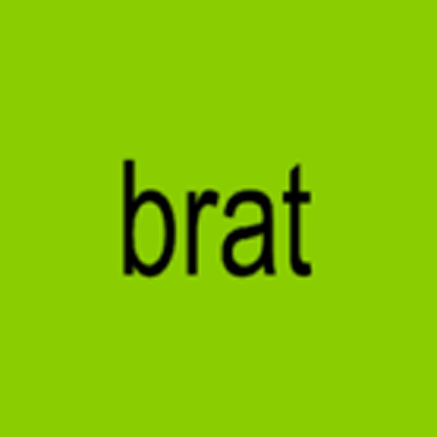
How should an album cover NOT look? Special Offer and Charli XCX decided to answer this question by stretching the word “brat” in Arial. ROM Mono by Dinamo and Neue Haas Unica by Linotype are used in the interior texts.
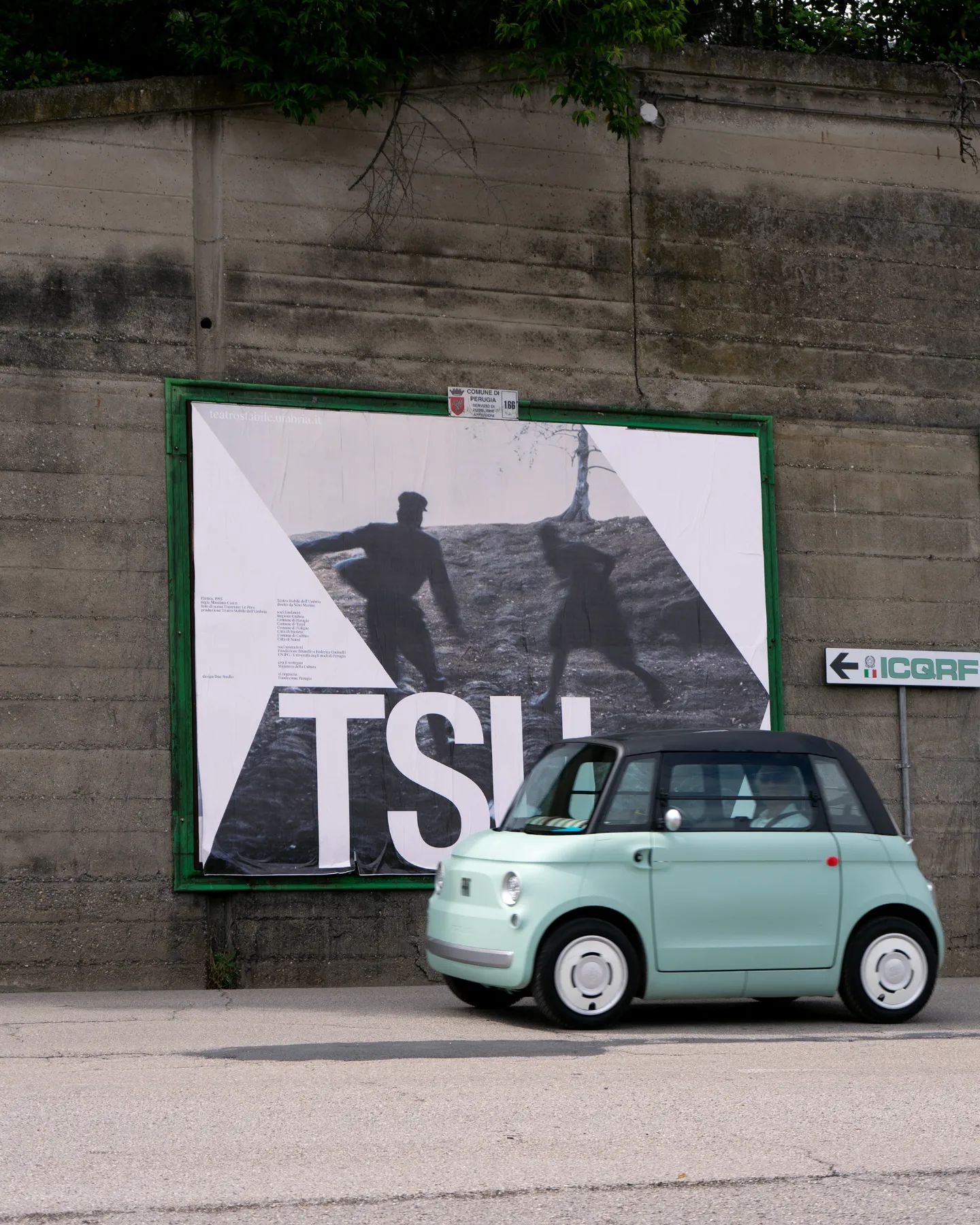
Suisse Int’l Condensed used for this strong and dramatic identity for the Teatro Stabile dell’Umbria. Designed by Due Studio.
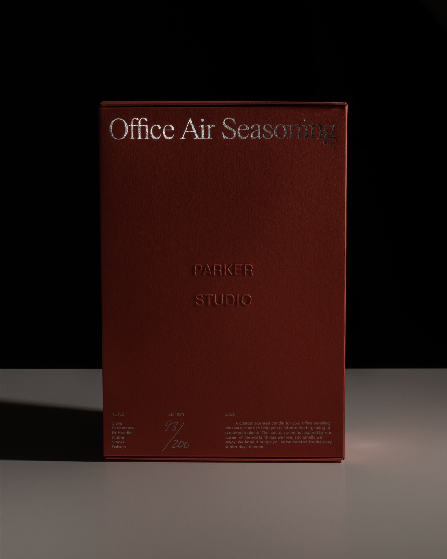
Parker Studio said goodbye to 2022 with this candle, made in collaboration with Imprimerie du Marais. The packaging uses Chalet Book, along with the first printed use of Parker’s PS Times.
Andrés Higueros designed this custom typeface for the private dining experiences hosted by La Vera Pasta.