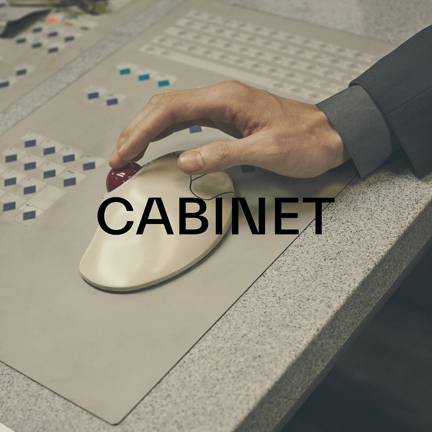
TWK Everett venturing into the fashion industry through the creative studio and fashion brand Cabinet Milano, led by Rossana Passalacqua and Francesco Valtolina.
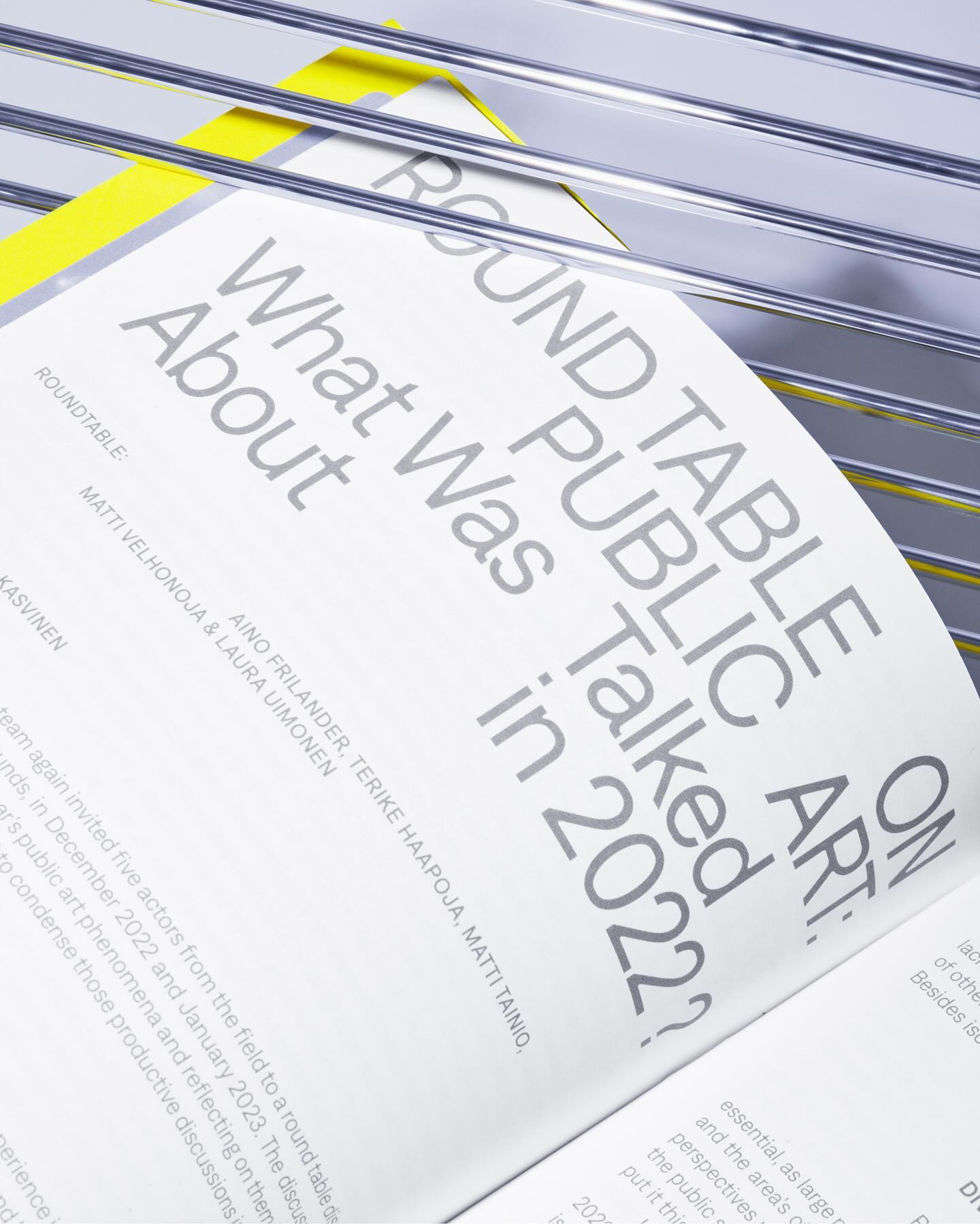
Denim performs admirably across various contexts, whether in small or large texts, as demonstrated in the publication Annual Review of Public Art 2023 for The Arts Promotion Centre Finland – Taike.
This fresh and fun poster design for the Teatro Prospero uses Review Condensed from Commercial Type, a Principal Studio project
Within the vast diversity of ideas in this application, the Pinterest design team, along with Kurppa Hosk, uses the neutrality of Neue Haas Grotesk to continue inspiring all kinds of minds.
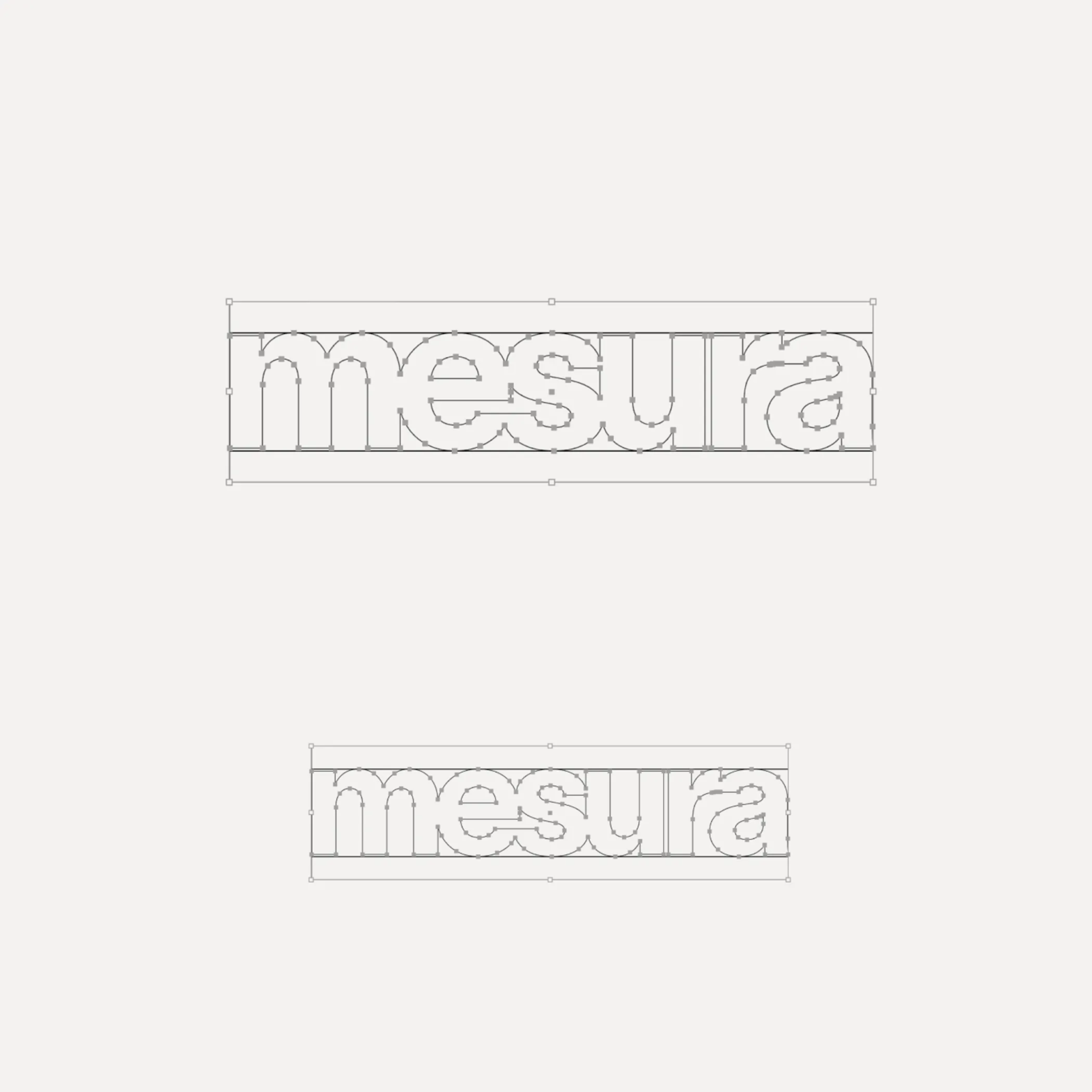
Flexibility was what Mouthwash studio aimed for with the typographic selection they made for the Messura . Kimera’s Waldenburg and Times LT were chosen to give solidity to the brand and possibilities to evolve.
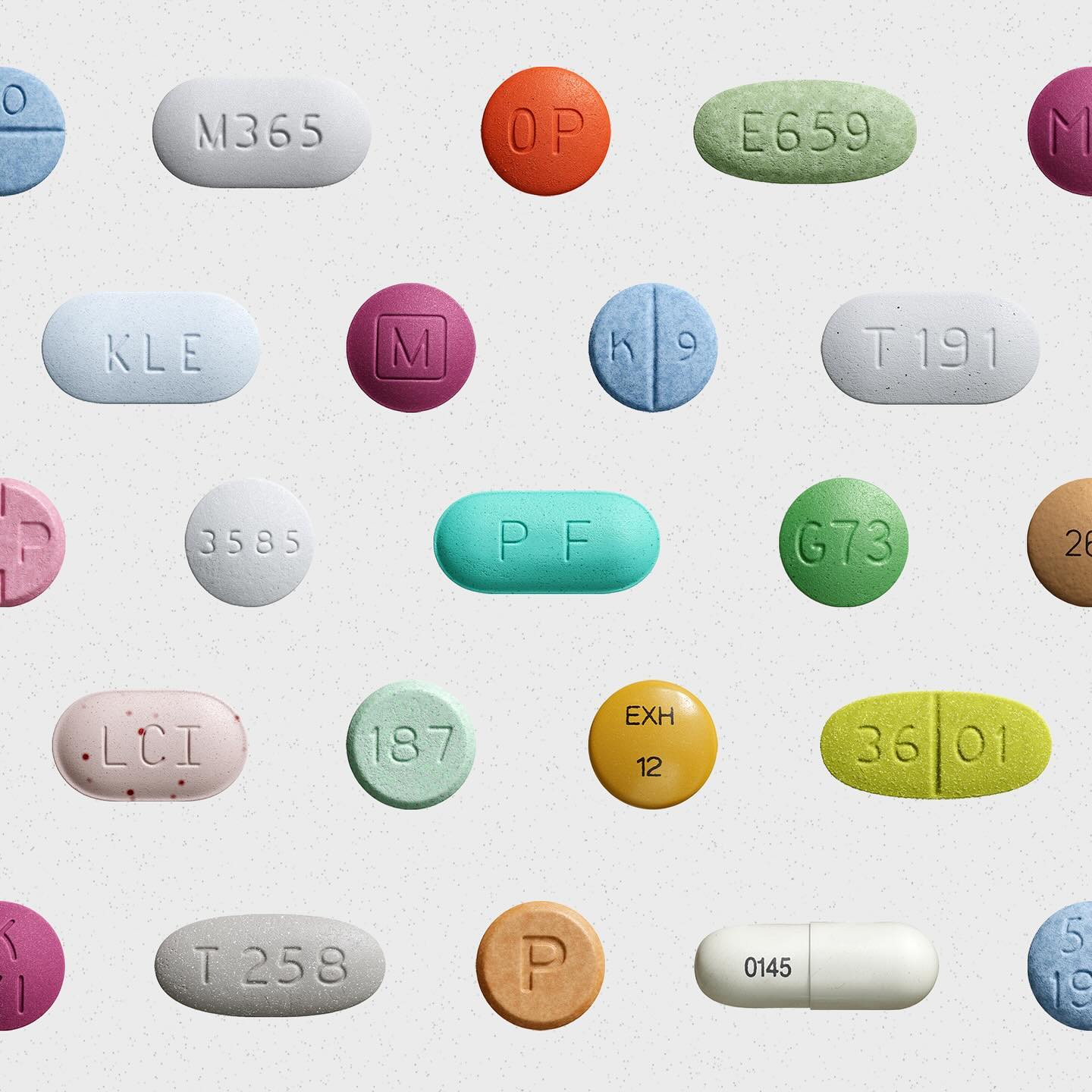
Waldenburg from Kimera Corp was customized to be part of the visual identity for a new line of assistance for people with opioid addiction issues. Designed by Raw Materials and Service Plan
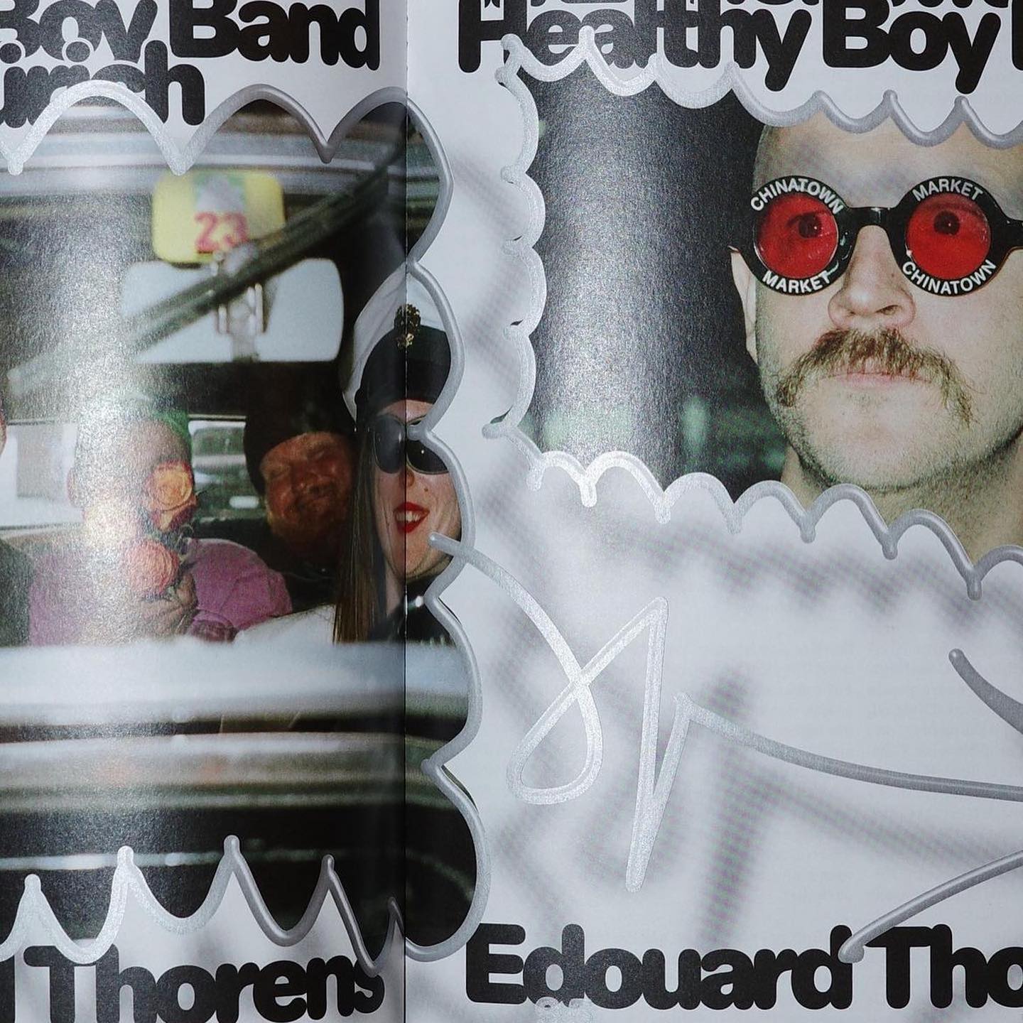
Diatype Rounded from ABC Dinamo is used in Healthy Boy Band, a cultural magazine that is a tribute to graphic design
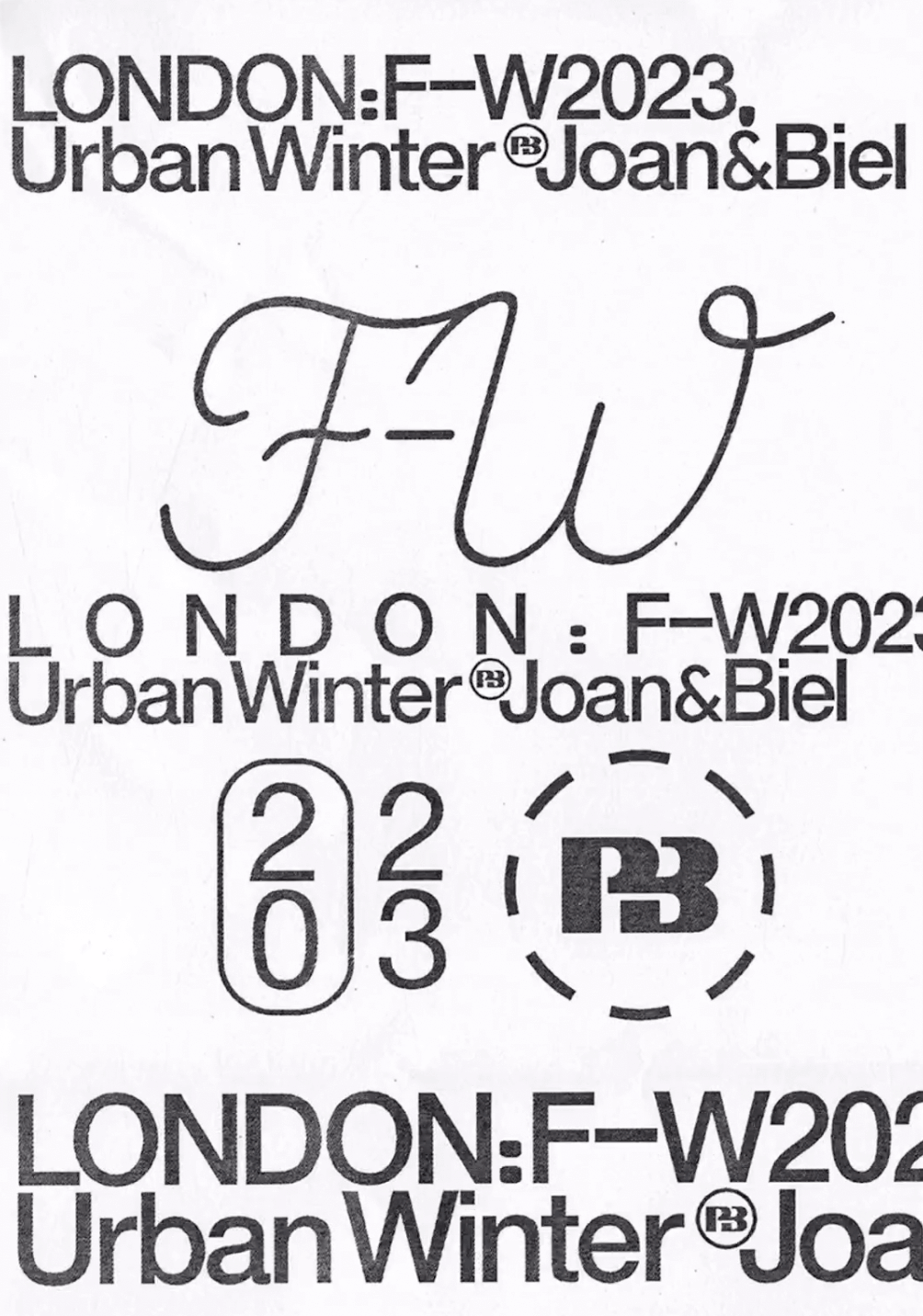
Simple and dynamic, these explorations by Paula de Álvaro use brand elements and basic information to present the Pull&Bear London AW 2023 collection.
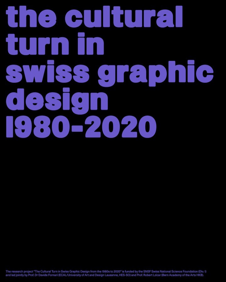
Trekking Sans is a lowercase typeface designed by Bureau Bernklau, for the research project Cultural Turn in Swiss Graphic Design (1980–2020).
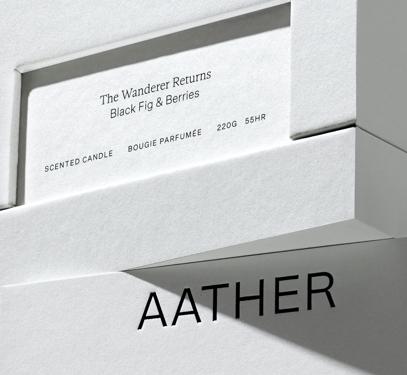
SOCIO Design used Untitled Sans from Klim Type Foundry and Gestura from Socio Type Foundry to complement the visual identity of AATHER’s high-quality candles.