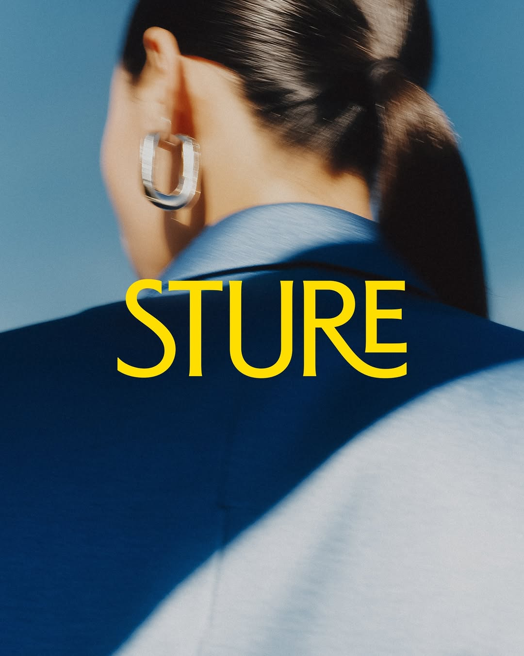
Stureplan was renewed, now becoming Sture with a design inspired by the block’s architecture. The typeface is custom, designed by Göran Söderström and Fredrik Gruber.
Buenaventura designed IOC, a typeface that becomes the visual signature of Islands of Cocoplum, blending tradition, luxury, and modernity.
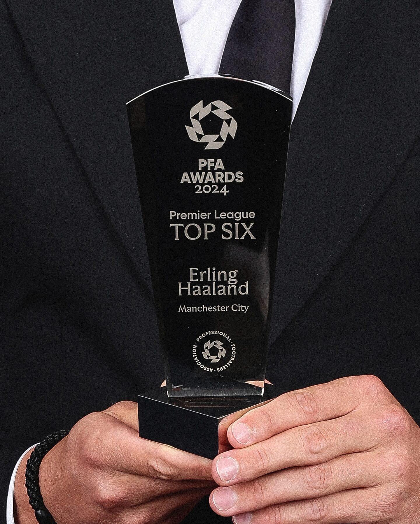
Realm by Approximate Type being used in this annual award ceremony for the best player of the year in the English league.
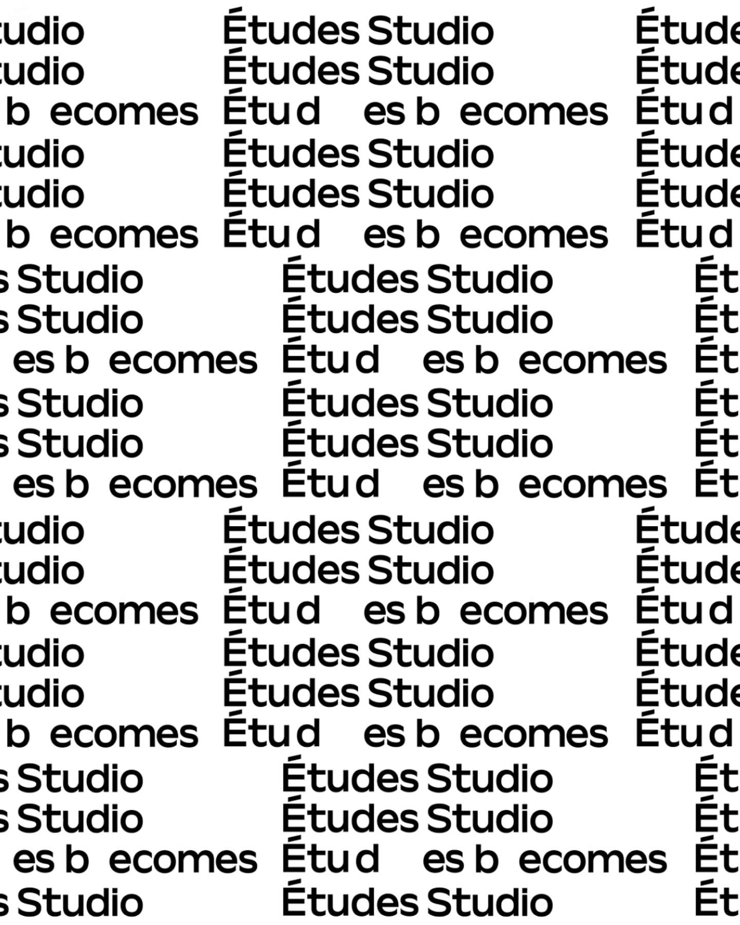
A geometric typeface with humanist features, crafted by Spassky Fischer, for the new identity of Études.
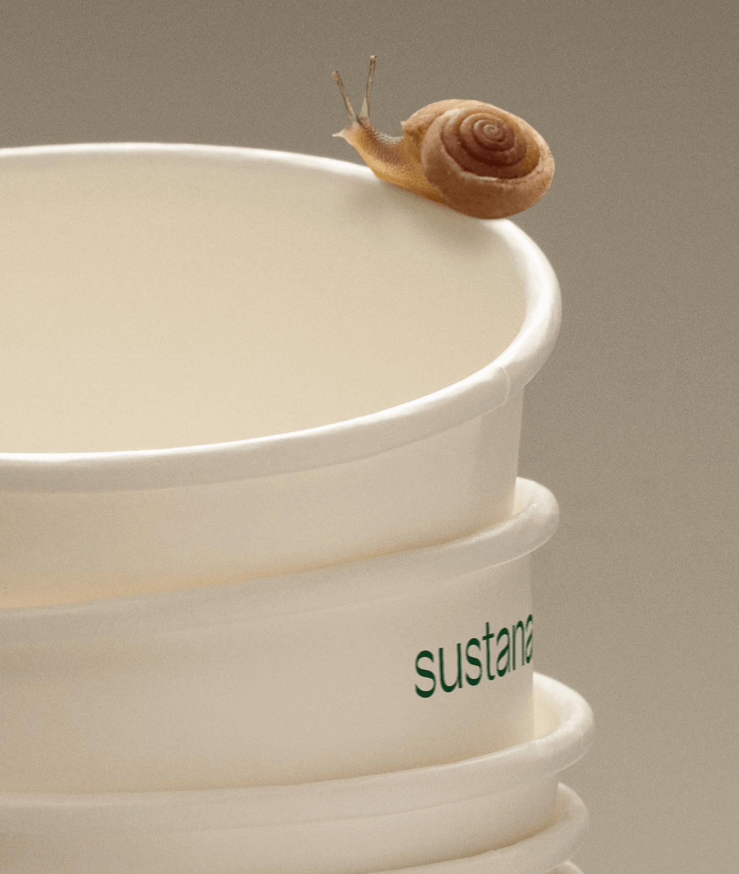
Paper made with clean materials; this was the twist COLLINS gave to this Canadian company, transforming it into Sustana. Custom typography by Sharp Type.
Workbyworks Studio designed this unconventional serif typeface and visual identity for Steffan Studio.
Moser Crystal launched an autumn collection, and Studio Marvil designed its image using the Atlantic typeface from Heavyweight.
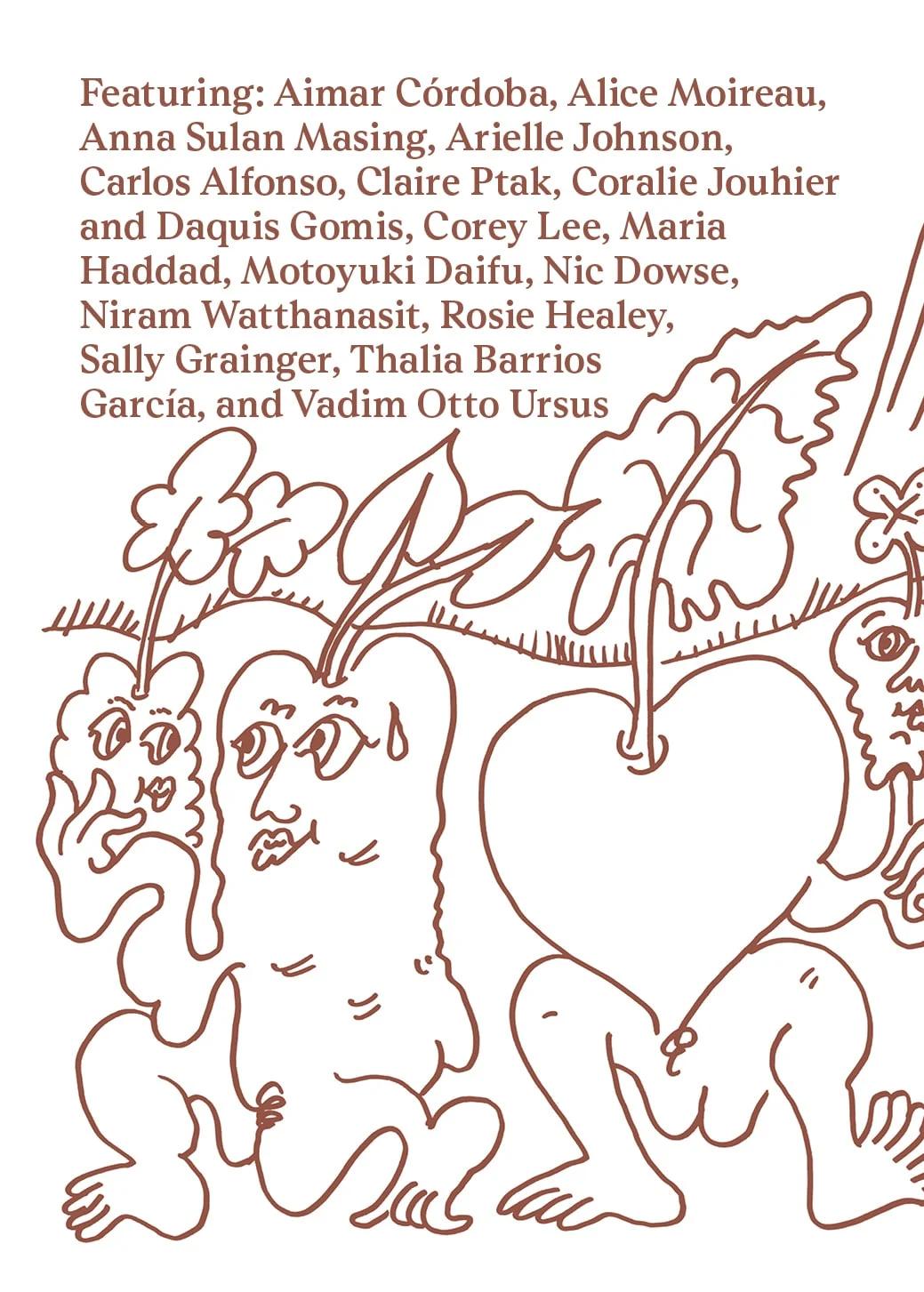
Last year, All Caps Type’s Rhetorik serif was featured in Apartamento’s annual cookbook edition #8, which gathers recipes based on tubers in a playful tone.