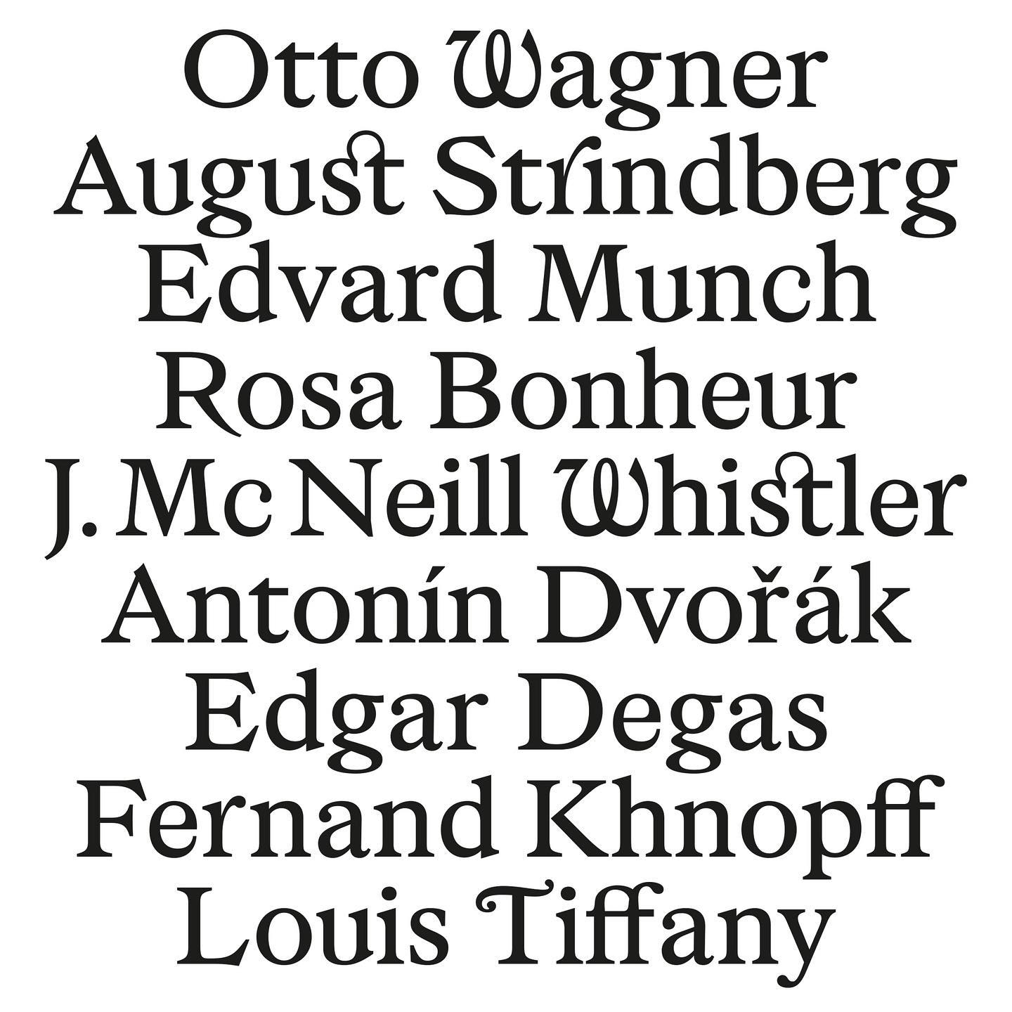
As part of Musée d’Orsay’s rebranding, Orsay Elzevir was created—a typeface inspired by La Belle Époque, reflecting the energy of the period the museum celebrates.
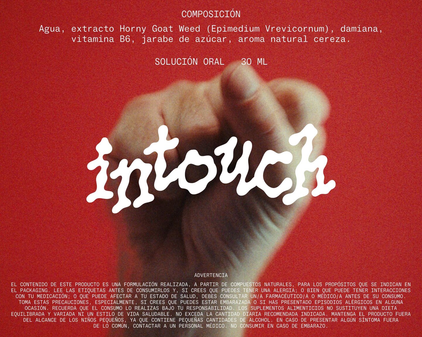
Technology has made our lives easier, but it seems everything comes at a price. INVOLUT introduces a range of supplements to combat the negative side effects of modern times. Featuring PicNic by Velvetyne.
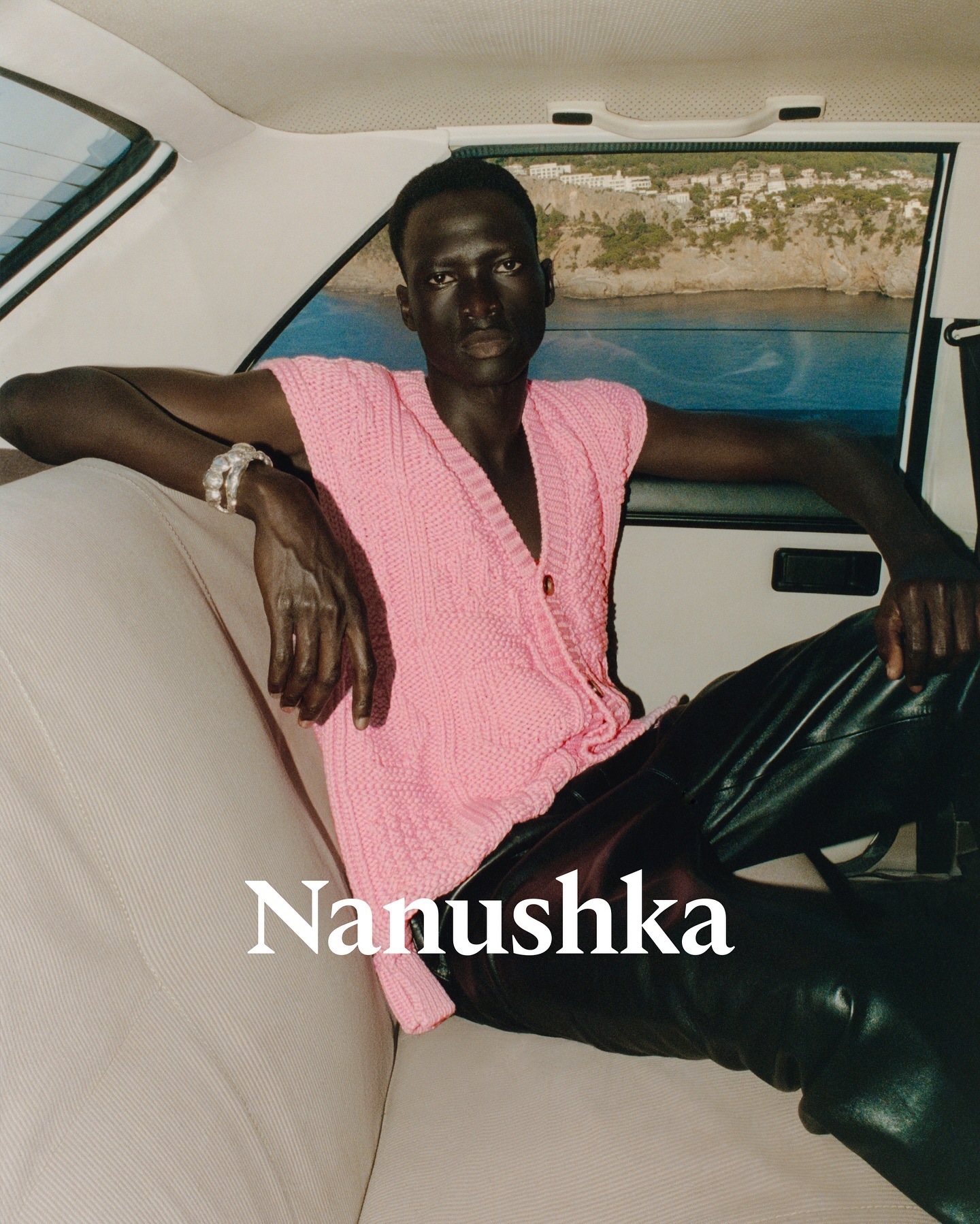
Nanushka is making its mark in the fashion market with inspiration drawn from Hungarian history as well as a wordmark and visual identity rooted in traditional symbols.
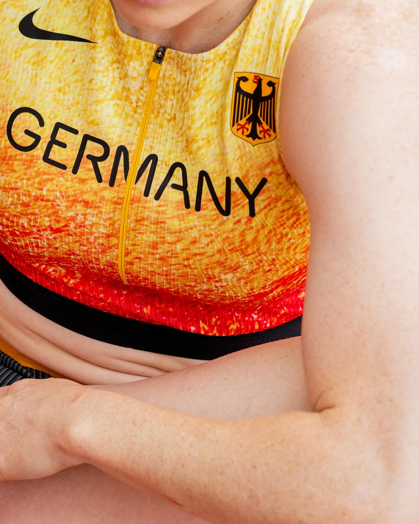
At the world’s largest sporting event, Nike embraced a modern, dynamic, and fluid typeface. In collaboration with Pizza Typefaces, they created the Nike Olympics fonts, a typeface inspired by twisting motion.
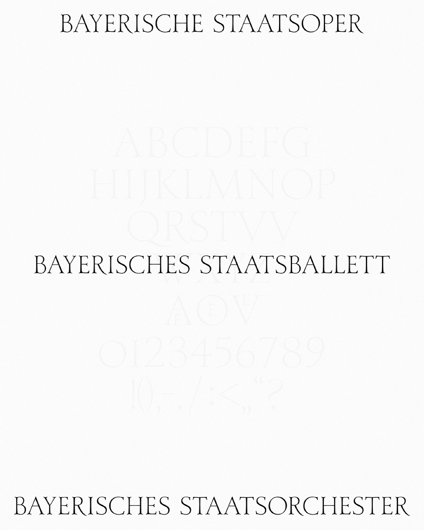
As part of the visual identity that Bureau Borsche created for the Bavarian State Opera, a digitized typeface —developed by Samara Keller— was created, based on a design found in the opera’s facilities.
Logotype and lettering inspired by the baroque era of the internet, proposed by Muon Studio for Youhee’s visual identity.
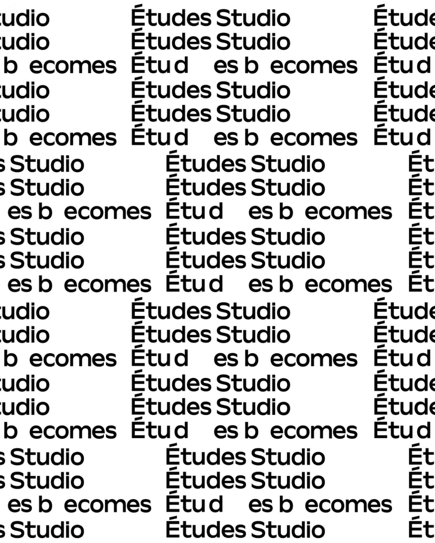
A geometric typeface with humanist features, crafted by Spassky Fischer, for the new identity of Études.
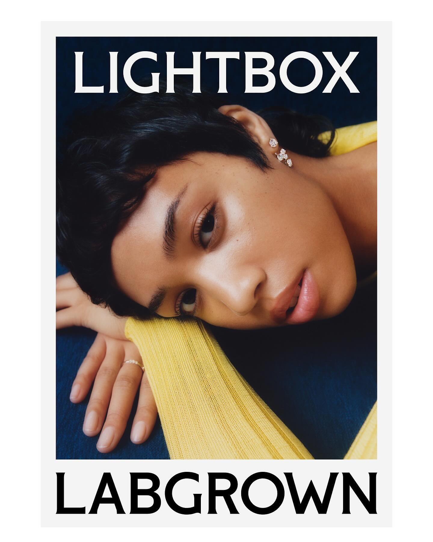
Decade created this visual identity to position an innovative lab-grown diamond brand, proposing a custom flare logo designed by Colophon Foundry.
Logotype custom-designed by Bureau Bernklau, drawing inspiration from the distinctive features of Ehmcke Antiqua, an early 20th-century typeface.
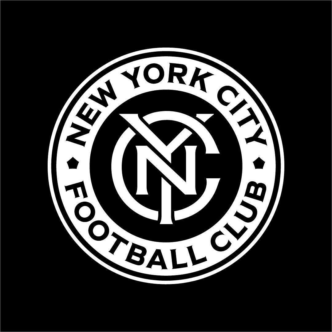
Frere-Jones was tasked with redesigning the New York City Football Club badge, and carefully adjusting each character to fit the circular arc of the badge.