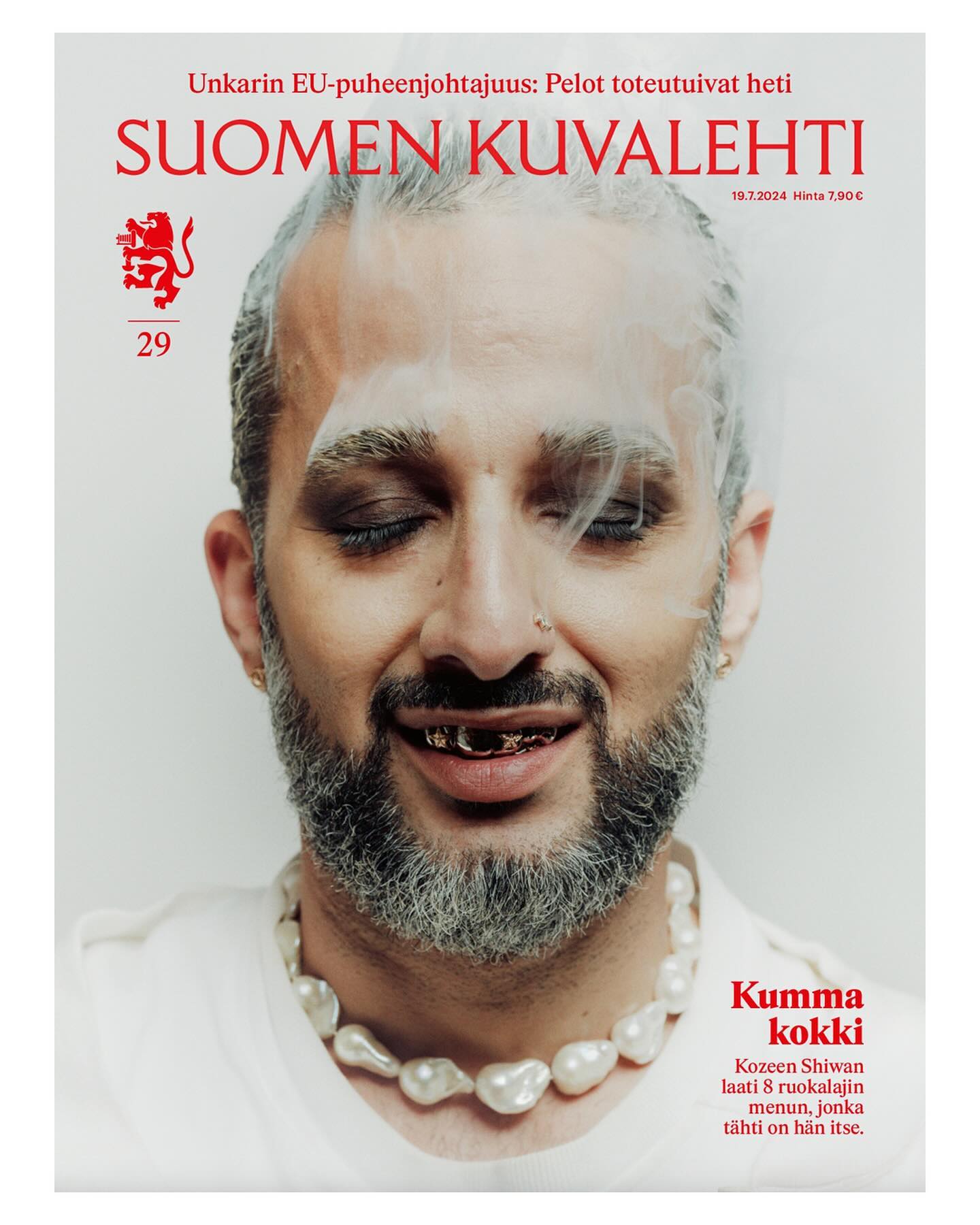
This historic Finnish newspaper refreshed its image with a new logo, using a custom typeface created by Schick Toikka, drawing inspiration from the newspaper’s earlier logos from the 1920s to 1940s.
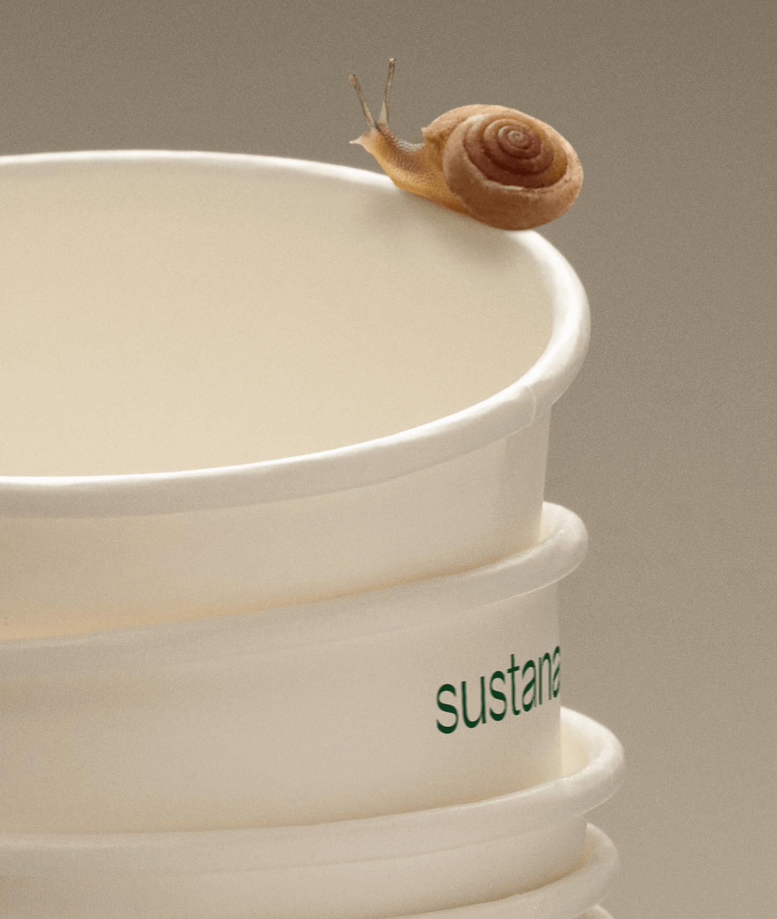
Paper made with clean materials; this was the twist COLLINS gave to this Canadian company, transforming it into Sustana. Custom typography by Sharp Type.
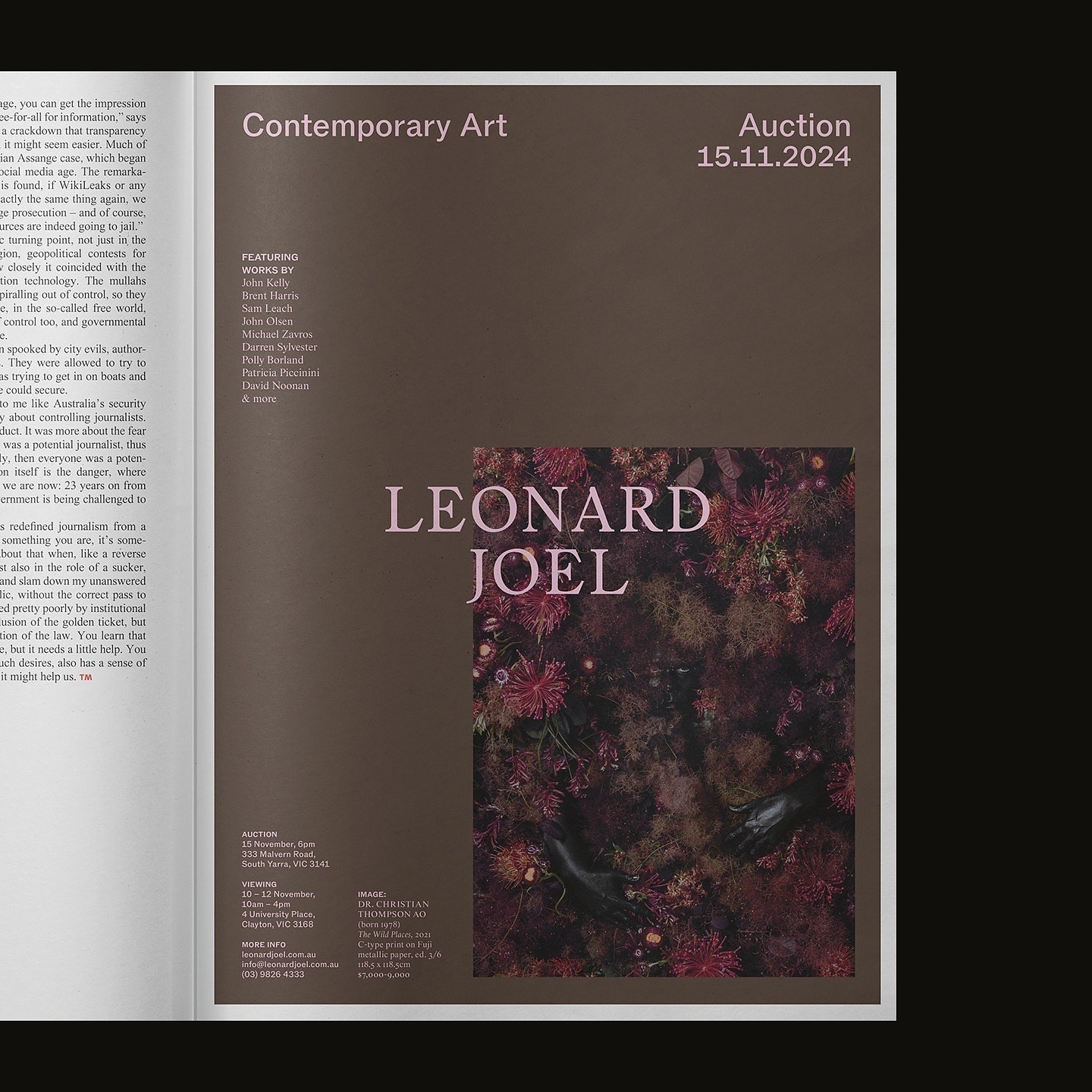
Leonard Joel, one of Australia’s top auction houses, refreshed its identity with Studio Doherty. The concept “Everything old is new again” blends heritage and modernity.
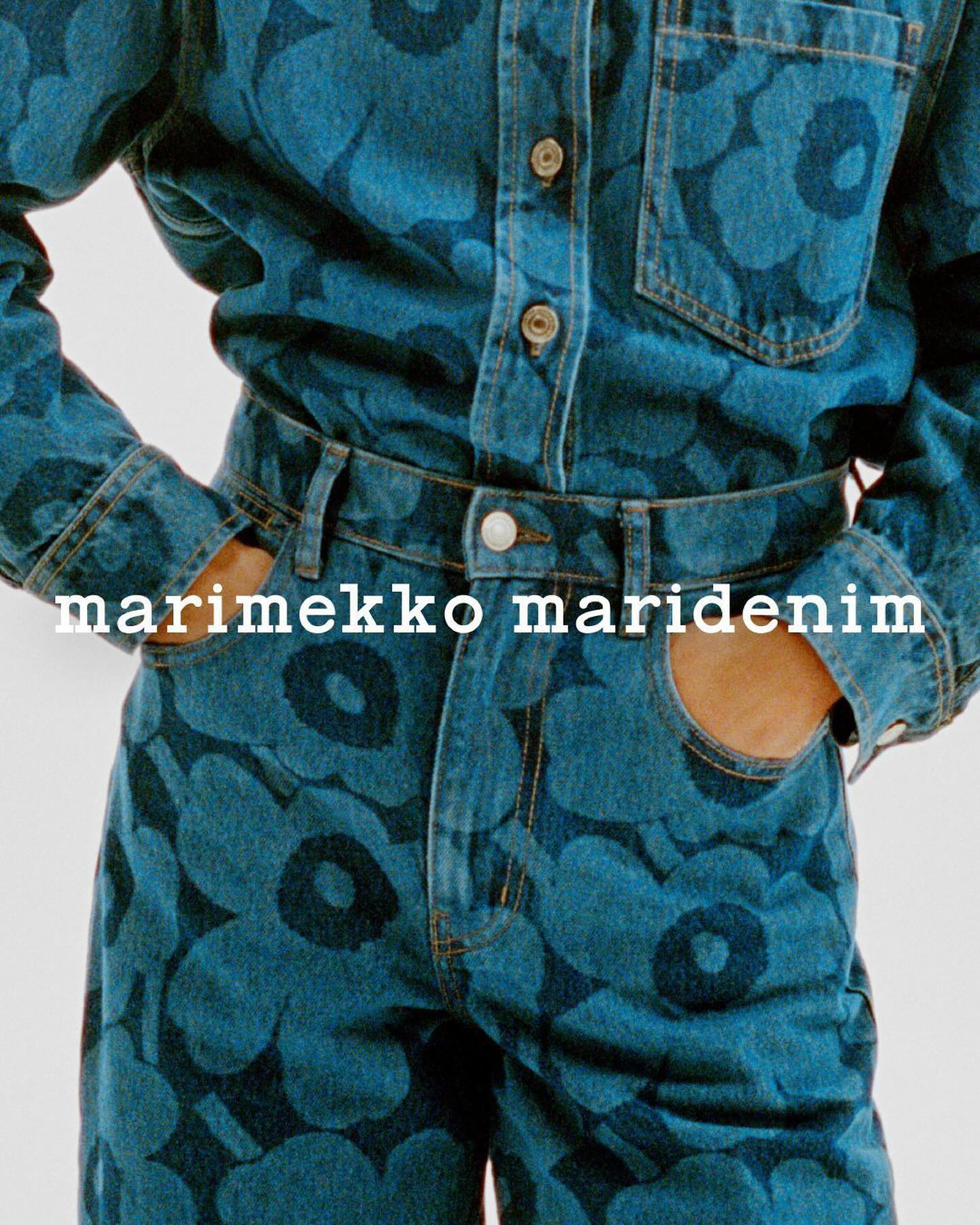
Maridenim just made its debut at the Fall/Winter 2024 show during Copenhagen Fashion Week. Blending their iconic bold designs with a fresh denim twist.
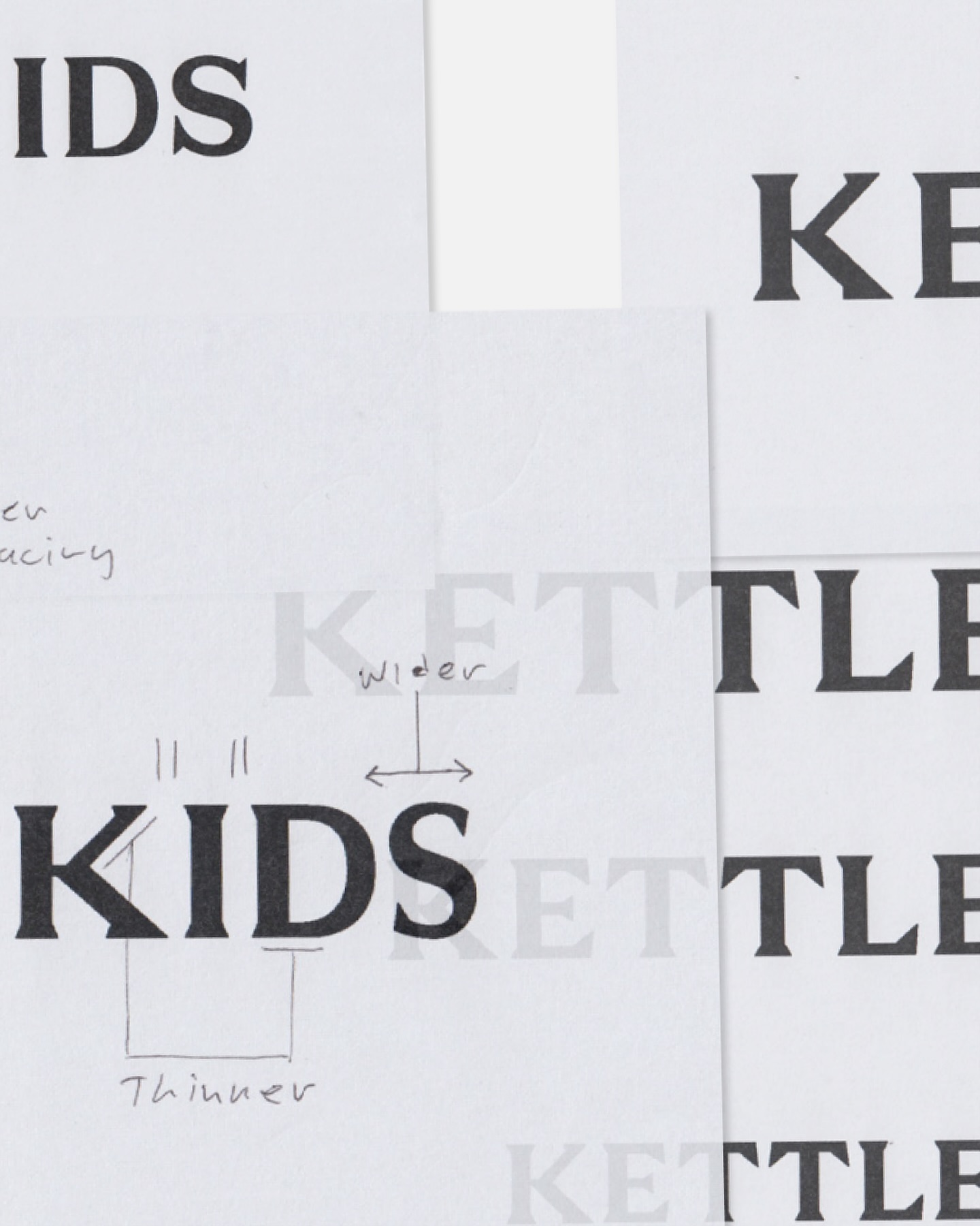
Two Times Elliot designed the logo, typography, and monogram for Kettle Kids, drawing inspiration from London’s historic architecture and signage.
An affair depicted through typography to create the identity for the Belgian Art and Design Affair, where @otisverhoeve,@bureauclaes, and @pino_type designed three different typefaces incorporating hearts into each letter.
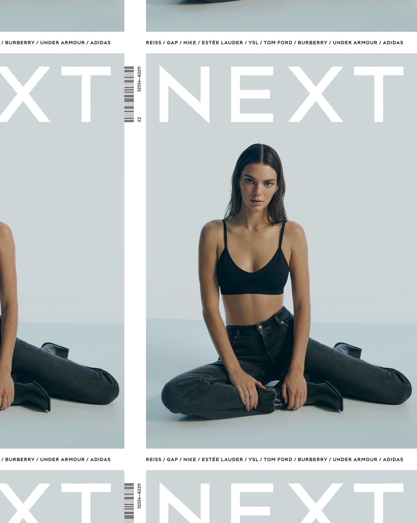
After designing the logo as part of the rebranding for the clothing brand Next, Frost was commissioned again by Six to create an entire typeface based on it.
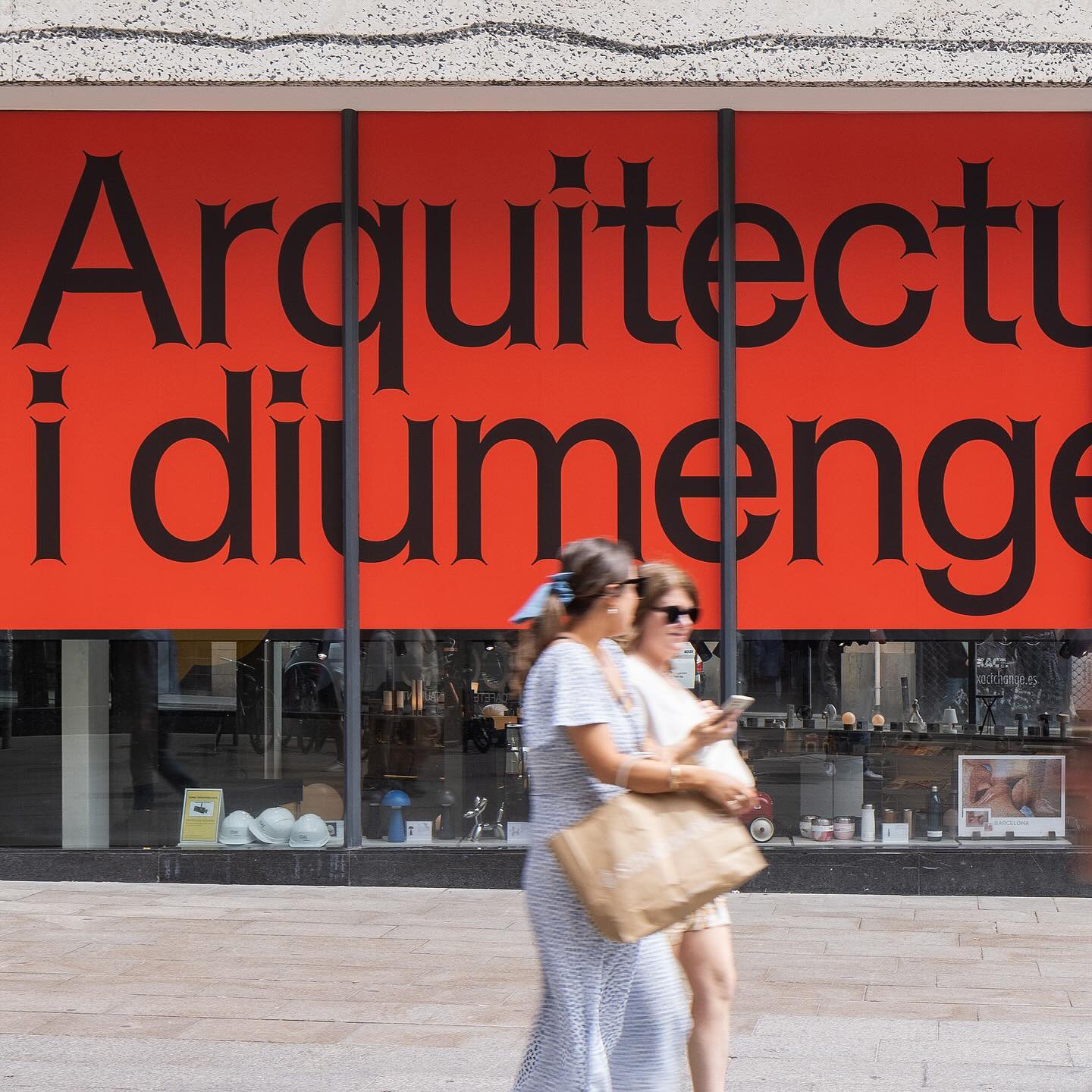
Graphic design for different spaces of this exhibition at the Architects’ Association of Catalonia, by PFP Disseny. Using Helveesti by Dinamo.
Workbyworks Studio designed this unconventional serif typeface and visual identity for Steffan Studio.