NASK Studio chose Clarendon Graphic Light by Optimo Foundry to shape a refined typographic system that frames the photographic content of JB Books & Projects.
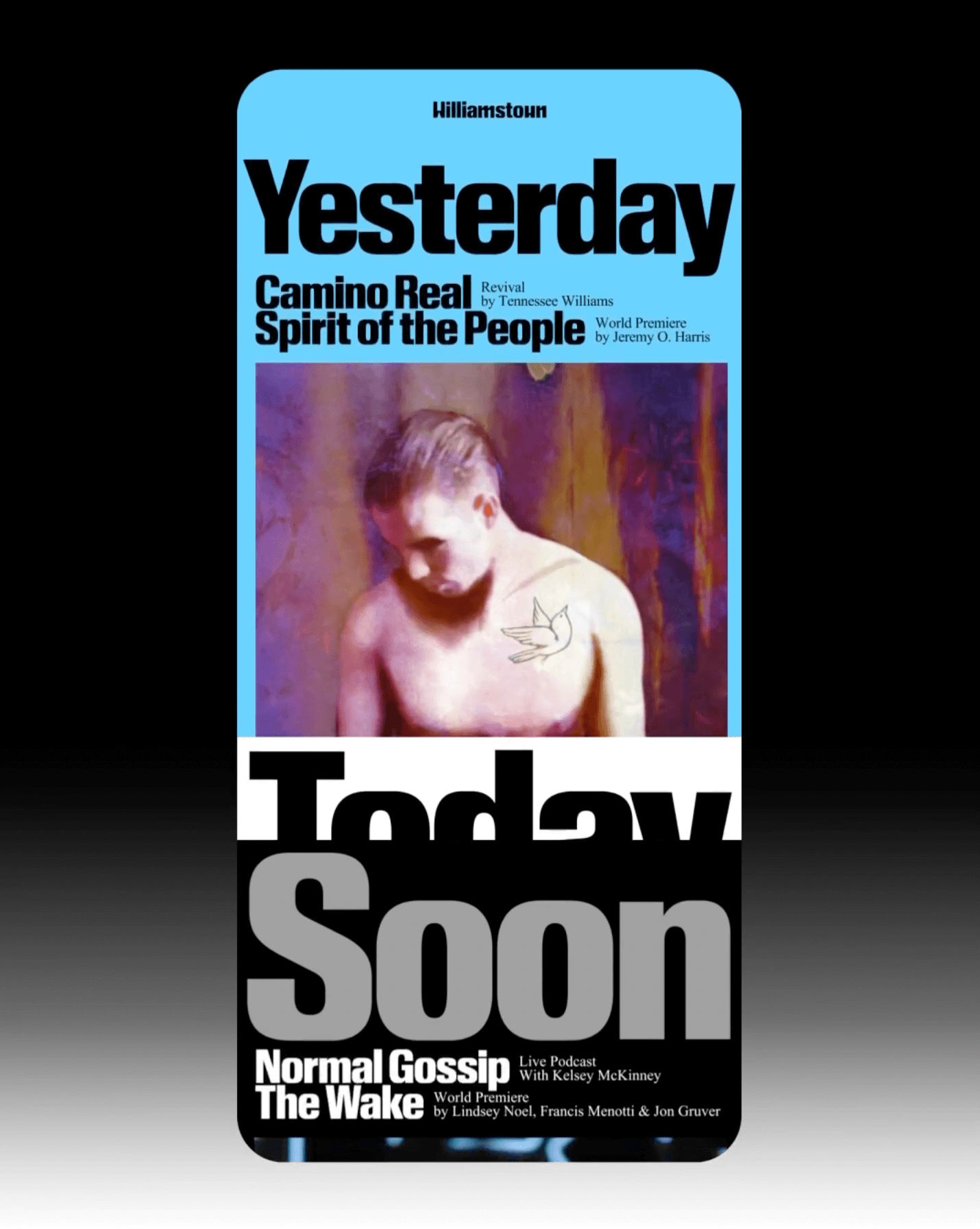
The identity that Pentagram created for the Williamstown Festival transforms the stage into a dynamic graphic system. A custom logo is complemented by Times New Roman and Review from Commercial Type.
The redesign of ArkDes in Stockholm by AM Stockholm features custom typefaces where dots and dashes create a unique typographic system. Alongside Diatype, these fonts redefine the museum’s identity.
Tetier, the jewelry brand using recycled materials that recently collaborated with Asics, features Octave by Faire Type in its logo and texts.
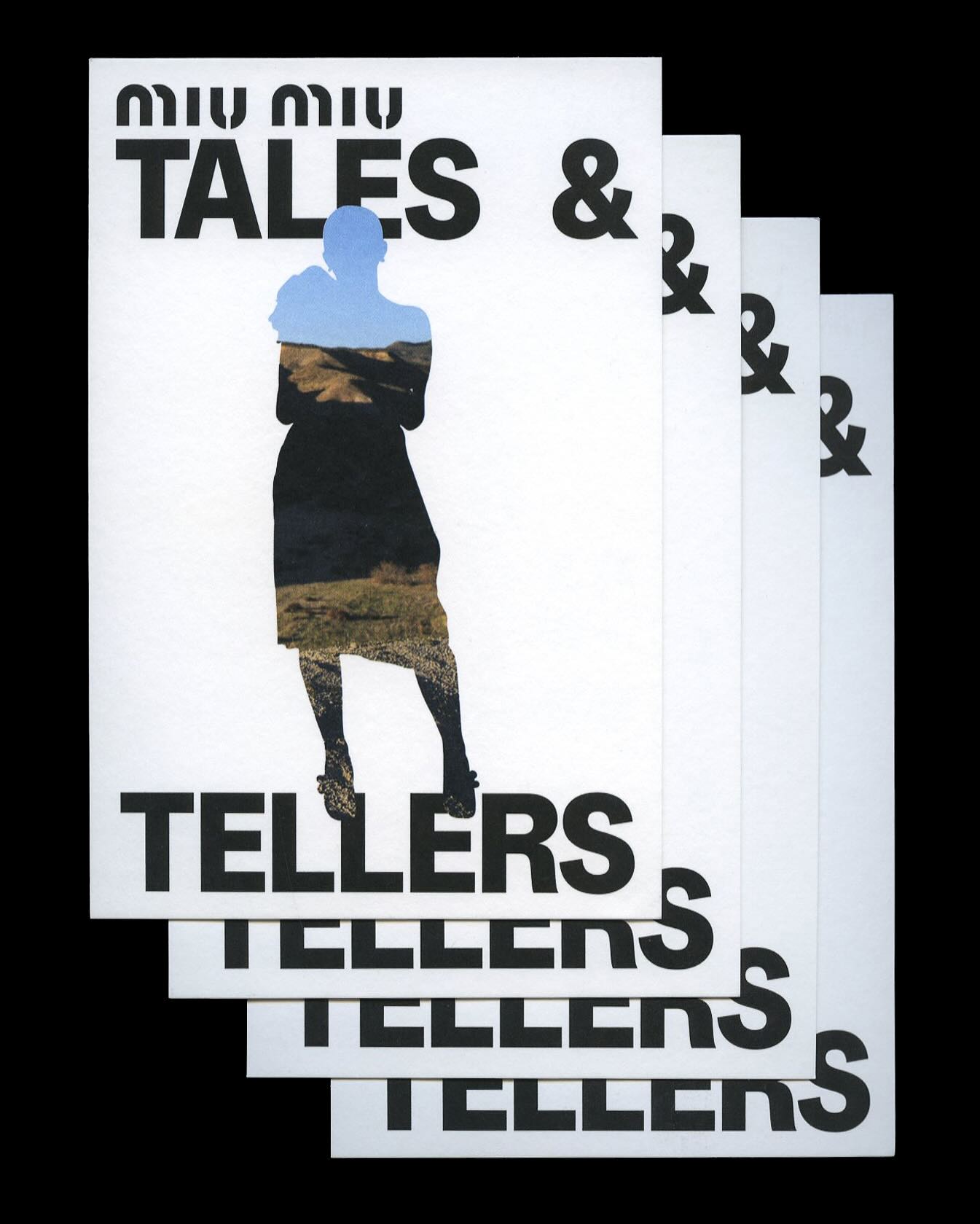
Kern typeface is featured in Tales & Tellers, a Miu Miu campaign that revisits various representations of femininity from past runway shows and short films.
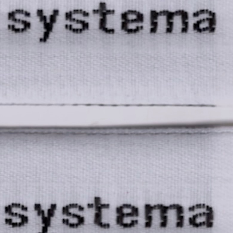
The French studio Plus Mûrs used Diatype Mono by Dinamo for the logo of the sophisticated sports brand, Counter Systema.
Horst Arts & Music 2024 debuts with a visual identity that connects disciplines, emotions, and practices through a network of symbols, featuring Oracle by Dinamo.
A classic typeface that reinvents itself by being interactive; Bonjour Garçon used Neue Haas Unica W1G Black, applying a negative effect in the web redesign they created for the art agency Pedro Booking.
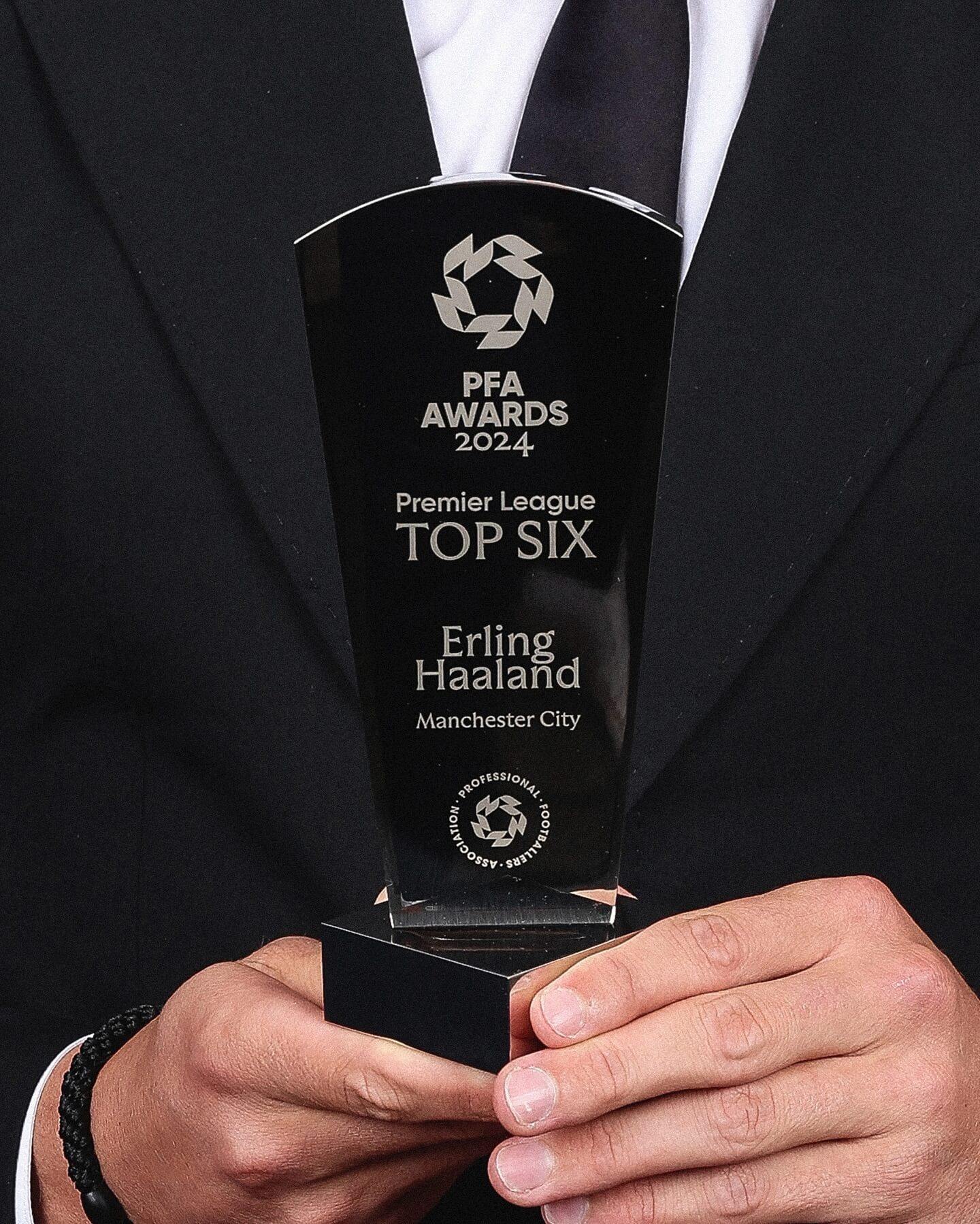
Realm by Approximate Type being used in this annual award ceremony for the best player of the year in the English league.