This custom typeface was part of the identity design that Bureau Bernklau created for the production company BWGTBLD—extended and bold, just like its cinematic vision.
With dots inviting the creation of interconnected forms, the design by Atelier Tout va bien features Baste in The MV Festival 2024.
Elephant magazine showcases the rustic and imperfect details of the ZG Elephant typeface through these graphic spreads. Type and editorial design by Zak Group.
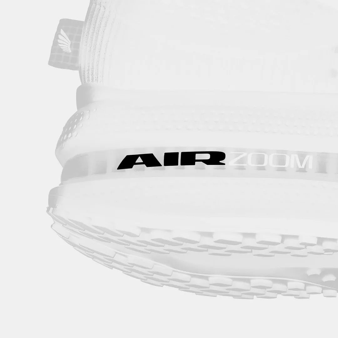
Win on Air is the name of the new Nike Air identity, where David Gobber and Hoang Nguyen were part of this project, designing the typography used in the logo, which is a custom version of Generation Mono, another typeface of their own creation.
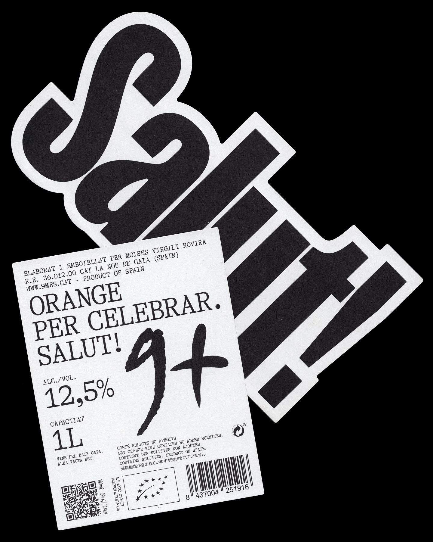
A simple and powerful label for a wine made to celebrate. Principi Studi used FK Screamer for the logo and GT Alpina for the complementary typography.
Asfalt will have its first edition featuring an identity filled with color blocks, sports images, a vertical logo using a customized version of Generation Mono, and texts using ABC Diatype.
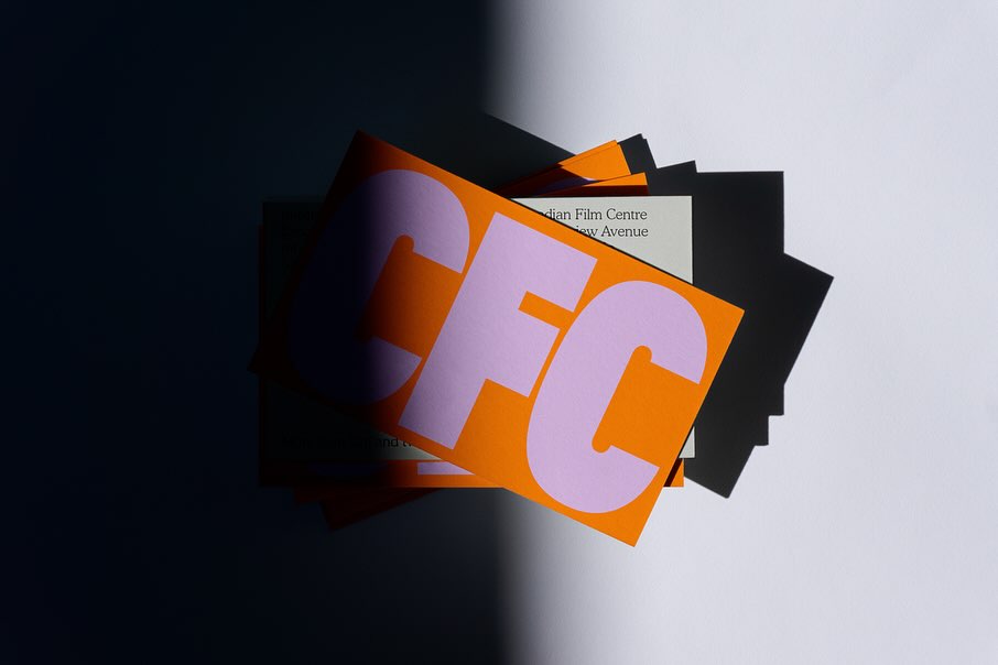
Helping to create a bold and inclusive visual identity, Quentin Coulombier’s Buzz and the well-known Cooper were selected by Underline Studio to represent the Canadian Film Centre (CFC)
Vibrant and loud, just like the conversations after an excellent dinner in Italy, that’s how Grand Bacàn Sans is, a custom typeface created by Pentagram for the Italian restaurant in Brooklyn; Bacàn
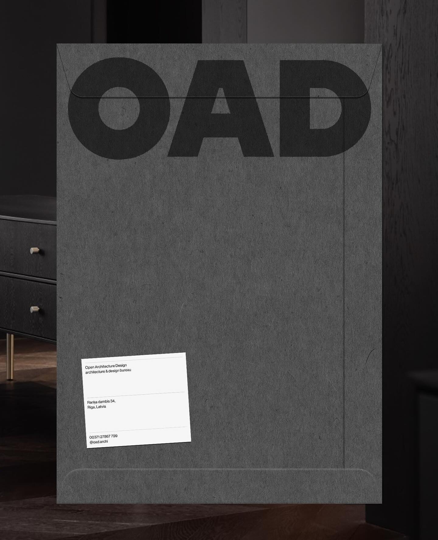
Just like its proposal, OAD (Open Architecture Design) has a strong and impactful lettering as a logo, complemented by Neue Haas Grotesk in its regular weight.
For a constantly moving entity like the PAC (Performing Arts Centre), Porto Rocha, together with AllCaps, created this strong and timeless typography as part of its new visual identity.