New custom typeface for La Fabra Centre d’Art designed by Fonts From Folch. A design that reflects the institution’s contemporary spirit, with refinements that ensure versatility, precision, and smooth composition.
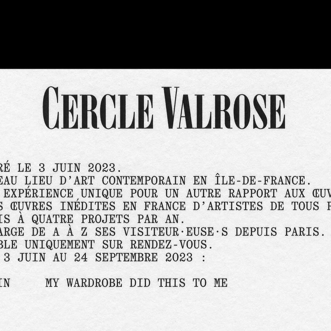
OTT Harker by Ornamental & Title Type is used in the logo for Cercle Valrose. The design is by Bizzarri-Rodriguez, who also created the typeface. Quadrant by Matter of Sorts is used for the supporting text.
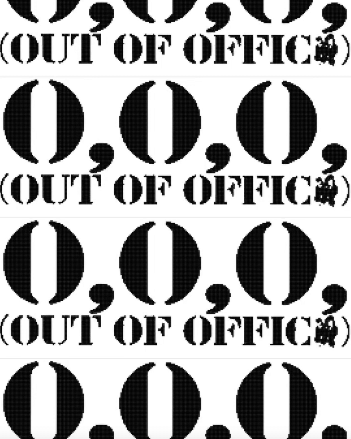
Typographic explorations by ErrorError Studio, using EE Parking®, a typeface they created inspired by stencils found in parking lots.
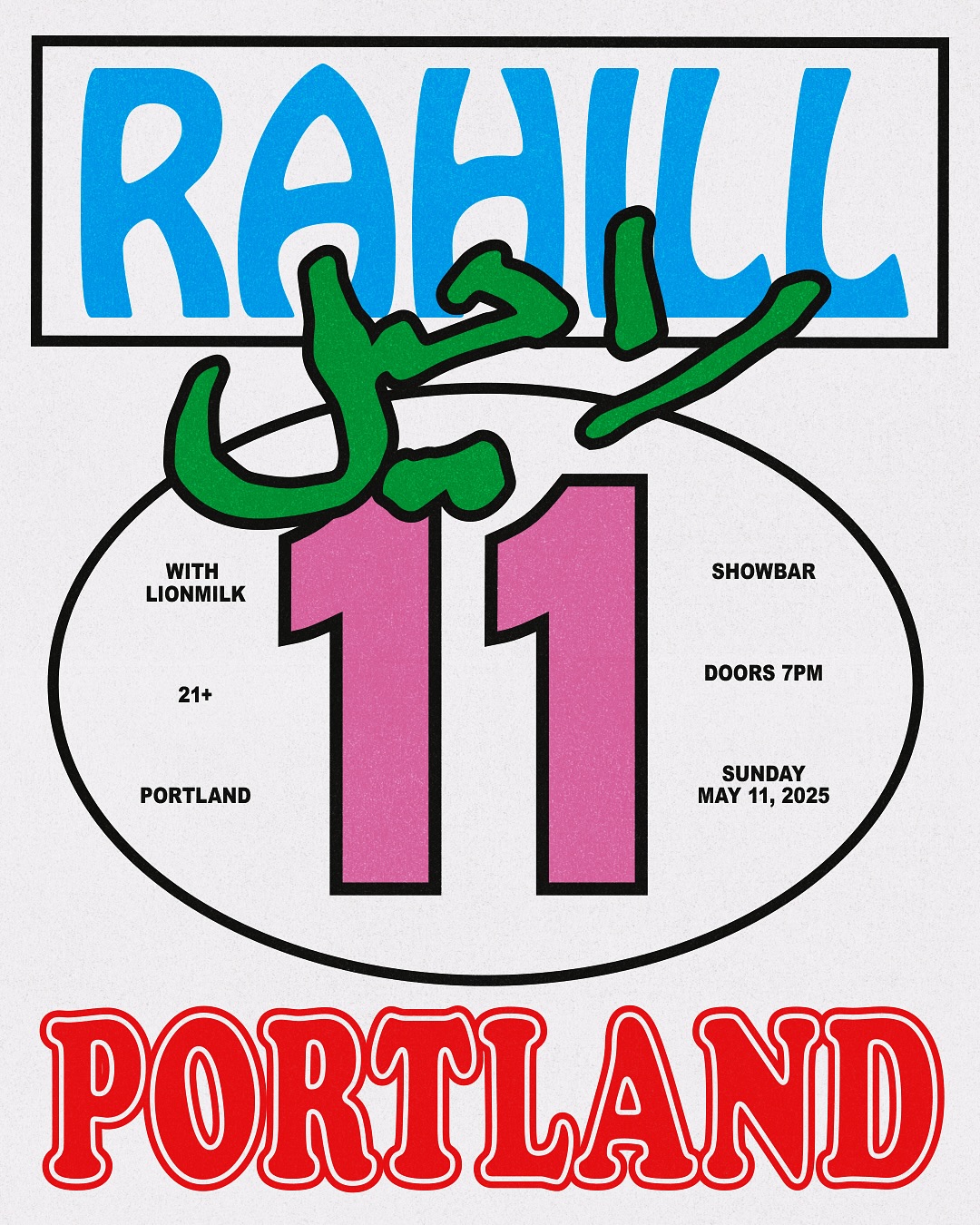
Flyer explorations by Bijan Herami, featuring lettering by his mother, Hobo, and a condensed version of Cooper Black, for Rahill Jamalifard’s show.
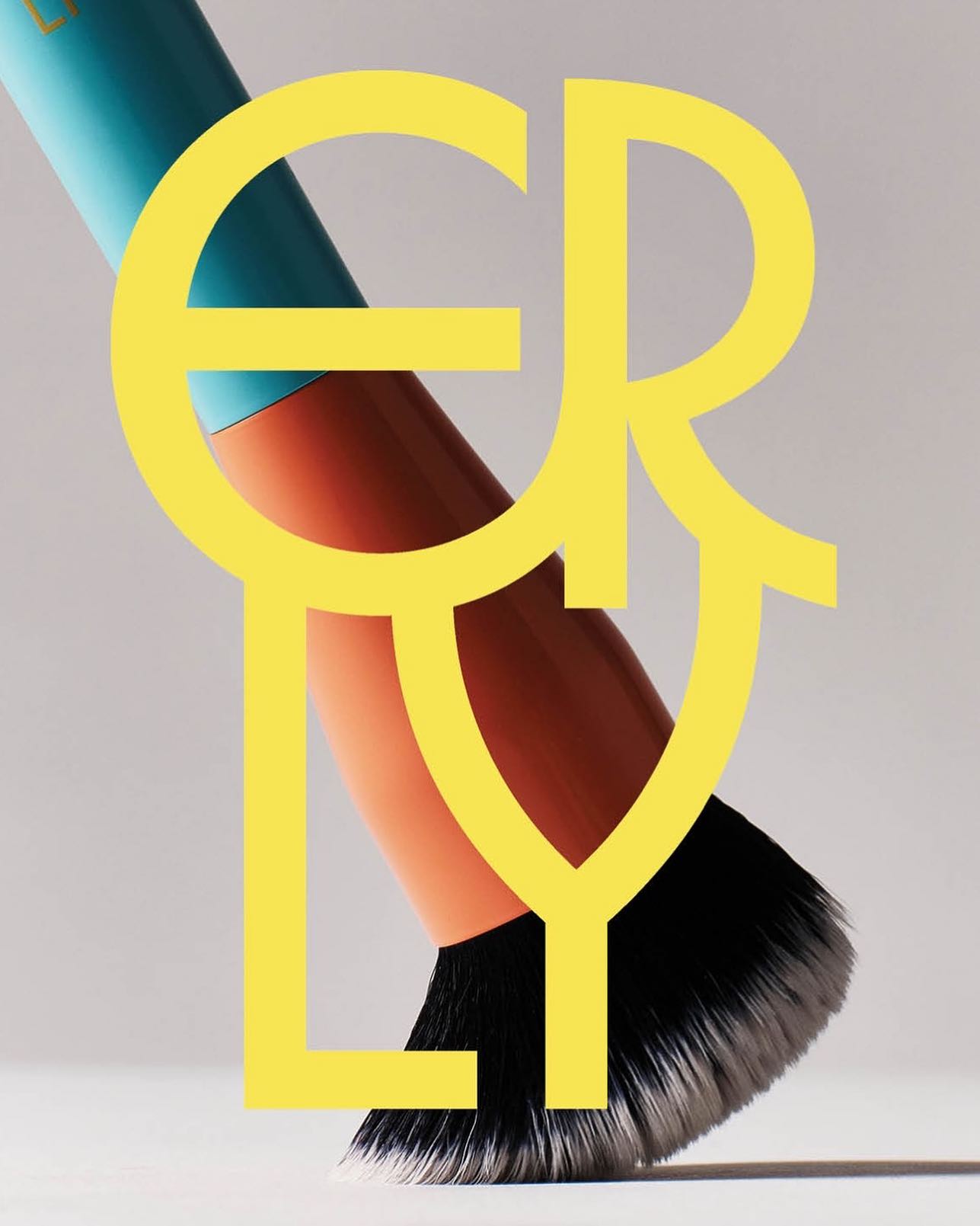
ERLY reinvents skincare with a fresh, typographic identity. Herbus Regular & Title Type, in the design by Studio Lotta Nieminen.
Inspired by Chicago’s sign painting, the packaging of Foxtrot’s potato chips captures the essence of the iconic Maxwell Street Market hot dog.
Buenaventura designed IOC, a typeface that becomes the visual signature of Islands of Cocoplum, blending tradition, luxury, and modernity.
Storefronts have served as stages for performances, for experimentation, and part of the art itself. Fresh Window at Museum Tinguely explores this connection with an identity using Stabilo Boss.
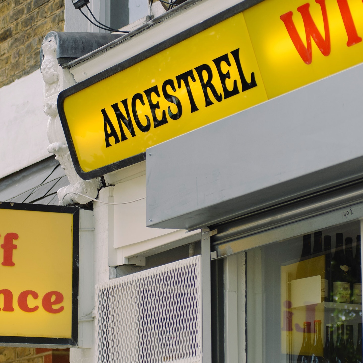
The first store to bring natural wine to the UK, Ancestral Wines, features an identity inspired by the winemaking process and a logo shaped like a grape cluster.
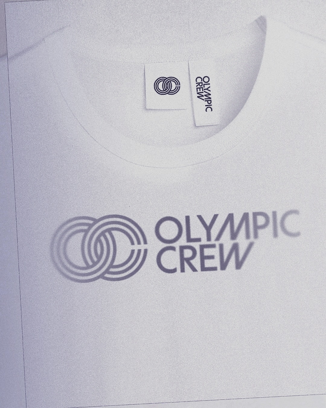
BonTemps studio designed the identity for Olympic Crew, combining the custom logotype and the iconic OC symbol to capture collaboration and modernity. They used the Univers Condensed Bold typeface.