As fun as family movie nights, Moore by Eliott Grunewald was used in this list of films curated by A24 and approved by kids and adults alike. Designed by Jordi Ng and Elana Schlenker.
Justin Sloane used this interesting mix of Gothic letters (Castilla by Sharptype) and sans serif (Octave by Josh Finklea) for a vinyl cover.
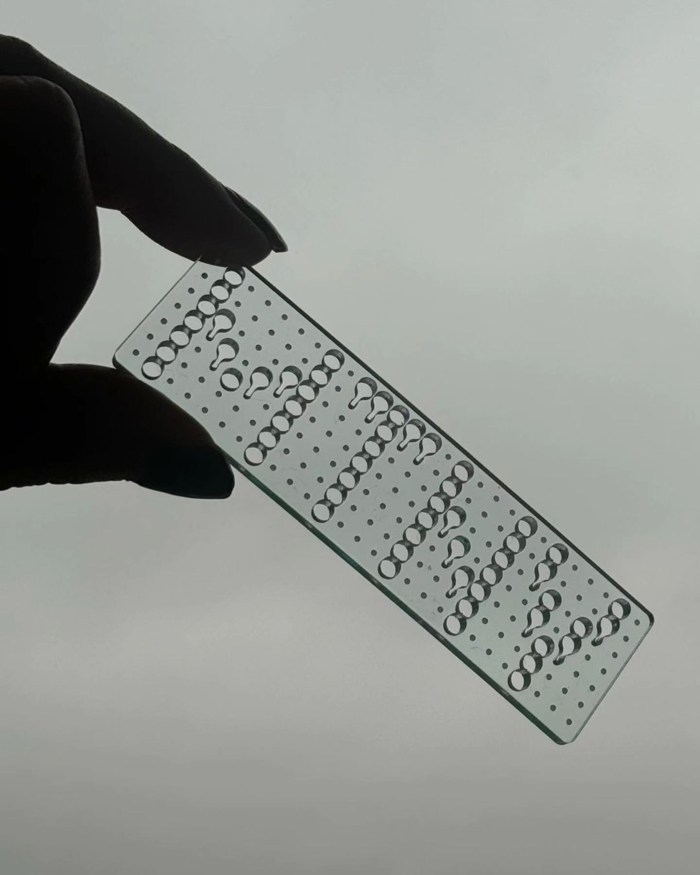
This series of keychains, the result of Pauline Esguerra’s exploration with laser cutting, uses, among other typefaces, Eurocat by Maxitype.
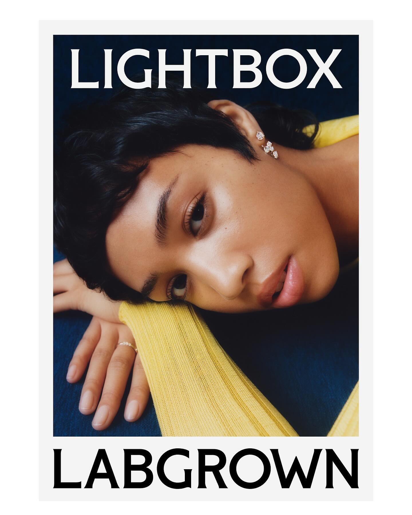
Decade created this visual identity to position an innovative lab-grown diamond brand, proposing a custom flare logo designed by Colophon Foundry.
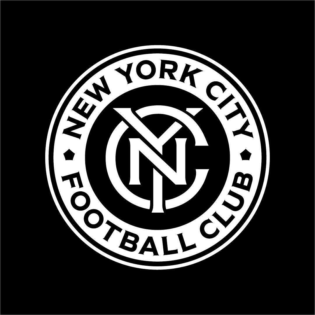
Frere-Jones was tasked with redesigning the New York City Football Club badge, and carefully adjusting each character to fit the circular arc of the badge.
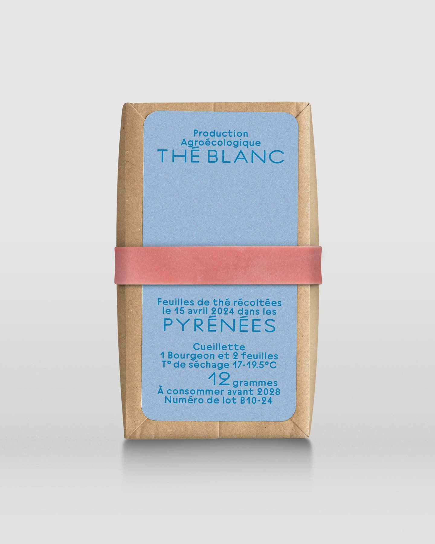
In a comprehensive project including handwriting, drawing, packaging conception, and global branding, Quentin gave @the.pyrenees an organic and approachable identity.
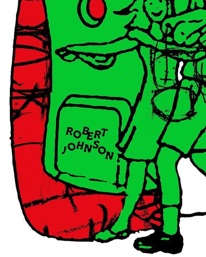
The Robert Johnson Club kicks off the 2024 season with these posters designed by Dominik Keller Studio. Typography used is Cosplay.
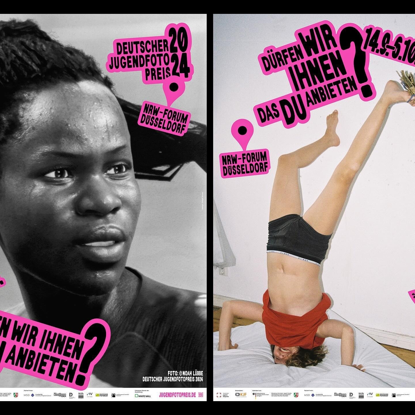
An identity made with stickers that follows no rules in the layouts. Distaff Studio used Serial A as the typeface for the image of this exhibition of the German Youth Photography Prize.
An identity that balances between distinctive and sober is composed of a bold uppercase logo, vibrant colors, and two specially customized typefaces; Saans from Displaay Foundry and LL Ruder Plakat from Lineto. Designed by Porto Rocha.
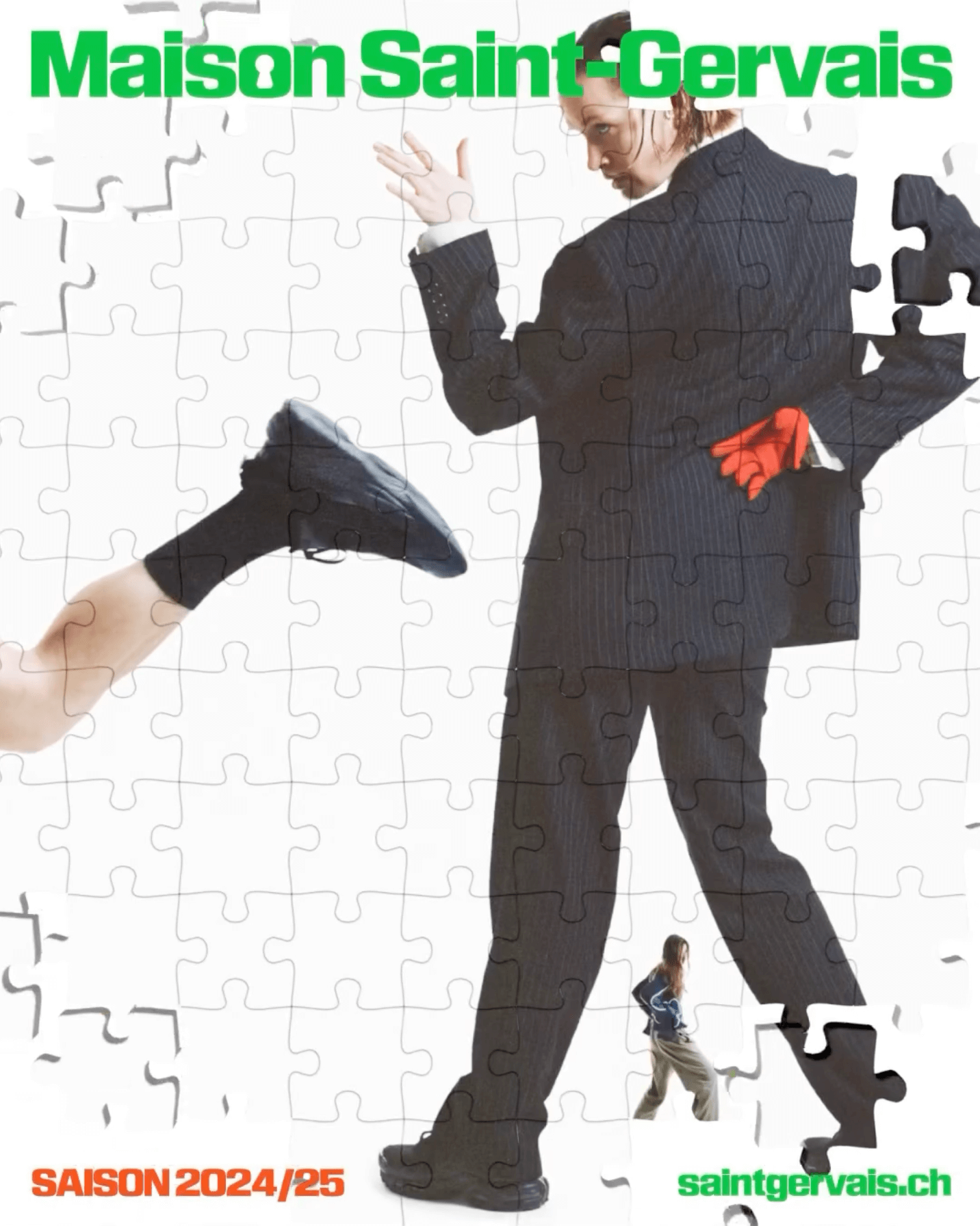
The Swiss graphic design studio Dual Room renewed the image of the Maison Saint-Gervais theater, using KTF Rublena Black.