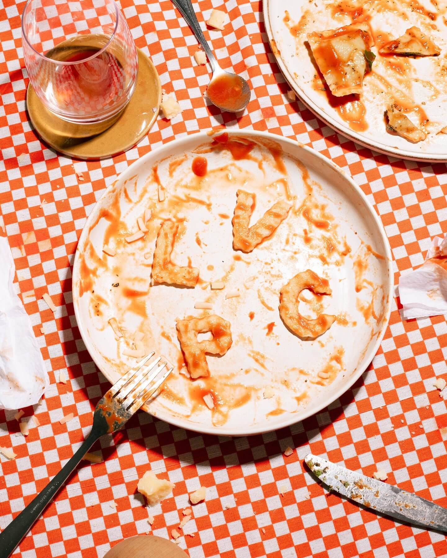
Andrés Higueros designed this custom typeface for the private dining experiences hosted by La Vera Pasta.
Address Arts leveraged the possibilities of Exposure by 205TF, a variable typeface whose weight was modified to achieve a solid and heavy logo.
For the past 3 years, Chejo and SHDW studios have been sharing lunch, and in this book, they compile the recipes they’ve made. Serial A from DumDum fonts is used as the main typography.
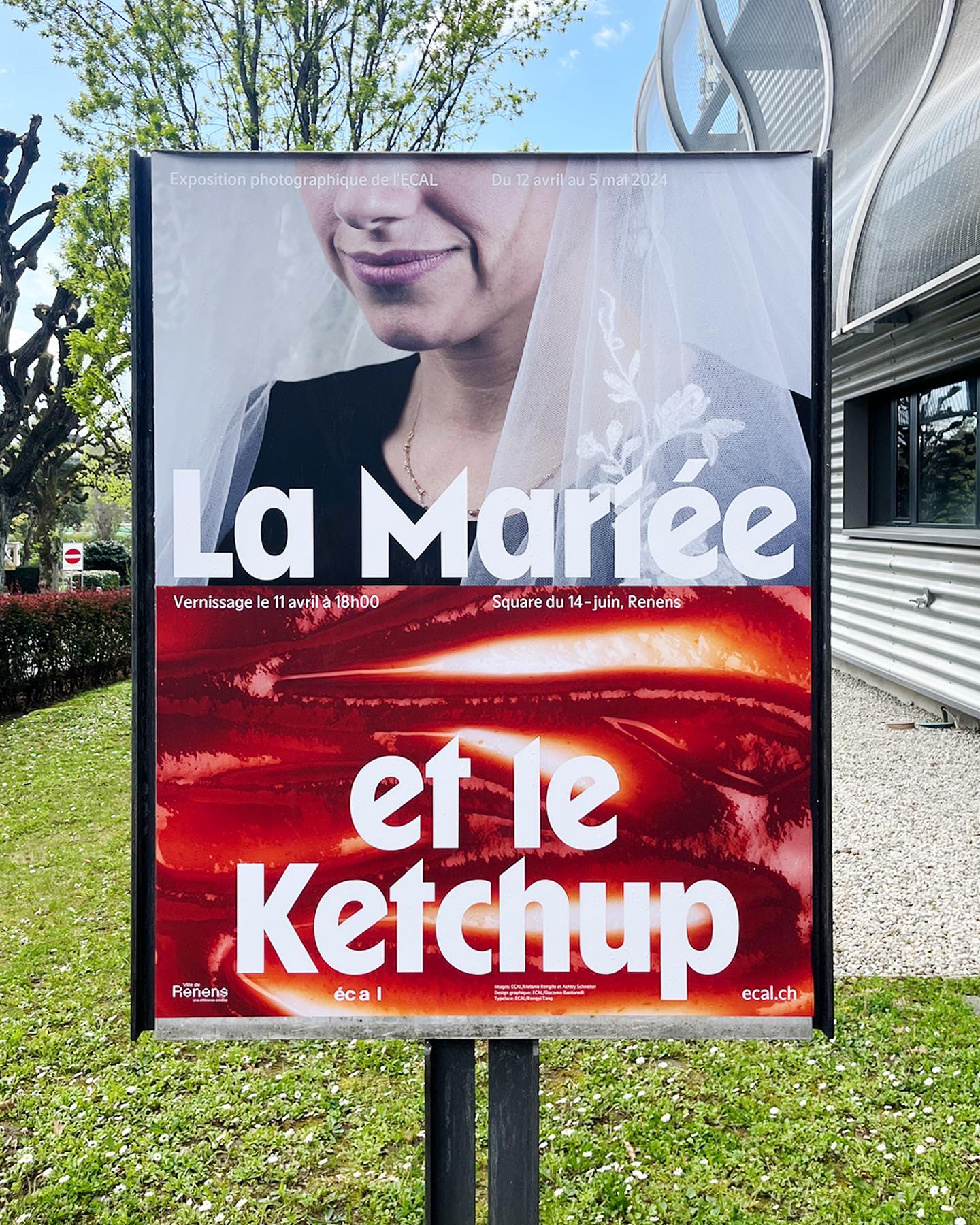
WaterPolo Display by @dontnotdon was used in this series of posters portraying the ordinary and extraordinary aspects of Renens.
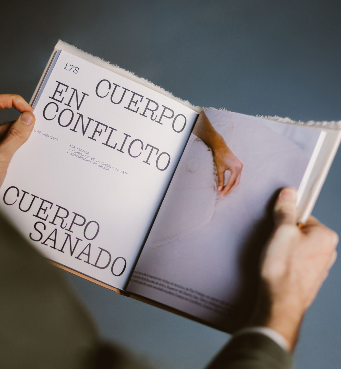
Mixture of materials, papers, and typefaces (Neue Montreal and Cucina); that’s how Tiquismiquis designed this editorial piece that covers Ela Fidalgo’s creative career.
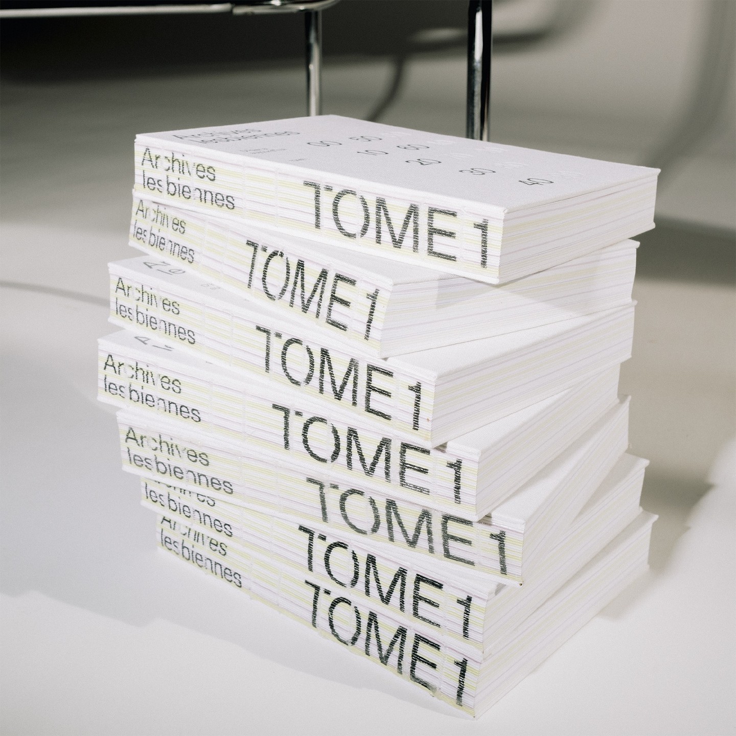
In this book that compiles the lesbian legacy in Quebec, we find Gerstner-Programm FSL as the main typeface, along with “handwritten” numbers using Sebastian Bobby. Designed by Harrison Fun Studio.
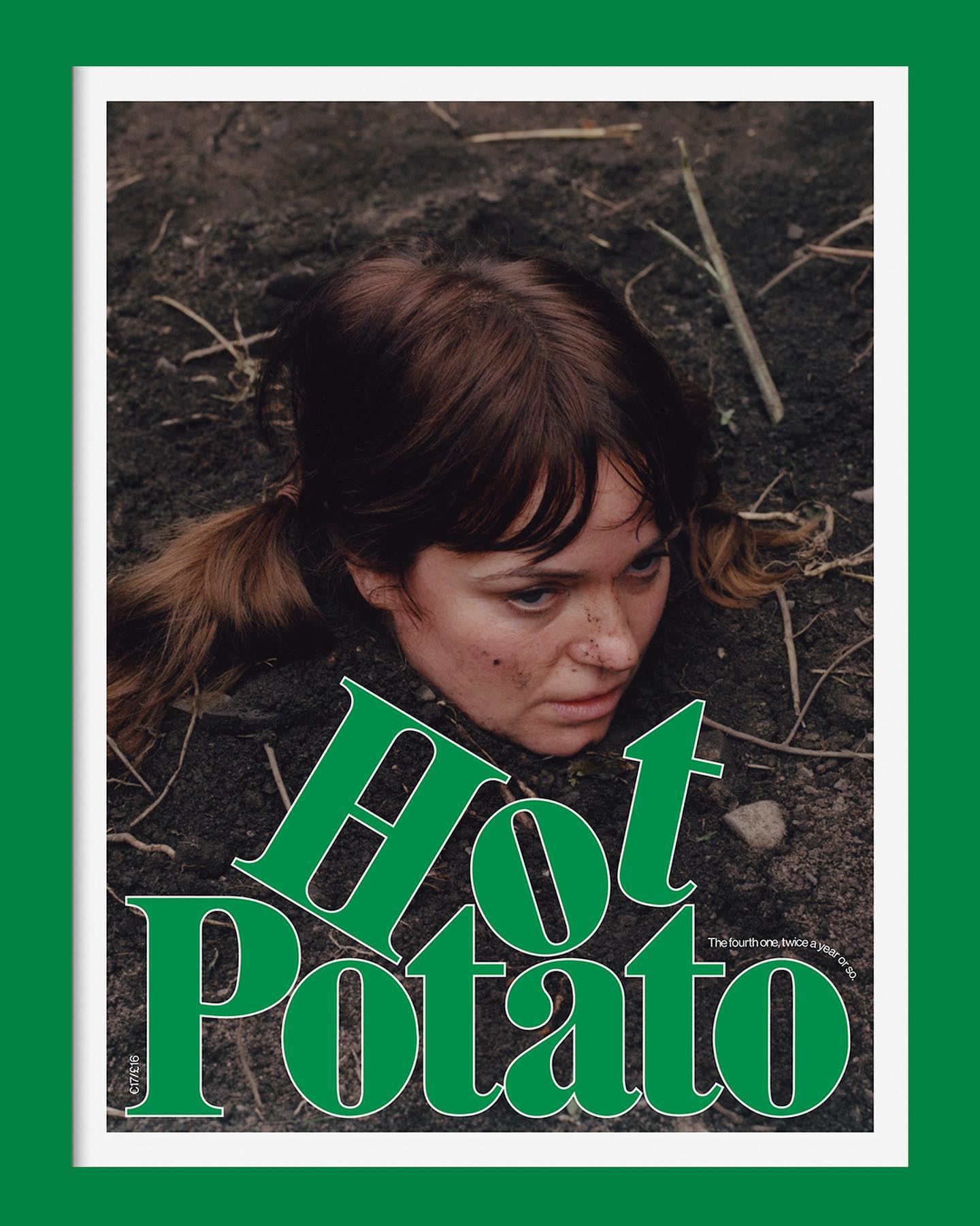
Neue Haas Grotesk is a common typeface on the blog, it works well in many scenarios, for example alongside Marfield in the fourth edition of Hot Potato magazine.
Within the vast diversity of ideas in this application, the Pinterest design team, along with Kurppa Hosk, uses the neutrality of Neue Haas Grotesk to continue inspiring all kinds of minds.
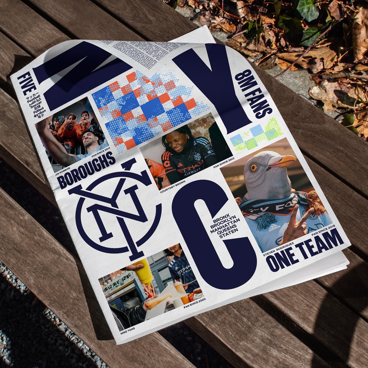
Express” and “Local” are the typefaces created for New York City FC in the rebranding process carried out by Gretel, in collaboration with the type design studio Frere-Jones.
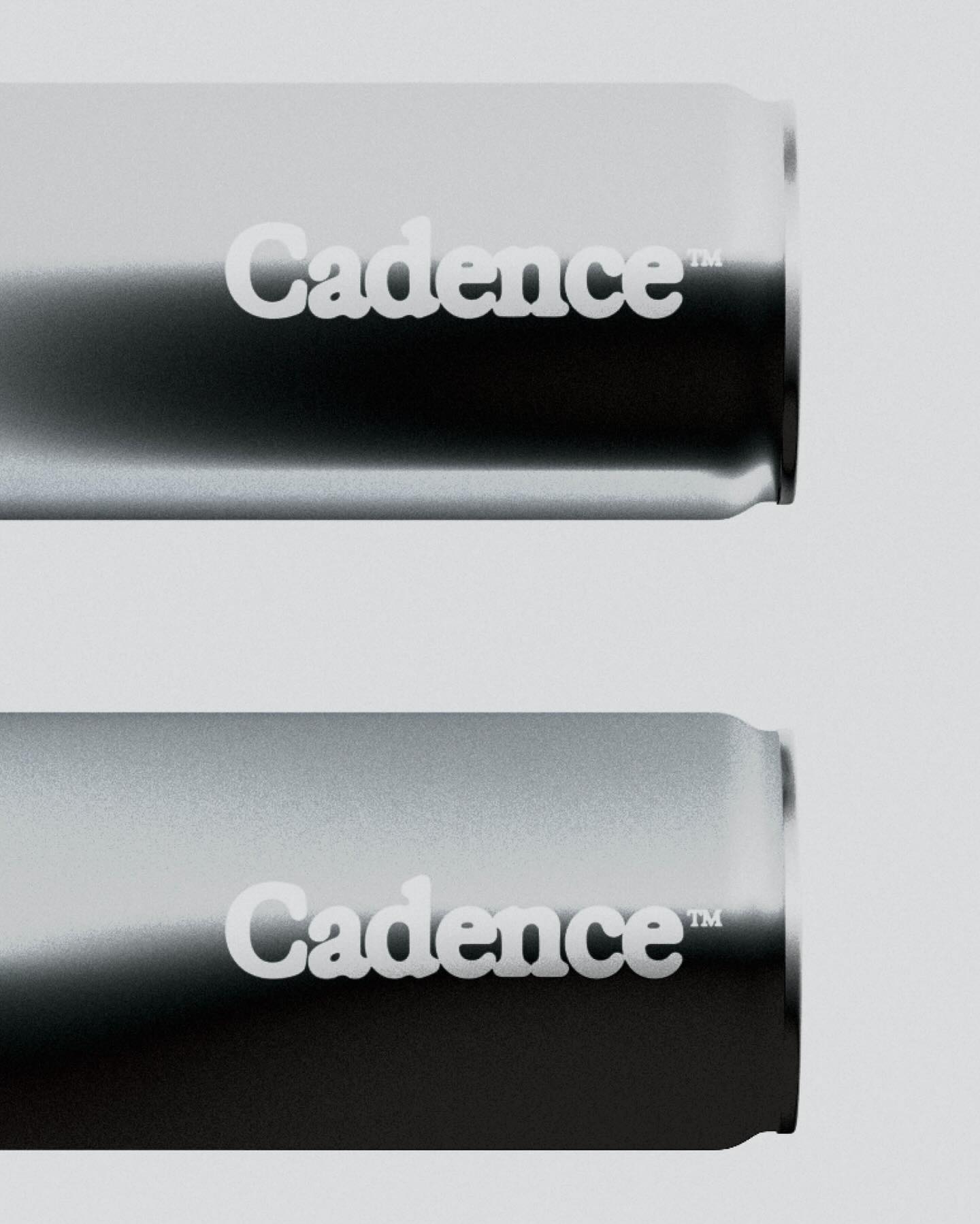
Supply stencil is the custom typeface Tric Studio inspired by streetwear, metal zines, tapes and the history of stencil, made as part of the identity system for Supply.