EXTRALESS, a Japanese clothing brand reflected its ethos in a custom typeface by British Standard Type embodying simplicity and shared humanity.
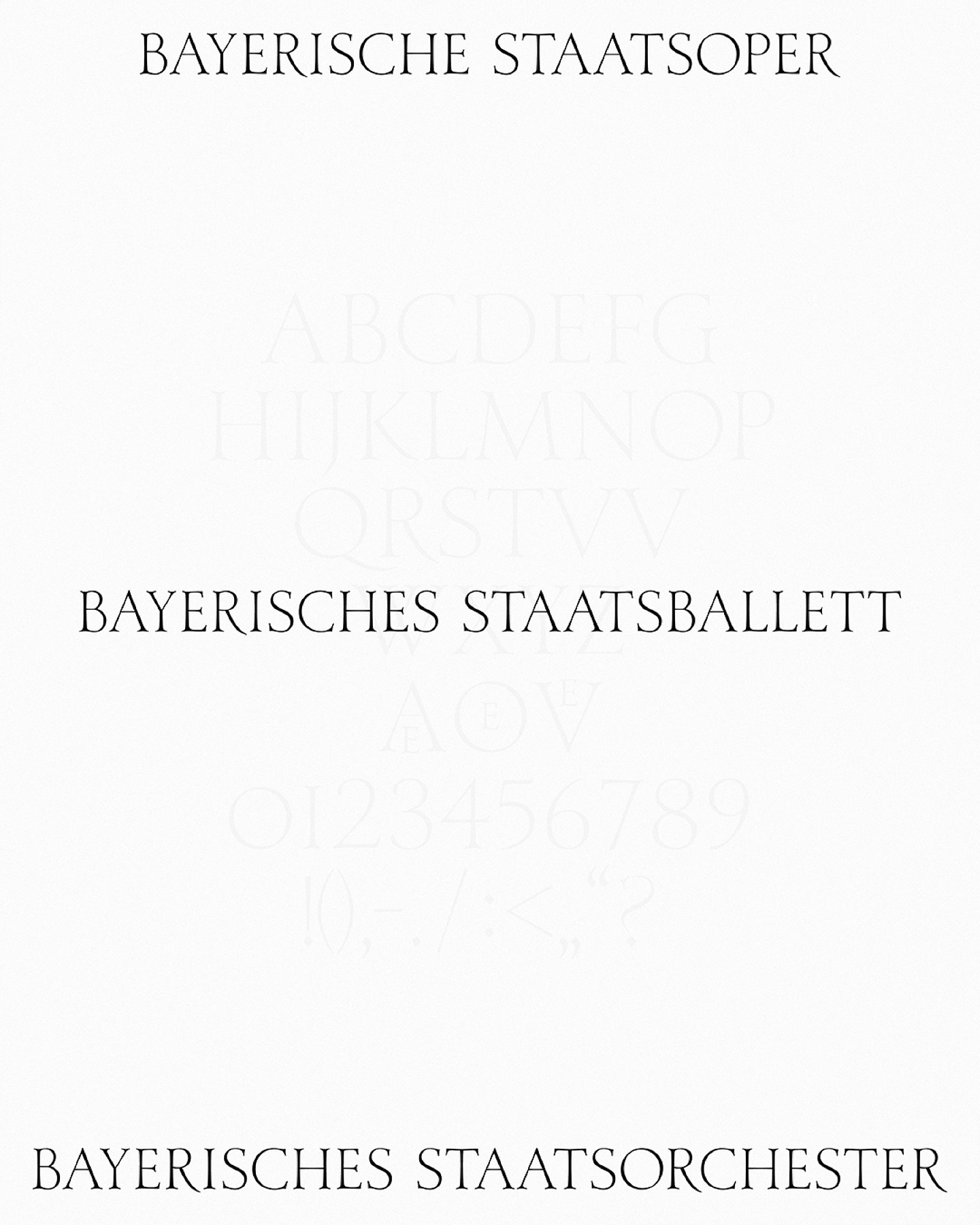
As part of the visual identity that Bureau Borsche created for the Bavarian State Opera, a digitized typeface —developed by Samara Keller— was created, based on a design found in the opera’s facilities.
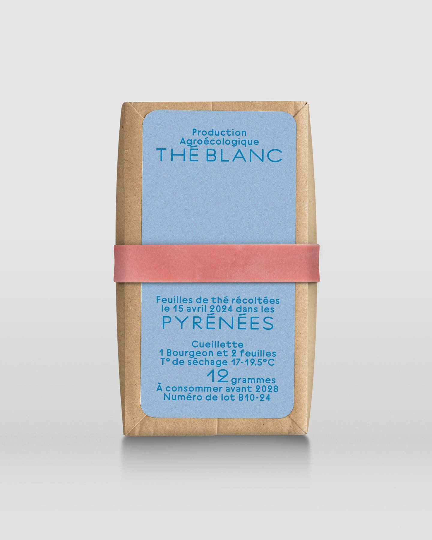
In a comprehensive project including handwriting, drawing, packaging conception, and global branding, Quentin gave @the.pyrenees an organic and approachable identity.
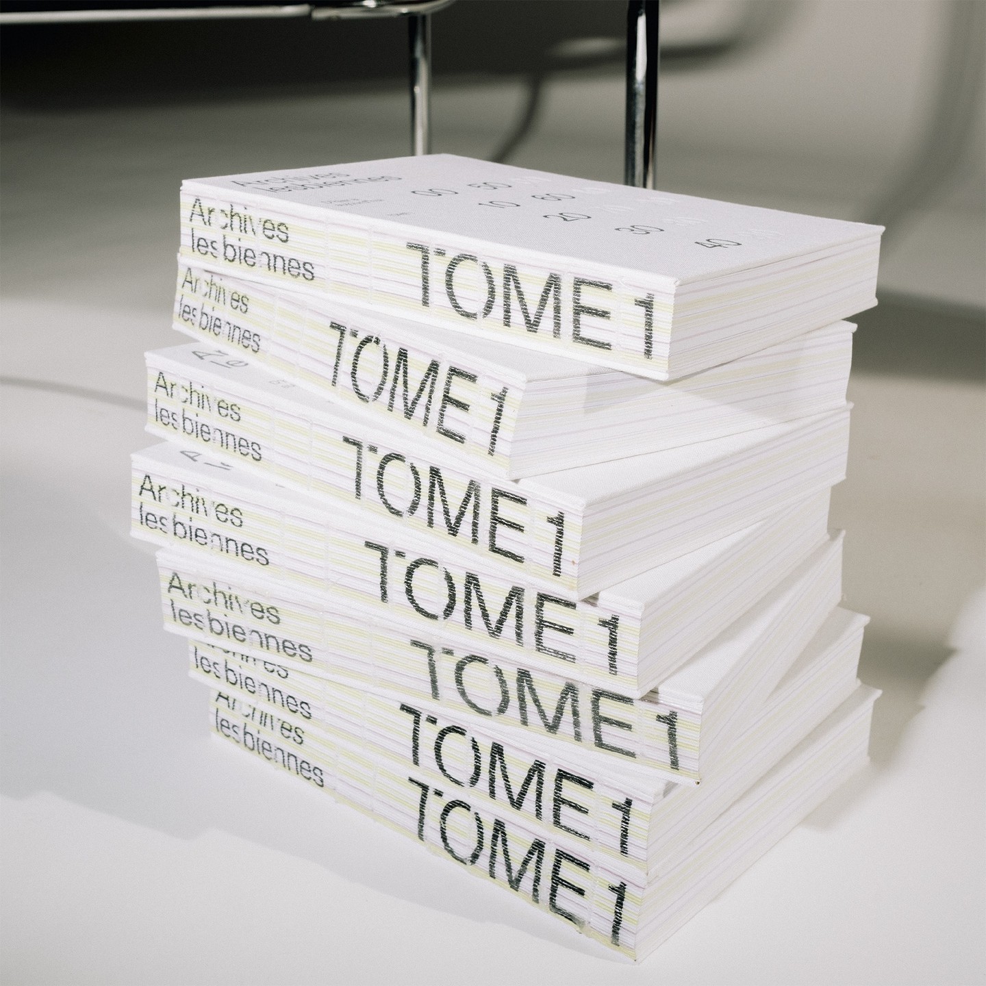
In this book that compiles the lesbian legacy in Quebec, we find Gerstner-Programm FSL as the main typeface, along with “handwritten” numbers using Sebastian Bobby. Designed by Harrison Fun Studio.
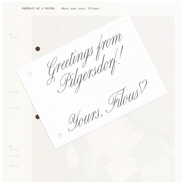
The zine “Portrait of a Friend (Rest Your Ears, Filous)” of the Vienna-based musician Filous, using Carta Nueva by Sharp Type.
With clean and neutral lines, Ana Mirats Studio creates a custom logo for Vezavena, a brand specialized in knitwear.