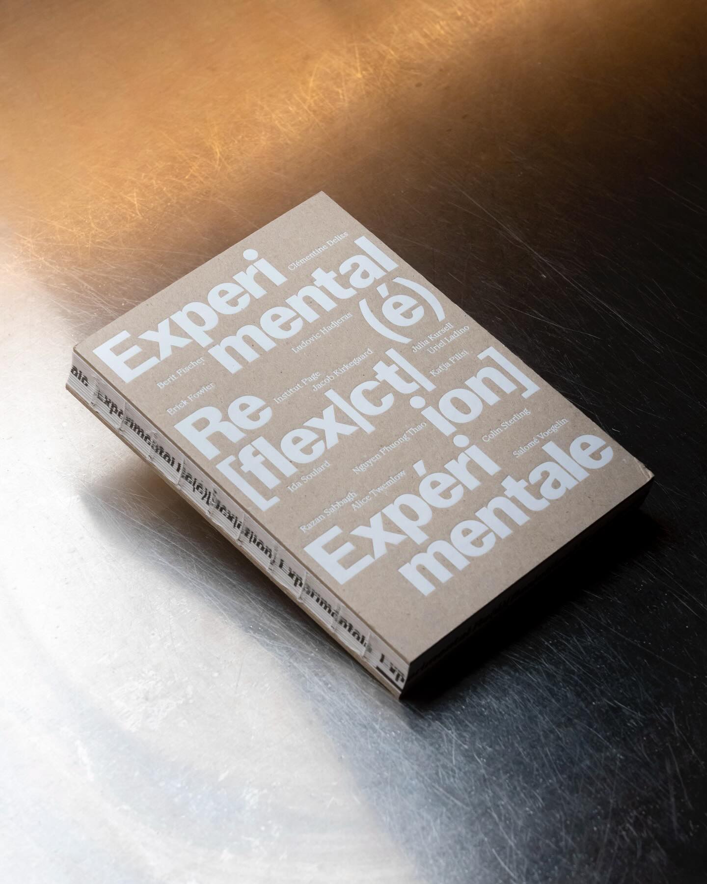
Experimental Re(é)[flex|ct|ion] is an editorial publication that explores concepts such as community, uncertainty, resistance, movement, among others, through explorations and discussions. Hannes Brischke uses ABC Walter Neue and Dark’s Remix A.
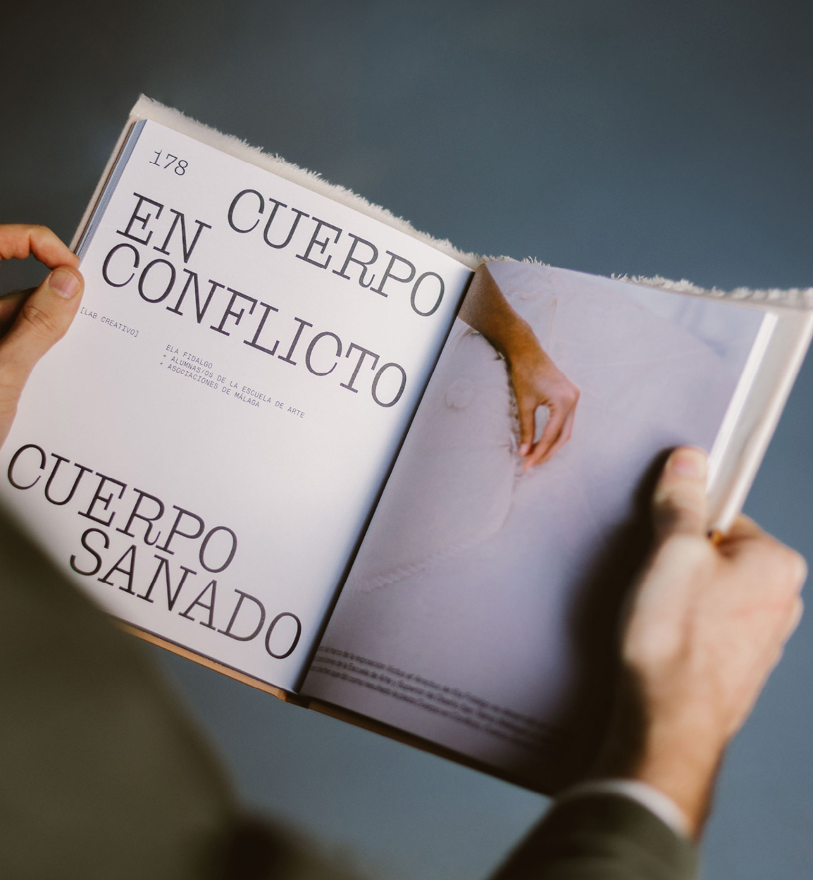
Mixture of materials, papers, and typefaces (Neue Montreal and Cucina); that’s how Tiquismiquis designed this editorial piece that covers Ela Fidalgo’s creative career.
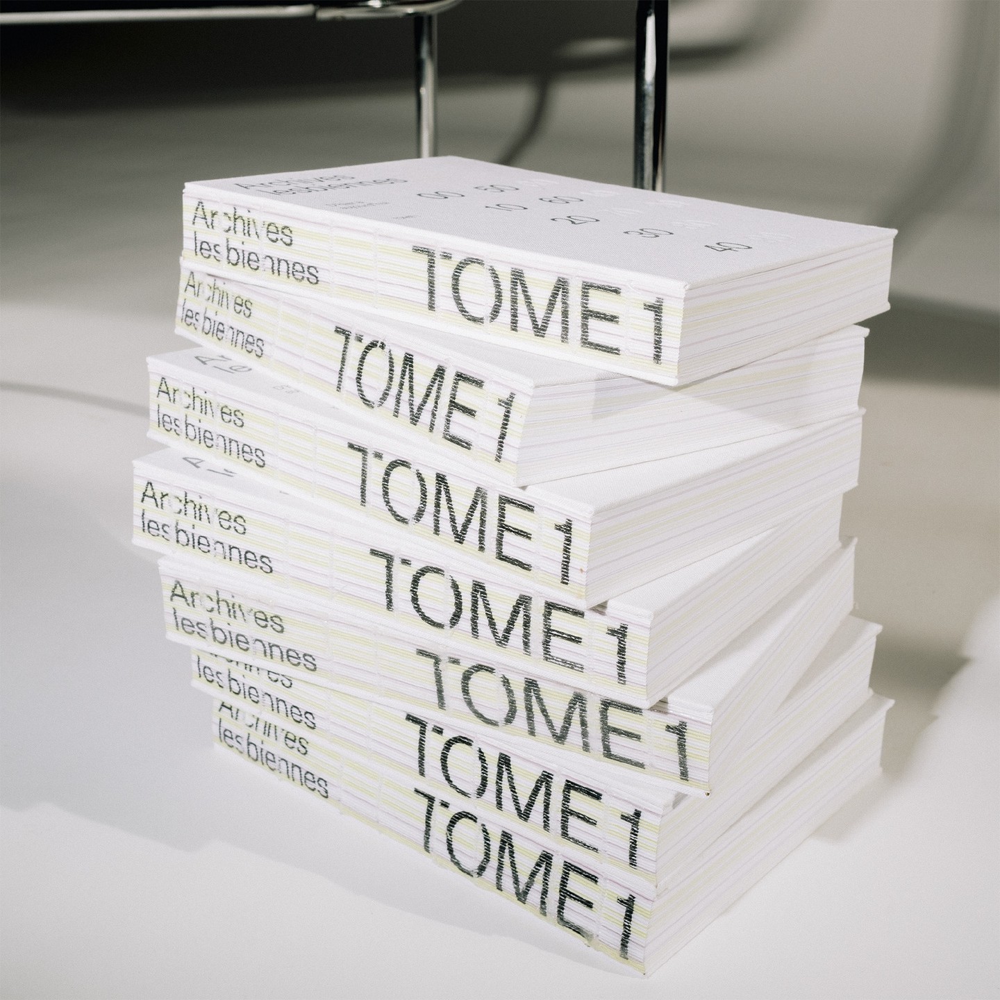
In this book that compiles the lesbian legacy in Quebec, we find Gerstner-Programm FSL as the main typeface, along with “handwritten” numbers using Sebastian Bobby. Designed by Harrison Fun Studio.
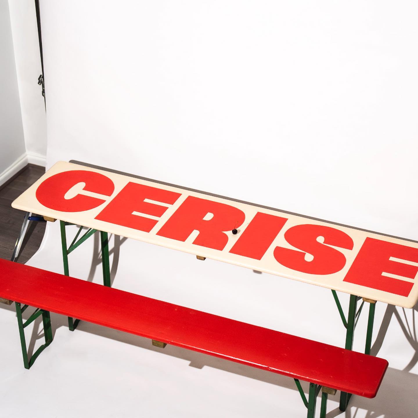
Studio Cerise, a colorful creative studio from East London, used Swinton by Nouvelle Noir for its logo.
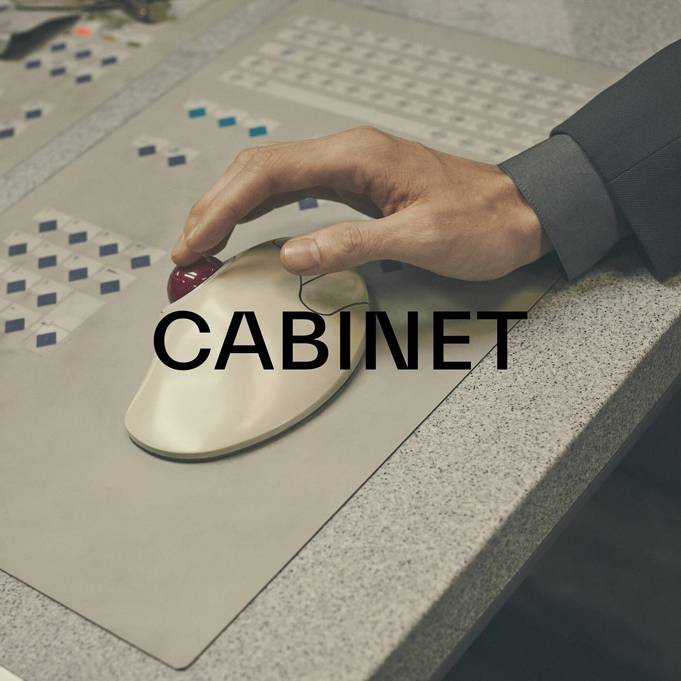
TWK Everett venturing into the fashion industry through the creative studio and fashion brand Cabinet Milano, led by Rossana Passalacqua and Francesco Valtolina.
This fresh and fun poster design for the Teatro Prospero uses Review Condensed from Commercial Type, a Principal Studio project
How to design the extension of –a very well-known– brand, while also making it unique. Order solves this question with the identity of Journal House, a branch of WSJ dedicated to events.
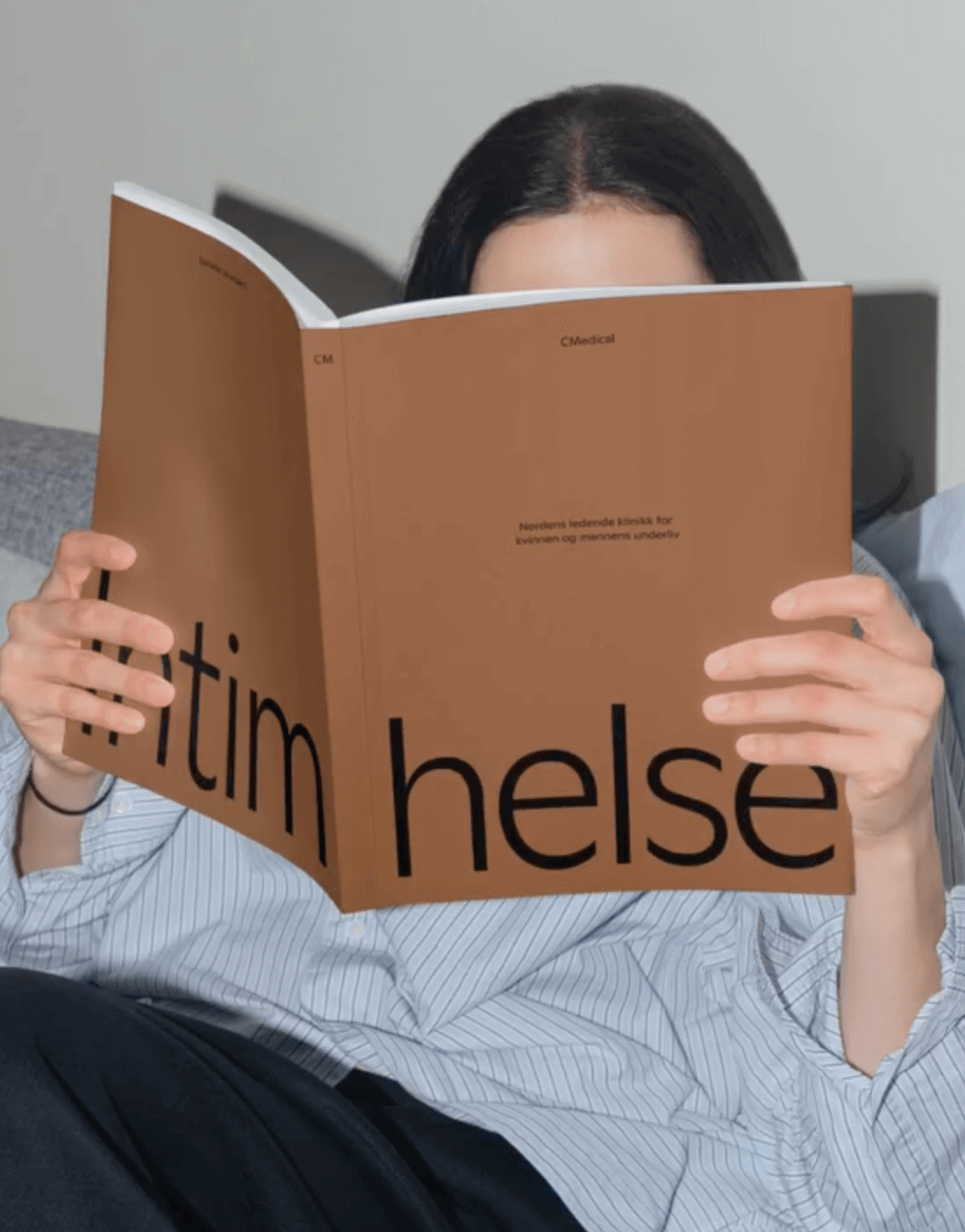
EY Doberman used Ginto from ABC Dinamo in different weights to achieve a consistent stroke throughout the visual identity for CMedical.
As a collectible object decorating a space, Christopher Doyle & Co. used Moulin for its unique and attractive features, along with Scto Grotesk, to achieve the elegance and sophistication that the interior design brand, Tom Mark Henry, aimed to convey with its new identity.
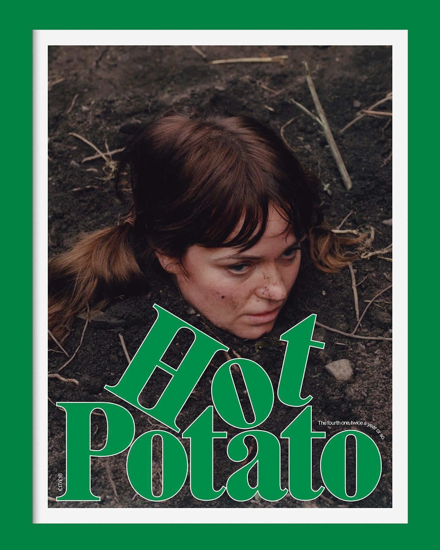
Neue Haas Grotesk is a common typeface on the blog, it works well in many scenarios, for example alongside Marfield in the fourth edition of Hot Potato magazine.